 THE COLOR WHEEL
 is a basic tool for representing the relationship between colors. It is basic in that it only attempts to show the relationship between particular hues, and it is a tool only insofar as it is useful and
not misleading. But we must recognize its limitations.
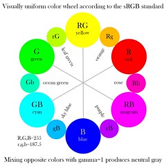
This wheel is only valid for the sRGB color space, since it explicitly uses the primary colors of that space; it may or may not be useful for other color spaces. Also, be aware that since this color space uses only three primary colors, it won’t be able to portray the entire color gamut of human vision. The wheel illustrates the principles of additive color, where we mix together various colors of light to get other colors; additive color works well enough with back-lit computer monitors and televisions, and also digital projectors. But this wheel is definitely not valid for mixing paints, watercolors, or other materials with color. It only works with light.
Additive mixing is conceptually simple
Mixing colors with light is an unusually pure and simple process that follows relatively basic mathematical laws. A computer scientist or programmer, or a digital photographer, not experienced with the manifold nuances of paints and pigments, can get a good representation of the world’s color with relatively little effort. But not so with the artist who works in oil paint: color mixing is a far more complex phenomenon.
Digital photography uses additive color — each phosphor on the computer monitor adds together with its companion phosphors to create a particular color. Adding together colored lights gives us brighter resulting colors. This addition is implicit in the color wheel above: with red, green, and blue as our primaries, mixing them together gives us our bright secondary colors of cyan, magenta, and yellow. If, for whatever reason, you had a computer monitor with primary colors made up of the cyan, magenta, and yellow phosphors of the wheel, you’d get a secondary colors which would be brighter and also less saturated: the secondary color made by mixing yellow and magenta would be a bright pink, and not red. But if we were to change the set of phosphors used in a monitor, we still should be able to accurately (and fairly easily) predict how our colors would mix.
Subtractive mixing
Paint is far more complicated. Light falls on paint, and some of it is absorbed (usually turning it into heat) while some of it is reflected, which leads to the color that we see. Leaves are green because their chlorophyl reflects green light — and they absorb much red and more blue light. So real-world objects subtract out some of the light falling on them, reflecting back colored light. Computer monitors have three, fixed colors which mix together, while real-world pigments reflect or absorb colors throughout the spectrum: this makes the subtractive colors of the painter much more complex.
For this reason, exceptionally pure and saturated paints are necessarily going to be rather dark: if a paint reflects only the far end of the color spectrum, near violet, then by necessity it will reflect only a tiny fraction of the total light falling on it. Fluorescence helps here, because normally invisible ultraviolet light is shifted in frequency to visible light — but this only works if the radiation falling on our paint has ultraviolet in it.
The colors should look the same...
Digital cameras have precisely three different kinds of color sensors, and the typical human eye also has three kinds of color receptors (plus another more noticeably used in low light). A camera and the eye collapses a broad range of hundreds of distinguishable light frequencies to merely three stimuli or numbers. But consider what this implies: various colored objects may absorb and reflect all sorts of differing frequencies of light, but
they all may appear to be the same color to the human eye under a given lighting condition. To complicate matters, digital cameras and human eyes don’t have matching color sensitivity: they are fairly close within the range used in photography, and under good lighting conditions such as daylight or bright incandescent, but they don’t match for all colors or under all lighting conditions. They most certainly won’t match under poor quality light, such as found with plasma discharge lamps (including fluorescent lamps) and LED lighting.
Therefore you cannot say that mixing a yellow paint and blue paint — even if they appear to perfectly match the colors on our color wheel — will give you a gray mixture. You need to know
which yellow, and
which blue paint are used. After all, a wide variety of reflectances will give you same yellow or blue color. You cannot use a color wheel like the one above to predict the outcome of mixing paint.
A good theory of subtractive color mixing?
If we could measure the reflectance of each pigment, and measure the spectrum of light falling on the pigments, then we could predict, with much bother and mathematics, what the resulting color mixture would look like, although still we would have to take into account whether the paint is wet or dry, or what kind of brushes and brushstrokes were used, plus the opacity of the paint, plus the thickness of the paint, plus the texture and color of the canvas or board or paper on which the paint is applied.
With additive color we can reliably produce white, black, and shades of gray by mixing together all three of our primary RGB colors in equal quantities. White, of course, can’t be mixed by any combination of colored paints, nor can we reliably get pure black by mixing together a few colors. The color of the canvas or backing, as well as the opacity of the paint, will limit the brightest and darkest colors that can be produced. As it so happens, the white and black paints used by artists does not evenly reflect or absorb light uniformly, making the process of creating tints or shades not completely straightforward — mixing a color with black may cause the color to shift towards warmer or cooler tones if not done carefully.
The solution, the difficult, laborious solution to subtractive color mixing is experience, or otherwise having access to sample swatches — a very large number, thousands, of color mixes — although experience is definitely needed if you want to do good work.
Minimal palettes of colors
A good, comprehensive, predictive theory of subtractive color mixing is complicated to the extreme, far more complicated than the already complicated theory of additive color mixing. To reduce complexity, in photography, we limit ourselves to three primary colors, knowing that not all the colors visible to the human eye can be represented in their full glory, and knowing that we accept these limitations in order to practice our art. In the realm of painting, artists (especially beginning artists, or those painting in oil in
plein air) often limit themselves to six or so colors, plus one or two kinds of black paint, and one or two kinds of white paint.
The idea of three primary colors works well with additive color, but even though it is limited, it is still used almost universally in digital photography: plus we have the advantage of being able to use mathematical primaries that are out of the range of human vision, expanding the gamut of colors we are able to accurately represent. But the use of three primary colors in painting is disastrous; following this misguided theory could cause an artist to severely limit his palette unnecessarily — although, if that is his artistic intent, that’s fine, it just isn’t a good
theory of color. And so, a painter must select a set of paints, and typically this set is more than three colors. If the color of any given paint cannot be mixed with the other paints in the set, then that is a primary color. An artist may use additional colors, such as burnt sienna, which are located within the chosen gamut, but using these is largely a convenience and not necessity.
Three
numbers suffice to describe any given color of light or pigment under controlled conditions. But three
colors are never sufficient to make up a complete system of colors.
Sadly, most commercial and much digital printing technology uses only three primary colors — cyan, magenta, and yellow — plus black, which gives us a limited gamut of possible color, and which is highly dependent on the whiteness of the printing paper used. While adequate, painters can do far better by adding other colors which cannot be mixed by these primaries. Typically speaking, a gamut made of six bright, saturated colors is adequate for creating a minimal palette, with the colors being fairly visually equidistant to each other, along with black and white. An older split-palette theory of color mixing used three pairs of primary colors, with one of each pair mixing cool and the other which mixed warm. Oddly enough, even though the split palette is somewhat deprecated in painting, a form of this is used in high-end digital printers: pastel primary colors are used to get better color in highlights, and only a few digital printers use good red, greens and blue inks which are otherwise not mixable.
While painters may envy the purity and simplicity of color mixing available to photographers, they must not assume that the overly simplistic tools of the photographer — like the digital color wheel — apply to their art. Likewise, photographers may have a certain smugness over their control of color, but instead they ought to be humbled by the skill required by the artist when mixing colors, as well as the range of the artist’s palette, which far exceeds that found in digital printers.
