...BUT PERHAPS AN inspiration to those seriously interested in the art of photography. Take a look at The Textile Blog: Design, Decoration and Craft.
Textiles and photographs are both flat, basically two-dimensional art forms. Both are typically made by machines and are usually not hand-made, although there is much artistry in both mediums. Certainly there is something for a photographer to learn about composition and art from examining other, similar art forms.
We live in an age of increased specialization, rationalization of labor, narrow job categories, hair-splitting definitions of genres, and narrow disciplines that do not understand each other. Now, some can call this individuality, but this division perversely leads to centralization, excess standardization, and the sense that we are seen as easily-replacable cogs in a huge machine, and not as free men and women.
For this reason, I think that a good education in the liberal arts is important if you want to improve your art, as well as avoiding too much specialization in art. The Textile Blog seems to understand this, and features artists who were much more and broader in scope in their artwork than what we tend see these days.
Tuesday, March 27, 2012
Thursday, March 15, 2012
An Imitation of the Autochrome Lumière Process
THE EARLIEST PRACTICAL method of color photography was the Autochrome Lumière process, introduced in France in 1907 by the Lumière brothers, who earlier had invented cinematography. Autochrome used standard silver chemistry, but with specially prepared glass plates, coated with tiny grains of transparent starch, dyed to three primary colors. This process produced slides suitable for projection or for viewing with bright back lighting; the colors produced were rather dark and somewhat muted, but many consider the final results to be rather beautiful. Later color photography methods tended to produce colors that could be garish.
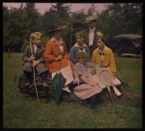
Family group outdoors, by unknown, ca. 1915, George Eastman House Collection
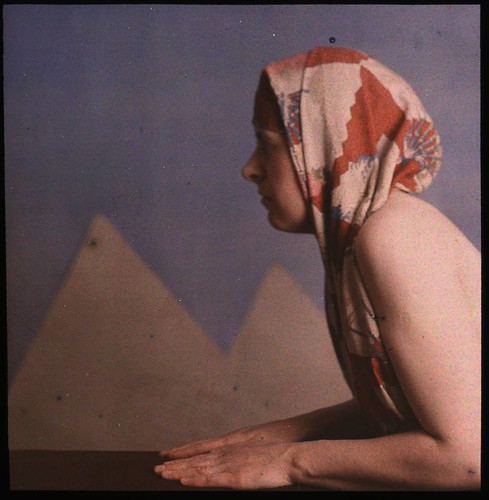
Woman posed as sphinx, by Dr. W. Simon, ca. 1910, George Eastman House Collection

Woman in floral silk robe, by Charles Spaeth, ca. 1915, George Eastman House Collection
Intrigued by this process, and captivated by many of the historical Autochrome images found on the Internet, I attempted to recreate the ‘look’ of these images. Since Autochrome is an additive process, using light-transmitting filters, the color properties of Autochrome ought to be quite reproducible with contemporary computer software.
The main problem is discovering the three primary colors used, and by various methods I was able to come up with a color gamut which seems to be fairly close to the original Autochrome. Characteristically, the primaries seem to be reddish-orange, a weak blueish violet color, and green. Using these primary colors, I was able to easily convert digital images to use this supposed Autochrome gamut:
This process, with its narrow gamut of colors, lacks the ability to capture reds and saturated blues, but it produces nice shades of pink and violet, as well as prominent orange and pale cyan colors. You can see other attempts at Autochroming images in my article Autochrome here and Autochrome at my other blog.
My process uses custom ICC profiles, created in Photoshop, which are linked in my article Using ICC Profiles for Creative Color Control. If you download one of these profiles, you can use standard image editing software to convert your standard profile images to use my estimates of the Autochrome primary colors. The nice feature of this method is that once you convert an image to use the Autochrome profile, you can edit the image as much as you would like while never having the colors go out of gamut. Once you are finished editing, you convert the image back to the standard sRGB profile for viewing on your computer or for printing.
While this is satisfying and interesting, these images lack prominent characteristics of the original Autochrome process, namely, the dark “gamma” of the images as well as the pointillistic grain pattern which derives from the colored starch grains found on Autochrome plates. Certainly my work with the Autochrome color gamut is sufficient to produce interesting images with a limited range of colors reminiscent of Autochrome, but I think it would be interesting, and possibly valuable, to come up with a better digital imitation of the historical method.
I don’t claim that my Autochrome color profiles actually match the color gamut found in the original process, for the sample images found on the Internet are highly variable, but with common characteristics. But close is good enough. Likewise, if I attempt to imitate the pointillistic nature of Autochrome, then close will again be good enough. It is my intention to create a method that is adequate.
In the article What is Autochrome? at the website of the Šechtl & Voseček Museum of Photography, you can see a microphotograph of the starch grains found in Autochrome, as well as many sample images and a description of the process.
The grains are generally round, bunched together in clusters, with a small amount of black pigment between the gaps. This grain, somehow, needs to be reproduced in Photoshop for our process. Now producing a photorealistic imitation of these grains would be very difficult, impractical, and would tax the resources of my computer, so I will produce a pixelated version instead, with clumps of square instead of round grains.
I’ve read a number of estimates of the sizes of the starch grains, from 5 to 10 microns in size, and some say that the process used 4 million grains per square inch. For our purposes, knowing the number of grains per linear inch is important, and various authorities state 1700, 2000, and 2500 grains per linear inch.
The Autochrome plates were manufactured in a wide variety of English and metric sizes. The pointillistic ‘look’ of the images is quite prominent on smaller plate sizes, but is not particularly noticeable on digital images made from larger plates. For our purposes, we’ll imitate the characteristics of a small plate, 3-1/4x4 inches in size, and use the intermediate value of 2000 grains per linear inch, which gives us an image 8000 x 6500 grains in size, or a 52 megagrain image. Please note that the color grains in Autochrome are randomly scattered, and so there is significant clumping of colors, reducing the final resolution and color accuracy of the image. Because it does not have the regular pattern of the Bayer sensor found in most digital cameras, Autochrome does not illustrate aliasing or the Moiré effect.
Now I have no idea as to the size of the light-sensitive silver grains found in Autochrome, but I’d think that the silver grains were smaller than the color grains, otherwise there would be a significant loss of saturation. I’m not sure how much this matters, but from my experimentation, very many color grains improve the final results. My digital camera is rather aged, and produces images 3008 x 2000 pixels in size, and using a grain pattern that size produces images that have an objectionable amount of grain. If we have a target of 6500 grains along the short edge of my image, then I will upsize from 3008 x 2000 to 9776 x 6500, preserving the aspect ratio, while imitating the grain pattern found in the smaller sample images. This would be roughly equal to an Autochrome plate 3-1/4 x 4-7/8 inches in size.
The difficult part of this process is creating a pixelated version of the color grain pattern of Autochrome, and it needs to be made in exactly the same number of pixels as the upsized image. As each manufacturer makes slightly different aspect ratios of images — and even some RAW converters will vary the number of pixels, then you will have to make your own grain pattern.
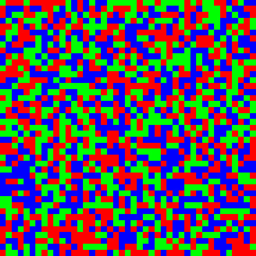
This is a highly-zoomed portion of a grain pattern that I made. Each pixel substitutes for an Autochrome grain, and like the original Autochrome, the grains are clumped together instead of being uniform. It doesn’t matter that it uses the standard sRGB primary colors, and not those of Autochrome.
Here is how I made it in Photoshop CS5:
Before:
After:

Before:
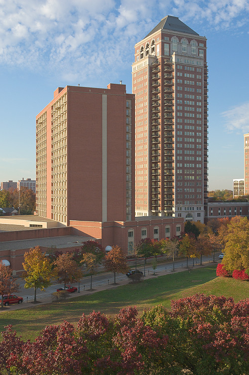
After:
Family group outdoors, by unknown, ca. 1915, George Eastman House Collection
Woman posed as sphinx, by Dr. W. Simon, ca. 1910, George Eastman House Collection
Woman in floral silk robe, by Charles Spaeth, ca. 1915, George Eastman House Collection
Intrigued by this process, and captivated by many of the historical Autochrome images found on the Internet, I attempted to recreate the ‘look’ of these images. Since Autochrome is an additive process, using light-transmitting filters, the color properties of Autochrome ought to be quite reproducible with contemporary computer software.
The main problem is discovering the three primary colors used, and by various methods I was able to come up with a color gamut which seems to be fairly close to the original Autochrome. Characteristically, the primaries seem to be reddish-orange, a weak blueish violet color, and green. Using these primary colors, I was able to easily convert digital images to use this supposed Autochrome gamut:
This process, with its narrow gamut of colors, lacks the ability to capture reds and saturated blues, but it produces nice shades of pink and violet, as well as prominent orange and pale cyan colors. You can see other attempts at Autochroming images in my article Autochrome here and Autochrome at my other blog.
My process uses custom ICC profiles, created in Photoshop, which are linked in my article Using ICC Profiles for Creative Color Control. If you download one of these profiles, you can use standard image editing software to convert your standard profile images to use my estimates of the Autochrome primary colors. The nice feature of this method is that once you convert an image to use the Autochrome profile, you can edit the image as much as you would like while never having the colors go out of gamut. Once you are finished editing, you convert the image back to the standard sRGB profile for viewing on your computer or for printing.
While this is satisfying and interesting, these images lack prominent characteristics of the original Autochrome process, namely, the dark “gamma” of the images as well as the pointillistic grain pattern which derives from the colored starch grains found on Autochrome plates. Certainly my work with the Autochrome color gamut is sufficient to produce interesting images with a limited range of colors reminiscent of Autochrome, but I think it would be interesting, and possibly valuable, to come up with a better digital imitation of the historical method.
I don’t claim that my Autochrome color profiles actually match the color gamut found in the original process, for the sample images found on the Internet are highly variable, but with common characteristics. But close is good enough. Likewise, if I attempt to imitate the pointillistic nature of Autochrome, then close will again be good enough. It is my intention to create a method that is adequate.
In the article What is Autochrome? at the website of the Šechtl & Voseček Museum of Photography, you can see a microphotograph of the starch grains found in Autochrome, as well as many sample images and a description of the process.
The grains are generally round, bunched together in clusters, with a small amount of black pigment between the gaps. This grain, somehow, needs to be reproduced in Photoshop for our process. Now producing a photorealistic imitation of these grains would be very difficult, impractical, and would tax the resources of my computer, so I will produce a pixelated version instead, with clumps of square instead of round grains.
I’ve read a number of estimates of the sizes of the starch grains, from 5 to 10 microns in size, and some say that the process used 4 million grains per square inch. For our purposes, knowing the number of grains per linear inch is important, and various authorities state 1700, 2000, and 2500 grains per linear inch.
The Autochrome plates were manufactured in a wide variety of English and metric sizes. The pointillistic ‘look’ of the images is quite prominent on smaller plate sizes, but is not particularly noticeable on digital images made from larger plates. For our purposes, we’ll imitate the characteristics of a small plate, 3-1/4x4 inches in size, and use the intermediate value of 2000 grains per linear inch, which gives us an image 8000 x 6500 grains in size, or a 52 megagrain image. Please note that the color grains in Autochrome are randomly scattered, and so there is significant clumping of colors, reducing the final resolution and color accuracy of the image. Because it does not have the regular pattern of the Bayer sensor found in most digital cameras, Autochrome does not illustrate aliasing or the Moiré effect.
Now I have no idea as to the size of the light-sensitive silver grains found in Autochrome, but I’d think that the silver grains were smaller than the color grains, otherwise there would be a significant loss of saturation. I’m not sure how much this matters, but from my experimentation, very many color grains improve the final results. My digital camera is rather aged, and produces images 3008 x 2000 pixels in size, and using a grain pattern that size produces images that have an objectionable amount of grain. If we have a target of 6500 grains along the short edge of my image, then I will upsize from 3008 x 2000 to 9776 x 6500, preserving the aspect ratio, while imitating the grain pattern found in the smaller sample images. This would be roughly equal to an Autochrome plate 3-1/4 x 4-7/8 inches in size.
The difficult part of this process is creating a pixelated version of the color grain pattern of Autochrome, and it needs to be made in exactly the same number of pixels as the upsized image. As each manufacturer makes slightly different aspect ratios of images — and even some RAW converters will vary the number of pixels, then you will have to make your own grain pattern.
This is a highly-zoomed portion of a grain pattern that I made. Each pixel substitutes for an Autochrome grain, and like the original Autochrome, the grains are clumped together instead of being uniform. It doesn’t matter that it uses the standard sRGB primary colors, and not those of Autochrome.
Here is how I made it in Photoshop CS5:
- Create a new image the precise size as your upsized digital image: for me, that is 6500 x 9776.
- Fill the blank image with 50% gray.
- Select the red channel.
- Select the menu item Filter - Noise - Add Noise...
- Adjust Amount to 50% and specify Uniform Distribution.
- Select the menu item Image - Adjustments - Threshold...
- Adjust Threshold Level to 173. If you check the histogram, you should see that 33.3% of the pixels are white; if not, you may have to adjust the Threshold Level slightly.
- Select the Green channel, and add the same amount of noise as before.
- Select the menu item Image - Apply Image...
- Use the Red channel, check Invert, and set Blending to Darken. This masks out the red pixels created in the previous step.
- Use the Threshold menu again, setting Threshold Level to 132. One third of the pixels are white. You may have to check the histogram to be sure: unequal percentages will throw off your white balance a bit.
- Select the Blue channel.
- Using Apply Image, apply both the inverted red and green channels, using Darken Blending, to mask out the red and green pixels.
- Select the menu item Image - Auto Tone to quickly turn the remaining gray pixels to white.
- Select the RGB channels, zoom into your image, and you will notice uniformly scattered red, green, and blue pixels.
- Save the image as a TIFF file to preserve the colors.
- If you haven’t done so already, download the Autochrome ICC profile from the article Using ICC Profiles for Creative Color Control, and install it in Photoshop.
- Select the menu item Edit - Assign Profile... and select Autochrome. This will change the sRGB primary colors to Autochrome’s primaries.
- Take your target image and upsize it to be equal in size to your grain pattern image.
- Either Assign or Convert your target image to the Autochrome profile. Read the article Using ICC Profiles for Creative Color Control for a discussion of the pros and cons of both methods.
- Edit your image as you would like.
- Drag the grain image on top of your target image and set the blending mode to Darken.
- Your image will now look terrible. Do not have fear.
- Flatten the image. It will now be rather dark, but will have textured grain, which you can see if you zoom into it.
- Shrink your image to a more manageable size if needed. The method you use will have a great effect on the grain in the image: Bicubic Sharper appears to do the best job.
- Convert the image back to the sRGB profile.
- Adjust the Levels to brighten the image a bit, but you may not want to clip any of the highlights.
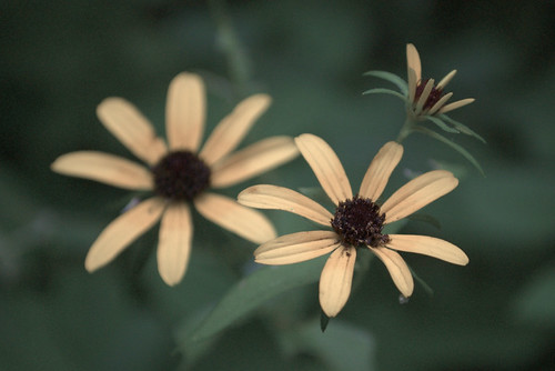
Before:
After:
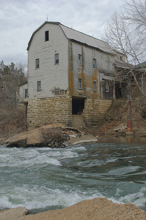
Before:
After:
Subscribe to:
Posts (Atom)