IGNORE THIS ARTICLE: the information presented here is problematic, difficult to apply in Photoshop, is error prone, and obsolete. Do not read any farther. This information is of no importance to photographers.
OK, not really. This article is about color systems that ought to be useful, that ought to be implemented — somehow — in Photoshop, but they still have plenty of traps for the unwary.
Artists, unlike those who have an affinity for mathematics, may find the RGB color system a pain. They perhaps object to the idea of reducing such a subjective concept as color to mere numbers, or perhaps they object to the unintuitive process of mixing the colors together in RGB. Photoshop is such a pain. It must have been invented by nerds.
For example, the RGB color for a particular tone of orange is R=180, G=95, B=6. But this is ridiculous; orange, a mixture of red and green? And with some blue thrown in also? No, that's wrong. Orange is a mixture of red and yellow, and there ain't no blue it it at all: but for sure that dim tone of orange has some black in it. And what's with these RGB values going from 0 to 255??? That number 255 makes no sense at all. Now, if we have to use numbers (and why can't we use good names for colors instead?), then why not use something more understandable like 0% to 100%?
Also, it seems that some particularly pure colors are missing from RGB. Tyrian purple, intense electric cyan colors, and rich, deep tones are nowhere to be found.
A painter would rather describe color in ways other than RGB. Here are some artists' color terms:
Hue is the basic quality of a color: is the color basically red, orange, yellow, chartreuse, green, aqua, blue, violet, or magenta? These hues are arranged in a circle around a color wheel, which shows how these colors relate to each other, and also how new colors can be obtained by mixing other colors. Now there is some controversy as to what precise set of colors ought to be used to obtain a minimal palette: some say that the three primary colors (red, yellow, and blue) is the minimum number of colors for a basic full-color palette; although white, black, or both are sometimes added to the mix, depending on whether the artist is using paint or watercolor. Other artists say that six colors (plus black and/or white) reproduces nearly the full range of color. Since these colors can mix together to produce nearly all known colors, any extra colors in the palette are simply a convenience to the artist; they aren't strictly needed. But no matter what color system is used, mixing together adjacent colors on the color wheel will produce novel colors, while mixing opposite colors together will give a grayish, blackish, or muddy tone.
Tints are pastel colors, made by mixing a color with white.
Shades are dark colors, made by mixing a color with black.
Brightness, value, or intensity tells us how close a color is in luminous quality to either white or black, or how bright a color is compared to the brightest available version of that color. Aqua is a brighter version of teal. Azure, dark midnight blue, and Dodger blue are basically only different in brightness.
Tones are colors that are mixed with both black and white (or gray) paint. These colors are muted, toned-down versions of the base colors.
Saturation, chroma, or colorfulness is how pure a particular color is. Tones, shades, and tints are less saturated than pure hues. Slate gray is less saturated than azure. Carmine is more saturated than copper rose, even though they are approximately the same hue and brightness.
Other qualities include transparency, fluorescence, glossiness, and so forth,
Friday, October 14, 2011
Tuesday, October 11, 2011
Deblurring
This is a technology preview of Photoshop software that can remove motion blur from an image.
Friday, October 7, 2011
A Visually-Uniform Digital Color Wheel
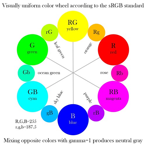
A WHILE BACK I published a color wheel, made according to the digital sRGB color standard. This standard color space is used with most digital cameras, and is the standard used by the Web and high-definition television. You can see this wheel by clicking here. But this wheel is wrong: rather, I present a new color wheel which is more visually uniform:
Most artist's color wheels, as found in art stores and Internet searches are quite misleading. The idea of a color wheel is to show the relationship between the colors. Of great importance is the idea of color opponency: if you mix two colors opposite from each other on the wheel, you will not get a third color, but rather gray. But these color wheels do not work for digital technology. Red, yellow, and blue — the primary colors typically used in these wheels — are not the primary colors used in digital photography.
But like the artist's color wheels, my old color wheel is also misleading:
The primary and secondary color relationships shown here are correct. The primary colors of red, green, and blue are opposed to the secondary colors of cyan, magenta, and yellow, and if you mix these opposed colors in Photoshop you will indeed get a neutral gray. But the tertiary colors look wrong. Orange appears to be closer in brightness to red, being much darker than yellow, and likewise sky blue looks darker than it ought to be. There is hardly any differentiation between the green colors.
We are looking for the brightest colors we can as our primaries. Setting R=255, with G and B both equal to 0, we will get the brightest and most saturated pure red that can be represented by the sRGB color system. The opponent color to red is cyan, which we get by setting R=0 and G and B both equal to 255, and this is the brightest and most saturated cyan we can represent in our system. When we mix these colors together, we get a neutral gray color. By default, Photoshop will average all these colors together to gray. As it so happens, the average color number ought to be 127.5, but since fractions are not possible when using Photoshop in 8-bit mode, we get either 127 or 128; but this is close enough.
Click here for an overview of the RGB color system.
The tertiary colors are halfway between adjacent primary and secondary colors. So the tertiary color between red and yellow will be orange. Our red value is equal to (255, 0, 0), while our yellow value is (255, 255, 0). Averaging these numbers together, I get a middle orange tone of (255, 127.5, 0). Rounding the green value up to 128 (since we can't use fractions), I get the orange tone shown in the old color wheel above. But it is too dark, too close to red in tonality than to yellow. The color appears to be correct, but not its brightness. So I set about manually trying to come up with a color that appeared to my eye to be halfway between red and yellow. Using a number of ad hoc methods to blend colors in Photoshop, I attempted to produce a visually continuous range of tones between each primary and secondary color. As it so happens, I found that the new tertiary colors were always brighter than my original estimates, in fact, the middle RGB value for these tertiaries were quite close to each other: I estimated that they all were around 180-190. Now this meant that the tertiary values across from each other on my color wheel were no longer opponents. Mixing my new orange with my new sky blue got me a somewhat dim and unsaturated green color. But I was willing to accept this shortcoming in order to portray my tertiary colors with visual uniformity.
My mistake was assuming that the mathematically intermediate value of 128 was also visually intermediate. This is wrong; I did not account for gamma correction. The human eye sees light in such a way that doubling the intensity of light only makes a scene to appear a bit brighter. Likewise, cutting the intensity of light by half makes the scene appear to be only a bit darker. Our eyes can operate under an extreme range in lighting due to this property. The practice of gamma correction adjusts the color tones in the RGB system so that the range of brightness is more visually uniform: otherwise, most of our RGB numbers would represent only the very brightest of colors and would neglect darker shades; our coding would be inefficient.
Now gamma correction requires more than simple arithmetic, and the sRGB standard uses a non-standard, non-uniform gamma correction to the RGB data, making this whole process murky. I'll spare you the details; instead, read the article linked above. What is important is that gamma correction does not change the values of 0 and 255 in 8-bit RGB color, it only modifies intermediate values, and so our calculations with our primary and secondary colors are unchanged. Only the tertiary colors will change with gamma correction. Intermediate values, after backing out the gamma correction of sRGB, become 187.5, and so in the color wheel above, I set the values to either 188 or 187.
This still leaves us the problem of mixing colors in Photoshop. Blending together opposite tertiary colors does not give us a neutral gray. However, this has already been thought of. If you go to Edit-Color Settings, and then click More Options, we get this:
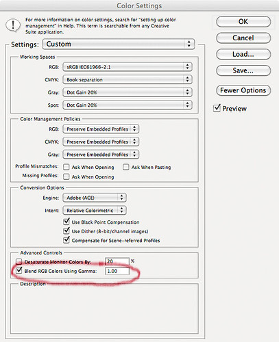
Select Blend RGB Colors Using Gamma 1.00, and the color mixing will be correct. This option subtracts out the gamma correction, allowing more accurate color blending. If we blend together our leaf green and our purple, under a gamma of 1, we will get a neutral gray color, and it will be the same shade of gray that we get if we blend together any of the opposing colors on the wheel. Since I'm not all that sure what other effects this option may have, it probably shouldn't be set at all times. But we do see that it in fact does produce more visually accurate color blends.
How does the wheel look? One problem is that the sRGB color gamut exceeds the capability of my calibrated iMac monitor, and so most of the colors here cannot be presented to my eye in their full glory. I find that I can hardly distinguish rose from magenta — how about you?
Most artist's color wheels, as found in art stores and Internet searches are quite misleading. The idea of a color wheel is to show the relationship between the colors. Of great importance is the idea of color opponency: if you mix two colors opposite from each other on the wheel, you will not get a third color, but rather gray. But these color wheels do not work for digital technology. Red, yellow, and blue — the primary colors typically used in these wheels — are not the primary colors used in digital photography.
But like the artist's color wheels, my old color wheel is also misleading:
The primary and secondary color relationships shown here are correct. The primary colors of red, green, and blue are opposed to the secondary colors of cyan, magenta, and yellow, and if you mix these opposed colors in Photoshop you will indeed get a neutral gray. But the tertiary colors look wrong. Orange appears to be closer in brightness to red, being much darker than yellow, and likewise sky blue looks darker than it ought to be. There is hardly any differentiation between the green colors.
We are looking for the brightest colors we can as our primaries. Setting R=255, with G and B both equal to 0, we will get the brightest and most saturated pure red that can be represented by the sRGB color system. The opponent color to red is cyan, which we get by setting R=0 and G and B both equal to 255, and this is the brightest and most saturated cyan we can represent in our system. When we mix these colors together, we get a neutral gray color. By default, Photoshop will average all these colors together to gray. As it so happens, the average color number ought to be 127.5, but since fractions are not possible when using Photoshop in 8-bit mode, we get either 127 or 128; but this is close enough.
Click here for an overview of the RGB color system.
The tertiary colors are halfway between adjacent primary and secondary colors. So the tertiary color between red and yellow will be orange. Our red value is equal to (255, 0, 0), while our yellow value is (255, 255, 0). Averaging these numbers together, I get a middle orange tone of (255, 127.5, 0). Rounding the green value up to 128 (since we can't use fractions), I get the orange tone shown in the old color wheel above. But it is too dark, too close to red in tonality than to yellow. The color appears to be correct, but not its brightness. So I set about manually trying to come up with a color that appeared to my eye to be halfway between red and yellow. Using a number of ad hoc methods to blend colors in Photoshop, I attempted to produce a visually continuous range of tones between each primary and secondary color. As it so happens, I found that the new tertiary colors were always brighter than my original estimates, in fact, the middle RGB value for these tertiaries were quite close to each other: I estimated that they all were around 180-190. Now this meant that the tertiary values across from each other on my color wheel were no longer opponents. Mixing my new orange with my new sky blue got me a somewhat dim and unsaturated green color. But I was willing to accept this shortcoming in order to portray my tertiary colors with visual uniformity.
My mistake was assuming that the mathematically intermediate value of 128 was also visually intermediate. This is wrong; I did not account for gamma correction. The human eye sees light in such a way that doubling the intensity of light only makes a scene to appear a bit brighter. Likewise, cutting the intensity of light by half makes the scene appear to be only a bit darker. Our eyes can operate under an extreme range in lighting due to this property. The practice of gamma correction adjusts the color tones in the RGB system so that the range of brightness is more visually uniform: otherwise, most of our RGB numbers would represent only the very brightest of colors and would neglect darker shades; our coding would be inefficient.
Now gamma correction requires more than simple arithmetic, and the sRGB standard uses a non-standard, non-uniform gamma correction to the RGB data, making this whole process murky. I'll spare you the details; instead, read the article linked above. What is important is that gamma correction does not change the values of 0 and 255 in 8-bit RGB color, it only modifies intermediate values, and so our calculations with our primary and secondary colors are unchanged. Only the tertiary colors will change with gamma correction. Intermediate values, after backing out the gamma correction of sRGB, become 187.5, and so in the color wheel above, I set the values to either 188 or 187.
This still leaves us the problem of mixing colors in Photoshop. Blending together opposite tertiary colors does not give us a neutral gray. However, this has already been thought of. If you go to Edit-Color Settings, and then click More Options, we get this:
Select Blend RGB Colors Using Gamma 1.00, and the color mixing will be correct. This option subtracts out the gamma correction, allowing more accurate color blending. If we blend together our leaf green and our purple, under a gamma of 1, we will get a neutral gray color, and it will be the same shade of gray that we get if we blend together any of the opposing colors on the wheel. Since I'm not all that sure what other effects this option may have, it probably shouldn't be set at all times. But we do see that it in fact does produce more visually accurate color blends.
How does the wheel look? One problem is that the sRGB color gamut exceeds the capability of my calibrated iMac monitor, and so most of the colors here cannot be presented to my eye in their full glory. I find that I can hardly distinguish rose from magenta — how about you?
Thursday, October 6, 2011
The Academy on LED Lighting Technology
BETWEEN 2% AND 10% of a motion picture's budget is for lighting, and if we consider that much of that cost is for electricity and for the purchase of low-life expectancy lamps, then new technologies look quite promising. Solid state light emitting diode (LED) lamps produce great amounts of light at low power consumption, they don't generate much heat, they have a long life, they are lightweight, and they are tough, making them unbreakable and safe to work around. The new solid state lighting has many benefits, and the United States government is heavily encouraging its use.
The Academy of Motion Picture Arts and Sciences is studying the new LED lamps for suitability in motion pictures. Their preliminary research can be found at the Solid State Lighting Project page.
The results are not good. LED lamps do not present colors very well to the camera.
Generally speaking, according the presentation linked above, LED lighting is currently a poor choice for getting good color, most particularly for getting good skin tones, which are particularly harmed. The example tests show skin looking more green and sickly instead of having a healthy ruddy glow. The tests show also that makeup looks inconsistent under LED lighting, and does not blend as well with bare skin. Tans, light browns, and reds tend to be harmed significantly, while some blues are enhanced. Colors in general appear to be less differentiated under LED lighting, and complex fabrics tend to 'flatten' and have less pronounced shading and texture. The use of these lights could impose greater costs, requiring color checks before filming.
Tungsten lamps and daylight produce a flat, uniform spectrum, and so are perfect at rendering colors accurately. Film stock and digital sensors render the colors from this kind of lighting very well.
In the Academy's opinion, the discontinuous spectra produced by LED lighting is problematic. The terms 'color temperature' and 'color rendering index' are not particularly useful when discussing LEDs, because of their discontinuous color quality. A solution, they think, may not be in improving the LED lamps themselves, but rather in developing custom film stock and digital sensors that better match the LED spectra. They also think that custom discontinuous filters could be used, but this will remove much of the electrical efficiency of the lamps, making their use largely moot. These fixes are not likely to help photographers who are much less in control of their lighting, and who need more general-purpose equipment — an LED optimized sensor would do a rather poor job under daylight.
Visually, the various light sources look the same to the human eye: but the camera does not perceive light the same way and colors are rather unpredictable. I ought to note that much research is currently being done to make a visually balanced LED spectrum, but this by no means is expected to work well with photography. Every model of sensor will have a different response to the LED lighting, making color matching more difficult.
The Academy thinks that LED lighting products are being rushed to market without taking into concern the needs of quality color reproduction. They also see the need to have quality third-party evaluation of the products emphasizing cinematography.
Saturday, October 1, 2011
Autochrome
THE LUMIÈRE BROTHERS, Auguste Marie and Louis Nicolas, are known for being pioneers in motion pictures, having patented the cinématographe in 1895, and by holding the first commercial movie screening that year. However, they thought that “the cinema is an invention without any future,” and instead they concentrated their work on developing color photography. While photographers did produce color images by taking a series of black-and-white exposures from behind various colored filters, the Lumières (their name, appropriately, is French for ‘light’) developed a method of making a color image from a single exposure. Their plates could be easily developed with standard darkroom methods and chemicals and required no unusual equipment to view.
Autochrome plates had a layer of starch grains, dyed to three primary colors. These tiny grains acted as color filters during both exposure and when viewing. The plate used standard silver chemistry, and was developed so as to remove the silver that was exposed to the light — which is the reverse of the normal process. The completed plate then had a positive color image when viewed with a back light.
Autochrome Lumière plates were first marketed in 1907, at a cost a number of times more than standard black and white plates. This proved to be the most practical color photography method until the 1930s.
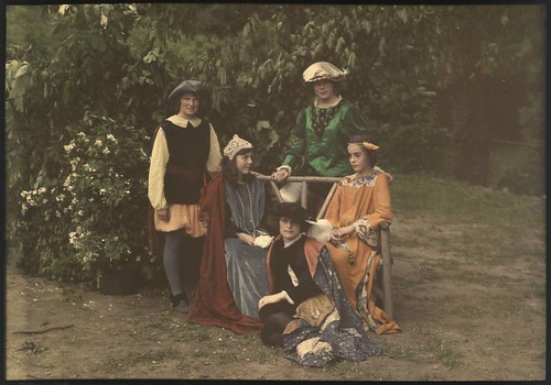
Children in Medieval Costume, by Mrs. Benjamin F. Russell, ca. 1910. George Eastman Collection.
Autochrome was used to create slides, viewed either by a slide projector, or through a hand-held viewer. It is said that printed reproductions of Autochromes — especially those made during the era when the process was used — do not do justice to the medium; the original colors are delicate, with excellent color separation and balance. But autochromes are sensitive to light, heat, and oxygen, with surviving images often being in poor condition.
While there are many differences between Autochrome and newer color photography methods, the most striking difference is that Autochrome used orange, green, and violet dyes as the primary colors of its palette, in contrast to the now-standard red, green, and blue primary colors. This inevitably and severely limits the range of colors that can be represented by this method.
But muted colors are not necessarily a bad thing. Autochrome remained popular until the 1950s, especially in France, because it produced more subtle color than newer films. The American film Kodachrome (produced from 1935 to 2009) was known for producing excessively bright color, while the Japanese Fujichrome Velvia (introduced in 1990) produces colors very often criticized as garish. The contemporary digital photography color standard also produces colors which can be excessively saturated. Can an understated, limited, and muted use of color be sometimes superior?
As it so happens, the range of colors produced by Autochrome ought to be accurately reproducible by modern digital cameras, since their native color gamut is so large. Intrigued by Autochrome, I set about devising a method of reproducing its color range. Here are some experimental digital photos, limited to use only my estimate of Autochrome's color palette:
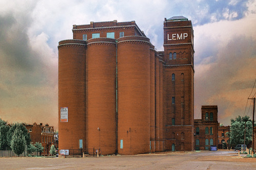
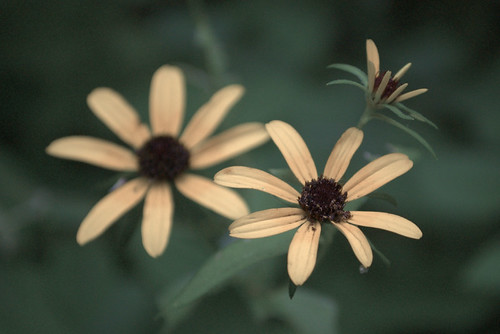
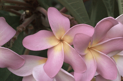
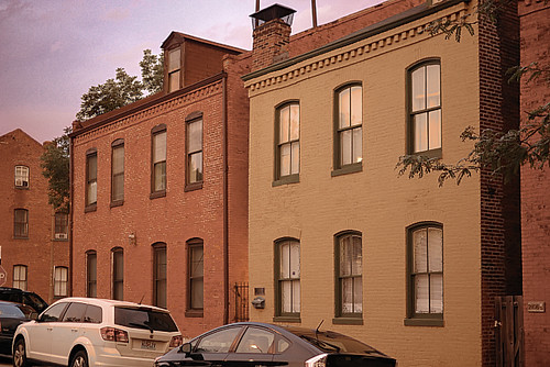
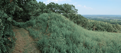
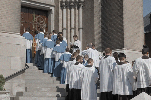
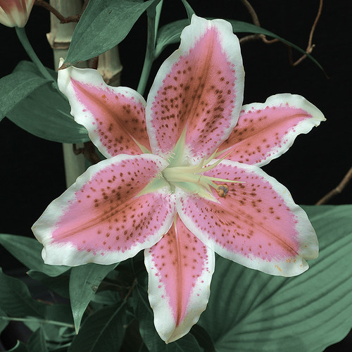
I reduced the color gamut of these photos to my estimates of the primary colors used by Autochrome. As these primary colors are more limited than the sRGB primaries, we ought to be able to reproduce them more or less faithfully here. There are plenty of Autochrome images on the Internet, but many of them are scans from printed images, which will throw the colors off. I attempted to find only direct digital images of Autochrome slides, and used those to estimate the primary colors. Clearly there is lots of variation among my sample photos, not the least of which is changes in exposure and white balance, as well as the color response of the various digital cameras or scanners. But I did the best that I could. Here is the process I used:
Some Frenchmen, using original Lumière equipment and notes, are attempting to duplicate the process in its full glory. While not likely to become widely used, this is still a worthy medium for color photography.
UPDATE: see the article Using ICC Profiles for Creative Color Control for specific instructions on converting images to the estimated Autochrome color gamut. For the photographs in this article, I used the Old Autochrome ICC profile. I’ve made an attempt at simulating the grain and dark tones of Autochrome. See the article An Imitation of the Autochrome Lumière Process.
Autochrome plates had a layer of starch grains, dyed to three primary colors. These tiny grains acted as color filters during both exposure and when viewing. The plate used standard silver chemistry, and was developed so as to remove the silver that was exposed to the light — which is the reverse of the normal process. The completed plate then had a positive color image when viewed with a back light.
Autochrome Lumière plates were first marketed in 1907, at a cost a number of times more than standard black and white plates. This proved to be the most practical color photography method until the 1930s.
Children in Medieval Costume, by Mrs. Benjamin F. Russell, ca. 1910. George Eastman Collection.
Autochrome was used to create slides, viewed either by a slide projector, or through a hand-held viewer. It is said that printed reproductions of Autochromes — especially those made during the era when the process was used — do not do justice to the medium; the original colors are delicate, with excellent color separation and balance. But autochromes are sensitive to light, heat, and oxygen, with surviving images often being in poor condition.
While there are many differences between Autochrome and newer color photography methods, the most striking difference is that Autochrome used orange, green, and violet dyes as the primary colors of its palette, in contrast to the now-standard red, green, and blue primary colors. This inevitably and severely limits the range of colors that can be represented by this method.
But muted colors are not necessarily a bad thing. Autochrome remained popular until the 1950s, especially in France, because it produced more subtle color than newer films. The American film Kodachrome (produced from 1935 to 2009) was known for producing excessively bright color, while the Japanese Fujichrome Velvia (introduced in 1990) produces colors very often criticized as garish. The contemporary digital photography color standard also produces colors which can be excessively saturated. Can an understated, limited, and muted use of color be sometimes superior?
As it so happens, the range of colors produced by Autochrome ought to be accurately reproducible by modern digital cameras, since their native color gamut is so large. Intrigued by Autochrome, I set about devising a method of reproducing its color range. Here are some experimental digital photos, limited to use only my estimate of Autochrome's color palette:
I reduced the color gamut of these photos to my estimates of the primary colors used by Autochrome. As these primary colors are more limited than the sRGB primaries, we ought to be able to reproduce them more or less faithfully here. There are plenty of Autochrome images on the Internet, but many of them are scans from printed images, which will throw the colors off. I attempted to find only direct digital images of Autochrome slides, and used those to estimate the primary colors. Clearly there is lots of variation among my sample photos, not the least of which is changes in exposure and white balance, as well as the color response of the various digital cameras or scanners. But I did the best that I could. Here is the process I used:
- I collected dozens of Autochrome images from the Internet, and put them together into a large photomosaic.
- Using selection and threshold tools in Photoshop, I eliminated colors that were not saturated, changing these to a uniform neutral gray.
- Using Indexed Color, I was able to reduce the color palette gradually until I was left with several clusters of colors, which corresponded to the three Autochrome primary colors, three secondary colors, and black and white.
- From the sample colors found in the Color Table, I picked out the brightest, most saturated typical-looking colors from each cluster as the primaries.
- Using a color conversion tool (ColorSync can do this), I determined the Yxy color values associated with the RGB numbers found in the Color Table.
- I created an Autochrome ICC profile in Photoshop using these Yxy values.
- Converting an sRGB image to the Autochrome profile may or may not make a big difference, depending on the brightness of the colors found in the original images. However, you can edit the image considerably to bring out the colors better, and never leave the Autochrome gamut.
- I have no way of knowing if I got the colors right, and there obviously is a lot more work that can be done with this, but this limited palette still has a certain beauty and opportunity.
Some Frenchmen, using original Lumière equipment and notes, are attempting to duplicate the process in its full glory. While not likely to become widely used, this is still a worthy medium for color photography.
UPDATE: see the article Using ICC Profiles for Creative Color Control for specific instructions on converting images to the estimated Autochrome color gamut. For the photographs in this article, I used the Old Autochrome ICC profile. I’ve made an attempt at simulating the grain and dark tones of Autochrome. See the article An Imitation of the Autochrome Lumière Process.
Subscribe to:
Posts (Atom)