A PHOTOGRAPHER ASKS: “When I make a print, it looks duller, grayer, and more bland than what I see on my computer monitor, even when I’m using soft proofing. Do you have any tips or advice on making the computer image match my prints?”
The range of colors — or gamut — that can be printed on a typical color printer is less than what can be displayed on a computer monitor, and so Photoshop and some other image editing software packages include a ‘soft proof’ tool which limits the colors on the screen to match the printer gamut. While this is a good way of checking color limits, very often people complain that the prints are much darker that what is seen on the screen. But this is to be expected, yes? You have a nice bright monitor lit by powerful lamps behind the screen while your prints are viewed under whatever dim lighting you might have in the room where you have your computer. Comparing these side-by-side is going to be disappointing.
The soft proofing will only be close to accurate if the brightness of what you see on the screen matches the brightness of the print — where the brightest white on the screen is equal to the brightest possible white you can see on a print. This is usually not the case with many monitors, which even at their dimmest setting is far brighter than typical ambient home of office lighting conditions.
However, it is considered good practice to turn down your monitor brightness enough to allow both comfortable editing and good print matching. This will probably get you 80% of the way towards good soft proofing and it costs you nothing. Any more physical accuracy will increase your costs and decrease your convenience dramatically.
Now if you turn up your lights in the computer’s room — or turn down the monitor brightness by a lot — then you might have so much glare on your screen to make editing it difficult. To correct for this, some folks will put a shield around their computer monitor, black on the inside, preventing much stray light from the room from hitting the screen — this is like a lens hood. You might be able to make one yourself out of cardboard and black spray paint.
This still might not allow a good match in brightness between your monitor and print, because as mentioned it might be quite impractical and undesirable to have the room brightness match your monitor brightness. In this case, imaging professionals will often use a ‘proof light box’, a good-sized enclosure where you can put your print, which has a number of presumably precisely-specified lamps inside of it which can be adjusted for brightness, and so can match the brightness of the monitor.
Using a light box allows for practical monitor brightness settings as well as desirable room brightness. However, this will not work well if the color of the lamps doesn’t match the monitor. The brightest white on the monitor ought to match the color of a pure white object in the light box, not only in brightness but in overall color cast, and so the right lamps need to be selected — but be aware that changing the brightness might very well change the color temperature of the lamps (common with incandescent lamps) —making your selection considerably more difficult.
However, you still may have a problem. A computer monitor has a multitude of red, green, and blue dots of colors, which can be mixed together in fine proportions in order to produce millions of colors of relatively good accuracy. On the contrary, the colors of a print are going to be strongly influenced by the spectral qualities of the lamp used to view it. If you don’t use a specially-made spectrally accurate lamp, the colors will very likely be different — sometimes greatly so — between the monitor and print, even though the tonality of dark and light neutrals might look the same. This problem is called metamerism failure.
This still might not give you an accurate match. The sRGB standard which defines the most common data format used in digital images specifies that images should be viewed surrounded by a dark gray surround — which will cause the eye to perceive shadow tones as being brighter than if they are surrounded by a white background. Photoshop does this normally, and your light box ought to have the same shade of gray surrounding your print. However, if you will eventually view your photo in a frame with a white matte around it, then you might want to edit the image with a brighter surround — and likewise evaluate the print with the same brightness surround. Also, be sure the view the print and computer image at the same size and distance.
Human eyes constantly adjust themselves to the lighting conditions, and so if there is a strong color cast in the room — say from bright, saturated paint on the walls — then your eyes will adjust, neutralizing the color a bit. This adjustment will effect your evaluation of the images, and will change your impression of the print under ambient conditions in the room, more than what you see on a bright monitor. For this reason, unsaturated colors in the computer’s room is desirable, and a medium gray is even more desirable.
Getting a good visual match between the monitor and print is going to be difficult and expensive. But there is an alternative. What I do is measure the brightness of the various parts of the image, using Photoshop’s dropper tool and by analyzing its histogram, and I adjust the values to give me what I know will be good values in the final print. Basically, I know, based on the measured color numbers on the digital image, what the colors will look like in the final print. I know that I don’t want the shadows to be too dark and adjust accordingly. If I need saturated colors, then I’ll use proofing and adjust the image to give me good bright colors without blowing out any of the ink values, which would lead to loss of detail and texture as well as shifts in hue. This ‘by the numbers’ method is accurate and highly predictable, and I really don’t need an accurate visual match on my screen. This is inexpensive but quite accurate, if somewhat difficult to do well. It also has the advantage that I know that my colors are right, even if I’m not seeing right at any given time, like when I’m tired.
Sunday, December 7, 2014
Monday, May 5, 2014
Color Trek
“P’tak!” shouted the Klingon, as he drove his dagger into the computer monitor, causing a shower of sparks to shoot across the bridge of the starship. “Nga’chuqing pjqlod of a sli-vak!” He proceeded to stomp the remaining bits of advanced computer hardware into tiny pieces, cursing furiously.
Commander Riker, stroking his clean-shaven chin, asked, “Hey Worf! Is something the matter?”
“Stupid Earth technology! VeQ! We almost lost the number 1 core because of that idiotic monitor. Overload conditions are to be displayed in red,” Worf growled, looking both hurt and angry, as if he was personally disrespected, “but that mIghtaHghach display is ambiguous. I can hardly tell a normal condition from abnormal.”
“Well, it looked pretty red to me,” replied Riker, “and I thought that I probably should have mentioned it to you, but you know how you get whenever you are contradicted.” Then he thought to himself, “Maybe I ought to grow a beard. I’d get a lot more respect that way.” Riker, turning to a pale android who seemed to have ignored the recent outburst of violence, asked “Data, any idea what is going on here?”
Lieutenant Commander Data showed his typical puzzled robotic expression. “I wish I could help you,” he replied, “but Ensign Crusher is siphoning off 98.7% of my positronic CPU capacity in order run an otome gēmu simulation. Please wait; process terminating.” [An anguished cry is heard from the other side of the bridge: “Noooooo!”]
“Let me download some pertinent information. OK. Lieutenant Worf, you stated that you were unable to distinguish between overload and normal conditions on the monitor, based on the status color. —All right, by your expression of anger I can assume the affirmative. Commander Riker, you state that the status condition color was red as expected for a core overload condition.” Data nodded seriously. “I think I know what the problem is.”
“Let me demonstrate.” Data randomly selected an image from the starship’s database, displaying it on the forward screen, an image showing Counselor Troi having too much to drink at a party. “Commander Riker, how does this image look to you?” He paused. “Commander Riker?”
“Yeah, she looks really great,” he replied, “Could you put a copy of that in my personal files?”
“Sir, I am asking you about the color rendition of the display. Do the colors look accurate to you?”
“Yes. Fine. Looks great.”
“Lieutenant Worf, how does this image look to you?”
“Like many Earth displays, it is far too bright — and maybe, what? fuzzy?”
“Would you say that the monitor has low contrast? That it does not render black tones well?”
“Yes. Exactly,” replied the Klingon.
“Klingon eyes,” explained Data, “are similar to human eyes in that they have a long-wave class of photon receptors which are generally sensitive to the red part of the spectrum, however, the sensitivity extends into what humans call the invisible ‘infrared’ — but of course, to Klingons, that part of the spectrum is simply ‘red’, indistinguishable from what a human would call red.”
The android continued, “Many Human displays, such as this one, emit a significant amount of uncontrolled infrared radiation, visible to Klingons, but not humans. This both makes the display excessively bright to Klingon eyes, as well as low in contrast. Also, I can assume that all humans, to Klingon eyes, look pale, due to the transparency of human skin to infrared.”
“Yes,” replied Worf, “they all look alike to me.” He addressed Lieutenant Commander La Forge: “But I always recognize you from your VISOR.”
“Lieutenant,” continued Data, “what about the colors on the screen? How do they look to you?”
“They are bad. Wrong. Filthy. I always have a nagging suspicion that humans choose wrong colors because they are weak, decadent aesthetes, or that they are doing that simply to outrage my people.”
“You know that isn’t true. Perhaps you could describe to us the colors of the spectrum? As you see them?”
“Of course. Red, orange, yellow, green, kth’arg, and blue. Every child knows that.”
“Kth’arg?” asked Riker. “Not cyan?”
“Yes, kth’arg,” snarled the Klingon. “Yes, cyan is a mixture of green and blue; I know that and I see that. But kth’arg is not cyan. Kth’arg is kth’arg. That photograph up there,” he pointed to the screen, “has colors that ought to be kth’arg but are blue, and are kth’arg instead of green. Things that are orange in real life appear to be red, and things that are yellow are shown as orange.” His hand moved slowly towards his dagger.
“Human eyes,” said Data, “have three general classes of light receptors, notionally identified as being sensitive to red, green, and blue light, or more accurately, to long, medium, and short wavelengths of light respectively. Klingons have a weak fourth class of color receptors which have a peak sensitivity to wavelengths between the ‘green’ and ‘blue’ receptors, which leads to the kth’arg sensation. As such, it is not a translatable or perceivable color to humans. Also, I might note that Klingons, due to the downwardly-shifted sensitivity of their red receptors, are unable to distinguish between blue and spectral violet — they literally are the same color to them.”
“That foul monitor,” said the Klingon, pointing to the pile of smoldering components, “was supposed to display normal condition with a green color, but it looked to me like a orangish kth’arg, while abnormal conditions ought to be shown in red, but instead looked like a kth’argy orange. Those colors are almost identical. If I hadn’t double-checked the core status, we would have all been dishonorably slain by now.”
“Now wait,” replied Riker, “I don’t understand this. Aren’t we using the latest equipment? How can this go wrong?”
“The problem is known as metamerism, where many wavelength combinations are perceived as the same color” replied the android. “My own ocular sensors are multispectral — I can distinguish among many narrow spectral bands of light — but these perform poorly under dim lighting conditions such as we experience here on the bridge, and so my vision module can combine many narrow bands into several large overlapping ones, similar to human vision. This gives me some color distinction while greatly reducing the amount of photonic noise in my sensors. While I have less data to go on, it usually hardly matters, and it greatly reduces the burden on my CPU from vision processing. But what this means is that there is an infinity of combinations of wavelengths that deliver the same perceived color. You might perceive a single wavelength as ‘cyan’, but any number of combinations of blue and green wavelengths will give you the same perception — that is metamerism. As it so happens, that single wavelength you perceive as ‘cyan’ is perceived by Lieutenant Worf as kth’arg, while both you and he both perceive combinations of green and blue as cyan. This is a metamerism failure.”
“So?”
“Our Federation Standard displays use three primary colors — red, green, and blue — which when mixed together in varying proportions can deliver a significant fraction of all colors seeable by the typical human eye. But don’t forget, there are an infinity of combinations of wavelengths of light that will be perceived — by a human — as the same primary color. The particular green color used in Lieutenant Worf’s late display — to him — appears to be more of a kth’arg color and not green at all. Another display — identical to you — might appear to be quite different to him, simply because the primary colors use a different metameric mix of wavelengths. You see Sir, our displays — with three primary colors — are designed specifically for human vision. A Klingon display needs at least four primary colors — including an infrared component — with a metamerism tailored for Klingon vision.”
“Commander Riker, Sir,” requested Data, “may I suggest that we requisition a Klingon-specific display for Lieutenant Worf’s use.”
[Three months later…]
“So Worf,” said Riker, confidently stroking his new beard, “how is the new display?”
“It is glorious! I shall compose a song praising its beauties.”
“Looks like garbage to me,” laughed the Commander as he walked away.
Saturday, April 12, 2014
Cook Your Own Raw Files, Part 3: Demosaic Your Images
AS SOON AS I wrote the following lines at the end of the last article in this series, I regretted it; I wasn't sure why, but I had a nagging feeling that it was too dismissive:
By trying to “get it out of the way,” perhaps I wasn't thinking about my readers, who might get something out of attempts to do demosaicing themselves. It is an important process that goes on in the camera, something that needs to be done right. The purpose of this series is to demonstrate the various steps that a digital camera or raw processor might go through in producing an image, for the education of photographers and retouchers. Simply omitting an important step because it is difficult is not helping anyone.
In the first article in the series, Cook Your Own Raw Files, Part 1: Introduction, I mentioned that I use Raw Photo Processor to produce lightly-processed images that can be used to experiment with the kinds of processing that goes on in raw converters. But this is a Macintosh-only application; and so, for users of Windows, Linux, and other computer operating systems I suggested using dcraw, but I hardly knew much about it.
But I recently discovered that dcraw can produce undemosaiced images; while this is in the documentation, I overlooked it. This feature can allow interested persons the ability to easily try out the demosaicing process themselves. You can get your own free copy of dcraw at http://www.cybercom.net/~dcoffin/dcraw/; it is a command-line utility, which makes its use more difficult for those computer users only familiar with typical graphical interfaces, but a bit of effort in trying this out can be worthwhile. The command to convert a file is thus:
dcraw -v -E -T -4 -o 0 DSC_5226.NEF
Where ‘DSC_5226.NEF’ is the camera raw file that you want to convert. You must issue the command in the same directory or folder where the file is located, or otherwise supply a path to the file. The command will output a TIFF file in the same directory: in this instance, dcraw will output DSC_5226.tiff.
The options used have this meaning:
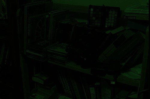
Here is a view of some bookshelves in my office, from approximately the same angle of view that I see from my computer:
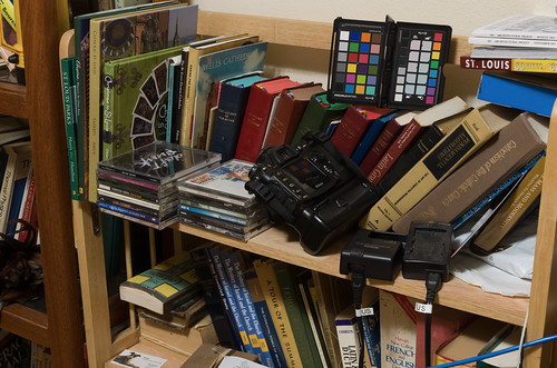
The color and tonality in this photograph on my calibrated monitor look pretty close to what I see in real life — maybe some of the bright yellows are a bit off. Otherwise this is a suitable image taken with reasonably good gear and technique. I will use this image as the sample for our further processing in this article. You can get a copy of this original Nikon raw NEF file here.
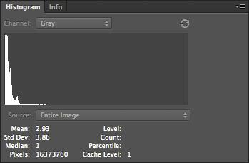
OK, I ran this image through dcraw using the settings shown above, and I get this result:

Not much to see here! If we take a closer look at the file:

We can see that it is monochrome, extremely dim, and has the camera's mosaic pattern on it. You can download a copy of this processed file here.
The image is so dark partly because my Nikon delivers 14 bit raw images — while the image format itself is 16 bits, and so we have unused brightness numbers. If you are unfamiliar with bits, you might want to review the Wikipedia article on binary numbers. Basically, the number of bits in this case is a measure of how many levels of brightness is represented in the raw file. If you add one bit of depth to an image, you double the number of levels of brightness:
When we process an image, we need to use all of the 16 bits, because white is defined as the brightest 16 bit number.
Understand that with a linear image such as this, the entire right half of the histogram is brightness levels associated with the 16th bit; and half of what is left is data associated with the 15th bit. So to scale the 14 bits data we have, so as to use all 16 bits, we can chop off the part of the data that isn't used by Nikon — the top three quarters of the histogram. Photoshop's Levels tool only gives us the ability to adjust 256 levels of brightness — 0 is black and 255 is white — even when working with a 16 bit file, but for our purpose this isn't a problem. So the 16th bit takes up the upper half of the data, the top 128 levels, from 128 to 255, while the 15th bit takes up the range from 64 to 127.
So for a 14 bit camera, we need to set levels to 63:
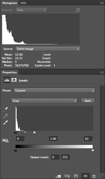
This use of Levels gives us the same results as if we multiplied all of our image numbers by 4.
Notice how the histogram shows that there is some image data going all of the way across — although, for other reasons, often won't quite touch the right hand side. Be aware that linear images tend to have most of their data clustered around the darkest, or lefthand part of the histogram — this is normal. JPEGs delivered by cameras, or images viewed on the Internet, have a gamma correction applied to them, which is a kind of data compression that assigns more color numbers to shadows and mid-tones at the expense of highlights. This actually works out well, but adds mathematical complexity, which I hope to cover later. This will give us a nice, usable histogram where most of the values are typically clustered around the middle instead of way down at the left hand edge.
Many cameras are 12 bit, and so the Levels would have to be set at 15 — which would give us the same results that we would get by multiplying all of the values in the image by 16.
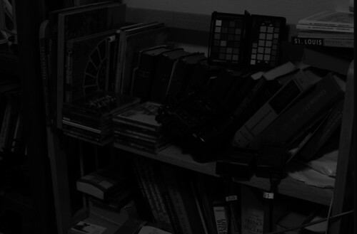
Our image is now brighter and we can actually see the subject tolerably well.
Now Photoshop is hardly the best software to do demosaicing, but it can be done with many cameras. The first thing we need to do is to identify the mosaic pattern used by the camera— there are a wide varieties of patterns used in the industry, but fortunately, there are a few that are commonly used. One major exception is Fuji, which often uses innovative patterns in their cameras. Sigma, which uses Foveon X3 sensors, do not have a pattern, and so this entire discussion on demosaicing is irrelevant.
My Nikon camera uses the RGGB pattern, where, starting in the upper-left hand corner of the image, we have a pattern that looks like this:
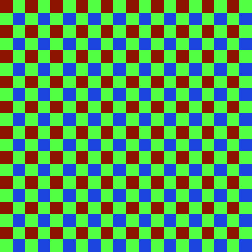
We have a repeating pattern of 2x2 blocks, with red in the upper left hand corner, and blue in the lower right hand corner.
You will have to look up the pattern used in your camera, or simply use my example files linked above. If you have clever computer programming skills, you might even be able to parse the dcraw.c source code for clues — all of the supported camera patterns are encoded in the file. However, be aware that not all mosaic patterns can be decoded by my method, which assumes the RGGB pattern. However, if your camera pattern is a rotation of this, you might be able to rotate your image to get it to fit — for example, I demosaiced a Panasonic camera raw file, which has a BGGR pattern, simply by rotating the image 180 degrees.
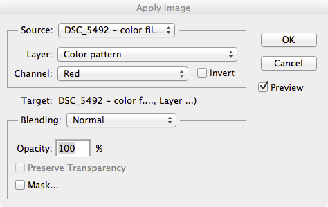
First duplicate the undemosaiced file in Photoshop, and convert it to the standard sRGB IEC61966-2.1 color space. The color space isn't yet important, but it will help you see what is going on in the processing. Now this conversion will mess with the tonality of image, and so I select each of the three color channels separately, and do an Image->Apply Image… command to put the original grayscale values into the new RGB image.
Then I create a 2x2 pixel image which duplicates the array pattern:

You see that little dot, right? That is the 2x2 image. Here is a bigger version:
Then I select the menu Edit, then Define Pattern…, then give it name.
On the new image, I create a new layer, go to Edit, then Fill… and then Use: Pattern, and then select my new Custom Pattern. The new layer will be filled with the repeating mosaic pattern. I turn this layer off so we don't have to see it.
Then I duplicate the image into three layers, which I name red, green, and blue, and put a layer mask on each.
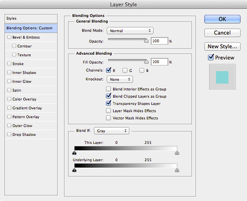
On the red layer mask, I apply the red channel of the color pattern, using Image, Apply Image…:
This gives us only the red bits of the color filter array in this layer. I do the similar action for the other layers. Then, I double click on the layer name in the Layers tab, and this comes up:
I select only the R channel, unchecking G and B; this turns the layer into the red color, and then I do the same for the blue and green layers, selecting only the corresponding channel to the layer. When I fill the bottom original layer with black, this results:
It appears to be a full-color image, albeit with a very bad white balance; but if we examine a small part of it:

We can see the color filter array on the image. You can download the full color mosaic image here.
The demosaicing procedure I will show here is completely ad hoc, but at least it might give Photoshop owners some of the flavor of the process. You might want to review the article Cook Your Own Raw Files, Part 2: Some Notes on the Sensor and Demosaicing for an overview of the process.
The basic problem is this — at any given pixel location, we only have one color, and we have to estimate the other two colors, based on the colors found in surrounding pixels. So for each type of pixel in our color array, we need need two functions to get the color, which for our 2x2 matrix, gives us 8 functions. For this exercise, I'll use a bilinear function, which is pretty good although still being simple.
Following is an illustration of bilinear demosaicing functions, which takes averages of all the adjacent surrounding pixel values to estimate full-color at each pixel.
In order to do demosaicing in Photoshop, we can use the obscure Custom filter, found in the menus under Filter->Other->Custom…
We will have to use four custom filters for this task, corresponding to the four types of patterns seen in the above animation:
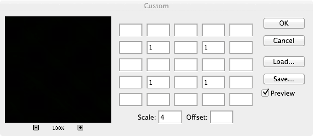
An explanation of the Custom Filter function can be found here.
We will now create a complex layered file, with a layer for each of our eight color estimates. The key to using this — since Custom Filter changes all pixels — is to use masking to limit our processing to solely red, green, and blue pixels where appropriate.
Here are the layers in the file:
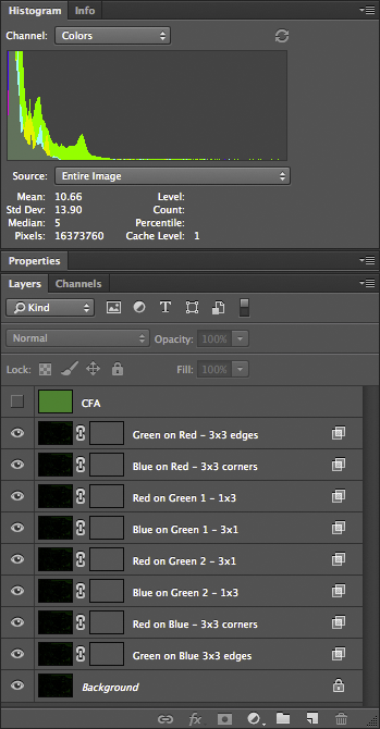
Doing this right requires a bit of patience and diligence. I named the layers to help do this more accurately. All of these layers, at first, are simply duplicates of our color mosaic image. The top layer is the color mosaic array, created using custom patterns — we will use this to create our masks.
The next layer — Green on Red - 3x3 edges — is processed like this:
Once all the layers are set up, we have a nicely demosaiced image:

You can download the 16-bit file here. A version of the file, with all of the layers, can be found here; beware, however, it is over half a gigabyte in size.
Looking more closely:
It appears that the demosaicing process was pretty clean; there might be some color fringing here, but I think most of it is chromatic aberration from the optics.
The next process is removing this color cast by doing a white balance. However, just because we are logically doing demosaicing first, this does not mean that this is optimal for getting good image quality — perhaps we might want to do white balance before demosaicing.
Obviously, it is a bit silly doing demosaicing in Photoshop — but it does work in this case — although a general-purpose programming language would be better.
Other articles in the series are:
Cook Your Own Raw Files, Part 1: Introduction
Cook Your Own Raw Files, Part 2: Some Notes on the Sensor and Demosaicing
Logically, I am presenting demosaicing as the first step in processing a raw file, but this is not necessarily the best thing to do — I am simply describing it now to get it out of the way.The article is Cook Your Own Raw Files, Part 2: Some Notes on the Sensor and Demosaicing.
By trying to “get it out of the way,” perhaps I wasn't thinking about my readers, who might get something out of attempts to do demosaicing themselves. It is an important process that goes on in the camera, something that needs to be done right. The purpose of this series is to demonstrate the various steps that a digital camera or raw processor might go through in producing an image, for the education of photographers and retouchers. Simply omitting an important step because it is difficult is not helping anyone.
In the first article in the series, Cook Your Own Raw Files, Part 1: Introduction, I mentioned that I use Raw Photo Processor to produce lightly-processed images that can be used to experiment with the kinds of processing that goes on in raw converters. But this is a Macintosh-only application; and so, for users of Windows, Linux, and other computer operating systems I suggested using dcraw, but I hardly knew much about it.
But I recently discovered that dcraw can produce undemosaiced images; while this is in the documentation, I overlooked it. This feature can allow interested persons the ability to easily try out the demosaicing process themselves. You can get your own free copy of dcraw at http://www.cybercom.net/~dcoffin/dcraw/; it is a command-line utility, which makes its use more difficult for those computer users only familiar with typical graphical interfaces, but a bit of effort in trying this out can be worthwhile. The command to convert a file is thus:
dcraw -v -E -T -4 -o 0 DSC_5226.NEF
Where ‘DSC_5226.NEF’ is the camera raw file that you want to convert. You must issue the command in the same directory or folder where the file is located, or otherwise supply a path to the file. The command will output a TIFF file in the same directory: in this instance, dcraw will output DSC_5226.tiff.
The options used have this meaning:
- -v Verbose output — the command will display extra text which might be useful in our further processing.
- -E Image will not be demosaiced; also, pixels along the edges of the sensor, normally cropped by the camera, are retained.
- -T Output an image conforming to the Tagged Image File Format (TIFF) is output. Many common image editors can read these lossless files.
- -4 A 16-bit image is produced instead of the more common 8 bit image files, which gives us more accuracy, without any gamma conversion or white level adjustments. This gives us a dark, linear image.
- -o 0 This is a lower-case letter ‘o’ and a zero. This turns off the adjustment of colors delivered by the camera; this option will deliver uncalibrated and unadjusted color.
These settings will give us an image file which most closely represents the raw data delivered by the camera. Also, I ought to note that a white balance won't be done by dcraw, turning off the mechanism which compensates for the color of the light illumining the scene in the image.
Here is a view of some bookshelves in my office, from approximately the same angle of view that I see from my computer:
The color and tonality in this photograph on my calibrated monitor look pretty close to what I see in real life — maybe some of the bright yellows are a bit off. Otherwise this is a suitable image taken with reasonably good gear and technique. I will use this image as the sample for our further processing in this article. You can get a copy of this original Nikon raw NEF file here.
OK, I ran this image through dcraw using the settings shown above, and I get this result:
Not much to see here! If we take a closer look at the file:
We can see that it is monochrome, extremely dim, and has the camera's mosaic pattern on it. You can download a copy of this processed file here.
The image is so dark partly because my Nikon delivers 14 bit raw images — while the image format itself is 16 bits, and so we have unused brightness numbers. If you are unfamiliar with bits, you might want to review the Wikipedia article on binary numbers. Basically, the number of bits in this case is a measure of how many levels of brightness is represented in the raw file. If you add one bit of depth to an image, you double the number of levels of brightness:
- If you have a one bit-depth image, you only have two levels of brightness — white and black.
- In a two bit image, you have four levels of brightness — black, dark gray, light gray, and white.
- Three bits gives 8 levels, four bits give 16 levels, five gives 32 and so forth.
- A 14 bit image has 16,384 levels, and a 16 bit image has 65,536 levels.
When we process an image, we need to use all of the 16 bits, because white is defined as the brightest 16 bit number.
Understand that with a linear image such as this, the entire right half of the histogram is brightness levels associated with the 16th bit; and half of what is left is data associated with the 15th bit. So to scale the 14 bits data we have, so as to use all 16 bits, we can chop off the part of the data that isn't used by Nikon — the top three quarters of the histogram. Photoshop's Levels tool only gives us the ability to adjust 256 levels of brightness — 0 is black and 255 is white — even when working with a 16 bit file, but for our purpose this isn't a problem. So the 16th bit takes up the upper half of the data, the top 128 levels, from 128 to 255, while the 15th bit takes up the range from 64 to 127.
So for a 14 bit camera, we need to set levels to 63:
This use of Levels gives us the same results as if we multiplied all of our image numbers by 4.
Notice how the histogram shows that there is some image data going all of the way across — although, for other reasons, often won't quite touch the right hand side. Be aware that linear images tend to have most of their data clustered around the darkest, or lefthand part of the histogram — this is normal. JPEGs delivered by cameras, or images viewed on the Internet, have a gamma correction applied to them, which is a kind of data compression that assigns more color numbers to shadows and mid-tones at the expense of highlights. This actually works out well, but adds mathematical complexity, which I hope to cover later. This will give us a nice, usable histogram where most of the values are typically clustered around the middle instead of way down at the left hand edge.
Many cameras are 12 bit, and so the Levels would have to be set at 15 — which would give us the same results that we would get by multiplying all of the values in the image by 16.
Our image is now brighter and we can actually see the subject tolerably well.
Now Photoshop is hardly the best software to do demosaicing, but it can be done with many cameras. The first thing we need to do is to identify the mosaic pattern used by the camera— there are a wide varieties of patterns used in the industry, but fortunately, there are a few that are commonly used. One major exception is Fuji, which often uses innovative patterns in their cameras. Sigma, which uses Foveon X3 sensors, do not have a pattern, and so this entire discussion on demosaicing is irrelevant.
My Nikon camera uses the RGGB pattern, where, starting in the upper-left hand corner of the image, we have a pattern that looks like this:
We have a repeating pattern of 2x2 blocks, with red in the upper left hand corner, and blue in the lower right hand corner.
You will have to look up the pattern used in your camera, or simply use my example files linked above. If you have clever computer programming skills, you might even be able to parse the dcraw.c source code for clues — all of the supported camera patterns are encoded in the file. However, be aware that not all mosaic patterns can be decoded by my method, which assumes the RGGB pattern. However, if your camera pattern is a rotation of this, you might be able to rotate your image to get it to fit — for example, I demosaiced a Panasonic camera raw file, which has a BGGR pattern, simply by rotating the image 180 degrees.
First duplicate the undemosaiced file in Photoshop, and convert it to the standard sRGB IEC61966-2.1 color space. The color space isn't yet important, but it will help you see what is going on in the processing. Now this conversion will mess with the tonality of image, and so I select each of the three color channels separately, and do an Image->Apply Image… command to put the original grayscale values into the new RGB image.
Then I create a 2x2 pixel image which duplicates the array pattern:
You see that little dot, right? That is the 2x2 image. Here is a bigger version:
Then I select the menu Edit, then Define Pattern…, then give it name.
On the new image, I create a new layer, go to Edit, then Fill… and then Use: Pattern, and then select my new Custom Pattern. The new layer will be filled with the repeating mosaic pattern. I turn this layer off so we don't have to see it.
Then I duplicate the image into three layers, which I name red, green, and blue, and put a layer mask on each.
On the red layer mask, I apply the red channel of the color pattern, using Image, Apply Image…:
This gives us only the red bits of the color filter array in this layer. I do the similar action for the other layers. Then, I double click on the layer name in the Layers tab, and this comes up:
I select only the R channel, unchecking G and B; this turns the layer into the red color, and then I do the same for the blue and green layers, selecting only the corresponding channel to the layer. When I fill the bottom original layer with black, this results:
It appears to be a full-color image, albeit with a very bad white balance; but if we examine a small part of it:
We can see the color filter array on the image. You can download the full color mosaic image here.
The demosaicing procedure I will show here is completely ad hoc, but at least it might give Photoshop owners some of the flavor of the process. You might want to review the article Cook Your Own Raw Files, Part 2: Some Notes on the Sensor and Demosaicing for an overview of the process.
The basic problem is this — at any given pixel location, we only have one color, and we have to estimate the other two colors, based on the colors found in surrounding pixels. So for each type of pixel in our color array, we need need two functions to get the color, which for our 2x2 matrix, gives us 8 functions. For this exercise, I'll use a bilinear function, which is pretty good although still being simple.
Following is an illustration of bilinear demosaicing functions, which takes averages of all the adjacent surrounding pixel values to estimate full-color at each pixel.
In order to do demosaicing in Photoshop, we can use the obscure Custom filter, found in the menus under Filter->Other->Custom…
We will have to use four custom filters for this task, corresponding to the four types of patterns seen in the above animation:
An explanation of the Custom Filter function can be found here.
We will now create a complex layered file, with a layer for each of our eight color estimates. The key to using this — since Custom Filter changes all pixels — is to use masking to limit our processing to solely red, green, and blue pixels where appropriate.
Here are the layers in the file:
Doing this right requires a bit of patience and diligence. I named the layers to help do this more accurately. All of these layers, at first, are simply duplicates of our color mosaic image. The top layer is the color mosaic array, created using custom patterns — we will use this to create our masks.
The next layer — Green on Red - 3x3 edges — is processed like this:
- We are estimating green color values for our red pixels; using the Layer Style (the box is opened by double-clicking the layer) we restrict this layer to only the green channel — G is selected in the Layer Style box.
- Likewise, for all the rest of the layers, we restrict the color channel to whatever color is being estimated: B for Blue on Red, G, for Green on Blue, etc.
- The masks, however, correspond to the color in the mosaic. For Green on Red, we are restricting processing to only the red pixels, giving them a green value in addition to red.
- The CFA layer is useful for creating these masks; for example, for the Green on Red layer, I used Image->Apply Image, selecting the Red channel of the CFA layer, applying it to the layer mask. This gives us a mask where only the red matrix colors are visible.
- If you zoom way into the image, so far nothing has changed; but the custom filter will alter the image. I used the custom filter indicated by the layer name. For the Green on Red layer, I used the 3x3 edges filter — which averages the four green pixels found on the edges of the red pixels, and then assigns that average to the green channel of the red pixel. These custom filters can be found here.
- The two green pixels are handled separately. What I do is use the Red or Blue channel from the CFA layer as a mask, and then shift it by one pixel according to the location, using Filter->Other->Offset; and I set it to Wrap Around.
Once all the layers are set up, we have a nicely demosaiced image:
You can download the 16-bit file here. A version of the file, with all of the layers, can be found here; beware, however, it is over half a gigabyte in size.
Looking more closely:
It appears that the demosaicing process was pretty clean; there might be some color fringing here, but I think most of it is chromatic aberration from the optics.
The next process is removing this color cast by doing a white balance. However, just because we are logically doing demosaicing first, this does not mean that this is optimal for getting good image quality — perhaps we might want to do white balance before demosaicing.
Obviously, it is a bit silly doing demosaicing in Photoshop — but it does work in this case — although a general-purpose programming language would be better.
Other articles in the series are:
Cook Your Own Raw Files, Part 1: Introduction
Cook Your Own Raw Files, Part 2: Some Notes on the Sensor and Demosaicing
Friday, March 21, 2014
Why are blue skies noisy in digital photos?
A PHOTOGRAPHER ASKS, “Why are blue skies so noisy in photos?”

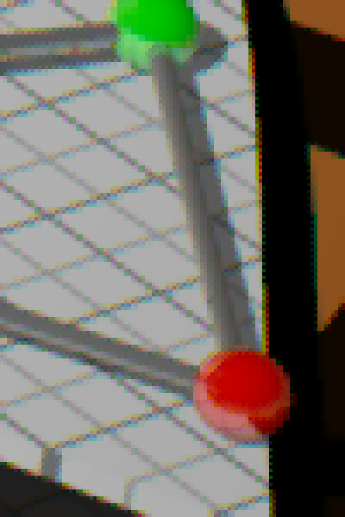
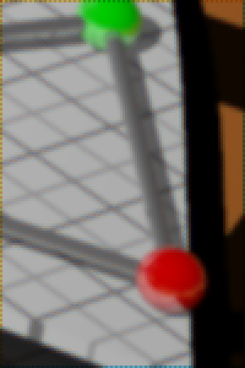
A noisy blue sky in a photo, greatly enlarged.
This is a common question. Here are the issues, as far as I can tell:
Skies are blue because of the process of Rayleigh scattering, where light is diffracted around the molecules of air. The higher the frequency of light, the more it is scattered: so when you photograph a blue sky, the camera’s blue color channel will be brighter than the green, and the green will be brighter than the red channel. This also explains the orange color of sunsets — when looking directly at the sun, you are mainly seeing the light which hasn’t been scattered, which is primarily the red along with some green, giving us orange colors. On the other hand, dust and water vapor in the sky will tend to scatter all frequencies of light, desaturating the blue color given us by Rayleigh scattering. I ought to note that overcast or hazy skies do not have a noise problem.
We tend to notice noise more in uniform regions, such as blue skies. The more uniform a perception is, the more sensitive we are to subtle differences in that perception. The same absolute amount of noise in a complex, heavily textured scene will be less noticeable.
Granted that there is some noise in the sky already for whatever reason, be aware that using the common JPEG file format — which is used for most photos on the Internet — can generate additional noise due to its compression artifacts — which are blocky 8x8 pixel patterns. Again these will be more visible in areas of uniform color. The greater the compression amount, the more visible the blocky patterns. JPEG can also optionally discard more color information, leading to even more noise.
The color of a blue sky can often be close to or outside of the range or gamut of the standard sRGB and Adobe RGB color spaces — the result of this is that the red color channel will be quite dark and noisy — unless you overexpose the sky, making it a bright, textureless cyan or white. This is most obvious with brilliant, clear, and clean blue skies, such as found in winter, at high latitudes and altitudes, and when using a polarizer. At dusk, the problem is probably worse.
Depending on the camera and white balance settings, the red color channel will be amplified greatly, increasing its noise greatly, and we already know that there will likely be significant noise in the red channel already, so this just makes things worse. Also, the blue color channel might be amplified also, increasing its noise. Also consider that most cameras have double the number of green-sensitive sensels compared to the red or blue variety, leading to more noise in those color channels.
Human vision is sensitive to changes in the blue color range. Small changes in the RGB numbers in this color range are going to have a larger visual sensation than with some other colors. So a relatively small amount of noise will be more visible in the color of a blue sky.
In order to create a really clean image from a camera’s raw data, high mathematical precision in the calculations is needed, as well as the ability to accept negative or excessive values of color, temporarily, during processing, which is called “unbounded mode” calculations. Now this can make raw conversion quite slow, and so many manufacturers take shortcuts, aiming for images that are “good enough” instead of being precisely accurate. But the result of using imprecise arithmetic is extra noise, along with possibly other digital artifacts.
So the problem of blue sky noise is a nice mixture of physics, mathematics, human physiology and psychology, technical standards, and camera engineering.
Saturday, March 8, 2014
On the Invention of Photography
IN THE EIGHTEENTH CENTURY, it became fashionable to tour the English countryside, visiting castles, ruined abbeys, and picturesque landscapes. Those who had the ability would often sketch the vistas as a memento.
William Gilpin, in his essays on the picturesque, defined a picturesque landscape as one which was a good subject for a drawing or a painting — and so his observations are relevant to contemporary photographers.

Illustration from Gilpin’s Three Essays: On Picturesque Beauty; On Picturesque Travel; and On Sketching Landscape: to which is Added a Poem, On Landscape Painting.
But not everyone is trained in drawing. As picturesque travel became more popular, new inventions such as the camera lucida helped novices sketch a landscape with more accuracy, while the Claude glass darkened and abstracted the scene, giving it a more painterly quality.
W. Henry Fox Talbot was in Italy on such a picturesque tour, and here he describes his experiences:
William Gilpin, in his essays on the picturesque, defined a picturesque landscape as one which was a good subject for a drawing or a painting — and so his observations are relevant to contemporary photographers.
Illustration from Gilpin’s Three Essays: On Picturesque Beauty; On Picturesque Travel; and On Sketching Landscape: to which is Added a Poem, On Landscape Painting.
But not everyone is trained in drawing. As picturesque travel became more popular, new inventions such as the camera lucida helped novices sketch a landscape with more accuracy, while the Claude glass darkened and abstracted the scene, giving it a more painterly quality.
W. Henry Fox Talbot was in Italy on such a picturesque tour, and here he describes his experiences:
One of the first days of the month of October 1833, I was amusing myself on the lovely shores of the Lake of Como, in Italy, taking sketches with Wollaston's Camera Lucida, or rather I should say, attempting to take them: but with the smallest possible amount of success. For when the eye was removed from the prism—in which all looked beautiful—I found that the faithless pencil had only left traces on the paper melancholy to behold.Talbot is credited as one of the inventors of photography.
After various fruitless attempts, I laid aside the instrument and came to the conclusion, that its use required a previous knowledge of drawing, which unfortunately I did not possess.
I then thought of trying again a method which I had tried many years before. This method was, to take a Camera Obscura, and to throw the image of the objects on a piece of transparent tracing paper laid on a pane of glass in the focus of the instrument. On this paper the objects are distinctly seen, and can be traced on it with a pencil with some degree of accuracy, though not without much time and trouble.
I had tried this simple method during former visits to Italy in 1823 and 1824, but found it in practice somewhat difficult to manage, because the pressure of the hand and pencil upon the paper tends to shake and displace the instrument (insecurely fixed, in all probability, while taking a hasty sketch by a roadside, or out of an inn window); and if the instrument is once deranged, it is most difficult to get it back again, so as to point truly in its former direction.
Besides which, there is another objection, namely, that it baffles the skill and patience of the amateur to trace all the minute details visible on the paper; so that, in fact, he carries away with him little beyond a mere souvenir of the scene—which, however, certainly has its value when looked back to, in long after years.
Such, then, was the method which I proposed to try again, and to endeavour, as before, to trace with my pencil the outlines of the scenery depicted on the paper. And this led me to reflect on the inimitable beauty of the pictures of nature's painting which the glass lens of the Camera throws upon the paper in its focus—fairy pictures, creations of a moment, and destined as rapidly to fade away.
It was during these thoughts that the idea occurred to me…how charming it would be if it were possible to cause these natural images to imprint themselves durably, and remain fixed upon the paper!
— from The Pencil of Nature, by William Henry Fox Talbot
Cook Your Own Raw Files, Part 2: Some Notes on the Sensor and Demosaicing
ADMITTEDLY, DIGITAL cameras are somewhat difficult to characterize well, because there is so much variety between models, but there are a few simple measures to help. Likely, most digital camera users are familiar with the term megapixels — perhaps with the vague understanding that more is better, but like many things, there is some sort of trade-off. Unfortunately, a particular megapixel value is usually hard to directly compare to another, simply because there are other factors we have to consider, like the sharpness of lenses used, the size of the sensor itself, any modifications made to the sensor, the processing done on the raw image data by the camera’s embedded computer, and a multitude of other factors. A 12 megapixel camera might very well produce sharper, cleaner images than a 16 megapixel camera.
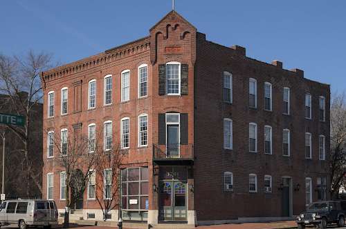
A building in the Soulard neighborhood, in Saint Louis, Missouri, USA.
By modern standards, this is a very small image. It is 500 pixels across by 332 pixels in height; and if we multiply them together, 500 x 332 = 166,000 total pixels. If we divide that by one million, we get a tiny 0.166 megapixels, a mere 1% or so of the total number of pixels that might be found in a contemporary camera. Don’t get me wrong — all the extra megapixels in my camera did find a good use, for when I made this image by downsampling, some of the impression of sharpness of the original image data did eventually find its way into this tiny image — if I only had a 0.166 megapixel camera, the final results would have been softer.
OK, it is very important to know that a digital image has ultimately a fixed pixel size, and if we enlarge it, we don’t get any more real detail out of it, and if we reduce it, we will we lose detail. Many beginners, if they get Photoshop or some other image editing software, will get confused over image sizes and the notorious “pixels per inch” setting, as we see in this Photoshop dialog box:
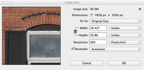
If you are displaying an image on the Internet, the “Resolution” or “Pixels/Inch” setting is meaningless because the image will display on the monitor at whatever the resolution of the display happens to be set at. Likewise, if you make a print, the Width and Height values you see here are likewise meaningless, for the dimensions of the printed image will be whatever size the image is printed at — and not these values. But — if you multiply the Pixels/Inch value by the Width or Height, you will get the actual pixel dimensions of the image.
The really important value then is the pixel dimensions: my camera delivers 4928 pixels across and 3264 pixels in the vertical dimension. I can resample the image to have larger pixel dimensions, but all those extra pixels will be padding, or interpolated data, and so I won’t see any new real detail. I can resample the image smaller, but I’ll be throwing away detail.
Sensels and Pixels
So, we might assume that my camera’s sensor has 4,928 pixels across and 3,264 pixels vertically — well, it actually has more than that, for a reason we’ll get to later. But in another sense, we can say that the camera has fewer pixels than that, if we define a pixel as having full color information. My camera then does not capture whole pixels, but only a series of partial pixels.
It would be more correct to say that a 16 megapixel camera actually has 16 million sensels, where each sensel captures only a narrow range of light frequencies. In most digital cameras, we have three kinds of sensels, each of which only captures one particular color.
The image sensor of my particular model of Nikon has a vast array of sensels — a quarter of which are only sensitive to red light, another quarter sensitive to blue light, and half sensitive to green light, arrayed in a pattern somewhat like this one:
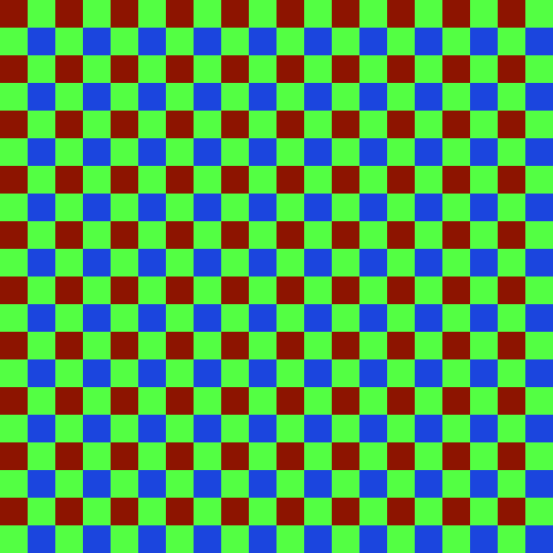
Since I was unable to find a good photomicrograph of an actual camera sensor, this will have to do for our needs — but this abstract representation doesn’t really show us the complexity of sensors.
Not only is the sensor most sensitive to a bright yellowish-green light (as far as I can tell), it has less sensitivity to blue, and is less sensitive to red: this is on top of the fact that we have as many green sensels as we have red and blue combined. Please be aware that the camera can only deliver these colors (in a variety of brightnesses), and so somehow we are going to have to find some means of combining these colors together in order to get a full gamut of color in our final image.
We have information on only one color at each sensel location. If we want to deliver a full pixel of color at each location, we need to use an interpolation algorithm — a method of estimating the full color at any particular sensel location based on the surrounding sensels. This process of estimating colors is called demosaicing, interpolation, or debayering — converting the mosaic of colors to a continuous image.
Camera raw files are of great interest because they record image data that have not yet been interpolated; you can, after the fact on your computer, use updated software that might include a better interpolation algorithm, and so you can possibly get better images today from the same raw file than what you could have gotten years ago.
Please be aware that the kind of pattern above — called a Bayer filter, after the Eastman Kodak inventor Bryce Bayer (1929–2012) — is not the only one. Fujifilm has experimented with a variety of innovative patterns for its cameras, while the Leica Monochrom has no color pattern at all, since it shoots in black and white only. Also be aware that the colors that any given model of camera captures might be somewhat different from what I show here — even cameras that use the same basic sensor might use a different color filter array and so have different color rendering. Camera manufacturers will use different formulations of a color filter array to adjust color sensitivity, or to allow for good performance in low light.
Sigma cameras with Foveon X3 sensors have no pattern, since they stack three different colors of sensels on top of each other, giving full-color information at each pixel location. While this may seem to be ideal, be aware that this design has its own problems.
A Clarification
I am using the term ‘color’ loosely here. Be aware that many combination of light frequencies can produce what looks like — to the human eye — the same color. For example, a laser might produce a pure yellow light, but that color of yellow might look the same as a combination of red and green light. This is called metamerism, and is a rather difficult problem. There are any number of formulations of color filters that can be used in a digital camera, and we can expect them to have varying absorbance of light — leading to different color renderings. For this reason, it is difficult to get truly accurate colors from a digital camera.
A Perfect Sample Image
For my demonstrations of demosaicing, I’ll be using sections of this image (Copyright © 2001 by Bruce Justin Lindbloom; source http://www.brucelindbloom.com):
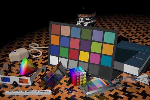
Mr. Lindbloom writes:
I am using two small crops of this image, 100x150 pixels in size each, which I show here enlarged 500%:

Applying the Mosaic
The sample image has brilliant, saturated colors of impossible clarity. But what happens if we pretend that this image was taken with a camera with a Bayer filter? Here I combine the image crop with a red-green-blue array similar to the one shown above:

It looks rather bad, and recovering something close to the original colors seems to be hopeless. What is worse, we apparently have lost all of the subtle color variations seen in the original image. If we take a closer look at this image:
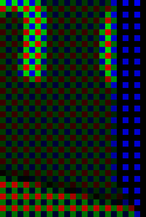
We see that we have only three colors [technically the red, green, and blue primary colors of the sRGB standard] with only variation in brightness. We seemed to have lost much of the color of our original image.
But this is precisely what happens with a digital camera — all the richness and variety of all the colors of the world get reduced down to only three colors. However, all is not lost — if we intelligently select three distinct primary colors, we can reconstruct all of the colors that lay between them by specifying varying quantities of each primary. This is the foundation of the RGB color system. Please take a look at these articles:
Removing the Matrix
Now we have lost color information because of the Bayer filter, and for most digital cameras we simply have to accept that fact and do the best we can to estimate the color information that has been lost. Since each pixel or rather sensel only delivers one color — and we need three for full color — we can have to estimate the colors by looking at the neighboring sensels and making some assumptions about the image. Red sensels need green and blue color data, green sensels lack red and blue data, and blue sensels need red and green.
A very simple method for doing this is the Nearest Neighbor interpolation algorithm, where we grab adjacent sensel colors and use those to estimate the full color of the image. Here is an illustration of a nearest neighbor algorithm:

Take a look at the three original color channels — in the red, we only have data from the red sensel, and the rest are black — and so we copy that red value to the adjoining sensels. Since we have two different green sensels, here we split the difference between them and copy the resulting average to the red and blue sensels. We end up with a variety of colors when we are finished. Now there are a number of ways we can implement a nearest neighbor algorithm, and these depend on the arrangement of the colors on the sensor, and each one will produce somewhat different results.
Here we apply a nearest neighbor algorithm to our sample images:
OK, it is apparent that we can reproduce areas of uniform color well, giving us back the colors of the original image. However, edges are a mess. Since the algorithm used has no idea that the lines on the second image are supposed to be gray, it gives us color artifacts. Generally, all edges are rough. Also notice that there is a bias towards one color on one side of an object, and a bias towards another color on the other side of the same object — in the samples, the orange patches have green artifacts on its top and left edges, and red artifacts on its bottom and right edges. This bias makes sense since we are only copying color data from one side of each sensel.
We can eliminate this bias if we replace the Nearest Neighbor algorithm with something that is symmetric. A Bilinear algorithm will examine the adjacent colors on all sides of each sensel, getting rid of the bias. Our sample images here are demosaiced with a bilinear algorithm:

OK, a bilinear algorithm eliminates the directional bias of color artifacts, which is good. While the edges are still rough, they do seem a bit softer — which makes sense, since we are taking data from a wider range of sensels, which in effect blurs the image a bit.
Demosaicing algorithms all assume that colors of adjacent pixels are going to be more similar to each other than they are different — and if we cannot make this assumption, then we can’t do demosaicing. Nearest neighbor algorithms assume that all colors in a 2x2 block are basically identical, while the bilinear algorithm assumes that colors change uniformly in a linear fashion. If we sample sensels farther away, we can assume more complicated relationships, such as a power series, and this assumption is built into the bicubic algorithm, which produces smoother results than those illustrated.
More complex algorithms will give us better gradations and smoothness in color, but have the side-effect of softening edges, and so there is research in ways of discovering edges to handle them separately, by forcing colors along an edge to one value or another. Some algorithms are optimized for scanning texts, while others are better for natural scenes taken with a camera. Be aware that noise will change the results also, and so there are some algorithms that are more resistant to noise, but may not produce sharp results with clean images.
As high frame rates are often desired for cameras, complex algorithms for producing JPEGs may not be desired, simply because it will take much longer to process each image — however, this is less of a problem with raw converters on computers, since we can assume that a slight or even long delay is more acceptable.
Notice that our bilinear images have a border around them. Because the bilinear algorithm takes data from all around each sensel, we don’t have complete data for the sensels on the edges, and so there will be a discontinuity on the border of the image. Because of this, cameras may have slightly more sensels than what is actually delivered in a final JPEG — edges are cropped.
We ought not assume that a camera with X megapixels needs to always deliver an image at that size: perhaps it makes sense to deliver a smaller image? For example, we can collapse each 2x2 square of sensels to one pixel, producing an image with half the resolution and one quarter the size, and possibly with fewer color artifacts. Some newer smartphone cameras routinely use this kind of processing to produce superior images from small, noisy high-megapixel sensors. This is a field of active research.
Antialias
Don’t pixel peep! Don’t zoom way into your images to see defects in your lens, focus, or demosaicing algorithms! Be satisfied with your final images on the computer screen, and if you make a large print, don’t stand up close to it looking for defects. Stand back at a comfortable distance, and enjoy your image.
Perhaps this is wise advice. Don’t agonize over tiny details which will never be seen by anyone who isn’t an obsessive photographer. This is especially true when we routinely have cameras with huge megapixel values — and never use all those pixels in ordinary work.
But impressive specifications can help you even if you never use technology to its fullest. If you want a car with good acceleration at legal highway speeds, you will need a car that can go much faster — even if you never drive over the speed limit. If you don’t want a bridge to collapse, build it to accept far more weight than it will ever experience. Most lenses are much sharper when stopped down by one or two stops: and so, if you want a good sharp lens at f/2.8, you will likely need to use an f/1.4 lens. A camera that is tolerable at ISO 6400 will likely be excellent at ISO 1600. If you want exceptionally sharp and clean 10 megapixel images, you might need a camera that has 24 megapixels.
OK, so then let’s consider the rated megapixel count of a camera as a safety factor, or as an engineering design feature intended to deliver excellent results at a lower final resolution. Under typical operating conditions, you won’t use all of your megapixels. As we can probably assume, better demosaicing algorithms might produce softer, but cleaner results, and that is perfectly acceptable. Now perhaps those color fringes around edges are rarely visible — although resampling algorithms might show them in places, and so getting rid of them ought to be at least somewhat important.
My attempts to blur the color defects around edges was not fruitful. In Photoshop, I attempted to use a half dozen methods of chroma blur and noise reduction, and either they didn’t work, or they produced artifacts that were more objectionable than the original flaws. The problem is, once the camera captures the image, the damage is already done: the camera does in fact capture different colors on opposite sides of a sharp edge — a red sensel might be on one side of an edge, and the blue sensel captures light from the other side.
In order to overcome unpleasant digital artifacts, most cameras incorporate antialias filters: they blur the image a bit so that light coming into the camera is split so that it goes to more than one sensel. This process can only be done at the time of image capture, it cannot be duplicated in software after the fact. Since I am working with a perfect synthetic image, I can simulate the effect of an antialias filter before I impose a mosaic.
Here I used box blur, at 75% opacity on the original image data before applying the mosaic: demosaicing leads to a rather clean looking image:

Now I could have used a stronger blurring to get rid of more color, but I think this is perfectly adequate. What little color noise that still remains can be easily cleaned up by doing a very slight amount of chroma noise reduction — but it is hardly needed. If I would have used stronger blurring, the residual noise would have been nearly non-existent, but it would also have made the image softer. Note that we still have the border problem, easily fixed by cropping out those pixels.
It is typically said that the purpose of the antialias filter is to avoid moiré patterns, as illustrated in the article The Problem of Resizing Images. Understand that moiré patterns are a type of aliasing — in any kind of digital sampling of an analog signal, such as sound or light, if the original analog signal isn’t processed well, the resulting digital recording or image may have an unnatural and unpleasant roughness when heard or seen. From my experience, I think that avoiding the generation of digital color noise defects due to the Bayer filter is a stronger or more common reason for using an antialias filter. But of course, both moiré and demosaicing noise are examples of aliasing in general, so solving one problem solves the other.
Producing a good digital representation of an analog signal requires two steps: blurring the original analog signal a bit, followed by oversampling — collecting more detailed data than you might think you actually need. In digital audio processing, the original analog sound is sent through a low-pass filter, eliminating ultrasonic frequencies, and the resulting signal is sampled at frequency more than double the highest frequency that can be heard by young, healthy ears — but this is not wasteful but rather essential for high-quality digital sound reproduction. Likewise, high megapixel cameras — often considered wasteful or overkill — ought to be seen as digital devices which properly implement oversampling so as to get a clean final image.
Anti-antialias
There has been a trend in recent years of DSLR camera makers producing sensors without antialias filters. A common opinion of this practice is that it makes for sharper-looking images. Indeed they are sharper looking — compare our images that implement the nearest neighbor algorithm with those which are blurred at the bottom. But is that apparent sharpness due to aliasing — a defect of processing — and isn’t real detail at all?
So in some respects, getting rid of an antialias filter ought to be considered a mistake. Perhaps Nikon realizes this, offering both the D800, which incorporates an antialias filter, and the D800E, which incorporates another filter which cancels out the effect of the antialias filter. But be aware that there is no way to digitally correct for the loss of the antialias blurring step of the original analog signal. Any attempts, after the fact, to correct for the digital aliasing flaws, will inevitably be worse than if the analog signal was blurred to begin with.
However, practically speaking, it is extremely difficult to get a pixel-level sharp image from a high megapixel camera, especially when the camera is a small image format like DSLRs. Optics usually aren’t all that good and excellent optics are often rare. Also, camera shake, poor focus, narrow depth of field, and diffraction will all blur the light hitting the sensor, giving us the analog pre-blur that is needed to produce clean digital images. In this case, elimination of the antialias filter can actually provide truly sharper images — since we don’t want to further blur light that is already blurry enough to avoid artifacts.
Be aware that construction of an antialias filter is rather problematic and they are not necessarily mathematically perfect for the purpose of pre-blurring the analog light signal for the Bayer filter. We do find a wide variation of anti-alias filters in various camera models, with some having the reputation of being too strong than needed.
Some Further Notes
A quick Web search for “demosaicing algorithms” will bring up many scholarly articles regarding the strengths and weaknesses of the various methods of interpolation, but these are rarely of interest to a photographer.
What a photographer needs to know is that the process does exist, and that most of the time, the method used isn’t too particularly important. The results and artifacts produced by demosaicing only become critical to image quality when the photographer is trying to do something extreme — like making tiny crops of an image or producing huge images, where exceptional optics are used with refined technique: where there is a real need to produce the cleanest possible images. This might also be useful if you are using a low-resolution camera with sharp optics. Otherwise, for casual photography, the details of demosaicing are of little value. Sometimes we simply need to retouch out obvious defects, like blurring the color along particularly noxious edges.
Most raw converter software does not give us any choice in demosaicing algorithm. But some that do include Raw Photo Processor, dcraw, darktable, and RawTherapee. The latter is interesting because you can quickly see the results of changing the algorithm used.
Logically, I am presenting demosaicing as the first step in processing a raw file, but this is not necessarily the best thing to do — I am simply describing it now to get it out of the way. The Dcraw tutorial demonstrates that white balance ought to be done before demosaicing, otherwise additional color artifacts might be generated.
Click here for the previous article in the series:
Cook Your Own Raw Files, Part 1: Introduction
And the next article:
Cook Your Own Raw Files, Part 3: Demosaic Your Images
This is the second article in a series; the first article is here:It is important to know is that there are a fixed number of light-recording sites on a typical digital camera sensor — millions of them — which is why we talk about megapixels. But consider that for many uses, such large numbers of pixels really aren’t needed:
Cook Your Own Raw Files, Part 1: Introduction
A building in the Soulard neighborhood, in Saint Louis, Missouri, USA.
By modern standards, this is a very small image. It is 500 pixels across by 332 pixels in height; and if we multiply them together, 500 x 332 = 166,000 total pixels. If we divide that by one million, we get a tiny 0.166 megapixels, a mere 1% or so of the total number of pixels that might be found in a contemporary camera. Don’t get me wrong — all the extra megapixels in my camera did find a good use, for when I made this image by downsampling, some of the impression of sharpness of the original image data did eventually find its way into this tiny image — if I only had a 0.166 megapixel camera, the final results would have been softer.
OK, it is very important to know that a digital image has ultimately a fixed pixel size, and if we enlarge it, we don’t get any more real detail out of it, and if we reduce it, we will we lose detail. Many beginners, if they get Photoshop or some other image editing software, will get confused over image sizes and the notorious “pixels per inch” setting, as we see in this Photoshop dialog box:
If you are displaying an image on the Internet, the “Resolution” or “Pixels/Inch” setting is meaningless because the image will display on the monitor at whatever the resolution of the display happens to be set at. Likewise, if you make a print, the Width and Height values you see here are likewise meaningless, for the dimensions of the printed image will be whatever size the image is printed at — and not these values. But — if you multiply the Pixels/Inch value by the Width or Height, you will get the actual pixel dimensions of the image.
The really important value then is the pixel dimensions: my camera delivers 4928 pixels across and 3264 pixels in the vertical dimension. I can resample the image to have larger pixel dimensions, but all those extra pixels will be padding, or interpolated data, and so I won’t see any new real detail. I can resample the image smaller, but I’ll be throwing away detail.
Sensels and Pixels
So, we might assume that my camera’s sensor has 4,928 pixels across and 3,264 pixels vertically — well, it actually has more than that, for a reason we’ll get to later. But in another sense, we can say that the camera has fewer pixels than that, if we define a pixel as having full color information. My camera then does not capture whole pixels, but only a series of partial pixels.
It would be more correct to say that a 16 megapixel camera actually has 16 million sensels, where each sensel captures only a narrow range of light frequencies. In most digital cameras, we have three kinds of sensels, each of which only captures one particular color.
The image sensor of my particular model of Nikon has a vast array of sensels — a quarter of which are only sensitive to red light, another quarter sensitive to blue light, and half sensitive to green light, arrayed in a pattern somewhat like this one:
Since I was unable to find a good photomicrograph of an actual camera sensor, this will have to do for our needs — but this abstract representation doesn’t really show us the complexity of sensors.
Not only is the sensor most sensitive to a bright yellowish-green light (as far as I can tell), it has less sensitivity to blue, and is less sensitive to red: this is on top of the fact that we have as many green sensels as we have red and blue combined. Please be aware that the camera can only deliver these colors (in a variety of brightnesses), and so somehow we are going to have to find some means of combining these colors together in order to get a full gamut of color in our final image.
We have information on only one color at each sensel location. If we want to deliver a full pixel of color at each location, we need to use an interpolation algorithm — a method of estimating the full color at any particular sensel location based on the surrounding sensels. This process of estimating colors is called demosaicing, interpolation, or debayering — converting the mosaic of colors to a continuous image.
Camera raw files are of great interest because they record image data that have not yet been interpolated; you can, after the fact on your computer, use updated software that might include a better interpolation algorithm, and so you can possibly get better images today from the same raw file than what you could have gotten years ago.
Please be aware that the kind of pattern above — called a Bayer filter, after the Eastman Kodak inventor Bryce Bayer (1929–2012) — is not the only one. Fujifilm has experimented with a variety of innovative patterns for its cameras, while the Leica Monochrom has no color pattern at all, since it shoots in black and white only. Also be aware that the colors that any given model of camera captures might be somewhat different from what I show here — even cameras that use the same basic sensor might use a different color filter array and so have different color rendering. Camera manufacturers will use different formulations of a color filter array to adjust color sensitivity, or to allow for good performance in low light.
Sigma cameras with Foveon X3 sensors have no pattern, since they stack three different colors of sensels on top of each other, giving full-color information at each pixel location. While this may seem to be ideal, be aware that this design has its own problems.
A Clarification
I am using the term ‘color’ loosely here. Be aware that many combination of light frequencies can produce what looks like — to the human eye — the same color. For example, a laser might produce a pure yellow light, but that color of yellow might look the same as a combination of red and green light. This is called metamerism, and is a rather difficult problem. There are any number of formulations of color filters that can be used in a digital camera, and we can expect them to have varying absorbance of light — leading to different color renderings. For this reason, it is difficult to get truly accurate colors from a digital camera.
A Perfect Sample Image
For my demonstrations of demosaicing, I’ll be using sections of this image (Copyright © 2001 by Bruce Justin Lindbloom; source http://www.brucelindbloom.com):
Mr. Lindbloom writes:
In the interest of digital imaging research, I am providing a set of four images that represent "perfect" images, that is, they represent a natural scene (as opposed to say, a test pattern or a gradient) which is completely void of any noise, aliasing or other image artifacts. They were taken with a virtual, six mega-pixel camera using a ray tracing program I wrote myself. The intensity of each pixel was computed in double precision floating point and then companded and quantized to 8- or 16-bits per channel at the last possible moment before writing the image file. The four variations represent all combinations of 8- or 16-bits per channel and gamma of 1.0 or 2.2. I believe these images will be useful for research purposes in answering such questions as "How many bits are needed to avoid visual defects?" and "How does one determine the number of bits of real image information, as opposed to digitized noise?" In this sense, they may provide ideal image references against which actual digitized images may be compared by various visual or statistical analysis techniques.No camera — at the same resolution — will produce images as sharp as this, nor will any camera produce colors as accurate as this image, and no camera image will be without noise. Using perfect images for our purposes has the benefit that it will make defects more visible; real cameras will have less pristine images.
I am using two small crops of this image, 100x150 pixels in size each, which I show here enlarged 500%:
Applying the Mosaic
The sample image has brilliant, saturated colors of impossible clarity. But what happens if we pretend that this image was taken with a camera with a Bayer filter? Here I combine the image crop with a red-green-blue array similar to the one shown above:
It looks rather bad, and recovering something close to the original colors seems to be hopeless. What is worse, we apparently have lost all of the subtle color variations seen in the original image. If we take a closer look at this image:
We see that we have only three colors [technically the red, green, and blue primary colors of the sRGB standard] with only variation in brightness. We seemed to have lost much of the color of our original image.
But this is precisely what happens with a digital camera — all the richness and variety of all the colors of the world get reduced down to only three colors. However, all is not lost — if we intelligently select three distinct primary colors, we can reconstruct all of the colors that lay between them by specifying varying quantities of each primary. This is the foundation of the RGB color system. Please take a look at these articles:
Removing the Matrix
Now we have lost color information because of the Bayer filter, and for most digital cameras we simply have to accept that fact and do the best we can to estimate the color information that has been lost. Since each pixel or rather sensel only delivers one color — and we need three for full color — we can have to estimate the colors by looking at the neighboring sensels and making some assumptions about the image. Red sensels need green and blue color data, green sensels lack red and blue data, and blue sensels need red and green.
A very simple method for doing this is the Nearest Neighbor interpolation algorithm, where we grab adjacent sensel colors and use those to estimate the full color of the image. Here is an illustration of a nearest neighbor algorithm:
Take a look at the three original color channels — in the red, we only have data from the red sensel, and the rest are black — and so we copy that red value to the adjoining sensels. Since we have two different green sensels, here we split the difference between them and copy the resulting average to the red and blue sensels. We end up with a variety of colors when we are finished. Now there are a number of ways we can implement a nearest neighbor algorithm, and these depend on the arrangement of the colors on the sensor, and each one will produce somewhat different results.
Here we apply a nearest neighbor algorithm to our sample images:
OK, it is apparent that we can reproduce areas of uniform color well, giving us back the colors of the original image. However, edges are a mess. Since the algorithm used has no idea that the lines on the second image are supposed to be gray, it gives us color artifacts. Generally, all edges are rough. Also notice that there is a bias towards one color on one side of an object, and a bias towards another color on the other side of the same object — in the samples, the orange patches have green artifacts on its top and left edges, and red artifacts on its bottom and right edges. This bias makes sense since we are only copying color data from one side of each sensel.
We can eliminate this bias if we replace the Nearest Neighbor algorithm with something that is symmetric. A Bilinear algorithm will examine the adjacent colors on all sides of each sensel, getting rid of the bias. Our sample images here are demosaiced with a bilinear algorithm:
OK, a bilinear algorithm eliminates the directional bias of color artifacts, which is good. While the edges are still rough, they do seem a bit softer — which makes sense, since we are taking data from a wider range of sensels, which in effect blurs the image a bit.
Demosaicing algorithms all assume that colors of adjacent pixels are going to be more similar to each other than they are different — and if we cannot make this assumption, then we can’t do demosaicing. Nearest neighbor algorithms assume that all colors in a 2x2 block are basically identical, while the bilinear algorithm assumes that colors change uniformly in a linear fashion. If we sample sensels farther away, we can assume more complicated relationships, such as a power series, and this assumption is built into the bicubic algorithm, which produces smoother results than those illustrated.
More complex algorithms will give us better gradations and smoothness in color, but have the side-effect of softening edges, and so there is research in ways of discovering edges to handle them separately, by forcing colors along an edge to one value or another. Some algorithms are optimized for scanning texts, while others are better for natural scenes taken with a camera. Be aware that noise will change the results also, and so there are some algorithms that are more resistant to noise, but may not produce sharp results with clean images.
As high frame rates are often desired for cameras, complex algorithms for producing JPEGs may not be desired, simply because it will take much longer to process each image — however, this is less of a problem with raw converters on computers, since we can assume that a slight or even long delay is more acceptable.
Notice that our bilinear images have a border around them. Because the bilinear algorithm takes data from all around each sensel, we don’t have complete data for the sensels on the edges, and so there will be a discontinuity on the border of the image. Because of this, cameras may have slightly more sensels than what is actually delivered in a final JPEG — edges are cropped.
We ought not assume that a camera with X megapixels needs to always deliver an image at that size: perhaps it makes sense to deliver a smaller image? For example, we can collapse each 2x2 square of sensels to one pixel, producing an image with half the resolution and one quarter the size, and possibly with fewer color artifacts. Some newer smartphone cameras routinely use this kind of processing to produce superior images from small, noisy high-megapixel sensors. This is a field of active research.
Antialias
Don’t pixel peep! Don’t zoom way into your images to see defects in your lens, focus, or demosaicing algorithms! Be satisfied with your final images on the computer screen, and if you make a large print, don’t stand up close to it looking for defects. Stand back at a comfortable distance, and enjoy your image.
Perhaps this is wise advice. Don’t agonize over tiny details which will never be seen by anyone who isn’t an obsessive photographer. This is especially true when we routinely have cameras with huge megapixel values — and never use all those pixels in ordinary work.
But impressive specifications can help you even if you never use technology to its fullest. If you want a car with good acceleration at legal highway speeds, you will need a car that can go much faster — even if you never drive over the speed limit. If you don’t want a bridge to collapse, build it to accept far more weight than it will ever experience. Most lenses are much sharper when stopped down by one or two stops: and so, if you want a good sharp lens at f/2.8, you will likely need to use an f/1.4 lens. A camera that is tolerable at ISO 6400 will likely be excellent at ISO 1600. If you want exceptionally sharp and clean 10 megapixel images, you might need a camera that has 24 megapixels.
OK, so then let’s consider the rated megapixel count of a camera as a safety factor, or as an engineering design feature intended to deliver excellent results at a lower final resolution. Under typical operating conditions, you won’t use all of your megapixels. As we can probably assume, better demosaicing algorithms might produce softer, but cleaner results, and that is perfectly acceptable. Now perhaps those color fringes around edges are rarely visible — although resampling algorithms might show them in places, and so getting rid of them ought to be at least somewhat important.
My attempts to blur the color defects around edges was not fruitful. In Photoshop, I attempted to use a half dozen methods of chroma blur and noise reduction, and either they didn’t work, or they produced artifacts that were more objectionable than the original flaws. The problem is, once the camera captures the image, the damage is already done: the camera does in fact capture different colors on opposite sides of a sharp edge — a red sensel might be on one side of an edge, and the blue sensel captures light from the other side.
In order to overcome unpleasant digital artifacts, most cameras incorporate antialias filters: they blur the image a bit so that light coming into the camera is split so that it goes to more than one sensel. This process can only be done at the time of image capture, it cannot be duplicated in software after the fact. Since I am working with a perfect synthetic image, I can simulate the effect of an antialias filter before I impose a mosaic.
Here I used box blur, at 75% opacity on the original image data before applying the mosaic: demosaicing leads to a rather clean looking image:
Now I could have used a stronger blurring to get rid of more color, but I think this is perfectly adequate. What little color noise that still remains can be easily cleaned up by doing a very slight amount of chroma noise reduction — but it is hardly needed. If I would have used stronger blurring, the residual noise would have been nearly non-existent, but it would also have made the image softer. Note that we still have the border problem, easily fixed by cropping out those pixels.
It is typically said that the purpose of the antialias filter is to avoid moiré patterns, as illustrated in the article The Problem of Resizing Images. Understand that moiré patterns are a type of aliasing — in any kind of digital sampling of an analog signal, such as sound or light, if the original analog signal isn’t processed well, the resulting digital recording or image may have an unnatural and unpleasant roughness when heard or seen. From my experience, I think that avoiding the generation of digital color noise defects due to the Bayer filter is a stronger or more common reason for using an antialias filter. But of course, both moiré and demosaicing noise are examples of aliasing in general, so solving one problem solves the other.
Producing a good digital representation of an analog signal requires two steps: blurring the original analog signal a bit, followed by oversampling — collecting more detailed data than you might think you actually need. In digital audio processing, the original analog sound is sent through a low-pass filter, eliminating ultrasonic frequencies, and the resulting signal is sampled at frequency more than double the highest frequency that can be heard by young, healthy ears — but this is not wasteful but rather essential for high-quality digital sound reproduction. Likewise, high megapixel cameras — often considered wasteful or overkill — ought to be seen as digital devices which properly implement oversampling so as to get a clean final image.
Anti-antialias
There has been a trend in recent years of DSLR camera makers producing sensors without antialias filters. A common opinion of this practice is that it makes for sharper-looking images. Indeed they are sharper looking — compare our images that implement the nearest neighbor algorithm with those which are blurred at the bottom. But is that apparent sharpness due to aliasing — a defect of processing — and isn’t real detail at all?
So in some respects, getting rid of an antialias filter ought to be considered a mistake. Perhaps Nikon realizes this, offering both the D800, which incorporates an antialias filter, and the D800E, which incorporates another filter which cancels out the effect of the antialias filter. But be aware that there is no way to digitally correct for the loss of the antialias blurring step of the original analog signal. Any attempts, after the fact, to correct for the digital aliasing flaws, will inevitably be worse than if the analog signal was blurred to begin with.
However, practically speaking, it is extremely difficult to get a pixel-level sharp image from a high megapixel camera, especially when the camera is a small image format like DSLRs. Optics usually aren’t all that good and excellent optics are often rare. Also, camera shake, poor focus, narrow depth of field, and diffraction will all blur the light hitting the sensor, giving us the analog pre-blur that is needed to produce clean digital images. In this case, elimination of the antialias filter can actually provide truly sharper images — since we don’t want to further blur light that is already blurry enough to avoid artifacts.
Be aware that construction of an antialias filter is rather problematic and they are not necessarily mathematically perfect for the purpose of pre-blurring the analog light signal for the Bayer filter. We do find a wide variation of anti-alias filters in various camera models, with some having the reputation of being too strong than needed.
Some Further Notes
A quick Web search for “demosaicing algorithms” will bring up many scholarly articles regarding the strengths and weaknesses of the various methods of interpolation, but these are rarely of interest to a photographer.
What a photographer needs to know is that the process does exist, and that most of the time, the method used isn’t too particularly important. The results and artifacts produced by demosaicing only become critical to image quality when the photographer is trying to do something extreme — like making tiny crops of an image or producing huge images, where exceptional optics are used with refined technique: where there is a real need to produce the cleanest possible images. This might also be useful if you are using a low-resolution camera with sharp optics. Otherwise, for casual photography, the details of demosaicing are of little value. Sometimes we simply need to retouch out obvious defects, like blurring the color along particularly noxious edges.
Most raw converter software does not give us any choice in demosaicing algorithm. But some that do include Raw Photo Processor, dcraw, darktable, and RawTherapee. The latter is interesting because you can quickly see the results of changing the algorithm used.
Logically, I am presenting demosaicing as the first step in processing a raw file, but this is not necessarily the best thing to do — I am simply describing it now to get it out of the way. The Dcraw tutorial demonstrates that white balance ought to be done before demosaicing, otherwise additional color artifacts might be generated.
Click here for the previous article in the series:
Cook Your Own Raw Files, Part 1: Introduction
And the next article:
Cook Your Own Raw Files, Part 3: Demosaic Your Images
Friday, February 7, 2014
Cook Your Own Raw Files, Part 1: Introduction
“IT MUST BE really simple. When a digital camera’s shutter button is pressed, the camera records the amount of light falling on it, which is written to an image file, which we then can display on a computer monitor or send to a printer.”
Well, no, it isn't quite that simple — in fact, it is quite complex, for reasons including:
The colors look plausible, we can see lots of highlight and shadow detail, and it is fairly crisp. But this is not how the camera records the image. What the camera records is rather something more like this:
This is dark and green. Not at all what we would expect, based on the naïve idea which opened this article. If we were to open this image into Photoshop, adjust the brightness, and subtract out the green color, we still would not have good colors — they would rather be somewhat subdued and have the wrong hue — and the image would still appear to be a bit lackluster and soft. There would also be severe banding or posterization in the shadows — but that is a matter for later. However, an image file such as this will give you a good idea of the performance, characteristics, and the limits of your camera.
The purpose of this proposed series of articles is to cover the basic steps that go on within cameras and raw processing software, and to do so, we are going to use some software that will emulate, at least partly, what happens in raw conversion, and I hope will explain it in an easy-to-understand fashion.
Now this is entirely for educational purposes — what I present here is no substitute for actually using a raw processor — but I hope that my readers will find this interesting to know, and maybe learn a few things which might make them better photographers and retouchers.
What we need for our experimentation is some computer software that will deliver the closest possible approximation of a camera’s raw data, which we can pull into Photoshop or some other image editing program for further investigation. I use Raw Photo Processor — a free download — but this, unfortunately, is only for Macintosh computers, but the dcraw program can be used with most any computer.
If you have a Mac, download RPP from http://www.raw-photo-processor.com. There are a few settings in Raw Photo Processor needed to produce a raw-like image:

If your imaging editor allows you to use a full 32-bit workflow, then you can set RPP to use Raw RGB TIFF 32-bit, which will give you better accuracy and less clipping. Photoshop has limited 32 functionality, but ought to be able to do most of the functions we plan to demonstrate.
An alternative is dcraw, a simple command-line program, by author Dave Coffin, whose mission is to “Write and maintain an ANSI C program that decodes any raw image from any digital camera on any computer running any operating system” and this software is used in many raw converter packages. You can download the software from http://www.cybercom.net/~dcoffin/dcraw, and a good tutorial for using it is found here.
This program operates off of the command line, rather than the more common graphical interface. The command to produce a lightly-processed raw-like image file is this:
dcraw -v -T -4 -o 0 198_0011.nef
where you replace 198_0011.nef with the name of the raw file you want to process. This software will generate a TIFF file in the form 198_0011.tiff. See the dcraw documentation for the usage of the utility and its parameters. This command creates a 16 TIFF file equivalent to what is generated by Raw Photo Processor.
I will demonstrate processing on Photoshop, although equivalent functionality for our purposes is available in other software applications.
You might want to experiment with RPP or dcraw, in order to get a good idea of what kind of image data your camera actually delivers. Here are some things you might want to look at and try:
Well, no, it isn't quite that simple — in fact, it is quite complex, for reasons including:
- The physics of light
- The physiology of human vision
- The psychology of color
- How cameras sense light in general
- How cameras sense color difference
- Technical trade-offs in camera design
- The efficiency of image data storage and computer processing of images
- The industry standards that guide camera manufacturers
The colors look plausible, we can see lots of highlight and shadow detail, and it is fairly crisp. But this is not how the camera records the image. What the camera records is rather something more like this:
This is dark and green. Not at all what we would expect, based on the naïve idea which opened this article. If we were to open this image into Photoshop, adjust the brightness, and subtract out the green color, we still would not have good colors — they would rather be somewhat subdued and have the wrong hue — and the image would still appear to be a bit lackluster and soft. There would also be severe banding or posterization in the shadows — but that is a matter for later. However, an image file such as this will give you a good idea of the performance, characteristics, and the limits of your camera.
The purpose of this proposed series of articles is to cover the basic steps that go on within cameras and raw processing software, and to do so, we are going to use some software that will emulate, at least partly, what happens in raw conversion, and I hope will explain it in an easy-to-understand fashion.
Now this is entirely for educational purposes — what I present here is no substitute for actually using a raw processor — but I hope that my readers will find this interesting to know, and maybe learn a few things which might make them better photographers and retouchers.
What we need for our experimentation is some computer software that will deliver the closest possible approximation of a camera’s raw data, which we can pull into Photoshop or some other image editing program for further investigation. I use Raw Photo Processor — a free download — but this, unfortunately, is only for Macintosh computers, but the dcraw program can be used with most any computer.
If you have a Mac, download RPP from http://www.raw-photo-processor.com. There are a few settings in Raw Photo Processor needed to produce a raw-like image:
If your imaging editor allows you to use a full 32-bit workflow, then you can set RPP to use Raw RGB TIFF 32-bit, which will give you better accuracy and less clipping. Photoshop has limited 32 functionality, but ought to be able to do most of the functions we plan to demonstrate.
An alternative is dcraw, a simple command-line program, by author Dave Coffin, whose mission is to “Write and maintain an ANSI C program that decodes any raw image from any digital camera on any computer running any operating system” and this software is used in many raw converter packages. You can download the software from http://www.cybercom.net/~dcoffin/dcraw, and a good tutorial for using it is found here.
This program operates off of the command line, rather than the more common graphical interface. The command to produce a lightly-processed raw-like image file is this:
dcraw -v -T -4 -o 0 198_0011.nef
where you replace 198_0011.nef with the name of the raw file you want to process. This software will generate a TIFF file in the form 198_0011.tiff. See the dcraw documentation for the usage of the utility and its parameters. This command creates a 16 TIFF file equivalent to what is generated by Raw Photo Processor.
I will demonstrate processing on Photoshop, although equivalent functionality for our purposes is available in other software applications.
You might want to experiment with RPP or dcraw, in order to get a good idea of what kind of image data your camera actually delivers. Here are some things you might want to look at and try:
- When you attempt to open the image in your image editing software, do you get a warning that your image does not have a profile? If so, assign it sRGB; if not, your software may not be color managed or it may automatically assign the standard sRGB color space — but this is a topic for a later article.
- What is the overall tonality of the image? How much highlight detail do you have, compared to mid tones and shadows?
- Do you have a full range of tones from white to black, or are there dominant bright colors? Are the darkest tones black or a noticeably gray color?
- Take a photo of a scene taken under dim incandescent lighting, and another taken outdoors in the shade, and compare the overall ‘look’ of the images. Try taking photos of the same object under different lighting.
- Try taking photos of the same scene at both high and low ISO. Compare the output.
- Play with Levels and Curves, and see if you can get a good white balance. How much adjustment is needed, and where? Try the automatic correction tools such as Photoshop’s Auto Tone or Auto Color.
- How is the saturation of the image? If you do increase saturation, how good are the resulting colors?
- Try applying a curve to brighten the image, or use some other technique to brighten the shadows. How well does this correct the tonality of the image? How does this change the detail found in the highlights?
- How much noise is in the highlights compared to the shadows?
One critical step in raw processing for most (but not all) digital cameras, demosaicing, will be considered in the next article in this series:
Cook Your Own Raw Files, Part 2: Some Notes on the Sensor and Demosaicing
Cook Your Own Raw Files, Part 2: Some Notes on the Sensor and Demosaicing
Subscribe to:
Posts (Atom)