Sunday, December 26, 2010

Focal Length

PHOTOGRAPHY IS NOTORIOUS for its many numbers that a photographer needs to know about. Focal length is one of those numbers.

Most inexpensive compact cameras have an easy-to-use zoom feature, and casual photographers can merely set the zoom to whatever they want without worrying about any confusing numbers. But confusion can occur if they use a camera with interchangeable lenses, for then they need to learn about focal length.

Fortunately for beginners, the kit lens that comes with most inexpensive interchangeable-lens cameras is adequate for most purposes. These cameras may even come with two lenses; for example, 18 to 55 millimeters and 70-200 mm. All you really need to know is that large numbers zoom onto distant objects, while smaller numbers capture ‘more of the scene’.

It's easy. If you want to get the whole scene in your photo, you set your lens to 18 millimeters. If you want to zoom in, you set your lens to 55 mm. But then a friend asks you to take a photo of her, using her camera. You stand about ten feet away, and taking note of the millimeter markings on her lens, you set it to 18 millimeters and then look through the viewfinder — and you are surprised that she appears smaller in the viewfinder than you would expect.  She suggests that you zoom in a bit, using a setting of about 30 millimeters. So 18 mm on your camera is the same as 30 mm on her camera. As it so happens, a nearby photographer is taking a photo of the same scene: his camera is large and he tells you that he is using a 55mm lens — but he too is taking in the whole scene, for 55 millimeters is a wide-angle lens for his camera. You learn that focal length settings are not necessarily commensurate between cameras.

A pinhole lens

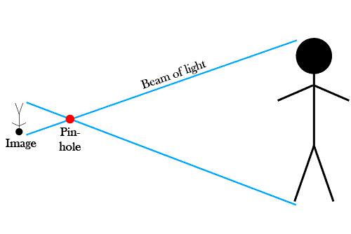
Light usually travels in a straight line through air, and so we can construct a very crude, but workable, lens just by making a small hole in an opaque surface. Light will travel in a straight line from an object, through this pinhole, where it reaches its destination, which may be light sensitive film or a digital camera sensor.

Pinhole lens

The focal length of the pinhole lens is merely the distance from your sensor to the pinhole. To illustrate the angle of view of this pinhole lens, draw a line which is the length of your sensor: say, 35 millimeters wide. Perpendicular and centered on this line, draw a dot, which represents your pinhole. Draw a straight line from the edges of the sensor through the dot: this shows the angle of view of your pinhole lens.  If you bring the pinhole closer, the view gets wider; and draw it farther away, and the angle of view gets narrower. You should see that for any given focal length, a larger sensor will give you a wider angle of view. Using trigonometry, you can calculate the angle of view for any combination of sensor size and focal length.  Suppose you have two cameras, one with a sensor twice as wide as the other: doubling the focal length of the pinhole lens on the larger camera will give you precisely the same angle of view as the smaller camera.

Now take a glass lens, and focus it on some object very, very far away, and note the size of the object projected on your sensor. Then take a pinhole lens, and move it closer or farther from the sensor until its projected image is precisely the same size as the image formed by the glass lens. The distance from the pinhole to the sensor is the effective focal length of the glass lens. An 18 millimeter glass lens projects the same size image as would a pinhole located 18 millimeters from the sensor.

But please note that this equivalence between a glass lens and pinhole lens only works when the distance from lens to the object is much greater than the distance from the lens to the sensor. A regular camera lens, after all, is not a tiny dot like our pinhole lens, but rather is made of multiple thick chunks of glass. If you focus a glass lens upon a subject very close by — like when using a macro lens to focus on a small insect — then its effective focal length will change considerably. Click here for more details.

Also note that this equivalence only works when a glass lens produces a rectilinear image — where straight lines in the scene translate to straight lines on the image. Fisheye lenses are a bit more complicated since they produce so much distortion.

Equivalent focal length

Serious photographers use seriously large cameras. This is for the simple reason that large camera sensors — either digital or film — naturally produce cleaner, sharper, more detailed images. Click here to see why. Now photojournalists also want good picture quality, but they also lug cameras around all day long, and so they need a camera that is a good compromise between weight and image quality. Photojournalists are typically the most commonly-seen type of professional photographer — and amateurs, in imitation, started using similar equipment, which included the 35mm film format. Vast numbers of amateur-grade, interchangeable-lens 35 millimeter film cameras were produced, most notably by the same manufacturers who made the photojournalist cameras.

People became quite used to the sizes of lenses for these cameras.  For example, a 50mm lens produced an image that looked rather normal — not too zoomed in, and not too wide. Lenses in the range of say 105 millimeters or larger were good for portraits, while 30 millimeter or smaller focal lengths were good for architectural interiors. Now, please recall that these focal length sizes are for 35 mm film; a medium-format camera would use longer focal lengths for the same purposes, while an inexpensive consumer camera would use much shorter focal lengths.

Eventually the manufacturers of photojournalist cameras went digital; alas, however, due high cost, the digital sensor size was smaller than the beloved 35 millimeter film. Because people were so familiar with the focal lengths used by 35 millimeter cameras, manufacturers stated equivalent focal lengths. So an 18 mm lens used with the new digital sensor is said to be equivalent to (that is, provides the same angle of view) a 27 mm lens used on a 35 mm camera. A 35mm lens on these digitals is equivalent to a 50 mm lens on a 35 mm camera. Is this helpful, or confusing?

Because the 35mm format was rather standard, digital cameras with sensors smaller than 35 mm are often called cropped-sensor cameras, although this terminology can be rather confusing to beginners. I find that beginners often get hung up on the marketing term ‘crop factor’. A 20 mm lens on a camera with a crop factor of 1.5 will provide the same angle of view as a 20 mm x 1.5 = 30 mm lens on a 35 millimeter film camera. Now this terminology is likely only useful if you are very familiar with the old 35 millimeter cameras and their lenses, and is otherwise confusing.

If you are a beginner, I would suggest you forget all about equivalent focal lengths and crop factors. Instead, find out the size of your sensor, in millimeters. For example, many consumer digital SLR cameras have a sensor that is about 30 millimeters across on the diagonal. A wide-angle lens will have a value that is less than this measurement, while a telephoto lens will be much larger than this value. A normal lens — for this sensor — will be equal to this size or perhaps a bit larger.

Tuesday, December 21, 2010

A Digital Color Wheel

MOST COLOR WHEELS you find at art stores, or images of wheels you find with Internet searches aren't too helpful for digital photography. While they may illustrate the visual order of the colors, they aren't too helpful if you want to mix colors digitally. They may even be quite misleading. So I created my own color wheel using the primary colors found in the sRGB standard, which is used by digital cameras, computers, and high-definition television.
Color wheel according to the sRGB standard

This color wheel shows the correct relationships between the red, green, and blue colors that are primary in the sRGB color system, as well as their opponent or secondary colors of cyan, magenta, and yellow.

These primary and secondary colors are the brightest and most saturated colors that can be generated from the sRGB color system. The coding in each color circle gives you the formula for generating the color: for example, cyan is GB, which means that Red=0, while Green and Blue = 255. Halfway in between the primaries and secondaries are bright tertiary colors. These tertiaries are coded with lower-case letters indicating half a given color: for example sky blue is coded gB, meaning Red=0, Green=128 and Blue= 255.

Some old color wheels use red, yellow, and blue as primary colors; others use green, purple, and orange as primaries. This is misleading for computer use since they don't give us a good idea of opponent colors.  In this color wheel, if you mix together equal portions of colors opposite to one another, you will get a middle gray color; mixing together blue and yellow gives you a gray where the red, green, and blue values all equal 128.

If your images have a color cast, you can achieve white balance by moving towards the opposite color. An image that is too yellow needs more blue, an image that is too green needs more magenta.

UPDATE: My use of a value of 128 for the tertiary colors is not correct, since 128 is NOT the middle tone. It is for this reason that the wheel does not appear to be visually uniform: the tertiaries appear to be somewhat dark. Updated wheel can be found here.

Sunday, December 19, 2010

sRGB Colors Out of Gamut

YOU OWN AN inexpensive desktop color printer. You have a digital camera, and you want to make prints. You print your images, and your final photos are disappointing. Does this sound familiar?

This is the color gamut problem: inexpensive desktop printers — those with four ink colors (cyan, magenta, yellow, and black) — cannot reproduce all of the colors that are produced by a digital camera. The best way around this is to get a printer that has more ink colors — but these can be expensive. And so the best alternative is to process your images to make the most of your printer's limited color gamut.

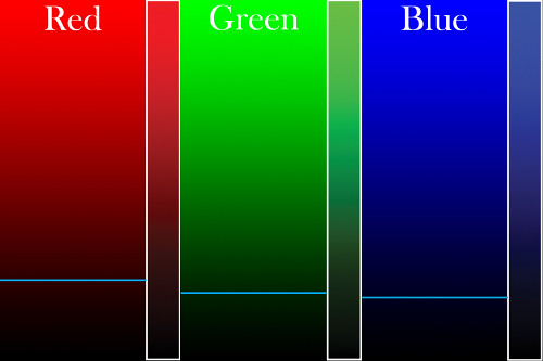
Here are the three primary colors in the sRGB color system:

RGB out of gamut

In the wide strips, we have one of the pure sRGB primary colors going from a value of 0, which is black, to 255 which is the brightest pure color that can be represented by the sRGB system.

Do you see the blue line at the bottom of each strip? This is the color gamut limit of four-color commercial printing presses and inexpensive desktop printers (this color space is abbreviated CMYK, after the four ink colors used: cyan, magenta, yellow, and black). Everything above the lines cannot be accurately printed — which is most of the image. Note that all the bright primary colors are out of the CMYK gamut. The narrow strips on the right are an approximate representation of the colors you will get from an inexpensive printer. Note that greens and blues are particularly poor and relatively unsaturated.

When we mix colors together in sRGB, we still see the same problem:

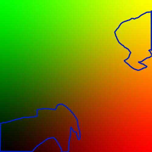
Red-Green showing CMYK gamut

Here, red goes from zero on the left to 255 on the right; from the bottom, green goes from zero to 255 on the top. Red and green mix together to make yellow.  The areas surrounded by the blue lines are colors that are within the CMYK color gamut! Reds, oranges, greens, and some leaf green colors cannot be accurately portrayed by CMYK, in fact, most of the colors in this mixture cannot be printed.

Other color mixtures are hardly better:

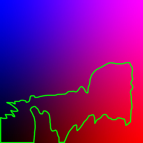
Red-Blue showing CMYK gamut

Red going across, blue going up.  Again, most of the image is not accurately printable.

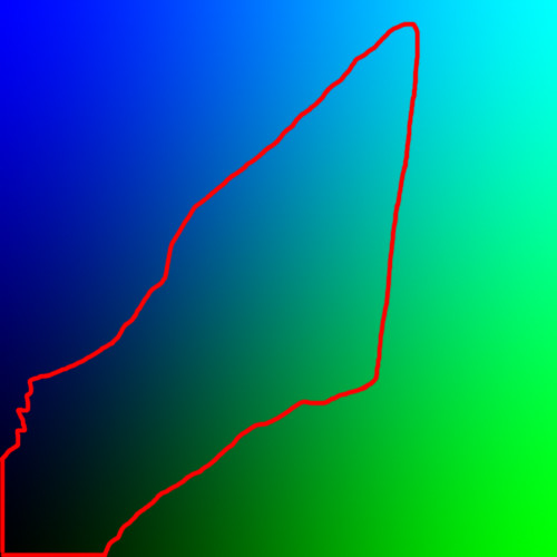
Green-Blue showing CMYK gamut

Green across, blue going up. This is somewhat better, but you still can't print decent primary colors.

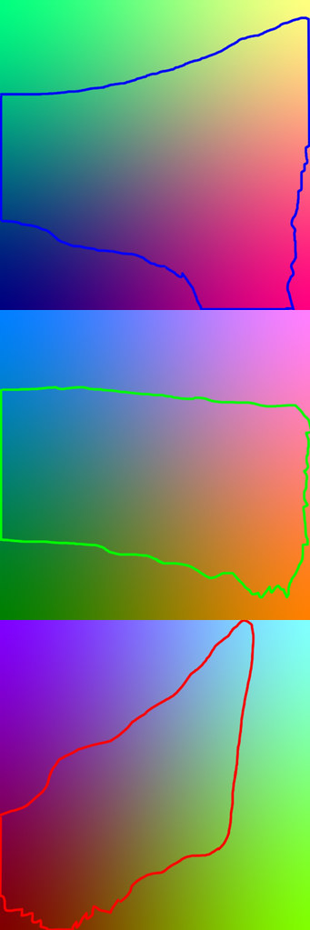
Things do get better when we have mixtures of all three colors. Here are mixtures of two colors; in each, the third color is set to 50% of its maximum value:

Mixed colors

The top image has dark blue mixed in, the middle dark green, and the bottom a dark red.  The printable color gamut is expanded by the addition of the third color.  If we had a pure grayscale image, then all the gray tones will be printable.

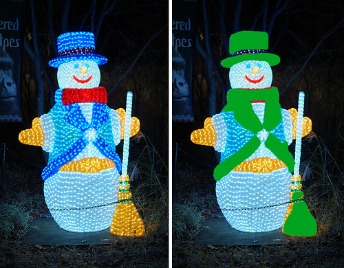
Real-world photos typically don't have too many pure, saturated reds, greens, and blues, and so the out-of-gamut problem may be a bit less prominent that what we see here. But most images will have at least some colors that can't be printed:

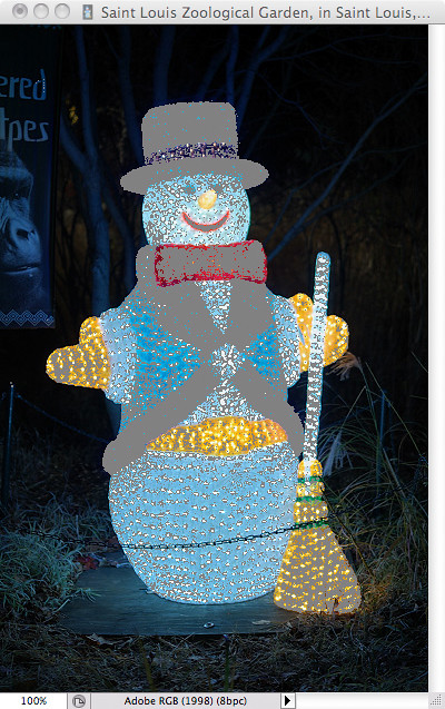
Saint Louis Zoological Garden, in Saint Louis, Missouri, USA - snowman with out of gamut colors

In this image of a snowman the out of gamut regions are seen on the right, painted in green. If you were to print this image on a four-color printer, these color regions would look a bit flat and unsaturated. You will lose detail also.

But CMYK gives as well as takes away. Even though we can not print the bright red, green, and blue primary colors, CMYK has its own primary colors: cyan, magenta, and yellow, which are typically brighter and more saturated than what you have with sRGB. You could process your images to take advantage of these colors.

To get an overview of these color systems, you may want to take a look at some of these articles:
Color Spaces, Part 1: RGB
An RGB Quiz
Color Spaces, Part 2: CMYK
Part 2 of "Color Spaces, Part 2: CMYK
A CMYK Quiz
When processing for print, you want to emphasize the colors the printer can print, while toning back the colors that are out of the printer's gamut. Following is a relatively simple process where you can make the most of your images in Photoshop.

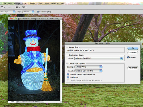
Convert your image to a wide-gamut color space. Typically Adobe RGB is used. If you shoot RAW, Photoshop's Adobe Camera RAW (ACR) program can select this color space upon import — this would be useful for best quality. Some cameras can shoot JPEG images in Adobe RGB, but I would suggest not using it unless you really know what you are doing.  Select the menu item Edit, Convert to Profile...

Convert to Profile

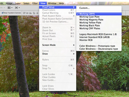
Turn on the Gamut Warning feature in Photoshop:

Gamut Warning

If your target printer has a color profile installed in Photoshop, go to the Custom... menu and select it instead of CMYK. Following shows an image with the gamut warning on; here I have the warning set to gray, but you can change the color to be more visible on a particular image.

Gamut warning on image

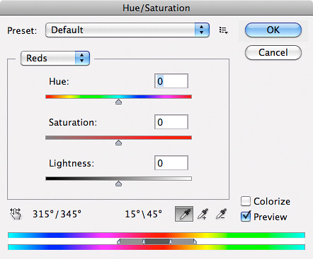
Select the Image, Adjustments, Hue/Saturation... menu item:

Hue-Saturation dialog box

Note that the drop-down list has both the RGB and CMYK primary colors. For each of the color classes which are out-of-gamut, adjust the Saturation and Lightness sliders until the Gamut Warning turns off.  You can be as careful or as sloppy as you want here, by adjusting the slider on the bottom. You can also select individual colors with the eyedropper tool. (The middle part of the slider shows the colors that will be fully corrected. You can adjust the outside parts of the slider for good blending.)

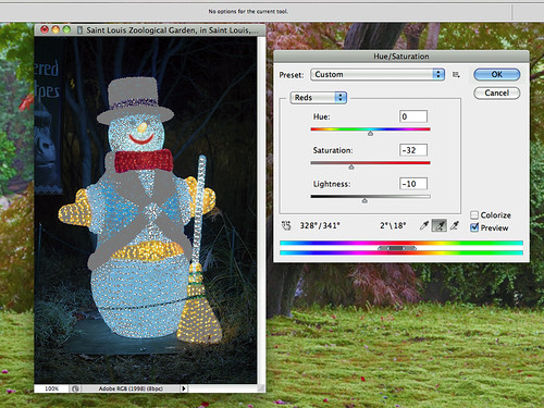
Adjusting reds

Here I brought the red bow tie into the CMYK color gamut by darkening and desaturating the color range; but be aware that there may be more than one way to bring it into gamut, with some being better than others. Were I being more careful, I would have done this on a layer with a mask so as not to also desaturate the snowman's smile. Then I corrected the the blue part of the image to bring it within the CMYK gamut. In other images you may also have to tone down the bright primary green colors.

Next we can enhance the printer's primary colors.  We go through the same process as before, but we work with the cyan, magenta, and yellow color ranges, increasing brightness and saturation. The major improvement we can make here are with the yellow colors, which I was able to saturate and brighten considerably. You can brighten and saturate until the Gamut Warning turns on; then you've gone too far. (However, it is OK if some small parts of your image are out of gamut... you just don't want too much over a broad area, otherwise you will lose detail.)

This is a bit of a leap of faith, since you most likely cannot see the final results of your editing: it is out of your monitor's gamut.  If you have areas of your image that ought to have lots of bright cyan, magenta, or yellow ink, you can place an eyedropper tool on the spot and measure the CMYK values directly. If a spot is supposed to have a very bright yellow component, the brightest you can get, then that spot, after your processing, ought to be rather close to having 100% yellow ink.

Purists may insist that all this manipulation is ‘inauthentic’ but in reality this scene greatly exceeded the color gamut and dynamic range of my digital camera; in fact this is a blend of three separately exposed images. So we are justified in making the colors of the snowman as bright and as saturated as we are able to. Likewise, if we are printing a full-color image to a narrow-gamut CMYK printer, we are justified in printing as much of a full-range of color as we are able.

There are many ways of accomplishing a goal in Photoshop, and this one is particularly straight-forward. The most visually accurate color corrections can be made using the Lab color space. Also of use is the Vibrance tool, layers, masking, and most notably Levels and Curves.

When I am preparing images for commercial press, I eventually manipulate the images directly in the CMYK color space, making the most of that limited range of color. Unfortunately we cannot do the same with desktop printers, since they use different inks than are found in commercial presses, and so they typically require the image to be in RGB format. The Gamut Warning feature is the most powerful tool for this purpose.

Wednesday, December 8, 2010

A CMYK Quiz

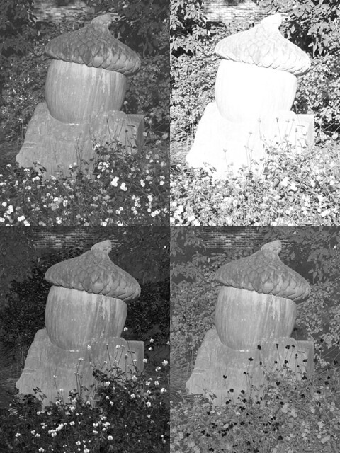
HERE IS A sample image, which shows the four channels of a CMYK image. Use your knowledge of CMYK to determine some facts about this image.

If you haven't read them yet, you may first want to read these articles: Color Spaces, Part 2: CMYK and Part Two of "Color Spaces, Part 2: CMYK".

Quiz - CMYK

This sculpture of an acorn is found in Wydown Park, in Clayton, Missouri.

I am convinced that a thorough knowledge of the channel system of digital images is essential for good photography. By looking at a color photograph, you ought to be able to imagine which each color channel ought to look like, and by examining the color channels, you ought to be able to determine what colors are represented.

The CMYK color system represents inks printed on a page, and includes the colors cyan, magenta, yellow, and black. Each channel represents one color of ink. No ink is placed on the page where the channel is white; and where the channel is black, we have 100% ink coverage. For example, a bright cyan-colored object will be black in the cyan channel, and white in the other channels. Where we happen to have roughly equal quantities of cyan, magenta, and yellow ink, the CMYK system will subtract those colors and replace them with black ink. So K (black) will dominate the shadows.

Here is your task:
  1. Identify each color channel in the image above.
  2. There are two colors of flowers in the image. Identify the colors.  We have taller flowers which can be seen in front of the acorn, and shorter flowers of a different color in the foreground.
Unlike my last quiz, I won't give you any clues. Use your knowledge of nature and the channel structure of CMYK to determine the answers.

Saturday, December 4, 2010

The Problem of Resizing Images

IMAGINE YOU HAVE a peculiar boss at work. He wants to make sure that you are at your desk working forty hours per week. So once a day (seven days a week!) at precisely the same time every day (since he is extremely methodical), he peers into your tiny cubical to see if you are at work. You are never there, and he is quite upset. You will hear about this at your next annual review, nine months from now. Sadly, it appears you won't be getting a raise.

Well, he looks into your cubical precisely at midnight every day. Despite graduating with honors in a top M.B.A. program, he really isn't all that bright, and he lacks a life outside of work. As a matter of fact, you do work 8 a.m. to 5 p.m. (with an hour for lunch), Monday through Friday, and you are always at your cubical during those times. But boss marks you down as being absent 100% of the time.

Well, since you actually do your required work, bossman decides to check up on you four times a day. Quite methodically, he appears at your cubical at midnight, 6 a.m., noon, and 6 p.m. As it so happens, you take your lunch at noon, and he just barely misses seeing you every time. You are still absent 100% of the time, in his mind.

Boss is still puzzled. With apparently too much time on his hands, he checks on you eight times a day. Midnight, 3 a.m, 6 a.m, 9 a.m., noon, 3 p.m., 6 p.m., and 9 p.m.  He finally sees you! Since he sees you 2 out of the 8 visits he makes, Monday through Friday, he estimates that you are working at most 2/8 x 24 x 5 = 30 hours per week. He is disappointed, but at least you get to keep your job.

Note that if he visited your cubical three times a day, at midnight, 8 a.m., and 4 p.m., he'd see you twice (the first time just as you got there) and would estimate a working time of 2/3 x 24 x 5 = up to 80 hours per week. But four times per day gives zero. Clearly the frequency of his visits can change the results dramatically.

Your boss's boss likes what he is doing, and asks that he get more data so that he can present an impressive chart at an upcoming meeting. Your boss now checks your cubical 12 times a day. He visits at midnight, 2 a.m., 4 a.m., 6 a.m., 8 a.m., 10 a.m., noon, 2 p.m., 4 p.m., 6 p.m., 8 p.m., and 10 p.m. He sees you working 4 times per day, Monday through Friday, and so he estimates that you work up to 40 hours per week.  If he visited your cubical 24 times a day, or 48 times a day or more, he may (hopefully) notice that his increasing visits didn't give him much more useful data: he would always get a result close to 40 hours per week.

Slightly different

Let's consider a slightly different scenario. Your boss is always on top of the latest scientific theories. He read that the natural sleep-and-wake rhythm of human beings, when not exposed to the cycle of the sun, is 25 hours a day. Always ready to implement these newest findings, and since he apparently never sees any sunlight, your boss now lives out a 25 hour day, although who knows when he actually gets any sleep. Instead of checking your cubical once a day, he checks it once every 25 hours. If he sees you at your desk, he gives you credit for the entire 24 hour day (unfortunately, he has yet to convince his boss to move all the employees to this new scientific schedule). So the first day, he checks for you at midnight, the second day at 1 a.m., the third at 2 a.m., and so forth.

Although he finds you working sometimes four days in a row, he is infuriated that you are (apparently) taking two week (and longer!) vacations at regular intervals. He does estimate that in the long run you are actually working on average 40 hours per week, but he is worried about all the important conference calls you must be missing.

No Common sense

This hypothetical boss, despite being diligent, lacks common sense. This lack of common sense, while being reprehensible in a human being, is quite the norm with digital cameras and with computer software such as Photoshop, although we must credit computer technology with also being diligent. It's hard — no, impossible — to program a computer with common sense, and so we ourselves must make up for what computers lack if we want good results.

Better yet worse

I was delighted when I upgraded from a nice but lowly point-and-shoot camera to a decent, yet inexpensive, DSLR model. Immediately I noticed how sharp my new photos were, as well as having much less noise, even in low light. But there was a problem, and I couldn't quite put my finger on it.  With my old camera, when I was processing images for the Internet, I would simply resize them and add sharpening. Even though there were various re-sizing algorithms available in Photoshop, none seemed to make much of a difference. I did put a lot of effort into using good sharpening algorithms, which made my photos look much crisper without obvious artifacts. But this did not work well with my new camera.

My old process did not work all of the time with my new camera — and the maddening thing was that my results were quite inconsistent — some of my final images looked fine, some were terrible (nature photos were typically the worst). Formerly, when I reduced the size of my images, I had Photoshop set to use the Bicubic Sharper algorithm, which Photoshop says is “best for reduction”, but I found that the new camera's images looked quite rough. So I changed it to use regular Bicubic. This required quite a bit more sharpening than I had used before, and I started using better algorithms that would reduce the bright artifacts I was now seeing, especially around distant leaves on trees and along certain edges. Sometimes I had to manually retouch out some of the sharpness. To me, this is not acceptable, so I started asking around for advice. As it turns out, Photoshop gets it wrong, and does not implement its resizing algorithms correctly.

Hit a brick wall

Digital cameras have ranks and files of pixels, arrayed across their sensor, in precise order, just like the smart-yet-foolish boss in our allegory above. Precisely every x micrometers, a different sensor captures light, just like precisely every y hours the boss would check up on his subordinate.

In the story, you arrive at work at a regular interval, but your nosy boss, if he didn't check up on you frequently enough, would get a wildly inaccurate estimate as to when you actually were present. Only when he checked up on you many times in a day did he get an estimate that was accurate enough.

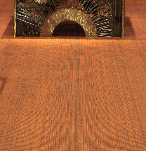
A similar same thing happens in a digital camera. If there is an underlying, repeating pattern in the scene, the camera may get a wrong estimate of what the scene looks like if you have an inadequate number of pixels to capture enough detail. We see this on initial capture. Here is a section of a photograph, showing textured carpet:
aliasing

The camera did not have enough resolution to capture the repeating texture of the carpet adequately. So we end up with ugly artifacts, here shown by the odd pattern. There were no curves in the texture of the carpet, but the pixels on the camera, being spaced too far apart, got a strange signal. It was not sampling the texture frequently enough. This pattern is called the Moiré effect or an interference pattern, and is a special case of aliasing.

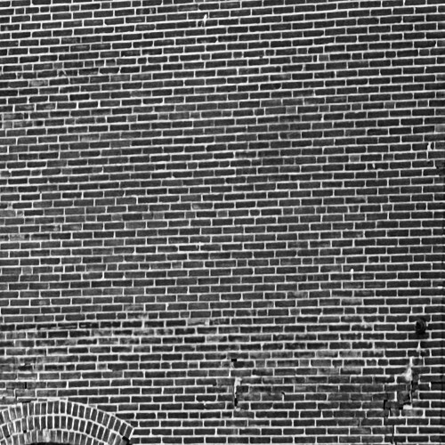
Not only do we see this on initial capture, but this can be a severe problem when we are downsizing an image. Downsizing in business ruins lives, while downsizing in digital photography ruins images.  If there is a repeating pattern in an image, we can get bizarre patterns upon downsizing if we end up with fewer pixels than a particular pattern requires. Here is a detail of a larger image:
Brick building detail

A brick wall. We have a classic, repeating pattern, which will test Photoshop's ability to resize.

First we use Bicubic Sharper, which Photoshop tells us is best for reduction:
Resizing - Bicubic Sharper

Ugh. Bad pattern. Just like the boss who was checking on you at 25 hour intervals (and thinking that you were frequently taking 16 day vacations), we see some bands of the brick wall where the lighter white mortar predominates, and other bands where the dark brick predominates. Also, the rest of the image looks rather rough.

Please note: these sample images are intended to be viewed at 100% resolution. If you are viewing these images on a mobile device, they may be further resized by your device, not giving you an accurate representation.

Now let's try Bicubic:
Resizing - Bicubic

The repeating pattern is still there, but the rest of the image looks a bit better, if soft. Now normally I'd add sharpening to an image like this, but the pattern on the bricks just looks unprofessional.

Bicubic Softer does not help:
Resizing - Bicubic softer

Now lately I've been using the Bilinear algorithm for resizing. The final images, to my eyes, look crisper than Bicubic, yet less rough compared to Bicubic Sharper.  Let's try Bilinear on the brick wall:
Resizing - Bilinear

Interesting. The pattern changed, and maybe it is somewhat less obvious. But still bad. I do like how the rest of the image turned out though: it would hardly need any sharpening at all.

For the sake of completeness, let's try the Nearest Neighbor resizing. As Photoshop says it is best when we want to ‘preserve hard edges’, and since the building has hard edges which we want to preserve, it should look fine, right?
Resizing - nearest neighbor

Nope. Blech. Looks like a zebra.

Note that the big problem we are seeing is due to the regular pattern of the subject, such as the brick wall, coupled with the regular pattern of pixels on the digital image. We do not see moiré patterns with film cameras and prints: the chemical film grains are irregular shapes and sizes.

But fortunately there is a good general theory to help us out. The Nyquist sampling theorem states:
If a function x(t) contains no frequencies equal to or higher than B hertz, it is completely determined by giving its ordinates at a series of points spaced 1/(2B) seconds apart.
Very roughly speaking, if we take a picture of something that has a regular pattern, if we don't allocate more than two pixels for a repeating element, then we will get the moiré pattern. But actually it is slightly more complicated than that, since we have three colors of pixels, at slightly different locations on our sensor. In the photo of the carpet above, there is much more moiré in the red and blue channels compared to green, as we do have twice as many green sensors.

There are also other mathematical effects involved to complicate matters, such as the Nyquist theorem assumes the frequencies are perfect sine waves. A pattern with hard edges, such as the bricks, actually are equivalent to somewhat higher sine wave frequencies.  So some authorities state that for hard-edged repeating patterns such as these bricks, and with a Bayer Array  (where we have separate photo-sites for each color channel), we ought to capture at least three (or maybe up to four) pixels per repeating pattern element to avoid aliasing.

We find the exact same thing when downsizing an image. If the final resampled image does not have more than two pixels capturing each element of a repeating texture in the original image, we will get a moiré pattern. Because of the complications given above, maybe we need a little bit more, like 3 or so pixels just to be safe. So if our bricks, about 10 pixels apart vertically on the original image, are roughly reduced 1/5 or less in size, then they will definitely show a bizarre pattern, since we are allocating two or fewer pixels per brick. This is what we see in the photos above. I didn't get any moiré effect when I downsized the image to either 50% or 33% (5 or 3.3 pixels per brick) — and just started getting moiré at 26%, which is about 2.6 pixels per brick.

This is analogous to what is done in the audio recording industry. Young, healthy human ears can hear frequencies up to about 22 kHz, and audio engineers will sample the audio at more than twice that frequency, 44.1 kHz, to avoid audio artifacts like we see in our aliased images.

Boss tries harder

Your boss still wants to keep track of you, but because he has other duties, he attempts to automate the task. He installs a sensor at your cubical door. Whenever you are in your cubical, the sensor records that fact. At the end of a fixed period of time, the sensor resets itself and sends a signal to your boss's office whether or not you were in your cubical anytime during that period. He sets the sensor to send him data every day at midnight. He successfully finds out that you are in the office every weekday. Under your boss's old system, he knew precisely when you were at your desk at a given moment in time, but the new system, while it is less specific, gives him more useful information. In effect, the sensor blurs the boss's data a bit, but he gets better results. With one sample per day, he gets better results than visiting your cubical four times. Were he to sample the sensor more times per day, he would get a much better idea of your attendance than if he were to visit your cubical the same number of times. Maybe he'll find something better to do with all the time saved.

As it so happens, digital cameras incorporate anti-aliasing filters to combat moiré patterns. This softens the image a bit, but it can lessen the effect that we see in the carpet photo above. Consumer grade compact cameras tend to have heavy anti-alias filters, DSLRs have weaker ones, while medium-format digital camera backs may have none. With the higher-grade cameras, it is up to the photographer to either avoid or correct for these imperfections — although with more pixels, this will be less of a problem.

Blurring is the key

This softening is the key to downsizing images. According to the Nyquist theorem, our samples need to be more than double the frequency of the original signal to avoid artifacts, but when we make an image smaller, we greatly increase the frequency of our patterns. So what we need to do is to blur the image first — before downsizing — so that the Nyquist theorem still holds for our final image. In more technical terms, an image needs to be put through a low-pass filter before being down-sampled — the high-frequency components of the image have to be eliminated first by blurring.

I started getting the ugly artifacts when I reduced the image below 2.6 pixels per brick, and so to eliminate them we need to run the image first through a low-pass filter, which will get rid of any detail 2.6 pixels in size or smaller.

Photoshop does not blur an image prior to downsizing, not even the newest Photoshop CS5. That is why we get these digital artifacts. I would think that this would be fairly easy to implement.

How an image ought to be blurred prior to downsizing is a mathematically complex subject, and certainly the optimal blurring algorithms are not found in Photoshop. But we could experiment with Gaussian Blur, although choosing the Gaussian radius may be a bit problematic.

OK, so we want to be sure that we don't have any frequency components of our bricks being any less than about 2.5 pixels per brick in the final image. I initially choose to apply a Gaussian blur with radius 2.5 before downsizing.  This is a quite naïve start, and so I did blurs in various steps:

Resizing - 2.5 blur - sharpened

Radius = 2.5. Just for fun, I used the Nearest Neighbor resizing algorithm, which gave us the horrendous zebra stripes seen above.  It doesn't look too bad, does it?  I added 50% Photoshop Sharpen to these images to make them look a little better. Better sharpening is called for however.

Here are other Gaussian blur radii:

Resizing - 1 blur - sharpened

Radius = 1.  We still have severe aliasing.

Resizing - 1.5 blur - sharpened

Radius = 1.5.  Still some aliasing.

Resizing - 2 blur - sharpened

Radius = 2. Some very faint aliasing; otherwise this is a good image.

Resizing - 3 blur - sharpened

Radius = 3.  Too soft.

Ok, for sure we can get rid of aliasing when it obviously appears on an image like this one. But this may not be optimal, for the final image appears a bit too soft. One trick I've used is to blend together two copies of an image, reduced using different algorithms. In this case, I'd select the anti-aliased part for the bricks, with a normal downsize for the rest of the image.

However, anti-aliasing may help images even without an obvious pattern such as this. I recall that I often get poor resizing results, particularly with distant leaves against the sky, and along certain edges. Perhaps using even a soft blur will help with these images.

But we really ought to be using better algorithms than Photoshop offers. Very many algorithms are implemented in the free ImageMagick command-line utility, and in-depth discussions are here and here. For downsizing, they recommend the Lanczos algorithm for photographic images. It properly does blurring before reducing, although it does not use the optimal blur algorithm, for the sake of good performance. Using that software, I resized the brick building:

Resizing - Lanczos

Lanczos still has a bit of moiré, so I'm a bit disappointed. Otherwise it looks pretty good, and is much better than any image found above.

I tweaked the processing a bit and got this:

best effort

I blended the above image with a version that I blurred before downsizing. I masked out the building in the unblurred layer, giving us this composite.

Apparently there are some other, better algorithms available, but they are computationally expensive, or difficult to fine-tune optimally. However, whichever resizing algorithm you use, it is important to sharpen the image afterwards to bring back some crispness to the image.
Wednesday, December 1, 2010

Part Two of "Color Spaces, Part 2: CMYK"

IF YOU TRY to invent a new language, like for example Esperanto, you won't get far if your new language has nouns but no verbs. Likewise, if you invent a new color system, you won't get far if you don't include the common primary colors, as well as black and white.  Your color system doesn't have to cover every conceivable color, just like every human language does not need to have words to describe quantum physics. You just need the basics.

The CMYK color system is used by commercial presses, as well as by inexpensive desktop printers. CMYK is not a very broad system of color, but it has the basics, and is suitable for most printing purposes. Using cyan, magenta, yellow, and black inks, these printers can output a smaller range of color than even the sRGB standard (used by most cameras, computers, and HDTV), which in turn only displays about 35% of all possible colors. But CMYK can print all the basic classes of colors, with a nice, continuous gradation between these colors.

I am convinced that a thorough knowledge of the color structure of images is needed for quality photography. At a bare minimum, a photographer ought to know about the three color channels delivered by the camera — red, green, and blue — and how the RGB channels work together to represent color.  You should just be able to look at an image, and imagine with your mind's eye how each of the channels ought to look.  And by looking at black and white representations of the channels, you ought to be able to estimate roughly what the various colors are in the image. Using the “by the numbers method”, you ought to be able to know if your colors are correct just by examining the RGB values — even if you are color blind. See my article, Color Spaces, Part 1: RGB for an introduction to this color system.
But it is nice having printed output, instead of just viewing pictures on a screen. If you are fortunate someone might be willing to pay you to print your photos in a book or magazine, or you may make prints for clients. If you want to do an excellent job with printing, better than typical, then having an understanding of the printer's color channel structure is also essential.

RGB output assumes three primary colors on a brightly lit screen — you illumine red, green, and blue lights which mix together to produce a broad range of colors, including black and white. The more light illuminating the screen, the brighter the picture. CMYK, on the other hand, places four colors of ink on a page, and the more ink on the page, the darker the image.  Fortunately, once you know RGB, moving to CMYK is is quite similar.  See my article, Color Spaces, Part 2: CMYK for details.
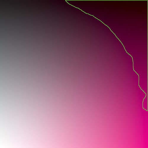
The key is the opponent color system. Some colors, when mixed, produce other colors, like green and red lights shining together will produce a yellowish light; or when you mix cyan and magenta inks together you get blue. However, when you mix opponent colors together, you get gray.  The RGB and CMYK color systems use colors that are opponent to each other: red is the opposite of cyan, and so on, and so the red channel will look quite similar to the cyan channel, while green will look similar to magenta. The major difference is the black channel in CMYK, which will have much of the shadow detail (by the way, RGB has very little color information in the shadows, and CMYK beats it in that department).

Let's examine how colors mix in the CMYK system (see the RGB article for analogous images):

Cyan versus magenta

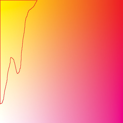
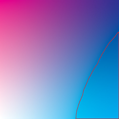
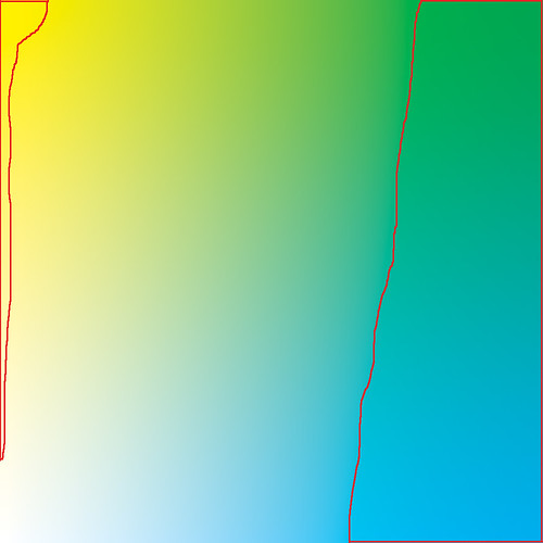
Here, we simulate an increasing amount of cyan ink moving across the image from none on the left to 100% coverage on the right. Likewise, we have an increasing amount of magenta ink from 0% at the bottom to 100% at the top. No yellow or black ink is shown. We have white at the lower left-hand corner, and somewhat purplish-blue at the upper right hand corner: if we draw a diagonal in between those corners, we have a purplish-blue color going from fully saturated, to a pastel, to white.  Along the upper side of the image we a gradation between magenta, purple, and blue, and the right-hand side we have cyan merging into blue.

Please note that this is simulating ink on a page. The red outlined region, in CMYK, is actually outside of the color gamut of the sRGB color system used by this image. When I converted the image from CMYK to sRGB, Photoshop chose the closest sRGB color to represent what was found in CMYK. As it so happens, we can get better, brighter, more saturated cyan inks than what can be shown on most computer monitors: what you are seeing here is actually a bit duller than can be printed.  (Perversely, if you were to print this image, some of these sRGB colors are themselves outside of the CMYK gamut, and the quality would degrade even further. Color management is complex, and frustrating.)
Most critical for photographers is the sky-blue colors along the middle of the right hand edge.  These colors are outside of the gamut of sRGB — but are well within the range of CMYK. When skies are particularly deep in color, such found at high altitudes, or during a brilliant, clear winter day — especially when you use a polarizing filter — your sky will be out of the sRGB gamut, and will exhibit lots of noise (and this noise will be exaggerated by JPEG compression). Examine your red channel: if it is black, then you know the sky is out of gamut; but if you carefully process your photograph, starting with a RAW image and never entering sRGB, you still might be able to get a clean printed sky.

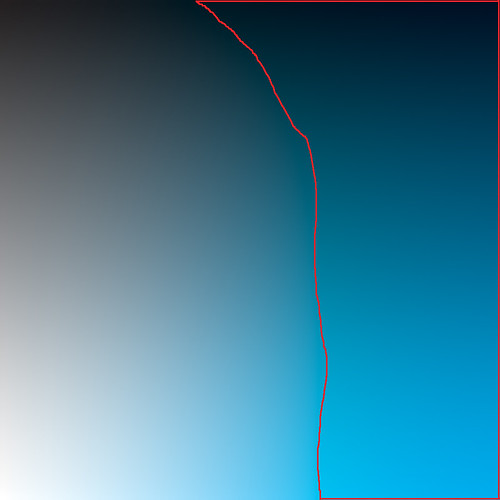
Cyan versus yellow

Here we have cyan ink going across, and yellow ink going upwards. There is no magenta or black ink. These two colors mix together to produce green.  We have various colors of leaf-green going along the top edge, and ocean-green along the right edge.

Our outlined gamut warning areas show that we can get a bit better yellow on printed output than we can on a display. Recall that yellow is the opponent color to blue, and digital cameras do a very poor job of capturing blue colors, particularly at low light levels, which may translate to a somewhat poor yellow. But if you capture an exceptionally clean image in the blue channel, you can convert your RAW image to CMYK and use the high-quality ink to get a slightly wider range of yellow in your final image, especially good pastel yellows which are hard to come by in sRGB.

Far more problematic are the green colors: CKMY does a much better job with certain shades of green compared to sRGB. Again, this is a simulation, and were I to have printed the original CMYK file, the color differences would be rather striking. Especially problematic are most shades of ocean green, as well as some shades of leaf-green. This is an interesting observation: CMYK technology, which is quite venerable, does a better job with the natural colors of the sea, sky, and land compared to the computer standard sRGB color system. Also, flesh tones — especially for Scandinavians and Africans — can easily go out of the sRGB gamut. The computer standard was developed before digital photography became widespread — when computer graphics were more concerned with simple business and scientific diagrams — and so was not fine-tuned for common natural colors. However, sRGB does a better job with pure bright reds and blues.

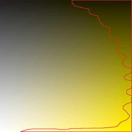
Magenta versus yellow

Magenta going across, yellow going up. These mix together to produce red at the upper right hand corner. They don't mix to produce a really good, bright red as we see in sRGB. But we see that CYMK produces better yellows, and some oranges.

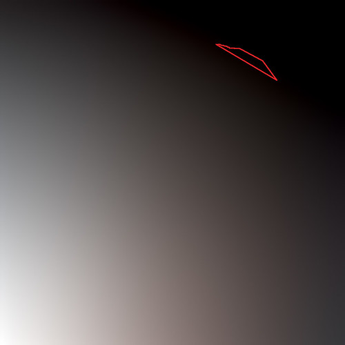
Cyan versus black

Cyan across, black up. Here we finally mix in some black tones, and clearly CMYK is the winner with cyans — and especially dark cyan colors. Recall that sRGB will often throw blue skies out of gamut, which the bright primary cyan ink and the black channel here makes up for quite nicely.

Magenta versus black

Magenta versus black. CMYK wins with dark magenta tones.   Again, remember that you really can't see the actual effect of ink blending on your monitor — the real result is darker and richer.

Generally, RGB color models can be poor because they don't allocate much information to the shadows. There are very few variations of colors that are darker than the blue primary — only about 1% of all allocated colors, which can be seen in another article. Shadows in general tend to be poor, and the number of dark colors are severely limited. CMYK makes up for this by allocating much of its gamut to dark colors.

Yellow versus black

Yellow versus black. If you studied the previous charts, you probably guessed what this looks like.

CMY versus black

Here I mixed 100% each of the three colors across the image, while I added black going up. You ought to notice on the lower half of the image that the mixture of the three colors is not precisely gray, rather it has a slight reddish tone, which tells us that the cyan ink is a bit deficient. (Cyan and red are opponent colors — more of one means less of the other.) With RGB, you merely make all three values equal if you want a pure gray tone, but with CMYK, cyan has to be a bit stronger. For this reason, doing a white balance in this color system is a bit more complex.

There are two reasons why printers have a black ink. One is that a CMY mixture is dark gray at best, and the other is the fact that too much ink on a page can cause smearing or other defects. The black ink can nearly replace all of the colored ink in the darkest shadows, using merely 1/3rd of the amount of total ink.

In the article Imaginary and Impossible Colors, I showed how three numbers are sufficient to describe any color visible to the human eye. CMYK uses four colors, which means there is often more than one way to specify the same color, by trading-off CMY for black. Printers consider the black plate to be the most important, and photographers creating CMYK separations of their photographs ought to study the trade-offs very carefully. You can also manipulate the K channel in Photoshop — it is an excellent place to add sharpening, local contrast, and nice steep curves for rich shadow detail, but you might inadvertently remove some color.

If you are sending your images to a desktop printer, do not use the CMYK color system. Rather, process your images in a wide-gamut RGB color space, such as Adobe RGB or ProPhoto, and set Photoshop's gamut warning to either CMYK or preferably the printer's own ICC profile. This will allow you to get the rich, deep colors, and to fully express the colors of nature, but avoid bright reds and greens which cannot be printed. Be aware that out-of-gamut colors will either translate to noise or to flat, muddy colors. Understanding CMYK will let you know what to expect.  If your printer uses more than four colors, then you are quite fortunate as you can get richer, purer colors — install the printer's ICC color profile in Photoshop and process your images using that profile as your gamut warning. Be sure to use a wider-gamut RGB colorspace for your processing. Since you will be working with colors which likely can't be displayed on your computer monitor, you ought to take the leap of faith that your images might actually look better when printed than what you see on the screen — just keep a close eye on the numbers and on the gamut warning.

If you are sending your images to commercial press, you will want to study CMYK further, or just take your chances and let the pre-press folks do the conversion for you.


You don't have to convert your image to CMYK in order to see what amounts of inks your image would use. You can configure Photoshop's Info panel to display CMYK values for the eyedropper tool. If you are attempting to set a particular color to the brightest possible CMYK red value, you can set an eyedropper on the color and keep an eye on the CMYK values as you adjust your image: you want to set magenta and yellow near 100% with cyan and black low.

CMYK values are also used to correct an image for good skin color. Humans of all races have a cyan channel that is less than the magenta channel, and a magenta that is less than yellow. Black can be nearly any value depending on race. Be very careful not to adjust skin tones so much that they go out of gamut — that is particularly noticeable.

Read part one of this article on CMYK: Color Spaces, Part 2: CMYK
And here is my article on RGB: Color Spaces, Part 1: RGB
If you are confident that you understand CMYK, try this: A CMYK Quiz
For color spaces based more closely on human vision, see this: Color Spaces, Part 3: HSB and HSL, and Color Spaces, Part 4: Lab.