Monday, November 29, 2010

Color Spaces, Part 2: CMYK

THREE NUMBERS SUFFICE. If you desire to mathematically describe or represent any color seeable by the human eye, the simplest and most well-ordered models will include exactly three numbers, no more and no less.

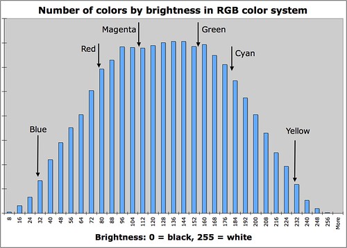
But please notice that I wrote that three numbers suffice. Normally we think of color theory in terms of mixing colors: for example, computer monitors typically have three kinds of dots, each a certain precise shade of either red, green, or blue. Various mixtures of these color dots at various intensities will produce all the shades of color viewable on the screen, from dark gray or black, to white, and with a rainbow of colors throughout. Alas, although we can accurately characterize every known color by three numbers, we cannot mix all known shades with three primary colors. Three colors do not suffice, and this is the color gamut problem. If you choose three colors for your primaries, then no matter which colors you chose, there will still be colors that you are unable to mix.

For more information, see my article on imaginary and impossible colors.

For reasons of cost and practicality, most color devices use just three colors, and these provide a limited gamut of colors. Most computer monitors and High-Definition televisions use the sRGB color gamut, which can display about 35% of possible colors. Expensive high-gamut monitors can approach 50% of possible colors. Generally missing in these color output devices are rare colors such as scarlet and Imperial purple. Good cyans and some greens are also missing, but the system is generally adequate for most uses.

In the RGB color system, red, green, and blue lights are mixed together to provide a wide range of colors and shades.  But we cannot use only red, green, and blue inks on a page to produce a similar range of colors. See my article, Color Spaces, Part 1: RGB, for examples of how these additive colors work together: for example, if you shine a red and green light together, you will get a bright yellow color, but if you mix red and green paints together, you will get a dark muddy mess. You cannot get a bright color by mixing RGB inks. Mixing saturated colored lights together will always produce a brighter color; mixing saturated colored paints together will always produce a darker color. So when we put ink to paper we have to use a subtractive color system, which chooses pure light primary colors for mixing.

Recall the discussion in the RGB article about the opponent color relationships. These are opposite color pairs, which produce shades of gray when you mix them, and not a unique color.
Red is opponent to cyan
Green is opponent to magenta
Blue is opponent to yellow
And since we are working with ink on paper, I might add:
White is opponent to black
The three primary colors in the RGB or additive color system are red, green, and blue, while the three primary colors in the CMY or subtractive color system are cyan, magenta, and yellow. RGB and CMY are therefore opponent to each other.

Consider the following image:

Broemmelsiek Park, in Saint Charles County, Missouri, USA - red berries against blue sky

We have red berries against a blue sky. In the RGB system, the red berries will be bright in the red channel, and dark in the green and blue channel, since pure reds have little to no green or blue in them. If we examine the color channels separately, we see this:

Red berries - RGB

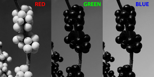
Red berries are almost white here, because in the RGB color system white is a strong color, while black means the absence of a particular color. Since the berries are nearly pure red, they are white in the red channel, and black in the other channels. Since we have a nice blue sky, the sky is suitably lightest in the blue channel; and since midday blue skies tend towards cyan and not magenta, the green channel is brighter than the red.

The CMY color system works a bit differently. White indicates an absence of ink, while black means that a particular ink has 100% coverage. So a part of an image where all three channels are white means that no ink is put on the page, and so the white color of the page shows through. The same image in the CMY color system is this:

Red berries - CMY

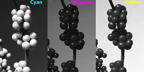
Red berries have no cyan color in them, and so are white in the cyan channel. Magenta and yellow ink mixed together makes red, so the berries are dark in both those channels.  Likewise, blue skies have little or no yellow in them, and so the sky in the yellow channel is light, and is dark in the cyan channel, meaning there is lots of cyan ink there. Cyan plus magenta equals blue, and since our cyan channel is darker than the magenta, the blue sky will properly be a greenish blue shade and not purple.

Please note that the RGB and CMY channels look nearly identical. Working in the CMY color system is hardly different than working in the RGB color system because of the opponent colors used. Please note that the channels are not identical because the printing and television industries use slightly different color standards. But they are close.

Recall the discussion above about limited color gamuts, and how three primary colors cannot produce the full gamut of colors visible to the human eye. Computer monitors really have it easy, since they have powerful back-lighting which can produce bright colors much brighter than the artificial illumination typically found indoors. But poor printed pages do not have that advantage: the brightest tone available will always be the paper itself, and that paper will be duller than the room lighting. And so, printed output will generally have a poor color gamut.

But we can expand the color gamut if we add more colors of ink. Full-color printing always adds at least one additional color to expand the gamut, and in commercial printing, that color is black:

Color space example - CMYK

The standard cyan, magenta, and yellow inks used in the printing industry really don't mix together well to make a good black, rather they look muddy. Another problem is that commercial printers have what is called an ink limit: some presses just can't have too much ink on the page without causing problems, and so printers will insist on a limit to the total ink coverage on any given spot on the page. Some shoddy printing may even have an ink limit of 240%, which means that you can't mix together full coverage of our three colored inks, since that would gives us a 300% coverage, which is over the ink limit. 100% black ink will replace 300% colored ink, which is quite a savings, and the black ink looks much better than an equal mixture of colors. Adding black expands the color gamut of the printed page, and does it while ensuring a cleaner press run with less chance of smudging ink.

Here is our image in CMYK (where 'K' means 'key' or black):

Red berries - CMYK

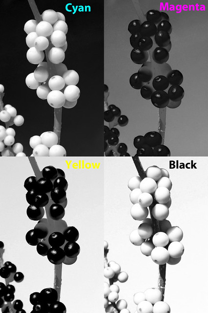
The twig is dark brown, and much of its tone now comes from the black channel, as do the shadows. See also how Photoshop removed ink from the color channels: shadows there are now a medium gray.

The CMYK color gamut is considerably smaller than the sRGB gamut most often used in the computer industry and by digital cameras. However, the CMYK gamut is not completely contained within sRGB: printing can produce better cyan, magenta, and yellow, whereas sRGB produces better red, green, and blue.

We can expand our color gamut by adding colored ink. In the printing industry, these are called spot colors. If you don't think that the standard color mixtures are good enough, you can pay the printer to add spot colors. Be aware that this can be quite expensive, and is typically only used for the finest work. Were I to use an accurate spot color for the red berries, they would then become white in the CMY channels — since most of the color would be transferred to the new spot channel.

Cheap computer printers use the CMYK color system. Quality computer printers will have more than three colors, and there are some models that use ten colors. But if you use a desktop color printer to output photographs, be aware that you will be paying several dollars per page for the ink alone. Your costs may be fifty times higher than what a commercial printer charges in bulk.

For a further discussion of CMYK, click here for part 2.
If you think you understand CMYK, then take A CMYK Quiz.
For an overview of the RGB color system: Color Spaces, Part 1: RGB
For color spaces more natural to artists, see Color Spaces, Part 3: HSB and HSL.
For a color space designed to be visually uniform, see Color Spaces, Part 4: Lab.

Thursday, November 25, 2010

Quick Tips for Food Photography

  1. Shoot quickly — food fresh out of the oven or refrigerator looks better.
  2. Use natural sky lighting. Food often lacks definition, so a small or fairly distant window can produce good shading. Generally, you want the light to provide sharp, well-defined shadows to enhance the texture of the food. You may have to use fill-in reflectors, otherwise color and texture will be lost if large areas of shadows are too dark. Aim for a 1-to-2 E.V. range between large lit and shadowed areas: of course, dark shadows under a plate for example are completely acceptable, just not on the main parts of the food itself.
  3. Avoid using the camera's own flash. Avoid mixing natural and artificial lighting, unless both have a close color balance. Authorities in food photography state that it is difficult to use artificially lighting well:  when they do use it, they prefer small, distant light sources to provide sharper shadows.
  4. Set your exposure and post-processing so that you get good highlights on the food: having a full exposure range will also bring out the colors of the food (in Photoshop, using Levels or Curves in RGB mode will enhance color). Be sure that you don't overexpose too large of areas because you might get muddy color shifts. It is OK to overexpose specular highlights.
  5. The color of food is very important to make it look appetizing. Be sure to do a good color balance. Contemporary food photograph seems to prefer a slightly cool color balance, while traditional food photography preferred slightly warm: both look good, as long as the color balance is close to neutral.
  6. Use props to good effect, such as tablecloths, utensils, glasses, napkins and shakers. But be aware that the food itself is the main subject and shouldn't be overwhelmed with secondary items.
  7. Contemporary food photography uses very shallow depth of field, and prefers lenses with excellent bokeh or background blur. This is tricky to do right, for you have to judge the correct focus point. While I think this effect is attractive, perhaps it is a bit overdone. Some use tilt/shift lenses — or even bellows cameras with these motions — in order to precisely control the plane of focus.
  8. Food photography is essentially still-life photography. There is an immense body of work in still-life, particularly with painting. Do some research and use still-life theory to good effect.
  9. Your image may not look like you remember seeing it, due to the dim-light adaptation of the human eye. In particular, your image and texture may look a bit flat. In this situation, food photos may benefit from having the blue color channel blended into the image to give greater contrast to specific colors. See my articles on the Purkinje Correction.
  10. Get low. Typically, we look down on food at about a 45 degree angle; this might not be best for getting a good shot. Get a bit lower.
  11.  Check your background. Be sure it doesn't detract from the food, which is your main subject. Classical still life preferred a black background, while contemporary food photography likes a white or pastel background, completely out of focus. You don't want the eye to be distracted by the background in most cases. Alternatively, your photo may only show the table top.
  12. Food benefits from extreme lens sharpness. Macro lenses are particularly prized for this sort of work. Use a sturdy tripod and focus carefully. In post processing, use good techniques to preserve and enhance sharpness.
  13. To give a good perspective, most food photographers use a slight telephoto lens for this work, and set their camera several feet away from the food, and six feet would be better. If you have a stylist, be sure there is plenty of room for working between the camera and the subject.  The wider angle the lens, the more area you have to control for your photo: but some have employed wide angles and great depth of field to portray an entire kitchen along with the food.
  14. Food styling — that is, preparing the food itself to look good in photography — is a an advanced specialty, and can be quite involved. I recommend the book Food Styling: The Art of Preparing Food for the Camera by Delores Custer.
  15. My food photography can be seen in the book Thursday Night Pizza, by Fr. Dominic Garramone. Click here to see larger photos of the pizzas: these photos were taken from directly above with no photo styling, per instructions from the publisher. Otherwise I used natural sky lighting, reflectors, and accurate white balance. I used an antique Nikkor 55mm f/3.5 Micro lens for sharpness, with the camera being located about six feet above the pizzas.

Wednesday, November 10, 2010

Photoshop Wishlist #1

I AM CURRENTLY evaluating Adobe Photoshop CS5 on my computer, and have 18 days left until the trial copy expires. For the most part, I am delighted by the product, and see many improvements over my old CS3 version. It does not require that much additional computer power — and sometimes it uses even less, since it uses the graphics processor and memory to do tasks once reserved for the main processor.

Photoshop is a venerable, highly developed and nuanced product, and like any complex, actively developed system that's been around for a long time, has many features which see little use nowadays, as well as the refinement to be able to do important things very, very well.

However, a highly developed system may find it difficult to adapt to new conditions, having been optimized for previous conditions. Photoshop has its roots as a raster image processor primarily for graphics arts professionals, and is well-known as a good platform for doing digital art, with its excellent support of many paintbrush-like tools for creating images from scratch. But it is also used in photography, as its name suggests. I am beginning to see some limitations of its photographic capabilities, and one major limit is that images are always strictly bound to an output medium.

For most Photoshop users, this limit means that you edit your images in the sRGB color space, with eight bits per color channel. That isn't too bad, and this is an obvious approach for 90% of all users: after all, that is the standard format used by most cameras and Internet web browsers. Certainly you would want to edit a file in the format which the camera delivers and what your computer can display. Photoshop does things the way it ought to be — right?

I see some problems with this. Each color channel has a maximum value of 255, a minimum value of 0, and we can use only integer steps between: 1, 2, 3, and so forth, with no intermediate values. This lack of precision is of little consequence to most users, and if you do need greater precision — for example, if you are applying severe curves to your image — then certainly you can use 16 bit mode (as I do) to increase the number of possible values. This extra precision helps avoid digital processing artifacts such as banding, and also lets you get better shadow detail.

CS5 has a great improvement over CS3 in that it allows far more operations on 32 bit images, giving us great precision in image manipulation; I haven't tried it yet, but look forward to experimenting with it.

But that isn't good enough. I'd like to see fractional RGB numbers. I want RGB values greater than 255.  I want negative RGB numbers. But this is madness! You cannot display an image with RGB values greater than 255! And what on earth are negative RGB values? Those are clearly impossible, there is no such thing as negative light!

But remember that I stated that in Photoshop images are always bound to a specific output medium, which for most photographer users is probably 8 bit sRGB. While clearly I do eventually want an 8 bit sRGB image, while I work on processing an image, there may be times when my intermediate files will be out of that gamut. And I do process my images mainly in the wide ProPhoto gamut — or in the ultra-wide L*a*b colorspace — with 16 bits per channel to overcome the limits of sRGB, at least temporarily.

Do not think of processing images as a step-by-step process, where each increment produces a superior image.  Sometimes you have to make an image look worse before you can make it look better. I propose making images so bad that they are impossible to print, or even view accurately on your computer monitor — at least temporarily.

For example, when I apply a severe curve to an image, anything that ought to go over 255 is set to 255, and so we lose information and image detail. However, if its value ought to be 300, I want it to be 300, even though it is out of the gamut for the time being.  If I tell Photoshop to make an image twice as bright, I want the entire image to be twice as bright, without worrying about losing highlight detail. I will deal with the gamut when I need to deal with it, which is when I'm preparing the final image for print or web display.

I often add together multiple images to make a final image. What I have to do is apply an opacity to each layer (which is like doing division) to get my final result, but certainly there must be severe rounding errors, and we are losing tremendous amounts of detail in the shadows as a result, which is a bad thing, and especially since digital photography is known for often having terrible shadows. What I would like to do is be able to add together images with impunity. Image addition, which is called Linear Burn in Photoshop, has a maximum value of 255, but if the final value of all this addition ought to be 500, that is what I would like to see.

Generally speaking, I would like to see in Photoshop a pure kind of image algebra, where we can do all sorts of operations on images in a way that follows the standard rules of arithmetic, such as add, subtract, multiply, and divide, as well as other more obscure operations such as exponentials. To do this accurately, we can't have the hard cutoffs of 0 and 255, nor should be we limited to mere integers.

This brings us to negative RGB numbers. These in fact can represent real colors. For example, if you work in a narrow-gamut color space similar to sRGB, and you want to represent a real color outside of its gamut, you can mathematically represent this if you are willing to allow at least one RGB number which is negative or greater than 255. So a negative RGB does not mean negative light, but rather that it is merely an out-of-gamut condition. If we are allowed to use negative numbers — and numbers greater than 255 —  then we will be able to represent all colors while still using a system that is otherwise identical to our narrow-gamut color system. This system will remain relative to a particular gamut, while not being limited to that gamut.

This has many benefits to a careful Photoshop user. If you work in the ProPhoto or Adobe RGB color spaces, and I know many people do, how then do you know that a particular color is out of sRGB gamut? Certainly you can turn on the Gamut Warning feature (I use it all the time), but how can you create a mask for this sort of thing? Can you tell, just by looking at an RGB value, that it is out of gamut? By using large and negative numbers, we can then precisely identify what is out of gamut simply by the numbers: is it greater than 255 or less than 0?

I often attempt to brighten shadows, and try to add lots of local contrast so that dark areas of an image still appear to be dark to the eye, yet in fact are not all that dark, and instead show lots of detail. This is often impossible to do well due to the arithmetical rounding errors found in low RGB values, which is a contributing factor to noise.  Ideally, a numerical representation of RGB would give equal precision to all levels of perceived brightness, but that is not what we currently have, as can be seen in the illustration below:

number of colors by brightness

Most of our current systems of numerically representing color are biased towards midtones, particularly saturated green and magenta tones, while offering a paucity of dark and bright colors. This gives us the risk of banding in our final image.  Having fractional RGB numbers would alleviate this problem greatly, and though we can use 16 bit images, having fractional values would give us a better guarantee of processing shadow values — and highly saturated dark colors — to avoid rounding errors.  I've noticed that 8 bit sRGB in particular handles navy blue rather poorly, which is a pity, for that is my favorite color. We always risk banding when we have large areas of dark blue, as is often found in brilliant deep blue winter skies, especially when using a polarizing filter. We see the same problem with bright yellow colors.

If you take an 8 bit image and convert it to 16 bit, Photoshop multiplies the RGB values so that they fill the new numerical representation. So a value of 255 will be converted to 32768, which is the maximum 16 bit number. In the 32 bit system, which uses floating point numbers, 255 is converted to 1.0, which is the maximum value allowed in that system: all smaller RGB values are some fraction less than 1.

Instead, I propose an alternative method. When you convert an 8 bit image to this new system, all values remain unchanged. The difference is that your values can, after processing, be greater than 255, less than 0, or some fractional number. With this system, you can be very careful, and never allow your image to go out of gamut, or you can edit to your heart's content and worry about gamut later. If you edit an sRGB image in the sRGB color space, your image may want to go out of gamut and you will never know it, except that detail will disappear.

There are a few problems with my system.  First, you can't see the extra colors if you don't have a wide gamut monitor, but we already see this problem when working in the Adobe RGB or L*a*b color space. The other problem comes when we want to convert a high-precision image back down to 8 bits.

The key to working with images in any gamut is to do by-the-numbers processing, and have a thorough understanding of the channel structure of the images. Instead of merely determining if an image looks OK on your screen, you instead measure an image to be sure the colors are right. Calibrating your images is more important than calibrating your monitor.

Converting an image back down to an output format like 8 bit sRGB is more problematic, but take a look at Photoshop's own conversion options from 32 bit images.

However, doing something like this may not work well within the Photoshop product, as it would require a major redesign of many features. However, I do think that it would be quite useful for accurate image processing.