Sunday, July 25, 2010

Photography in Low Light, part 2: The Purkinje Correction

FUTILITY IS where you do keep doing something over and over again, pointlessly and with no good result. The ancients called it pervicacia — pertinacity — which the vice of excessive perseverance, for a person shouldn't keep doing something if they have no prospect of success. There is no point in flogging a dead horse, no point in stubborn inflexible obstinacy.

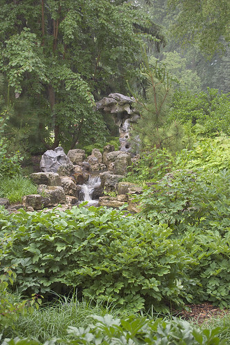
Although I enjoy hiking through forests, I really ought to leave the camera at home: I might take dozens or a hundred photos and none of them are keepers. I ought to stick to architectural photos, for they say I'm good at those. Taking forest photos, for me, is a pointless, futile exercise. For example:

Bee Tree County Park, in Saint Louis County, Missouri, USA - Mississippi River trail under forest canopy

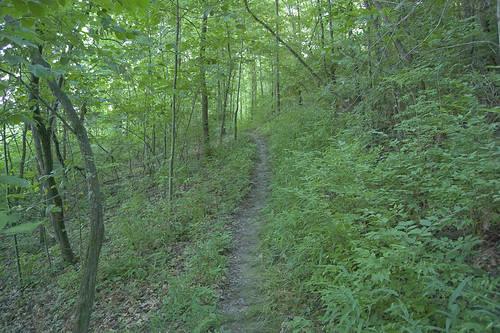
Yeah, it is green. A bad photo. And worst of all, for me, it doesn't look like how I remember seeing it. This was an awesome scene — even though it was an hour before sunset, this stretch of the trail was very dark, and quite mysterious. I pointed the camera, and this is the result. Not a keeper.

Now, I'm sure a creative digital artist could make something of this, but I'm not creative. I just like straightforward image corrections, according to the school of Dan Margulis. While perhaps I could just fiddle with the Adobe Camera RAW settings, or start applying curves in Photoshop, I would much rather start with more certain things.

We have two facts to work with:  the scene was very dark, and the scene does not look like how I remember seeing it. Most specifically, the green foliage was not, to my eyes, a bright yellowish green, as seen here; the foliage was darker, yet distinct, maybe a bit bluish green.

Cameras are designed to approximate human vision in broad daylight. As lighting dims, human vision has special adaptations for seeing in the dark. This phenomenon is called the Purkinje effect, and cameras do not correct for this.  We can expect that cameras will not record what we actually perceive in dim lighting.

Click to see my first article in this series: Photography in Low Light, part 1: The Purkinje Effect.

As light dims, the eye perceives blue things to be relatively brighter, while red things darken considerably; eventually, we can no longer see color, but just shades of gray. The scene above was very dim; I estimate that a sunny day is about 1800 times brighter! Certainly, the Purkinje effect was very active, and so perhaps there is a Purkinje correction that we can apply to improve the image.

In my previous article, I naïvely assumed that boosting the luminance contribution of the blue channel to the image would approximate the Purkinje's effect, and while that seemed to work, it is not a good model of what happens in the eye. Here is my Purkinje correction, version 1:
  1. In Photoshop, duplicate the layer.
  2. Apply the Blue channel to the top layer, with Normal blending.
  3. Change blending of top layer to Luminosity
  4. Adjust opacity to taste.
But this is only part of the answer. Not only must we have more blue, but also less red. This correction also keeps the white balance the same, which may or may not be what we want.

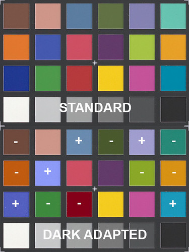
Our eyes do an automatic white balance under many circumstances: if the lighting is bright and fairly uniform in color temperature, our eyes will quickly adapt to the conditions and neutral tones will appear neutral to us. When we photograph the same scene, we had better do a manual white balance, otherwise very strong color casts will result. As an experiment, set your camera to 'daylight' and photograph an interior scene, either lit by incandescent or fluorescent lighting, and see just how much correction is built into the eye! Or conversely, set your camera to 'incandescent' (tungsten is the same as incandescent) and see what it looks like under daylight.

The latter correction, using a tungsten white balance or tungsten film, and shooting outdoors while underexposing, is an old cinematographer's trick for simulating nighttime during the day. Now, I don't find that trick particularly convincing, but it ought to give us clues to what may be happening in the eye.

Bee Tree County Park, in Saint Louis County, Missouri, USA - Mississippi River with daylight and tungsten white balance

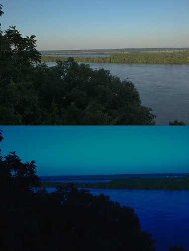
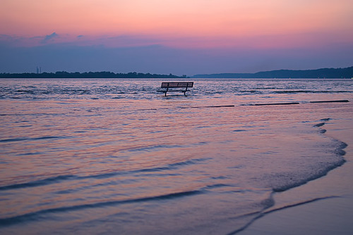
This is a shoddy special effect, and when I was a youth, I strongly rejected it. I don't like it now, but I am more tolerant of folks who make the most of limited resources — filming at night is more expensive than filming in the daytime, plus daylight shooting makes the cast and crew happier. But this exercise does tell us something: night vision is more blue and less red. (This photo was taken from the same trail, and is a view of the Mississippi River.)

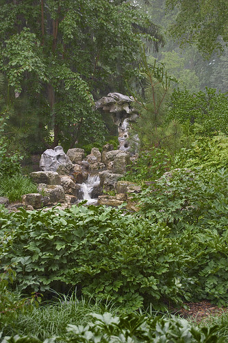
So let's try this on my initial example image. In Adobe Camera Raw, I set the white balance to Tungsten and reduced the brightness a lot. We'll call this the Purkinje Correction, version 2.

Bee Tree County Park, in Saint Louis County, Missouri, USA - Mississippi River trail under forest canopy - tungsten white balance

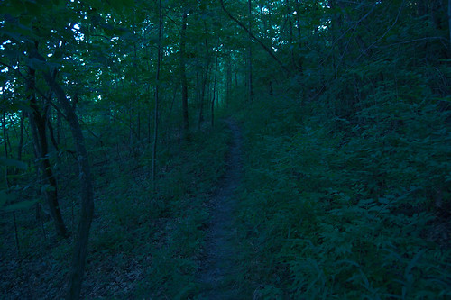
Yes, it is dark, and perhaps would be better viewed on a dark background. The foliage is now much less yellow, which is closer to how I recall seeing the scene. But this still not a good image, and is unconvincing to me.  A true Purkinje correction would shift some color tones around, and certainly would make reds darker and blues brighter, but the eye — I think — still attempts some white balancing.

I'm not really interested in taking a daytime photograph and making it appear as though it is night time, although that might be useful for other people. (The major flaw in this is the lack of bright artificial lighting in these photos, although I've seen some people actually paint-in lights in a rather convincing manner). Rather, I'm interested in making dim scenes look more as I remember seeing them.

I would like a photograph that implies a dark forest scene, while actually not being all that dark. I still want a photograph that can be easily viewed on a normal computer screen, while still representing the impression I had. Is this a realistic wish? Or not?
  1. This is not a realistic wish, because I do not have a full frequency spectrum for each pixel of the image: I only have three wide and overlapping average measurements of the spectra corresponding to the red, green, and blue channels. Were I to have this sort of thing, then the data is available to calculate the perceived color for most people under most lighting conditions, and this would theoretically solve my problem.
  2. We might be able to do OK given the data that we do have. We might not be able to measure the whole frequency spectrum of each pixel in the scene, but for a fact we can know what rough range of frequencies are not present in each pixel. Our results might not be perfect, but they may be plausible. I'll take this latter approach.
When lighting is dim, we see more blue and less red.  So, I duplicated the image, and applied the following channel mixer to it:

Channel Mixer settings - Purkinje correction

This makes a monochrome image that is strongly influenced by blue, and not at all influenced by red. I am more certain of the red setting than green or blue, however.  I added this on top of my original image, in luminosity mode, added a bit of contrast, reduced opacity, and this is the result:

Bee Tree County Park, in Saint Louis County, Missouri, USA - Mississippi River trail under forest canopy - Purkinje correction

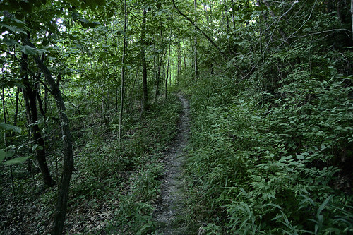
Not perfect, but I think it is more interesting and closer to what I remember seeing. This looks better than other methods I've tried.

This is the Purkinje correction, version 3. Next I’ll be interested in how white balance in the eye is changed by brightness.

UPDATE: Using the Channel Mixer tool in Photoshop, I was able to more closely mimic the eye’s color response in dim lighting due to the Purkinje Effect.  See the article Examples of Color Mixing.

Monday, July 19, 2010

One Easy Rule for Quality Images

MANY PHOTO hobbyists, if they take pictures with one of the very many consumer compact cameras, soon ask for advice on how to improve their picture quality.

Admittedly, many photo faults are hard to describe, unless you know what to look for — certainly I know that from experience. But I constantly hear complaints that photos are fuzzy and grainy.

Initially, there seems to be a belief that something is wrong — either with the photographer himself or perhaps the camera isn't working right. Well, yes, maybe. Simple problems like camera shake are easily overcome, and learning how to set the camera properly will improve image quality. But even excellent technique still ultimately gives poor quality results: the images have a certain irreducible amount of fuzz and grain. Our eager beginner realizes that the problem is with the camera, and seeks to upgrade.

Then comes the agonizing part. Should I get Canon, or Nikon, or Sony, or Olympus, or Pentax? Something else? Ought I save my money to get a Leica? Then what lenses should I get?  Is is true that prime lenses are better than zooms? Should I get a 35mm or 50mm lens? Is f/1.4 maximum aperture better than f/1.8? What are the sharpest lenses? How many megapixels should I get? Are off-brand lenses as sharp as manufacturer's brands? Which camera model should I get? Should I buy new or used? Should I wait until the new models come out? What will give me the best image quality?

Some photographers assert that the camera does not matter, that any camera, used properly, will produce good results. The important things, they claim, are composition and subject matter. This is undoubtably true — but the camera acts as an intermediary between artistic vision and the material world as photographed. The medium used has a great effect on how the viewer perceives the final artwork; the medium used can be so jarring as to even overwhelm the purported final purpose of composition and subject. We see this in Lomography, where the photographer intentionally uses poor-quality cameras and ignores camera technique to achieve a very specific low-fidelity look. But does that ‘look’ serve the higher purpose, or is it an end in itself?

(Note: much contemporary emphasis on studying the media itself rather than the content of media, is due to the pioneering studies of Marshall McLuhan; although this study is worthy in itself, in my opinion, we need to re-emphaize content while not discounting the medium. A photographer who spends too much time contemplating the meaning of photography at the expense of higher things may have images that suffer in quality.)

But consider the fact that a single fuzzy, grainy photograph of a dear loved one is of vastly greater importance — to the lover — than a gallery of even the most finely crafted art photographs. As Chesterton wrote, “if a thing is worth doing it is worth doing badly.” But some subjects, out of worthiness and justice, ought to be portrayed in a better way, although a poor image will suffice.

Inexpensive compact digital cameras have a low signal-to-noise ratio, that is, much of the image as delivered consists of artifacts that are not present in the scene photographed. We perceive this noise as fuzziness and grain. We may see a certain blocky quality of the pixels if we view the image close up: this is due to high lossy JPEG compression often found in compact cameras. Also, consider that many low-end cameras include aggressive noise reduction — this invariably results in the destruction of detail.

It is understandable that photographers would want to get rid of this extraneous noise and deliver a clearer final image, a picture that is more faithful to the subject of the photo, a picture that looks sharper and cleaner.

There is basically just one easy rule for quality photography: a bigger sensor means better quality.

Many factors go into making a quality image, but the overwhelming quality advantage goes to the larger sensor. Many problems simply fall away when the sensor size is larger. First and foremost, optical quality becomes less of a concern when the sensor is big: you just don't need that good of a lens when it delivers an image over a larger surface area. Sharpness is a given when you use a large sensor. The problem of packing too many pixels in a small area leads to the problem of noise, and a large sensor with big pixels will have very low noise.

Within the market of inexpensive consumer cameras, we see sensor sizes ranging from less than 2 square millimeters to over 360 square millimeters. We can expect image quality to be roughly proportional to surface area.

500px-Sensor_sizes_overlaid_inside.svg
Original image source and attribution: en.wikipedia.org/wiki/File:Sensor_sizes_overlaid_inside.svg

Good image quality is easy to find and is low in cost, as long as you are willing to use a larger camera. Any DSLR-class camera will deliver far better image quality than a typical compact camera, since they all have much larger sensors, as well as inherently better lenses and other incidentals.

Well, some photographers insist that they want to improve their image quality, but only in a compact camera. That is tough. There are some new cameras that do offer larger sensors in a compact case — but these are often at extreme cost. Good quality can be found in slightly larger, and much more economical cameras. You just have to be humble and accept the compromise of having a slightly larger camera.

By sensor I also mean film. Chemical photographic technology is nearly two centuries old, and is very highly refined. The image quality that can be delivered by a used 35mm film camera is quite impressive, and there is no comparison when you use medium or large format film. Film cameras are inexpensive, but are less convenient than digital. Large format cameras are extremely inconvenient, but also deliver unmatched results.

Film cameras are inconvenient, but can deliver superior results. We can likewise capture extreme quality images with even cheap digital cameras if are willing to be inconvenienced.  By taking multiple overlapping photos of an object — but only a static object, unfortunately — we can simulate an arbitrarily large camera sensor by fusing the images together on the computer.

Friday, July 16, 2010

Photography in Low Light, part 1: The Purkinje Effect

SOME EMPIRICAL observations:
  • I've long found that my photos taken under heavy overcast skies were disappointing. None of my standard techniques produced an attractive image.
  • When I take photos at dusk, finding the right white balance is difficult.
  • Exposure changes drastically at dusk, even though it doesn't seem to get dark so fast.
  • Finding the right white balance under incandescent illumination is easy.
In 1819, the Bohemian medical student Jan Evangelista Purkyně would take long walks outdoors in the early morning hours. He noticed how the quality of color changed as the sky got brighter. He wrote:
Objectively, the degree of illumination has a great influence on the intensity of color quality. In order to prove this most vividly, take some colors before daybreak, when it begins slowly to get lighter. Initially one sees only black and grey. Particularly the brightest colors, red and green, appear darkest. Yellow cannot be distinguished from a rosy red. Blue became noticeable to me first. Nuances of red, which otherwise burn brightest in daylight, namely carmine, cinnabar and orange, show themselves as darkest for quite a while, in contrast to their average brightness. Green appears more bluish to me, and its yellow tint develops with increasing daylight only.
Purkyně discovered that the human eye has two systems of capturing light; one adapted to bright lighting, and another for dim conditions. Undoubtably, this phenomenon was already well known (if but subconsciously), but he wrote down and publicized his discovery. This change in human color perception in dim lighting is now called the Purkinje effect. (Note: there are other ways his name is spelled, including Purkinie, Purkynje, and Burkinė)

Certainly, digital cameras do not model human vision in low light.  As light dims, the eye becomes more sensitive to the bluer wavelengths of light, due to the presence of blue-green sensitive (and red-blind) rod cells. No similar mechanism is found in cameras. Invariably, photos taken under very dim light do not match the color that is actually seen. Using a color calibration target under these conditions will certainly be disappointing if you want to reproduce what you actually see.

This leads me to photographic intent. Sometimes, I want to record the colors and brightness of the various objects in the scene in a way that faithfully preserves their relative tones, while also subtracting out most of the variation of lighting. This is perhaps the most objective way of recording a subject, and this kind of flat uniform lighting is often found in product shoots, or in the exposure blending techniques I use when taking architectural interiors.  But other times, I want to record a scene that is faithful to how I perceived it, and invariably this problem crops up under dim lighting outdoors. Very much is made these days of subjectivity in art, however, many phenomena are what I like to call objectively-subjective: yes, subjective human vision sees things differently than a machine, but this subjective impression follows objective laws.

I was recently at the Missouri Botanical Garden in Saint Louis, Missouri, USA. Usually a beautiful place, I was trapped under shelter during an intense downpour, and during the rest of my time there I experienced mainly heavy overcast skies. From experience, I learned that flower pictures taken under overcast don't look so good to me, and so I turned my camera to other subjects.

Missouri Botanical Garden ("Shaw's Garden"), in Saint Louis, Missouri, USA - waterfall in Chinese Garden - uncorrected for Purkinje effect

This is a particularly awful photo of a waterfall in the Chinese garden, one of many terrible photos I took that day. Although you can hardly tell, it was raining during this photo, and was also quite dark. How dark? I estimate this was about 1/200th the amount of illumination that is found on a sunny day — the kind of illumination you'd expect to find during dusk, when Purkyně's effect is at work.

I didn't want to waste that day of photos, and wanted to improve them somehow. Thinking about why the photos looked bad, I noticed that the vegetation seemed to be too yellow, bright, and flat compared to how I remembered seeing it. Now the white balance on this image, measured by the camera, is actually biased towards blue, and so a perfectly white balanced version of this would be much yellower. Blech. Generally, faithful white balance correction under overcast skies looks bad, often because of yellow vegetation.

I knew that the eye becomes more sensitive to blue light as lighting dims, and I wondered if there is some method that would boost the images's sensitivity to blue light, while not changing the colors. There are several ways of doing this in Photoshop. Here I duplicated the layer, applied the blue channel, and set that layer mode to luminosity and reduced the opacity; this would simulate, I thought, greater sensitivity to blue light.

Missouri Botanical Garden ("Shaw's Garden"), in Saint Louis, Missouri, USA - waterfall in Chinese Garden

Ah, a bit better. I think the tones on the vegetation look more like I remember seeing them; darker and less apparently yellow, as well as displaying more tonal range in the leaves. This is an ad hoc method, but I think it at least somewhat models human vision, and in my opinion it does improve the image. Using this method — let's call it the Purkinje correction version 1 — I was able to rescue a number of other photos taken that day; and you can see them here.

I think that this kind of correction may help rescue floral pictures taken under overcast lighting — which I usually find disappointing. Clearly, besides modifying the brightness contribution of the various color channels, we need to do some modification in white balance, not accepting the measured white balance at face value; certainly these two phenomena are closely related.

There ought to be an experimentally determined Purkinje correction that would work over various luminance levels by variably adjusting the brightness contribution of the red, green, and blue channels. As lighting dims, red would turn dark while blue would be bright, and ultimately, under very dim illumination, the image would become black and white. Now, cameras don't have sensors that mimic the color response that is found in the rod cells; perhaps some combination of green and blue would act as a good estimate — I just don't know. Perhaps some kind of filter is called for — Cinematographers have done that for years with Day for Night (or nuit américaine, “American night”) filters, although I don't find this technique convincing. This correction, if done accurately, would be useful when you want to record your impressions of a scene in dim lighting.


When trying to understand something, it is often good to contemplate it before going to bed, and then sleep on it.  Maybe in the morning you'll have some fresh insights. I thought that I would double-check my wild guess about correcting photos, and continue thinking about it the morning.

I thought that perhaps a quick experiment was called for. I got my handy X-Rite ColorChecker Passport and viewed it under semi-controled conditions after spending some time in darkness. My white-balanced computer monitor in the other room gave off a dim white light — but which appeared bluish to my eyes — and I viewed the ColorChecker's colored squares. For each color, I attempted to match the luminosity of the patch with the neutral squares on the bottom. Here are my rough results:

dark adaptation

I used as a scale the bottom gray squares, assigning 0 to the darkest and 5 to the brightest, and then attempted to match the luminosity of each color square with the gray ones.  The brightest square was the yellow one, with a value of 4, and the darkest one was the red square, with a value of 0.5. I adjusted the brightness of the color squares to match the numbers I wrote down. For a quick aid in showing the differences, I put in a plus or minus sign to indicate if the color was brighter or darker than the standard.

Using both the light meter on my camera, and my old Gossen Lunasix handheld meter, I estimate the luminosity was somewhere between .6 to 1 Lux — or two to four times brighter than the illumination of the full moon in mid-lattitudes. At this light level, I was able to perceive all the colors without problem.

As found by Purkyně, the blue tones are the brightest, and the red and green tones were darkest. Purple tones and the caucasian skin tone patch, along with yellow, remained unaffected in luminosity. That yellow appeared to be unaffected leads me to reject my first version of the Purkinje correction, seen above, as being too naïve: that method reduces pure yellow tones strongly.

Now, there is an oddity in human low-light vision. Our dark adaptation is only sensitive to blue and green light — red is ignored.  So we can use bright red lights at night (with pure red L.E.D. lighting being the best), while still preserving night vision. Since the red and the dark-adapted tones are so vastly different in measured brightness, they would overwhelm the capabilities of modern digital cameras, and so the perceived color and tones of this scene would not be easily captured. I would ignore this phenomenon unless we do some very clever and yet-to-be-invented High Dynamic Range techniques.

I took the ColorChecker into my room, and drew the shades, making the room very dark, being illumined only by dim yellow street lighting filtering through the curtains, and the red glow from an alarm clock. After time for dark adaptation, I was only able to perceive the two brightest patches on the neutral scale, and a few bluish patches — all the rest were dark gray and indistinguishable. I could not perceive any color on the ColorChecker. I did find that the red alarm clock light did not harm my night vision. There are fewer rod cells in the center of vision, and so I could see objects better if I did not look directly at them. Also, the rod cells have a much larger time lag for receiving a signal — we are after all, actually seeing individual photons of light; but the red alarm clock light is seen with normal color vision. Moving my head while looking at the red clock was amusing — the numbers would appear to shift around relative to the dim objects around it.

While it is fun doing some experimentation, there is plenty of quality research regarding human vision in low light. Our problem is to identify the principles and figure out some way to apply them to photography.

Click to see the second article in the series: Photography in Low Light, part 2: The Purkinje Correction.

Monday, July 12, 2010

Fail

BEWARE! Memory cards for digital cameras can and do fail. To avoid problems, consider this:
  • Upload your photos to a computer every day, and more often if you are doing something critical.
  • If you are doing product shoots, like I did this past weekend, consider shooting tethered. This automatically sends the photos to the computer, either over a cable or via wireless transmitter.
  • Copy the photos to another hard drive, just to be safe. And copy them to DVD.
  • Occasionally reformat the memory card, using the format function found in the camera; this ensures a clean file structure on the card. This erases the photos on the card!
  • Wedding photographers, especially, use cameras that can write the images to two cards simultaneously.
  • Get software that can recover data from the memory card. This is not necessarily a good safety net, though, as I found out today attempting to recover data from a friend's card.
These may work for you:

I use Nikon Transfer software to copy photos from my camera. This is a free download from Nikon. If you keep the camera cable connected to the computer, you can configure this software to make uploads simple and painless:

Nikon Transfer

You can configure this to automatically save the images to a second location. Adobe Photoshop has a similar program that also works well.

Some tethered applications:
  • Nikon Camera Control Pro 2 Software offers tethered shooting for Nikon cameras.
  • Canon's EOS Utility, which comes with Canon DSLRs, has tethered shooting built-in.
  • Sofortbild is a freeware tethered shooting application for Mac and Nikon DSLRs.
  • A review of more applications can be found here.
PhotoRec is a a free data recovery program than runs on Windows, Mac, and Unix. There are a myriad of commercial products that do recovery also.

Canon EOS 1D series cameras can write to multiple memory cards simultaneously. So does the Nikon D3 series cameras. These are expensive, but because you don't want to get the bride angry, they are worth every penny.

Tuesday, July 6, 2010

Rule of Thirds?

SOMEONE ASKS ABOUT the significance of the Rule of Thirds, a simple compositional rule found in painting, drawing, and photography. Unless he is given proof, he thinks it is mere mythology, and so can be ignored.

Read the conversation here, on Digital Photography Review.

Flooding on Smallpox Island parking lot, at sunset, near Alton, Illinois, USA

Basically, the Rule of Thirds states that the major compositional elements of an image ought to be placed one third of the way between the edges of the image.  For example, the horizon in a seascape or sunset ought to be a third of the way from the top or bottom. What is the justification for this?

The principles of classical harmony are of great significance in music, design, and architecture, and were explicitly used from remote antiquity — and ended only with radical modernism.

I agree that much of the language associated with the rule seems to be excessively fuzzy, and purported uses of the rule often seem unconvincing. However, this does not mean that the rule has no merit, and certainly can be used where there are strong compositional elements that can correspond to it. Good composition can improve an image, and good composition often includes simple rules such as this one.

The argument for the rule can be made top-down or bottom-up. Certainly the use of simple ratios of small numbers — the basics of classical harmony — can be justified by mathematical means, especially when we consider the stability and order of harmonic systems and compare them to the instability and disorder of inharmonic systems. Also, we can consider human psychology at its lowest impulses, which seeks out good things for life via their implicit order. Certainly, artists who are revolutionaries produce jarring compositions — which violate the rules of classical harmony — to cause anxiety in the viewer, which proves the rule by its negation.

However, the rules of classical harmony do not state that the Rule of Thirds is an ideal. Rather, this system has a number of ratios, with 1:1, 2:1, 3:2, and 4:3 being considered the most pleasing, and with 5:4 and 6:5 following in value. Note that harmonious ratios are small - between 1 and 2, and are created by dividing one small number into another.

Artist and lecturer David Clayton, on his website The Way of Beauty, discusses this topic in his article, Using Boethian Proportion for Better Web Design. Clayton states that the common emphasis on the Golden Ratio — which is irrational and is not a ratio of small numbers — has only been considered important since the Renaissance, and is not directly involved in good proportion.

Unless the photographer has complete control over his subject, as in a studio, the photographer will likely have less need for classical harmony and the Rule of Thirds; rather, the subject itself is of greater importance. This does not mean that harmony is unimportant, but rather that it is of lesser importance and ought to serve the higher thing. Conversely, if an artist wants to represent the order and harmony found in the cosmos or a higher order of being, then the use of classical harmony is very important: this was commonly found in traditional non-representational abstract art which has been practiced since antiquity.

Ultimately, we ought not to merely promote rules, for this leads to legalism and its inevitable rejection. Rather, we ought to seek the meaning behind them. Here, both the ancient philosophers and modern scientists would agree.

Monday, July 5, 2010

What Does the Camera Really See?

X-Rite ColorChecker

Here is the familiar X-Rite ColorChecker, a handy color calibration target, which despite undergoing many name changes over the years, is well-supported by the photography industry. I took this as a RAW image, and processed it in Adobe Camera RAW (ACR) using a custom profile generated from this image. The colors look pretty good. I adjusted the exposure and black point a bit in ACR, so that the darkest and lightest neutral patches have their correct luminance value. I took this image under incandescent lighting, with an estimated color temperature of 2900 Kelvin; the camera measured the white balance from this card, and it looks quite accurate.

Human color vision is poorly understood, being subject to many conflicting theories, but this is understandable since biology is inherently messy. Ultimately we are subject to one of the greatest puzzles in philosophy: “Know Thyself”, which is found in Plato and other Classical literature. As knowledge of a thing is not a part of the thing itself, self-knowledge is problematical at best. But even if we plead ignorance about our own vision, we do have certain knowledge that digital cameras do not model human vision very well.

Digital cameras are made to be inexpensive and easy to mass-produce, and produce images that conform to widely-supported industry standards. These are not designed by biologists, psychologists, or philosophers, but rather by electrical engineers who follow the practices and principles of their profession. This is as it ought to be, but we also ought to expect that cameras won't record things precisely as we remember seeing them.

500px-Bayer_pattern_on_sensor.svg

This illustration is originally from Wikipedia and is not my own work. Click here for source and attribution.

This is an illustration of the Bayer Array, the most common method of distributing light sensors on a silicon chip. Individual sensels, specifically sensitive to red, green, and blue light, are systematically arrayed across the silicon chip. Dedicated computer algorithms, found in the cameras' embedded computer, analyze adjoining sensels to estimate the color and intensity of light that falls on each spot. All of these taken together comprise the final image — after some additional processing.

Note that there are twice as many green sensors than either red or blue sensors. More sensors mean better detail and less noise in that channel. This is justified by the fact that human vision is most sensitive in the green region. Generally speaking, the green channel typically has the most natural looking luminance, while the red channel tends to be too light and the blue too dark. After all, luminance is more important than color.

Let's take another look at the image above, but showing it more as the camera actually recorded it:

X-Rite ColorChecker - UniWB

I processed this using the excellent free Macintosh software package, RAW Photo Processor. I developed this RAW image to closely represent what was actually recorded by the camera. Here I used UniWB as the white balance, which give us the colors as actually recorded without adjusting for the color of the light.

Because half of the camera's sensors record green light, this image has a green color cast, and since this photo was taken under incandescent lighting (which is more yellow and less blue than daylight), it also has a yellowish color cast. Either the camera's computer, or Adobe Camera RAW as in the top photo, will adjust the RAW image so that we get roughly equal red, green, and blue values on each of the neutral patches seen on the bottom row of the X-Rite calibration target.

The image is also quite dark compared to the corrected version. This is because the camera is linearly sensitive to light, and can only faithfully capture a rather limited range of light levels in one exposure, unlike the human eye. Typically, a digital camera will apply a Gamma correction to the raw sensor data to generate the final image, giving us plausible mid-tones. In RAW Photo Processor, I used a Gamma value of 1, which does no correction: digital cameras usually use a Gamma value of 2.2, and accordingly this is the default setting of the program.

So the camera does a lot of processing behind the scenes to generate our final image. I loaded the greenish image into Photoshop to see what kind of curves are needed to produce the corrected image. I adjusted the Photoshop curves so that the adjusted values of the neutral patches roughly matched the published values for this target. This is what I got:

X-Rite ColorChecker - UniWB - adjusted with curves

The neutral targets look fine, but the colors are a bit off, especially red tones; obviously there is additional image processing going on: see the article Examples of Color Mixing.

Here are my curves for this image in Photoshop:

Curves applied to UniWB

My oh my, there is a lot of adjustment going on in this image.  The diagonal line on the graph indicates the line of no adjustment; whatever is below the line has been brightened, and whatever is above the line is darkened.  The steeper the line, the more adjustment. We can deduce a few things from this graph:
  • The photo was a bit underexposed, since all the color channels needed to be brightened.
  • The blue channel is severely deficient, and needed a very steep curve.
  • Incandescent lighting tends towards the red color. If we didn't have two green sensels for each red one, the red channel would have been brighter than the green channel.
  • Getting good white balance does not guarantee that colors are correct.
The blue line was so steep that Photoshop did not offer enough precision to adjust the curve accurately! Were I not trying to illustrate this point, I would have first adjusted the levels coarsely, and afterwards adjusted the curves more precisely.

We ought to be worried about the steepness of the lines. Increased contrast — that is, steep curves — means increased noise. Brightening is a form of amplification, and amplification necessarily increases noise. For this reason, I recommend using Photoshop in 16 bit mode when applying severe curves to images, and also using RAW instead of JPEG images if much processing is foreseen, for both of these methods retain more information about the image.

However, this also illustrates that severe curves are applied to the raw sensor data within the camera itself, which increases noise. Now, this image came from a Nikon D40, which is known for having low noise — even at ISO 1600 as was used here — and I did perform slight noise reduction over the image. However, under more extreme conditions, like dim low-wattage bulbs, or with an inexpensive compact camera, we can expect lots of noise in the blue channel under incandescent lighting.

For critical work, this problem is lessened by using low ISO, shooting in RAW, using a tripod, and blending together multiple exposures so as to get an excellent blue channel. Or alternatively, use lots of high quality supplemental light, such as from strobes.


I am of divided opinion as to effectiveness of the Bayer array. It does not appear to provide optimal performance under the any of the most common lighting conditions, nor does it appear to be an optimal compromise offering good average performance. I tend to think that blue light, under almost all conditions, is under-measured by this kind of sensor. I may be wrong because illuminance — which is primarily measured by green light — is more important than color, and so perhaps a camera sensor deserves to have more green sensors. I just don't know. The Bayer array has the advantage of being compact, as it has a repeating 2x2 pattern, which is more compact than every other proposed array and so will have the greatest color accuracy for each final pixel of the image. However, we ought to consider the Foveon sensor, which records full color at every sensel, and so does not display any demosaicing errors as found with the Bayer array and its rivals.

In dim lighting, human vision becomes even more sensitive to blue light, and so diverges greatly from what is seen by the camera, but that is a problem best considered in another post.

Saturday, July 3, 2010

Opponent Color

AN OPTICAL ILLUSION: Stare at the white X for about a minute, then look at the black X below.

US flag - opponent colors

Engineers, when they want to precisely measure something, will often measure the difference of output signals between two separate sensors. This is often done with pressure; for example, one pressure gauge will be at the bottom of river, and another will be nearby in the air, the difference between these pressure measurements is proportional to the water level in the river. This differential measurement eliminates the atmospheric pressure, which is an irrelevant factor.

Human color vision seems to operate using this kind of differential measure. While both cameras and the human eye have various kinds of sensors, some more sensitive to red, others green, and some others to blue light, the eye likely responds to differences in levels between the various kinds, whereas the camera merely records the direct red, green, and blue levels.

The optical illusion above illustrates a number of factors:
  1. The afterimage shows that the eye has either a kind of persistence of vision, fatigue, or some other process that modifies our perception of color for a while after we look at something. This is by no means a well-understood process controlled by a generally-accepted theory, so plenty of research can still be fruitfully done. The phenomenon seen here can be intensified with those who suffer from migraine headaches.
  2. This illustrates the opponent process theory of color vision. The cyan, black, and yellow flag briefly turns into an afterimage of red, white, and blue. Opponent colors are those that cancel each other out — such as yellow and blue — and do not mix into an intermediate color. In the afterimage, we see the opponent colors of the original hues. The phenomenon of opponent colors derives from the differential measurement of color. I suspect that the optical illusion we see above is due to the eye's automatic white balance: when the general lighting in a room changes in color, the eye partially or even entirely adjusts to that color, allowing us to still accurately identify colors. Perhaps when we stare at the reverse-image flag, our eyes adjust the white balance: and when we look away, that old white balance persists for a short period, generating the illusion. Digital cameras also have an automatic white balance, which often do a very poor job; film cameras need to have special color film for each lighting condition — or filters over the lens — in order to deliver good white balance.
  3. The opponent of red is cyan. Many authorities still state that green is the opposite to red, but that is likely not true. The various historical theories of color often conflict, and artists' color wheels, which ought to model the opponent color process, are often inconsistent. These older theories differ in their definition of the primary and secondary colors. Newer research indicates that the primary opponent relationships are red versus cyan, green versus magenta, and blue versus yellow.
  4. It is the Forth of July weekend: may my American readers enjoy a happy Independence Day!