DO YOU THINK that your photography is good? Do other people — people that aren't your friends or family — think that it is good? How would you feel if one of your photographs found its way into a junk shop or a flea market, and someone purchased it only because of its frame?
Ultimately, we must be humble enough to realize that no matter how much
artistic vision and effort we put into something, a buyer simply might
like our photograph only because it is nicely framed.
When I did a Google search for the phrase “I bought it for the frame,” I got over ten million search results, with many people telling of some print or painting they found at a junk shop, but which they discarded, simply because they liked the frame. Now we mustn't jump to the conclusion that the frame-buyers are ignorant, tasteless philistines. Perhaps your photograph isn't all that good. Perhaps the frame is really good. [NOTICE: I must admit to having a bit of anxiety whenever I go to a book fair or used book store, thinking that I might find one of my own books being sold cheap.]
Apparently, according to the same Google search, lots of people also buy bicycles only for their frame. They plan to strip the frame of all the seemingly more critically important stuff that actually makes the bicycle work, such as the wheels, gears, and chain. Certainly these working components are more important than the frame? Doesn't the frame just sit there? The answer is that in many respects these components are more important, and the components that just happen to be attached to the frame may not be all that good or fitting for the purchaser. The brakes and tires on a bicycle become gradually worn with use and slowly become less effective over time, and a bicycle rider can choose to replace them whenever it is convenient. But a bicycle frame must be perfectly durable, and it must not ever fail during use, for it cannot be repaired in the field: a frame does not slowly lose its functionality over time, for the welded joints on a frame are either rigid or are broken with no significant intermediate state. A frame, of course, can be repainted as needed.
So what kind of framed photograph would be more valuable to most any given person: an excellent portrait of someone else's child, or a cheap snapshot of their own child? We ought to realize that prints and paintings are more important than a frame, but they tend to be more personally important. If someone buys a framed print at a flea market and then discards the original print, that is because their print is more important than the original. Likewise, someone may purchase a used bicycle, but they might replace the seat for one that is more comfortable for them; they might replace the brakes because they are worn, but if the frame isn't good, they won't buy the bicycle.
A photograph or painting may be chosen because of a particular style of a room, or because of a particular mood expressed, or its use of particular coordinating colors. The subject matter may spark the imagination of the buyer, or the subject may invoke particular memories or devotions. An image may be discarded because it no longer fits the decor of the room, or it may invoke unpleasant memories: maybe it is faded or worn, or it is no longer interesting, or it is out of style.
Now, there are some artists, particularly in the past, who strove to make images that have a more universal, timeless character, that expressed objective beauty and the sublime. This is rare today because modernity rejects the eternal and universal in favor of that which is transitory and cheap. This means, perhaps, that contemporary works are more prone to being quickly discarded.
People may buy a print because of its frame, but the frame is not bought for its own sake, no matter how well it is made or decorated, but because it is ultimately intended to enclose a print or a painting. I know of no museum or gallery that is dedicated to the presentation of frames as objects of art (although this might be an exception), but there are vast numbers of merchants — including art galleries — that sell frames in a wide variety, and the cost of these frames may equal or exceed the cost of the image that is presented within it.
Frames are works of art in themselves (as is anything intentionally well-made by man's intellect), but their purpose is mainly in relationship to the fine art contained within them. The word ‘fine’ in ‘fine art’ is related to Aristotle's understanding of the “final cause” or ultimate purpose of a thing. The final cause of a frame is to support, display, protect, enhance, and delineate the work of art contained within it, as well as provide a visual transition between the work of art and its location. The buck stops at the image contained in the frame, as it is the final cause of the art: the job of art is complete and the viewer's job of looking at the image begins. But this does not mean that the frame is unimportant, for it has important functions, but it is subservient to those things, the images, which are greater. Even though we have differing opinions on what makes a good print or painting, we should not be surprised that most of us would largely agree on what what makes a good frame, for frames have a more definite purpose.
Getting a good understanding of composition is difficult, because it involves human psychology. The many proposed rules of composition seem to rest on shaky theoretical ground, and many of the supposed examples of the use of the rules are unconvincing. However, one element of composition is concrete and objective, that being the framing or the specific crop of the image. See the article Composition, Part 1 - the Frame for a more in-depth discussion of this. The objective framing of an image, due to a specific crop, can be be a powerful tool of composition if used well, and bad framing can certainly harm an image.
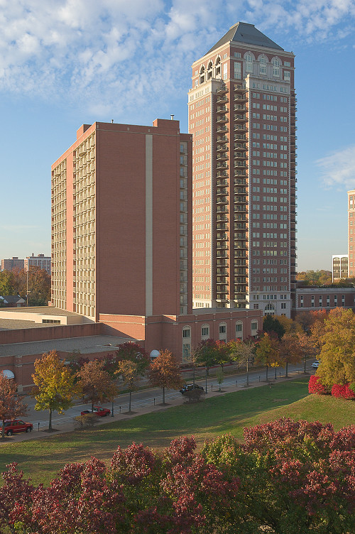
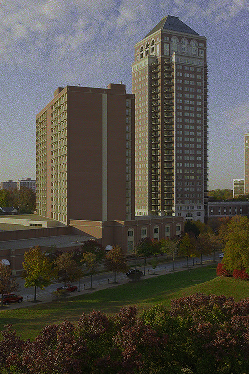
As the vast majority of images are rectangles, this suggests the good use of harmonic proportions between the length and width of the image with the proportions of the matting and size of the frame. The common standard print, matte, and frame sizes do express proportions that harmonize well with each other. Attempts at making custom frames and mattes for a non-standard print size will generally be expensive and error-prone. Custom sizes may also look awkward if the maker does not apply the mathematics of proportion ahead of time: for example, it may be possible to harmonize an image with a large aspect ratio within a frame with a smaller aspect ratio if the margins or matting are well-chosen, but if the ratios are not chosen well, the final object may look ridiculous, cheap, or inartistic.
For all these reasons, I think that it would be prudent if photographers give serious consideration to framing, since, after all, nearly every print that will be displayed on a wall needs a frame, and for the simple fact that a purchaser may buy your print because they like its frame.
Tuesday, November 27, 2012
Monday, November 12, 2012
Announcement
YOU CAN NOW PURCHASE my photographs online:
http://msabeln.zenfolio.com
Please see my announcement here.
http://msabeln.zenfolio.com
Please see my announcement here.
Friday, November 2, 2012
Ancient Wisdom about Photography
SOME PHILOSOPHY, often paradoxical, for your enjoyment…
A bad camera can be the best tool for making a good photographer.
The best photographers can make the best photographs with even poor cameras. For this reason, the best photographers use the best cameras.
A poor photographer blames his camera; a good photographer blames himself. For this reason, good photographers use cameras they cannot blame.
Many good photographs are due to luck. Good photographers are luckier than poor ones.
You must not care what master photographers think of your photography, for they are prone to envy. You achieve this by carefully following the advice of master photographers.
Any person with minimal aptitude can become a good photographer if they spend thousands of hours learning. Some people have a natural talent for photography; they develop this talent by spending thousands of hours learning.
If you desire to be creative above all else, then your photographs will have a boring sameness. Do what has been done thousands of times before, but strive to do it better, then you will find yourself to be creative.
A bird song may be pretty, but the song is not art. Find inspiration in the work of the masters, but strive to be a master in your own right.
The business of photography is not the art of photography, for the art of selling a photograph is different from the art of making a photograph.
You have mastered photography when it is graceful, effortless, and joyful. Your tools ought to appear to be a natural extension of yourself.
Cameras change and technologies change, but art never changes, for art is inside and flows from above.
Being a good photographer does not mean that you are a good person. It simply means that your photographs are good.
—
[Post-processing is the work done on digital images using a computer image processing program such as Photoshop; also, this will include traditional darkroom work for photographic film.]
All photographs are post-processed; one just has to understand the meaning of post-processing.
If you capture a good image in the camera, then that image needs no post-processing. In order to do good post-processing, you need to capture a good image in the camera.
To master photography, you must master post-processing. You have mastered post-processing when it appears as if you did not use post-processing.
You must master Photoshop by mastering its functions. You master Photoshop’s functions by never using most of them. Likewise, the worst Photoshop books are those that explain all of its functions, and the best are those that explain only a few.
In order to post-process a photograph of a subject, you must bring out the subjectness that the photograph failed to capture.
To sharpen a photograph in Photoshop, you should not use the Sharpen function, but rather use the Unsharp function.
To achieve utter freedom and creativity in post-processing, you must enslave yourself to the logic and mathematics underlying post-processing.
The sRGB color space is worst color space because it represents the narrowest range of colors of any standard RGB color space. For this reason, sRGB is the best color space to use in post processing.
Do not trust your eyes, for they deceive you, and so you must measure the color numbers to ensure that they are good. But you must trust your eyes, for if the image does not look good, then the color numbers must not be good.
You must spend thousands of hours post-processing images in order to post-process images quickly.
If you must ask if Photoshop is the right post processing software for you, then Photoshop is the wrong software for you.
Wednesday, August 29, 2012
Composition in Landscapes and the Photography of Marcin Sobas
SOME INSPIRATIONAL LANDSCAPE photography, from Polish photographer Marcin Sobas, can be found here.
Sobas has lately gained a lot of positive attention for his remarkable landscapes of Moravia and Tuscany.
A while back, I made an effort to learn why some landscape photography has great appeal, and I attempted to identify the common characteristics of great landscape images. Now, there is no end to advice that can be found on the subject of landscapes, but I desire to discover those characteristics that are more certain and definite. Some of my observations can be found in the article Composition, Part 2 - Composition and Subject in Landscape Photography.
From my analysis of highly-regarded landscape images, I found some characteristics that nearly all of them share. These ought not be considered unbreakable rules, nor should this list be considered exhaustive, for they are not the only things that photographers consider; rather this is simply what I saw, and there could be great landscapes that are otherwise.
1. Almost by definition, a landscape ought to have a superhuman scale. Good landscapes depict scenes that dwarf the human person, and so have the characteristic of sublimity. The sublime describes “a sense of awe, grandeur, or greatness, something that is lofty to an extreme degree, so much so that it dwarfs the human person in insignificance.” See the article On the Sublime for more details. A sublime scene may or may not be a beautiful scene, but it certainly has to be big, and Sobas’ images show rather big scenes that are sublime and beautiful.
Imagine taking a photograph of a small garden; the flowers may be beautiful, but the scene will likely lack sublimity, because the garden is of human scale. This problem of scale concerned the designers of the Victorian-era Tower Grove Park in Saint Louis, Missouri, USA, and they knew that the sublime would not be possible in their park. The results are pretty, but not lofty, as I show in the article here.
2. Unusual use of lenses can make for better landscape photos. Beginning landscape photographers often desire ultra-wide angle lenses so as to “get the whole scene in.” But consider that wide angle lenses not only get in the whole scene, but at the same time they make distant objects recede in size and scale, taking away the impression of sublimity. Wide angle lenses instead emphasize the foreground, which may include objects of a more human scale, while reducing the grand vistas of the background.
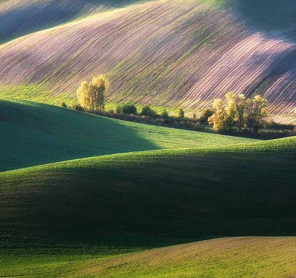
Instead, Sobas often uses a telephoto lens, a Canon 70-200mm f/4 L-series lens, which gives a horizontal angle of view of 18.2 to 6.4 degrees on his Canon 40D camera. This narrow angle of view provides foreshortening — making distant objects appear closer to each other — as we see with the hills in the photograph above. The use of a telephoto exaggerates the vertical dimension at the expense of perceived depth. Would the scenes have appeared as sublime if he had stood closer, and had used a wide-angle lens?
You may, however, consider the final size of your image and how close you will view it: if you are creating a panorama that will cover the wall of a room, then small detail becomes more prominent, and so a wider angle of view may not decrease the impression of sublimity.
Also note that Sobas often uses a high camera angle. Instead of just seeing one line of ridges, we can see multiple lines of ridges and hilltops, one behind the other, which increases the grandeur of the scenes.
3. Good landscapes are almost always taken around sunrise or sunset, or at night. I’m not saying that good landscapes can’t be taken at midday, I’m just saying that they typically aren’t. The lighting angle during the extremities of the day is low, and so shadows thrown are long, and serve to model the undulating terrain. In this way, early or late landscape photography is like using Rembrandt lighting for portraiture, which models the human face with shadow. Harsh lighting, like we find at midday, will often underexpose shadows or overexpose highlights; on the contrary, with the sun at a low angle, the sky acts as a great fill-in light. The attenuated orange light from the sun provides a good contrasting color with the blue of the sky, giving us far more color during the preferred times of day.
According to this interview, Sobas prefers cloudless mornings for his shooting. I’ve noticed that while sunsets are often pretty, the sky at sunrise is usually dull, but this makes for a better, more uniform light for this kind of work.
4. Unusual weather can help improve a landscape photo. Dramatic stormy skies and snow on the ground can turn an ordinary landscape into something more special. Sorbas likes foggy mornings to make his photos more interesting:
He recommends getting some knowledge of weather so as to predict the best times for taking photos. The Lawrenceville Weather website includes a fog forecast map for the lower 48 United States; I refer to this map frequently to find interesting shooting conditions. Also of use is The Photographer's Ephemeris, an application that calculates the angle of the sun; this can help to predict the direction of shadows, which may lead to better compositions.
5. Good landscapes usually have a full range of tones or color. Sobas subtly post-processes his images, and the final results do have a broad range of tones. The simple use of the levels tool, and saturation or vibrance — not done too strongly — can enhance a landscape photo without making it look overprocessed. Choosing the right subject, exposure, white balance, time of day, time of year, and weather conditions all contribute to getting good color.
6. Good landscapes typically have a unity and harmony, and avoid distracting details. A certain measure of abstraction works well. Again, many of Sorbos’images are so abstract that they, at first glance, appear to be paintings, but instead they are almost undoubtedly straight camera images with some mild postprocessing.
This is perhaps the most difficult part of landscape photography: what subject, what camera position, and what lens and cropping best suit the image? A good photographer ought to be able to view a scene, taking in both the subject as well as potentially distracting elements, instead of merely doing the same back home on the computer. Especially when an image is to be displayed at a small size on a computer screen, a large measure of abstraction is needed, more so than if the final image is larger.
7. Remember that photographs are made to be viewed by human beings, and adding a bit of human interest to an image may make a photograph more interesting to your viewers. Having a human in a landscape can draw attention to it, and in the best examples, can transform an ordinary landscape photograph into a dreamscape, deepening its emotional impact. From what I've seen, Sobas does not often include humans in his photos, but we do see buildings, boats, roads, and sometimes animals. I might add that most or all of these images depict landscapes that have been heavily altered by humans, perhaps over thousands of years, but in a harmonious way, and so they have an organic look to them.
8. Good landscape photos are usually made with good equipment and good technique. Because landscapes may not be as intrinsically interesting as a human figure, it takes extra effort to attract the eye. Journalistic style images can be rough, and that does not distract from them; indeed, a rough image may have a feeling of immediacy about it. Landscapes, on the other hand, are more timeless, and seem to call for more perfection.
There are any number of rules or principles used in landscape painting and photography, and the brief list above are merely my observations of what most good landscapes definitely seem to share. I haven’t mentioned commonly-cited principles such as the use of diagonals, leading lines, the rule of thirds, balance, avoiding subjects leaving the scene, the use of S curves, having a definite center of attention, and so forth, simply because these principles, in my mind, aren’t certain, or perhaps I simply don’t understand them well enough. Human psychology is complex, but some things are more certain than others; getting the basics right is more important than the subtleties. After knowledge, experience, and inspiration, comes more perfection.
 Ruins by Marcin Sobas |
Sobas has lately gained a lot of positive attention for his remarkable landscapes of Moravia and Tuscany.
A while back, I made an effort to learn why some landscape photography has great appeal, and I attempted to identify the common characteristics of great landscape images. Now, there is no end to advice that can be found on the subject of landscapes, but I desire to discover those characteristics that are more certain and definite. Some of my observations can be found in the article Composition, Part 2 - Composition and Subject in Landscape Photography.
From my analysis of highly-regarded landscape images, I found some characteristics that nearly all of them share. These ought not be considered unbreakable rules, nor should this list be considered exhaustive, for they are not the only things that photographers consider; rather this is simply what I saw, and there could be great landscapes that are otherwise.
1. Almost by definition, a landscape ought to have a superhuman scale. Good landscapes depict scenes that dwarf the human person, and so have the characteristic of sublimity. The sublime describes “a sense of awe, grandeur, or greatness, something that is lofty to an extreme degree, so much so that it dwarfs the human person in insignificance.” See the article On the Sublime for more details. A sublime scene may or may not be a beautiful scene, but it certainly has to be big, and Sobas’ images show rather big scenes that are sublime and beautiful.
Imagine taking a photograph of a small garden; the flowers may be beautiful, but the scene will likely lack sublimity, because the garden is of human scale. This problem of scale concerned the designers of the Victorian-era Tower Grove Park in Saint Louis, Missouri, USA, and they knew that the sublime would not be possible in their park. The results are pretty, but not lofty, as I show in the article here.
2. Unusual use of lenses can make for better landscape photos. Beginning landscape photographers often desire ultra-wide angle lenses so as to “get the whole scene in.” But consider that wide angle lenses not only get in the whole scene, but at the same time they make distant objects recede in size and scale, taking away the impression of sublimity. Wide angle lenses instead emphasize the foreground, which may include objects of a more human scale, while reducing the grand vistas of the background.
Instead, Sobas often uses a telephoto lens, a Canon 70-200mm f/4 L-series lens, which gives a horizontal angle of view of 18.2 to 6.4 degrees on his Canon 40D camera. This narrow angle of view provides foreshortening — making distant objects appear closer to each other — as we see with the hills in the photograph above. The use of a telephoto exaggerates the vertical dimension at the expense of perceived depth. Would the scenes have appeared as sublime if he had stood closer, and had used a wide-angle lens?
You may, however, consider the final size of your image and how close you will view it: if you are creating a panorama that will cover the wall of a room, then small detail becomes more prominent, and so a wider angle of view may not decrease the impression of sublimity.
Also note that Sobas often uses a high camera angle. Instead of just seeing one line of ridges, we can see multiple lines of ridges and hilltops, one behind the other, which increases the grandeur of the scenes.
3. Good landscapes are almost always taken around sunrise or sunset, or at night. I’m not saying that good landscapes can’t be taken at midday, I’m just saying that they typically aren’t. The lighting angle during the extremities of the day is low, and so shadows thrown are long, and serve to model the undulating terrain. In this way, early or late landscape photography is like using Rembrandt lighting for portraiture, which models the human face with shadow. Harsh lighting, like we find at midday, will often underexpose shadows or overexpose highlights; on the contrary, with the sun at a low angle, the sky acts as a great fill-in light. The attenuated orange light from the sun provides a good contrasting color with the blue of the sky, giving us far more color during the preferred times of day.
 Autumn ... by Marcin Sobas |
According to this interview, Sobas prefers cloudless mornings for his shooting. I’ve noticed that while sunsets are often pretty, the sky at sunrise is usually dull, but this makes for a better, more uniform light for this kind of work.
4. Unusual weather can help improve a landscape photo. Dramatic stormy skies and snow on the ground can turn an ordinary landscape into something more special. Sorbas likes foggy mornings to make his photos more interesting:
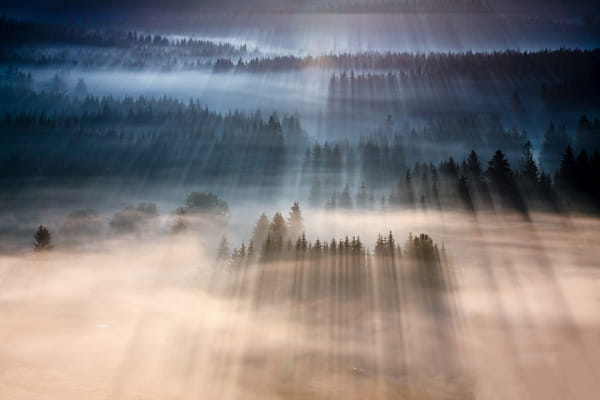 Rays by Marcin Sobas |
He recommends getting some knowledge of weather so as to predict the best times for taking photos. The Lawrenceville Weather website includes a fog forecast map for the lower 48 United States; I refer to this map frequently to find interesting shooting conditions. Also of use is The Photographer's Ephemeris, an application that calculates the angle of the sun; this can help to predict the direction of shadows, which may lead to better compositions.
5. Good landscapes usually have a full range of tones or color. Sobas subtly post-processes his images, and the final results do have a broad range of tones. The simple use of the levels tool, and saturation or vibrance — not done too strongly — can enhance a landscape photo without making it look overprocessed. Choosing the right subject, exposure, white balance, time of day, time of year, and weather conditions all contribute to getting good color.
6. Good landscapes typically have a unity and harmony, and avoid distracting details. A certain measure of abstraction works well. Again, many of Sorbos’images are so abstract that they, at first glance, appear to be paintings, but instead they are almost undoubtedly straight camera images with some mild postprocessing.
This is perhaps the most difficult part of landscape photography: what subject, what camera position, and what lens and cropping best suit the image? A good photographer ought to be able to view a scene, taking in both the subject as well as potentially distracting elements, instead of merely doing the same back home on the computer. Especially when an image is to be displayed at a small size on a computer screen, a large measure of abstraction is needed, more so than if the final image is larger.
7. Remember that photographs are made to be viewed by human beings, and adding a bit of human interest to an image may make a photograph more interesting to your viewers. Having a human in a landscape can draw attention to it, and in the best examples, can transform an ordinary landscape photograph into a dreamscape, deepening its emotional impact. From what I've seen, Sobas does not often include humans in his photos, but we do see buildings, boats, roads, and sometimes animals. I might add that most or all of these images depict landscapes that have been heavily altered by humans, perhaps over thousands of years, but in a harmonious way, and so they have an organic look to them.
8. Good landscape photos are usually made with good equipment and good technique. Because landscapes may not be as intrinsically interesting as a human figure, it takes extra effort to attract the eye. Journalistic style images can be rough, and that does not distract from them; indeed, a rough image may have a feeling of immediacy about it. Landscapes, on the other hand, are more timeless, and seem to call for more perfection.
There are any number of rules or principles used in landscape painting and photography, and the brief list above are merely my observations of what most good landscapes definitely seem to share. I haven’t mentioned commonly-cited principles such as the use of diagonals, leading lines, the rule of thirds, balance, avoiding subjects leaving the scene, the use of S curves, having a definite center of attention, and so forth, simply because these principles, in my mind, aren’t certain, or perhaps I simply don’t understand them well enough. Human psychology is complex, but some things are more certain than others; getting the basics right is more important than the subtleties. After knowledge, experience, and inspiration, comes more perfection.
Monday, August 20, 2012
Sensor Size and the Total Quantity of Light
IT IS SOMETIMES SURPRISING that even inexpensive cameras can take good quality images in the bright mid-day sun. I've seen many photos from cell-phones and from ridiculously cheap point-and-shoot cameras that have more than adequate image quality. Maybe these images aren't particularly optically sharp, but even low-end cameras can produce images in full sunlight that have a low amount of digital noise. They are “good enough.”
But one of the overarching rules of thumb in photography is that the larger the sensor size (or film size), generally speaking, the better the image quality of the final photograph. A bigger sensor makes it easier to have a lower noise image, a bigger sensor makes it easier to make matching quality optics, a bigger sensor makes it easier (up to a point) to make an ergonomic camera, and so forth. Now, I'm not saying that quality photos can’t be taken with a tiny image sensor, rather, it is easier to take an image with higher technical image quality by using a larger sensor. See the article One Easy Rule for Quality Images for more details.

A comparison of camera sensor sizes. [Source and attribution]
As noted, even low-end digital cameras can produce good images in broad daylight. The problem is that their image quality tends to sharply decline as the light gets dimmer. These cameras, taking photos under dim incandescent lighting, produce images that are a noisy mess, with terrible color rendition and digital grain ruining the sharpness of the image. Now, perhaps a tripod could help, but certainly these kinds of cameras are very disappointing for hand-held images.
Our eyesight doesn’t work as we might naïvely think. One scene, which to our eyes appears to be slightly dimmer than another, might in fact have half of the total amount of light falling on it. Likewise, a scene that appears to be only somewhat brighter than another might in reality be twice as bright. In particular, where I live, in the mid-lattitudes of the northern hemisphere, we get to enjoy long periods of dusk in mid-summer; the fading daylight seems to last for hours, until we finally notice that it is very dark out. Our eyes valiantly attempt to see in the dimming light, until the laws of physics and biology finally conspire against our vision, and we are plunged into darkness. Our eyes attempt to flatten out the huge range of brightness that we experience.
A hazy day may be objectively half as bright as a sunny day, although it certainly seems to be only slightly dimmer. A cloudy day may be one fourth as bright, while an overcast day may be one eighth as bright. At sunset, it may be one sixteenth as bright as a bright sunny day, and a bright day may be thirty two times as bright as what we find at dusk. On ground covered with snow or white sand, a scene may be twice as bright as what we are accustomed to, and there is a real risk of contracting snow blindness due to the excessive amount of light.
Cameras, like eyes, are designed to work over a large range of brightness. Camera lenses have adjustable apertures to vary the amount of light hitting the sensor, and the shutter speed can be varied over a large ranges of values. The sensors also have varying amounts of sensitivity to light. But a sensor with twice the surface area of another collects twice the total amount of light, and we could assume (all things otherwise being equal) that it can operate similarly in light that is half as bright.
Now I've taken decent photos in dark places with a cheap point-and-shoot camera, but that was only when the camera was sitting on a tripod and its shutter was open for a long time. I certainly could not hand-hold the camera and expect to get anything else except digital noise. However, I can and do often take fairly decent hand-held shots at dusk with my Nikon DSLR. The major difference between these two cameras is simply the size of the sensor: the Nikon lets in a far larger total amount of light.

Same scene taken with a newer cell phone camera on top, and an older DSLR camera on the bottom.
We know that cheap point-and-shoot cameras, selling for less than US$50, and having tiny sensors, can take good images in broad daylight with little digital noise. Let us take this quality as our baseline, and determine what size of a sensor we need if we want to take images of similar quality and with similar camera settings under dimmer lighting. This table shows standard digital sensor sizes, along with the lighting conditions that would be equivalent to typical cell phone cameras in bright daylight:
A camera sensor that has twice the surface area ought to produce an image with a similar amount of digital noise when the lighting is half as bright, all things else being equal. Certainly there are more factors involved, but sensor size is one of the most significant when it comes to image noise.
Photojournalists tend to use the cameras near the bottom of the list, especially if they need to capture a scene in dim lighting without the use of a flash. Note that the Micro 4/3rds cameras are fairly close in sensor size to the APS-C sized cameras, and their discrete size and noiseless operation make them viable for some work under dim lighting. Manufacturers have recently been putting the larger APS-C and 35mm sensors into compact cameras, which many photographers find highly desirable.
For more information, along with some of the data I used to make the table above, see these Wikipedia articles:
But one of the overarching rules of thumb in photography is that the larger the sensor size (or film size), generally speaking, the better the image quality of the final photograph. A bigger sensor makes it easier to have a lower noise image, a bigger sensor makes it easier to make matching quality optics, a bigger sensor makes it easier (up to a point) to make an ergonomic camera, and so forth. Now, I'm not saying that quality photos can’t be taken with a tiny image sensor, rather, it is easier to take an image with higher technical image quality by using a larger sensor. See the article One Easy Rule for Quality Images for more details.
A comparison of camera sensor sizes. [Source and attribution]
As noted, even low-end digital cameras can produce good images in broad daylight. The problem is that their image quality tends to sharply decline as the light gets dimmer. These cameras, taking photos under dim incandescent lighting, produce images that are a noisy mess, with terrible color rendition and digital grain ruining the sharpness of the image. Now, perhaps a tripod could help, but certainly these kinds of cameras are very disappointing for hand-held images.
Our eyesight doesn’t work as we might naïvely think. One scene, which to our eyes appears to be slightly dimmer than another, might in fact have half of the total amount of light falling on it. Likewise, a scene that appears to be only somewhat brighter than another might in reality be twice as bright. In particular, where I live, in the mid-lattitudes of the northern hemisphere, we get to enjoy long periods of dusk in mid-summer; the fading daylight seems to last for hours, until we finally notice that it is very dark out. Our eyes valiantly attempt to see in the dimming light, until the laws of physics and biology finally conspire against our vision, and we are plunged into darkness. Our eyes attempt to flatten out the huge range of brightness that we experience.
A hazy day may be objectively half as bright as a sunny day, although it certainly seems to be only slightly dimmer. A cloudy day may be one fourth as bright, while an overcast day may be one eighth as bright. At sunset, it may be one sixteenth as bright as a bright sunny day, and a bright day may be thirty two times as bright as what we find at dusk. On ground covered with snow or white sand, a scene may be twice as bright as what we are accustomed to, and there is a real risk of contracting snow blindness due to the excessive amount of light.
Cameras, like eyes, are designed to work over a large range of brightness. Camera lenses have adjustable apertures to vary the amount of light hitting the sensor, and the shutter speed can be varied over a large ranges of values. The sensors also have varying amounts of sensitivity to light. But a sensor with twice the surface area of another collects twice the total amount of light, and we could assume (all things otherwise being equal) that it can operate similarly in light that is half as bright.
Now I've taken decent photos in dark places with a cheap point-and-shoot camera, but that was only when the camera was sitting on a tripod and its shutter was open for a long time. I certainly could not hand-hold the camera and expect to get anything else except digital noise. However, I can and do often take fairly decent hand-held shots at dusk with my Nikon DSLR. The major difference between these two cameras is simply the size of the sensor: the Nikon lets in a far larger total amount of light.

Same scene taken with a newer cell phone camera on top, and an older DSLR camera on the bottom.
We know that cheap point-and-shoot cameras, selling for less than US$50, and having tiny sensors, can take good images in broad daylight with little digital noise. Let us take this quality as our baseline, and determine what size of a sensor we need if we want to take images of similar quality and with similar camera settings under dimmer lighting. This table shows standard digital sensor sizes, along with the lighting conditions that would be equivalent to typical cell phone cameras in bright daylight:
| Sensor size | Use | Sensor area in square millimeters | Lighting condition |
| 1/4” | Cell phones and toy digital cameras. | 7.68 | Bright daylight |
| 1/3.2” | Premium cell phone cameras. | 15.5 | Hazy sunlight |
| 1/2.3” | Compact digital cameras. | 28 | Cloudy bright |
| 1/1.7” | Premium compact cameras. | 43 | Light overcast |
| 2/3” | Some bridge cameras. | 58 | Heavy overcast |
| CX or 1” | Nikon 1 series. | 116 | Sunset |
| Micro 4/3rds | Olympus and Panasonic mirrorless interchangeable lens cameras. | 225 | Dusk |
| APS-C | Most Nikon, Pentax, and Sony DSLRs; lower-end Canon sensors are slightly smaller at 329 square mm. Also found in some premium rangefinder cameras. | 370 | Indoor sports, stage shows |
| 35mm, “Full frame” | High-end cameras from Nikon, Pentax, Sony, Canon, and Leica. | 864 | Bright street lighting at night |
A camera sensor that has twice the surface area ought to produce an image with a similar amount of digital noise when the lighting is half as bright, all things else being equal. Certainly there are more factors involved, but sensor size is one of the most significant when it comes to image noise.
Photojournalists tend to use the cameras near the bottom of the list, especially if they need to capture a scene in dim lighting without the use of a flash. Note that the Micro 4/3rds cameras are fairly close in sensor size to the APS-C sized cameras, and their discrete size and noiseless operation make them viable for some work under dim lighting. Manufacturers have recently been putting the larger APS-C and 35mm sensors into compact cameras, which many photographers find highly desirable.
For more information, along with some of the data I used to make the table above, see these Wikipedia articles:
Monday, July 30, 2012

Friday, July 27, 2012
Two-Color (Or One-Axis) Color Systems
RESEARCH INTO COLOR motion pictures started soon after cinematography itself was invented in the late 19th century. While color photography at that time was already well-established in the laboratory and by intrepid amateurs, cinema had its own problems, notably the need to project multiple frames per second in order to give the illusion of motion.
The main method of making color photographs was suggested in 1855 by the Scottish physicist James Clerk Maxwell. By exposing three photographic plates separately through red, green, and blue filters, and then projecting those images, overlapping, through the same filters, would then produce a color image on a screen. Or the same images could be printed on paper using various colored inks.
The main problem was determining how to do the same thing with cinematography. Any method devised would have to be visually impressive, relatively inexpensive, and would have to be extremely reliable, especially during projection at the theater. Using three cameras with three color filters was out of the question, due to parallax problems, and worse was the great expense and difficulty of aligning three separate projectors.
Compromises had to be made, and one such compromise was using only two colors: some color, perhaps, is better than no color. Film stock is transparent and has two sides, and many methods were devised so that one side would be sensitive to one range of colors, with the other side being sensitive to another range of colors. The film would be developed, producing an image on both sides, which were then dyed to the appropriate colors. The film could then be projected through standard projectors with no additional equipment needed. Surprisingly, very many films were created with the two-color method, starting in 1908, becoming common in the 1920s, and this was still used until the 1950s. But few of these color films remain with us today, and many of those survivors are now only available in monochrome versions specially made for early television.
While the two-color method died out in favor of three-color cinematography, by no means should we think that these kinds of methods are completely obsolete, being only temporary solutions limited to a particular place and time in history. Instead, I think that these methods, reinvented with digital technology, are interesting in their own right and can be used by contemporary photographers for artistic purpose. My related research on imitating Autochrome, an early color photographic process with a more limited color palette than is now standard, can be found here.
Tuesday, July 17, 2012
At the Limit of Perception
MANY PHOTOGRAPHERS AIM FOR exceptionally clean images, low in noise, and high in dynamic range. However, extreme sensor sensitivity is rarely needed for most photographs, especially if the photographer sticks to the basic rules of photography, which include the practice of using good lighting. A good, bright primary source of light, along with perhaps fill-in lights or reflectors, are typically needed to get good photographs.
But consider this photograph of a canoe, taken about 45 minutes after sunset, on a moonless, starless night, illumined by the waning skylight, distant fireworks and lightning, and a lone incandescent lamp a hundred or more yards away:

This was an interesting scene to my eyes, but there isn’t much to see in my image — just a very faint outline of an object. You might have better luck seeing something if you click the photo twice to see it in Flickr with a dark gray background.
I took this with my camera mounted on a tripod, but because I could hardly focus at all, I set the aperture to f/8 for greater depth of field, and I didn’t use a long exposure time because I didn’t want to spend 2 hours getting my photo — one hour, perhaps, for the exposure, and one hour for dark frame subtraction. Sometimes it is inconvenient or even impossible to get a good exposure, so you have to make do with what you can get. I wanted to see how good of an image I could get at the limit of the camera’s performance.
But consider this photograph of a canoe, taken about 45 minutes after sunset, on a moonless, starless night, illumined by the waning skylight, distant fireworks and lightning, and a lone incandescent lamp a hundred or more yards away:
This was an interesting scene to my eyes, but there isn’t much to see in my image — just a very faint outline of an object. You might have better luck seeing something if you click the photo twice to see it in Flickr with a dark gray background.
I took this with my camera mounted on a tripod, but because I could hardly focus at all, I set the aperture to f/8 for greater depth of field, and I didn’t use a long exposure time because I didn’t want to spend 2 hours getting my photo — one hour, perhaps, for the exposure, and one hour for dark frame subtraction. Sometimes it is inconvenient or even impossible to get a good exposure, so you have to make do with what you can get. I wanted to see how good of an image I could get at the limit of the camera’s performance.
Wednesday, July 11, 2012
Sunday, June 17, 2012
Giving Credit...
...WHERE CREDIT is due.
Recently I wrote about landscape photography, in the article Composition, Part 2 - Composition and Subject in Landscape Photography. But I failed to mention someone who helped me out tremendously, not only by often driving me around to locations, and providing moral support and encouragement, but also by pointing out good camera positions. I owe a lot to Tina, whose photos can be found at http://snupsphotos.blogspot.com.
Recently I wrote about landscape photography, in the article Composition, Part 2 - Composition and Subject in Landscape Photography. But I failed to mention someone who helped me out tremendously, not only by often driving me around to locations, and providing moral support and encouragement, but also by pointing out good camera positions. I owe a lot to Tina, whose photos can be found at http://snupsphotos.blogspot.com.
Composition, Part 2 - Composition and Subject in Landscape Photography
A WHILE BACK, I got a somewhat difficult assignment: I was to photograph a considerable number of city parks for a coffee table photo book. While I liked my architectural photos, I’d always been rather disappointed with my landscapes, as I mentioned in an earlier article, Composition, Part 1 - the Frame. My publisher, Reedy Press, must have thought I was up to the task, even though I was uncertain. But with a year to study, experiment, and shoot, I was able to successfully produce many good photos. Certainly I’m no master of the subject, but I think it might be useful to share some of what I learned while shooting this book.
The final book, St. Louis Parks, turned out well, and it is well-recieved by the public. Please click here if you would like to purchase a copy, autographed by me.
My publisher selected the photo above for the cover of the book, and I generally like it. It isn’t perfect — the sky appears to have a slight greenish tone, especially when seen under fluorescent illumination (although it is correctly white-balanced, and I didn’t alter the hue in post-processing), and the image is a bit darker than I’d like. The formal symmetry, with the fountain and building centered with each other and with the frame, is pleasing to me, but it is slightly off — although this is offset by the presence of the spine, not seen here, on the left hand of the book. What makes the photo, I think, is the presence of teenagers enjoying the fountain; having human subjects in a landscape photo is often appealing. The photo is technically OK, has a good subject, and is composed adequately, making it, in the opinion of my publisher, good enough to be on the cover of a book.
Generally speaking, there is a certain lightness of spirit or relief you can get when you leave certain decisions to others — were I to have selected the photos for the book, I think I would have agonized too much over them, seeing little else than flaws. Instead, my publisher selected images that he thought had general appeal, and he usually selected my favorites. Artists are often not the best judges of their works. Getting a sense of what is good takes understanding, time, and experience, as well as receiving the good judgement of others.
The first step towards getting better in photography, or any art, I think, is to understand why your works are disappointing, and understanding what makes good images superior. This can be exceptionally difficult, for oftentimes it is hard to put vague feelings into words. Determining what actions to take can be difficult also, for it requires an understanding of the technology. For example, you may find that your photographs are too yellow, but you have to understand color theory in order to know that you must make the photos more blue to cancel out the yellow, and you have to understand manual white balance on the camera, or the use of post-processing on the computer to correct for this flaw.
Saturday, May 12, 2012
Digital Forensics
HAS A PHOTO been severely altered? I’m sure you’ve seen examples of photo forgery lately in the news media. How exactly can you detect if a photograph is a composite of more than one original camera image? How can you tell if the clone tool has been used on an image, replacing scene detail at one part from another?
See the Digital Forensics webpage for original research by Hany Farid and his group at Dartmouth College.
Of particular interest is a large PDF file of lecture notes, which starts out with a number of famed doctored photographs from history, and then immediately jumps into complex mathematical examinations of digital images.
Tuesday, May 8, 2012
Ars Photographica
Ars PhotographicaThis poem was set to music by Gavin Bryars, and is available on Amazon: On Photography - Bryars, Maskats, Silvestrov
Vincenzo Gioacchino Raffaele Luigi Cardinal Pecci
1867
Expressa solis spiculo
Nitens imago, quam bene
Frontis decus, vim luminum
Refers, et oris gratiam.
O mira virtus ingeni
Novumque monstrum! Imaginem
Naturae Apelles aemulus
Non pulchriorem pingeret.
On Photography
(translated by H.T. Henry, 1902)
Sun-wrought with magic of the skies
The image fair before me lies:
Deep-vaulted brain and sparkling eyes
And lip's fine chiselling.
O miracle of human thought,
O art with newest marvels fraught -
Apelles, Nature's rival, wrought
No fairer imaging!
Saturday, April 21, 2012
“St. Louis Parks”
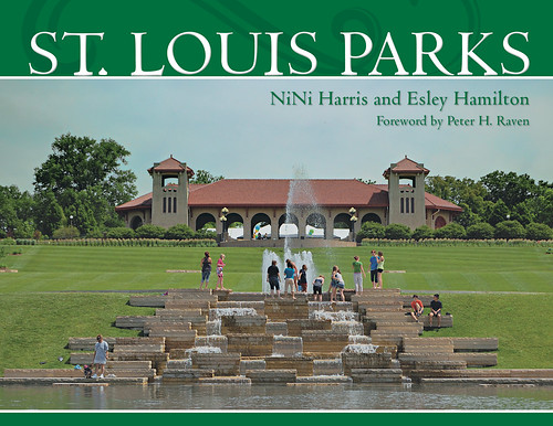
ST. LOUIS PARKS — a new book from Reedy Press — with photography by yours truly, including the photo on the cover:
This view shows the World’s Fair Pavilion atop Government Hill, in Forest Park, in the City of Saint Louis, Missouri. Teenagers are seen here enjoying the cool water of the fountain on a warm June day. I think this photo adequately captures the joy and simple pleasure that ought to be found in a pleasant park.
This book contains over a hundred of my photos of parks located within the City of Saint Louis. Click here to get your own copy of this book:
From the publisher, Reedy Press:
St. Louis Parks By NiNi Harris and Esley Hamilton, Foreword by Peter H. Raven
St. Louis has great parks. And St. Louisans are passionate about them. St. Louis Parks delivers portraits of St. Louis City and County parks, both major and minor, that prove why these common spaces are crucial to the region’s way of life.
Acclaimed local historians NiNi Harris and Esley Hamilton take readers through the city and county, respectively. Starting with the establishment of Lafayette Park from thirty acres of common fields in 1836, Harris covers the creation of gems like Tower Grove Park, the nation’s finest Victorian Park, and the dazzling, 1,293-acre Forest Park, while including Citygarden, and its interactive artwork, in the heart of downtown.
In the county, Hamilton highlights one-of-a-kind attractions like the renowned Museum of Transportation and Laumeier Sculpture Park, the Butterfly House and St. Louis Carousel at Faust Park, a farm zoo at Suson Park, and the military museums at Jefferson Barracks. In both sections, the authors recognize the citizens, civic leaders, and architects whose work delivered to all St. Louisans picturesque landscapes, ball fields, tennis courts, natural savannahs, and grasslands filled with wildlife, and trails that lead runners through forests and by shimmering lakes.
Dramatic photography by Mark Scott Abeln and Steve Tiemann complement the essays. The photographs evoke the unique character and history of the individual parks. They visualize the importance of green space for both escaping and coming together as a community.
ABOUT THE AUTHORS AND PHOTOGRAPHERS
NiNi Harris’s earliest memory is of an early autumn evening, picking up acorns as she and her father walked along Bellerive Boulevard to Bellerive Park. Her great- great-grandfather’s first job when he arrived in St. Louis in 1864 was planting trees in a St. Louis park. This is her tenth book on St. Louis history and architecture.Mr. Peter Raven is President Emeritus of the famed Missouri Botanical Garden.
Esley Hamilton has been working for the St. Louis County Department of Parks and Recreation as historian and preservationist since 1977. Among preservation-
ists in the St. Louis region, Hamilton’s is a household name. He teaches the history of landscape architecture at Washington University and serves on the board of the National Association for Olmsted Parks.
Mark Abeln is a native of St. Louis and attended college at Caltech, in Pasadena, California. Mark started taking photography seriously after he took disappointing photos of an important subject. He spent the next years learning the art of photography, and his photos can now be found in numerous publications as well as on his website “Rome of the West.”
Steve Tiemann graduated from McCluer High School and went on to obtain his forestry degree from the University of Missouri at Columbia. Steve has enjoyed his career as a park ranger and park ranger supervisor with St. Louis County Parks for nearly thirty years. He tries to be in ready mode with a camera while patrolling on foot or bike.
This book’s publication date is May 1st. You can order a copy now:
You can also purchase my earlier book of photography, Catholic St. Louis: A Pictorial History:
Tuesday, April 10, 2012
A Good Photograph
SOMEONE ASKS, “What makes a good photo?”
According to modern philosophies, if any answer to this question is given at all, it is usually convoluted, unsatisfactory, or it has nothing to do about photography. Instead, I will go back to ideas discovered by the philosophers of Greece and the Middle Ages, eras that produced great art that astonishes us still.
A good photograph will please the eye and give it rest. Nothing can be seen that ought to be removed, nor can the imagination perceive anything that ought to be added or changed.
A good photograph will cause the viewer to stand outside of himself for a brief moment. The viewer, in his imagination, is transported within the frame of the image.
A good photograph will reward a viewer every time he sees it. He can contemplate it many times for many years, and yet discover new things never before noticed. It does not grow stale or boring over time.
A good photograph will evoke immediate recognition within the viewer. The viewer will think that he has seen the photograph before; indeed, the photograph will seem to be a part of the viewer’s earliest memories.
A good photograph will become a part of the viewer. The viewer will use his memory of the photograph as a type and model for other things.
A good photograph will cause the viewer to see that this particular photograph is the most appropriate medium for expressing the subject.
A good photograph will have a sense of unity — each part will relate in some way to every other part.
A good photograph will have due proportion and symmetry, a formal structure that is harmonious and expressive of the subject matter.
A good photograph will have a clarity and vividness that expresses the photographer’s intention.
A good photograph will clearly show the truth, even if what is depicted is not factually true, but rather instead expresses a higher truth.
A good photograph will obviously show that the photographer has mastery over the medium.
A good photograph will elicit a lively positive response from all who view it, without regard to age, sex, race, nationality, education, class, party, or religion.
Now, this is a very high target to aim for, and very few photographs ever come close. But it helps to know what we are aiming for, even it we always shoot low. These ideas are also applicable to very many of the fine arts, and not just photography.
Tuesday, March 27, 2012
Nothing to do About Photography...
...BUT PERHAPS AN inspiration to those seriously interested in the art of photography. Take a look at The Textile Blog: Design, Decoration and Craft.
Textiles and photographs are both flat, basically two-dimensional art forms. Both are typically made by machines and are usually not hand-made, although there is much artistry in both mediums. Certainly there is something for a photographer to learn about composition and art from examining other, similar art forms.
We live in an age of increased specialization, rationalization of labor, narrow job categories, hair-splitting definitions of genres, and narrow disciplines that do not understand each other. Now, some can call this individuality, but this division perversely leads to centralization, excess standardization, and the sense that we are seen as easily-replacable cogs in a huge machine, and not as free men and women.
For this reason, I think that a good education in the liberal arts is important if you want to improve your art, as well as avoiding too much specialization in art. The Textile Blog seems to understand this, and features artists who were much more and broader in scope in their artwork than what we tend see these days.
Thursday, March 15, 2012
An Imitation of the Autochrome Lumière Process
THE EARLIEST PRACTICAL method of color photography was the Autochrome Lumière process, introduced in France in 1907 by the Lumière brothers, who earlier had invented cinematography. Autochrome used standard silver chemistry, but with specially prepared glass plates, coated with tiny grains of transparent starch, dyed to three primary colors. This process produced slides suitable for projection or for viewing with bright back lighting; the colors produced were rather dark and somewhat muted, but many consider the final results to be rather beautiful. Later color photography methods tended to produce colors that could be garish.
Family group outdoors, by unknown, ca. 1915, George Eastman House Collection
Woman posed as sphinx, by Dr. W. Simon, ca. 1910, George Eastman House Collection

Woman in floral silk robe, by Charles Spaeth, ca. 1915, George Eastman House Collection
Intrigued by this process, and captivated by many of the historical Autochrome images found on the Internet, I attempted to recreate the ‘look’ of these images. Since Autochrome is an additive process, using light-transmitting filters, the color properties of Autochrome ought to be quite reproducible with contemporary computer software.
The main problem is discovering the three primary colors used, and by various methods I was able to come up with a color gamut which seems to be fairly close to the original Autochrome. Characteristically, the primaries seem to be reddish-orange, a weak blueish violet color, and green. Using these primary colors, I was able to easily convert digital images to use this supposed Autochrome gamut:
This process, with its narrow gamut of colors, lacks the ability to capture reds and saturated blues, but it produces nice shades of pink and violet, as well as prominent orange and pale cyan colors. You can see other attempts at Autochroming images in my article Autochrome here and Autochrome at my other blog.
My process uses custom ICC profiles, created in Photoshop, which are linked in my article Using ICC Profiles for Creative Color Control. If you download one of these profiles, you can use standard image editing software to convert your standard profile images to use my estimates of the Autochrome primary colors. The nice feature of this method is that once you convert an image to use the Autochrome profile, you can edit the image as much as you would like while never having the colors go out of gamut. Once you are finished editing, you convert the image back to the standard sRGB profile for viewing on your computer or for printing.
While this is satisfying and interesting, these images lack prominent characteristics of the original Autochrome process, namely, the dark “gamma” of the images as well as the pointillistic grain pattern which derives from the colored starch grains found on Autochrome plates. Certainly my work with the Autochrome color gamut is sufficient to produce interesting images with a limited range of colors reminiscent of Autochrome, but I think it would be interesting, and possibly valuable, to come up with a better digital imitation of the historical method.
I don’t claim that my Autochrome color profiles actually match the color gamut found in the original process, for the sample images found on the Internet are highly variable, but with common characteristics. But close is good enough. Likewise, if I attempt to imitate the pointillistic nature of Autochrome, then close will again be good enough. It is my intention to create a method that is adequate.
In the article What is Autochrome? at the website of the Šechtl & Voseček Museum of Photography, you can see a microphotograph of the starch grains found in Autochrome, as well as many sample images and a description of the process.
The grains are generally round, bunched together in clusters, with a small amount of black pigment between the gaps. This grain, somehow, needs to be reproduced in Photoshop for our process. Now producing a photorealistic imitation of these grains would be very difficult, impractical, and would tax the resources of my computer, so I will produce a pixelated version instead, with clumps of square instead of round grains.
I’ve read a number of estimates of the sizes of the starch grains, from 5 to 10 microns in size, and some say that the process used 4 million grains per square inch. For our purposes, knowing the number of grains per linear inch is important, and various authorities state 1700, 2000, and 2500 grains per linear inch.
The Autochrome plates were manufactured in a wide variety of English and metric sizes. The pointillistic ‘look’ of the images is quite prominent on smaller plate sizes, but is not particularly noticeable on digital images made from larger plates. For our purposes, we’ll imitate the characteristics of a small plate, 3-1/4x4 inches in size, and use the intermediate value of 2000 grains per linear inch, which gives us an image 8000 x 6500 grains in size, or a 52 megagrain image. Please note that the color grains in Autochrome are randomly scattered, and so there is significant clumping of colors, reducing the final resolution and color accuracy of the image. Because it does not have the regular pattern of the Bayer sensor found in most digital cameras, Autochrome does not illustrate aliasing or the Moiré effect.
Now I have no idea as to the size of the light-sensitive silver grains found in Autochrome, but I’d think that the silver grains were smaller than the color grains, otherwise there would be a significant loss of saturation. I’m not sure how much this matters, but from my experimentation, very many color grains improve the final results. My digital camera is rather aged, and produces images 3008 x 2000 pixels in size, and using a grain pattern that size produces images that have an objectionable amount of grain. If we have a target of 6500 grains along the short edge of my image, then I will upsize from 3008 x 2000 to 9776 x 6500, preserving the aspect ratio, while imitating the grain pattern found in the smaller sample images. This would be roughly equal to an Autochrome plate 3-1/4 x 4-7/8 inches in size.
The difficult part of this process is creating a pixelated version of the color grain pattern of Autochrome, and it needs to be made in exactly the same number of pixels as the upsized image. As each manufacturer makes slightly different aspect ratios of images — and even some RAW converters will vary the number of pixels, then you will have to make your own grain pattern.

This is a highly-zoomed portion of a grain pattern that I made. Each pixel substitutes for an Autochrome grain, and like the original Autochrome, the grains are clumped together instead of being uniform. It doesn’t matter that it uses the standard sRGB primary colors, and not those of Autochrome.
Here is how I made it in Photoshop CS5:
Before:
After:

Before:
After:
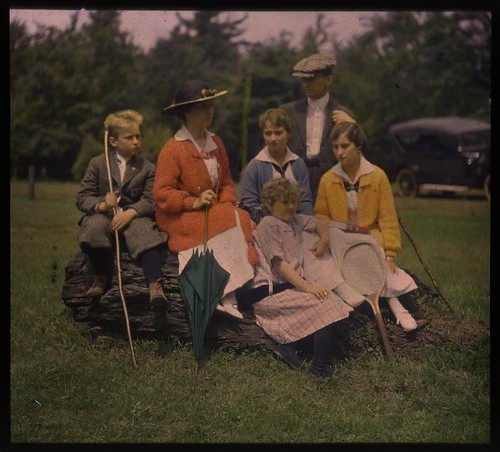
Family group outdoors, by unknown, ca. 1915, George Eastman House Collection
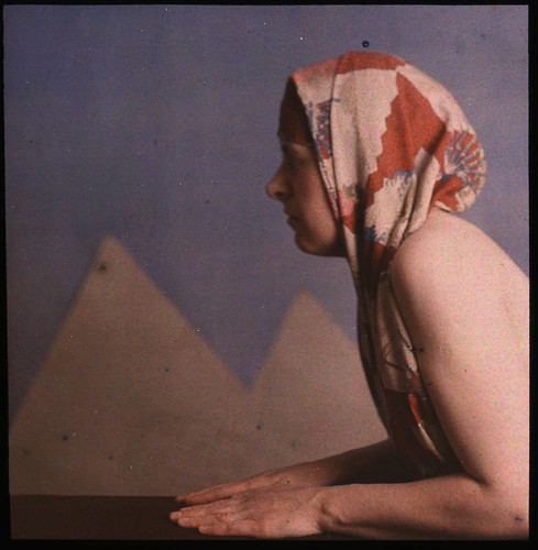
Woman posed as sphinx, by Dr. W. Simon, ca. 1910, George Eastman House Collection
Woman in floral silk robe, by Charles Spaeth, ca. 1915, George Eastman House Collection
Intrigued by this process, and captivated by many of the historical Autochrome images found on the Internet, I attempted to recreate the ‘look’ of these images. Since Autochrome is an additive process, using light-transmitting filters, the color properties of Autochrome ought to be quite reproducible with contemporary computer software.
The main problem is discovering the three primary colors used, and by various methods I was able to come up with a color gamut which seems to be fairly close to the original Autochrome. Characteristically, the primaries seem to be reddish-orange, a weak blueish violet color, and green. Using these primary colors, I was able to easily convert digital images to use this supposed Autochrome gamut:
This process, with its narrow gamut of colors, lacks the ability to capture reds and saturated blues, but it produces nice shades of pink and violet, as well as prominent orange and pale cyan colors. You can see other attempts at Autochroming images in my article Autochrome here and Autochrome at my other blog.
My process uses custom ICC profiles, created in Photoshop, which are linked in my article Using ICC Profiles for Creative Color Control. If you download one of these profiles, you can use standard image editing software to convert your standard profile images to use my estimates of the Autochrome primary colors. The nice feature of this method is that once you convert an image to use the Autochrome profile, you can edit the image as much as you would like while never having the colors go out of gamut. Once you are finished editing, you convert the image back to the standard sRGB profile for viewing on your computer or for printing.
While this is satisfying and interesting, these images lack prominent characteristics of the original Autochrome process, namely, the dark “gamma” of the images as well as the pointillistic grain pattern which derives from the colored starch grains found on Autochrome plates. Certainly my work with the Autochrome color gamut is sufficient to produce interesting images with a limited range of colors reminiscent of Autochrome, but I think it would be interesting, and possibly valuable, to come up with a better digital imitation of the historical method.
I don’t claim that my Autochrome color profiles actually match the color gamut found in the original process, for the sample images found on the Internet are highly variable, but with common characteristics. But close is good enough. Likewise, if I attempt to imitate the pointillistic nature of Autochrome, then close will again be good enough. It is my intention to create a method that is adequate.
In the article What is Autochrome? at the website of the Šechtl & Voseček Museum of Photography, you can see a microphotograph of the starch grains found in Autochrome, as well as many sample images and a description of the process.
The grains are generally round, bunched together in clusters, with a small amount of black pigment between the gaps. This grain, somehow, needs to be reproduced in Photoshop for our process. Now producing a photorealistic imitation of these grains would be very difficult, impractical, and would tax the resources of my computer, so I will produce a pixelated version instead, with clumps of square instead of round grains.
I’ve read a number of estimates of the sizes of the starch grains, from 5 to 10 microns in size, and some say that the process used 4 million grains per square inch. For our purposes, knowing the number of grains per linear inch is important, and various authorities state 1700, 2000, and 2500 grains per linear inch.
The Autochrome plates were manufactured in a wide variety of English and metric sizes. The pointillistic ‘look’ of the images is quite prominent on smaller plate sizes, but is not particularly noticeable on digital images made from larger plates. For our purposes, we’ll imitate the characteristics of a small plate, 3-1/4x4 inches in size, and use the intermediate value of 2000 grains per linear inch, which gives us an image 8000 x 6500 grains in size, or a 52 megagrain image. Please note that the color grains in Autochrome are randomly scattered, and so there is significant clumping of colors, reducing the final resolution and color accuracy of the image. Because it does not have the regular pattern of the Bayer sensor found in most digital cameras, Autochrome does not illustrate aliasing or the Moiré effect.
Now I have no idea as to the size of the light-sensitive silver grains found in Autochrome, but I’d think that the silver grains were smaller than the color grains, otherwise there would be a significant loss of saturation. I’m not sure how much this matters, but from my experimentation, very many color grains improve the final results. My digital camera is rather aged, and produces images 3008 x 2000 pixels in size, and using a grain pattern that size produces images that have an objectionable amount of grain. If we have a target of 6500 grains along the short edge of my image, then I will upsize from 3008 x 2000 to 9776 x 6500, preserving the aspect ratio, while imitating the grain pattern found in the smaller sample images. This would be roughly equal to an Autochrome plate 3-1/4 x 4-7/8 inches in size.
The difficult part of this process is creating a pixelated version of the color grain pattern of Autochrome, and it needs to be made in exactly the same number of pixels as the upsized image. As each manufacturer makes slightly different aspect ratios of images — and even some RAW converters will vary the number of pixels, then you will have to make your own grain pattern.
This is a highly-zoomed portion of a grain pattern that I made. Each pixel substitutes for an Autochrome grain, and like the original Autochrome, the grains are clumped together instead of being uniform. It doesn’t matter that it uses the standard sRGB primary colors, and not those of Autochrome.
Here is how I made it in Photoshop CS5:
- Create a new image the precise size as your upsized digital image: for me, that is 6500 x 9776.
- Fill the blank image with 50% gray.
- Select the red channel.
- Select the menu item Filter - Noise - Add Noise...
- Adjust Amount to 50% and specify Uniform Distribution.
- Select the menu item Image - Adjustments - Threshold...
- Adjust Threshold Level to 173. If you check the histogram, you should see that 33.3% of the pixels are white; if not, you may have to adjust the Threshold Level slightly.
- Select the Green channel, and add the same amount of noise as before.
- Select the menu item Image - Apply Image...
- Use the Red channel, check Invert, and set Blending to Darken. This masks out the red pixels created in the previous step.
- Use the Threshold menu again, setting Threshold Level to 132. One third of the pixels are white. You may have to check the histogram to be sure: unequal percentages will throw off your white balance a bit.
- Select the Blue channel.
- Using Apply Image, apply both the inverted red and green channels, using Darken Blending, to mask out the red and green pixels.
- Select the menu item Image - Auto Tone to quickly turn the remaining gray pixels to white.
- Select the RGB channels, zoom into your image, and you will notice uniformly scattered red, green, and blue pixels.
- Save the image as a TIFF file to preserve the colors.
- If you haven’t done so already, download the Autochrome ICC profile from the article Using ICC Profiles for Creative Color Control, and install it in Photoshop.
- Select the menu item Edit - Assign Profile... and select Autochrome. This will change the sRGB primary colors to Autochrome’s primaries.
- Take your target image and upsize it to be equal in size to your grain pattern image.
- Either Assign or Convert your target image to the Autochrome profile. Read the article Using ICC Profiles for Creative Color Control for a discussion of the pros and cons of both methods.
- Edit your image as you would like.
- Drag the grain image on top of your target image and set the blending mode to Darken.
- Your image will now look terrible. Do not have fear.
- Flatten the image. It will now be rather dark, but will have textured grain, which you can see if you zoom into it.
- Shrink your image to a more manageable size if needed. The method you use will have a great effect on the grain in the image: Bicubic Sharper appears to do the best job.
- Convert the image back to the sRGB profile.
- Adjust the Levels to brighten the image a bit, but you may not want to clip any of the highlights.
Before:
After:
Before:
After:
Tuesday, February 28, 2012
Color Spaces, Part 4: Lab
THE MOST COMMON models of human color vision take three precisely-determined shades of red, green, and blue light, and mix them together in various proportions to generate a gamut of colors. The familiar sRGB standard, proposed by Microsoft and Hewlett-Packard in 1996, is supported by most computers, digital cameras, scanners, projectors, and printers as the standard color model, and sRGB is the color model assumed by the world wide web and most common image file formats.
RGB color models are very useful. A computer monitor typically has a large array of tiny red, green, and blue colored cells, these cells being so small that we cannot see them without a magnifying glass. The cells blend together to give us the other colors. For example, if the red and green cells are turned on, and blue is turned off, we are likely to get a shade of yellow. This physical process of mixing colors of light is very similar to how colors are defined in the various RGB color models: the primary red color in sRGB is defined as the three color numbers [255, 0, 0] and the computer monitor will likewise fully turn on the red cells while keeping the green and blue cells off. A particular medium gray color, defined in sRGB as [186,186,186] will cause the computer monitor to set the red, green, and blue cells to an intermediate value about halfway between fully on and fully off. Now, while no computer monitor or other digital imaging device has precisely the same properties of the sRGB standard, these are usually designed to be close enough for most purposes.
But there are some problems. First, you cannot mix red, green, and blue paint together to do decent painting, for we aren't mixing pure light, like on a computer screen, but rather are mixing together pigments which absorb some of the light falling on them, reflecting away the rest. And so, the RGB color system isn't particularly useful for painters, and is likely highly misleading: see the article Additive versus Subtractive Color. Furthermore, you cannot get all shades of colors by mixing together only three colors of lights.
The image below, called a CIE chromaticity diagram, shows the range of saturated colors that can be seen by the human eye:
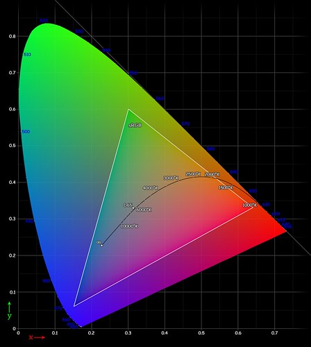
[source]
The curved outline shows the full gamut of human vision, while the triangle within it shows the gamut of the sRGB color standard. If you use three primary colors for your standard, your available colors will be limited to only those colors within the triangle. sRGB excludes pure spectral violet, and deep scarlet red, and also neglects bright cyans and greens. Please note that this image itself is fully within the sRGB color standard, and so we cannot show you here the full range of visible colors, only the relative amount of color that can be represented by sRGB.
RGB color models are very useful. A computer monitor typically has a large array of tiny red, green, and blue colored cells, these cells being so small that we cannot see them without a magnifying glass. The cells blend together to give us the other colors. For example, if the red and green cells are turned on, and blue is turned off, we are likely to get a shade of yellow. This physical process of mixing colors of light is very similar to how colors are defined in the various RGB color models: the primary red color in sRGB is defined as the three color numbers [255, 0, 0] and the computer monitor will likewise fully turn on the red cells while keeping the green and blue cells off. A particular medium gray color, defined in sRGB as [186,186,186] will cause the computer monitor to set the red, green, and blue cells to an intermediate value about halfway between fully on and fully off. Now, while no computer monitor or other digital imaging device has precisely the same properties of the sRGB standard, these are usually designed to be close enough for most purposes.
But there are some problems. First, you cannot mix red, green, and blue paint together to do decent painting, for we aren't mixing pure light, like on a computer screen, but rather are mixing together pigments which absorb some of the light falling on them, reflecting away the rest. And so, the RGB color system isn't particularly useful for painters, and is likely highly misleading: see the article Additive versus Subtractive Color. Furthermore, you cannot get all shades of colors by mixing together only three colors of lights.
The image below, called a CIE chromaticity diagram, shows the range of saturated colors that can be seen by the human eye:
[source]
The curved outline shows the full gamut of human vision, while the triangle within it shows the gamut of the sRGB color standard. If you use three primary colors for your standard, your available colors will be limited to only those colors within the triangle. sRGB excludes pure spectral violet, and deep scarlet red, and also neglects bright cyans and greens. Please note that this image itself is fully within the sRGB color standard, and so we cannot show you here the full range of visible colors, only the relative amount of color that can be represented by sRGB.
Wednesday, February 15, 2012
Staying Hip is a Full-Time Job
SEEN ON REDDIT:
A: Sometimes I feel like there are no contemporary art movements left but "Postmodernism."
B: Didn’t you get the memo? Postmodernism is over and done with. Don't ask where we are now.
A: does that mean painting is cool again?
B: Now it gets confusing. Post rock means you can use accoustic gitars again, and hispsters play vinyl records and use analogue cameras. Ergo: Post-Hip Post-modernism means you can paint again.
Wednesday, February 1, 2012
Friday, January 27, 2012
Composition, Part 1 - the Frame
I MUST ADMIT that the technical aspects of photography are easiest for me. Color spaces, exposure and lens calculations, f/stops, shutter speeds, and ISO sensitivity are generally objectively certain and quantifiable. On the contrary, artistic considerations such as the use of color itself and composition seem to be subjective, qualitative, and much less certain. However, we must not oppose technique with art: they are not two things, but are different aspects of one thing, and they both must be taken into consideration when making a final image.
When I became serious about photography a number of years ago, I didn't give composition too much consideration, simply due to the fact that I was taking mainly architectural photos:
Saint Francis Xavier Church, at Saint Louis University, in Saint Louis, Missouri, USA.
The hard work of composition was already done for me by the architect. I merely had to discover good camera positions and angles, and the kind of post processing that would express the work of the architect in a pleasing manner. Fortunately, these discoveries came rather quickly to me.
Likewise, I found it easy to take pleasing photos of flowers:
Flower, at the Missouri Botanical Garden (Shaw's Garden), in Saint Louis.
Flowers are intrinsically interesting, and nature suggests composition.
Subscribe to:
Posts (Atom)