Besides thinking that good photography merely involves choosing the ‘best’ camera, I was quite naïve about the properties of color digital images, and how they differ from black and white film. Exposure is far more critical to color photography relative to black and white.
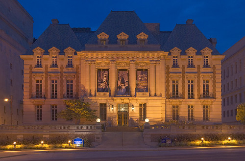
Please consider the following series of images, taken at ISO 200, f/8, with each exposure time varying from 1/8th for the darkest, to 8 seconds for the brightest. This Beaux-Arts building was built in 1900 for the Saint Louis Club, later became the headquarters for the Woolworth's company, and now houses the Saint Louis University Museum of Art.

Which image is exposed the best? Certainly exposure is something of a matter of taste, and your particular monitor settings may make one look better than another, and you might change your opinion if you used a different computer or if you printed these. However, too much exposure will give you all white, and too little exposure will give you black, and then you no longer have an image of a building. Objectively speaking, you have to expose within a specific range, which will vary depending on subject matter, your camera, and your post-processing.
If I had to choose between these four images, I'd select either the upper right hand image, or the lower left hand one; although I think that an intermediate exposure between these two would have been better. I took this in the morning, and perhaps I ought to have waited a few minutes for the sky to get brighter, which would have given a better balance of light over the entire image.
OK, I might say that I'll choose whatever image looks best to me; of course you do have to do that. Just because a machine says that one image is better than another doesn't mean that we have to follow that advice, because photographs are intended for humans, not machines. Just because the camera says that the photograph is correctly exposed doesn't mean that it will look best to us. But limiting ourselves to just gut instinct can't be right: “The unexamined life is not worth living for a human being” wrote Plato in the Apology. Instead, we ought to ask some questions. Why does one image look better than another? How can we reliably and predictably make good images?
Just because an image appears to be a bit dark does not mean that it is bad — there is a lot of detail that can be pulled up from the shadows. Generally, overexposure is more of a problem with digital images than underexposure, and so the standard advice is to expose for the highlights and process for the shadows. By the way, this is opposite to the advice used for shooting film negatives, where you generally have to expose to get good shadow detail.
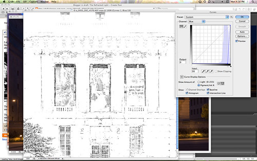
Let's pull up some shadow detail from the upper right hand image:
I think this is an adequate image. Lots of detail is normally lost in the shadows, and it is easy to make this detail visible. This is just a rough brightening, and there are lots of techniques to show good detail in shadows. Were I doing a better job, I'd add more local contrast in the shadows; these shadows look a bit flat.
My intention when taking these photos was to produce a series of images which I would later blend together to make decent single image with lots of highlight and shadow detail with little noise and good color rendition. Before I submit the images to my exposure-blending software, I create hard exposure masks which cut off those parts of the images which are over- and under-exposed; the end result is a nicer looking image with low noise and good color tone. Without these masks, the software produces unpleasant color shifts in the highlights and excessive noise in the shadows. Masking also reduces haloing artifacts generated by my software.
Overexposure
It would be helpful if we define our terms. A pixel in an image is overexposed if any one of the three color channels is at its maximum value; or for eight bit images, if any channel is equal to 255. Now 255 might just happen to be the correct value of a pixel, but that is unlikely, since everything brighter will be equal to 255 also. If any one of the three color channels clips due to overexposure, then you will get color shifts in the final image.
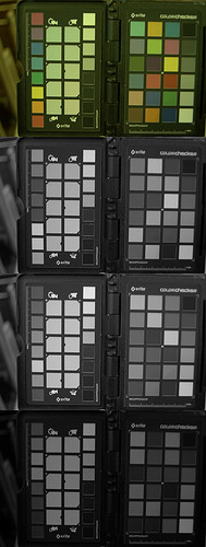
This color shift is rather prominent on the brightest of my sample images. Here is a close up view; note how the color of the building near the light goes from a nice orange color to yellow, and then white; while the blue sign goes to cyan then white:
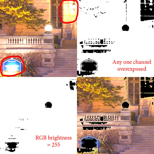
In the upper right hand corner, I put in black wherever any one of the three color channels of a pixel is equal to 255. In the lower left hand corner is a mask which shows wherever the RGB luminosity goes to 255; notice how it masks out a smaller area than the full overexposure mask.
RGB luminosity is roughly defined as:
30% Red + 59% Green + 11% BlueThis approximates the sensitivity our eyes have to each primary color. But this value will often be less than 255, even if one of the channels is overexposed. Some camera histograms will show this value instead of three individual color histograms, which can be less than helpful. Also, some exposure blending and tone-mapping methods use this value as an estimate of brightness, and the final images often show these color shifts.
In the lower right hand corner I superimposed the full overexposure mask on the image. Note that it covers up nearly all of the areas that show an obvious color shift, but not all. There appears to be some bad color bleeding out from around the edges of the mask.
This image, even though it comes from a Camera RAW file, still has been highly processed by the RAW converter, plus I did some lens distortion correction as well as straightening of the image. My camera uses a matrix of light sensors, and each one is sensitive to only one color. When the RAW converter makes the final image, it estimates the missing colors at each pixel by examining neighboring pixels. Likewise, when correcting for lens distortion and camera tilt, Photoshop estimates the correct pixel values by also examining neighboring values. So we are always doing some averaging; but consider this example equation:
Estimated value = (250+240+235+garbage)/4 = garbageSo the effects of overexposure anywhere in an image will spread a bit to neighboring pixels. In practice, when I make a mask like this, I will mask out everything that has a value over 250 or so, which seems to get rid of most if not all of these nominally good, but actually bad pixels, without losing too much highlight detail. Someday I'd like to see software that offers a mask channel associated with images, which will show all pixels which are overexposed, or which are indirectly unreliable due to processing.
Here is the brightest image, with a black overexposure mask superimposed on it:
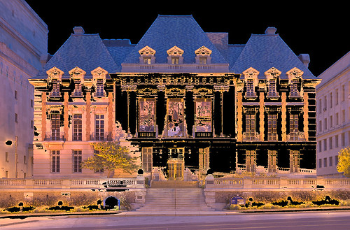
I extended the mask a little bit, so as to eliminate the color shift which extends a few pixels beyond the measurably overexposed parts. Note that the sky is masked out, because it is completely overexposed in the blue channel. About 1/3rd of the image is overexposed. There is good detail throughout the rest of the image. Note that there is a slight blue halo around the roofline; this is because this image is not particularly sharp, and so there is a bit of blur along edges which does not get masked out.
Photography has many trade-offs, requiring us to make choices; we neither want to overexpose, nor do we want to underexpose. Ultimately, some detail doesn't matter, and specular highlights and light sources are usually considered unimportant — it is OK to overexpose them most of the time, as we see even in our darkest example photo above. The lights aren't the obvious subject of the photo.
Now if you have large areas of color in your photo, you probably don't want to overexpose them, even if they aren't the subject. Digital cameras will often overexpose blue skies, which I think is objectionable most of the time, even if it is not the subject of the photograph. This kind of overexposure is particularly objectionable when the sky goes from blue to cyan to white in a single image: that just doesn't look natural. See my article Three Opportunities for Overexposure. Alternatively, it is often best to strongly overexpose a background, turning it a pure color or white, rather than having a muddled partial overexposure with obvious color shifts.
Another problem with overexposure, besides color shift, is that it removes texture from the image. Areas with even one channel overexposed will appear somewhat flat. Now there are techniques which you can use to rescue such overexposed images, by generating plausible detail from the remaining channels. This is difficult to do correctly, and is time-consuming.
Now technique ought to serve the subject matter; the subject does not serve the technique except perhaps when you are creating images for teaching. Just because the blue channel of the sky in an image is overexposed does not mean that you can't end up with a terrific photograph, if the subject is worthy.
Underexposure
Defining overexposure is easy, even if we have to be careful and realize that it isn't quite as simple as we would like. Defining underexposure is far more problematic.
I defined overexposure on any given pixel as the situation where any one channel is at its maximum value, generally equal to 255 with 8 bit images. OK, we can naïvely assume that underexposure is the situation where any color channel equals 0. For example:
Not much of a mask at the bottom. This is next to worthless, just a few black dots here and there, even though there is a lot of black in this image. There are several problems with our effort here, the most significant is that there is a tremendous amount of noise, relatively speaking, that is found in the darkest part of the image, often due to the quantum fluctuation of light. Light is detected in discrete quantities due to a mysterious property of matter and energy on a small scale, and therefore is quite non-uniform. There are also several sources of noise in the camera itself, and these sources will add to the signal, moving it away from zero. Also consider the indirect problem mentioned with overexposure: image manipulation will ‘infect’ neighboring pixels, and since no pixel value can be less than zero, this averaging will only increase the value found at pixels which ought to be zero. Noise at low levels does not average out to zero, but instead will brighten dark pixels..
Some cameras, as well as RAW converters, will do plenty of image manipulation including noise reduction or black-point cutoff, making our low-value pixels even more unreliable.
Instead I use a working definition of underexposure which masks out those values near zero. Now, should I take into account all three color channels at one time, or each color channel separately? If I choose all three, then I might not mask out a particular poor, noisy channel if the other two are good.
But if I mask out each channel separately, then I might get the situation where a particular pixel is both overexposed and underexposed! I often see this with stained glass. For a particularly brilliant red piece of glass, I may have the Red channel at 255, while the Blue channel is at 0: this indicates that the color is particularly pure and outside of the color gamut of the camera or color space used in Photoshop.
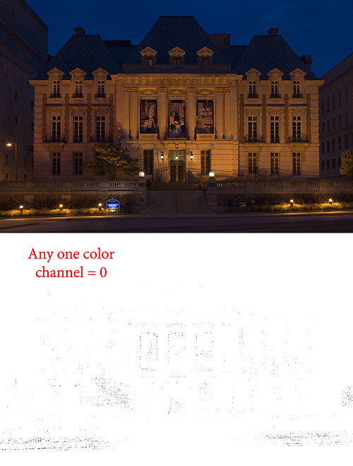
There are several methods I use to mask out dark noise. The simplest uses the image itself and the Threshold slider; this uses the RGB luminance function shown above. I examine the image while moving Threshold, and stop when a reasonable amount of noise is eliminated. Using this process on our darkest sample image we see:
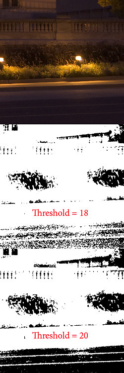
The road and the top of the building on the left shows the most noise. I adjusted the Threshold slider until much of that noise is eliminated, as you can see on this detail from the lower right hand corner of the image. You don't want to do too much of this.
I also use the same process, but doing each channel independently. This makes an exceptionally clean final image, but only if we don't have the simultaneous over and under exposure problem mentioned above.
This looks like a pretty good mask. It masks out the most underexposed parts of the image while not showing too much residual noise.
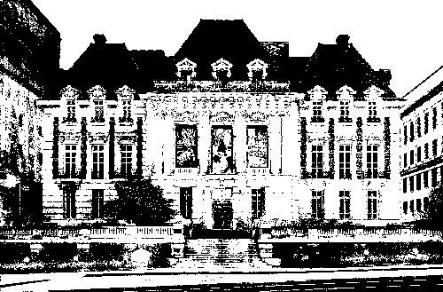
There is another technique which illustrates the problem of dark noise quite dramatically. What I do is take each channel separately, and brighten it with Curves until it no longer appears to be a photograph, but rather a line and charcoal drawing. Instead of a nice apparently continuous series of tones, we get discrete steps. This shows that we don't have enough spacing between brightness levels to produce a good image. Usually this effect is most prominent in the Blue channel because normal in-camera processing greatly amplifies its shadows.
You may want to click on the image to see the full size version. Some image enhancement software will work quite hard to bring out detail in shadows, but this is certainly detail we don't want to emphasize — unless of course we are going for a cartoony look. As it happens in this image, the red and green channels don't quite go to zero much and so we don't get much of the line drawing effect, but the blue channel does; so our mask eliminates considerable amounts of noise.
Creating masks like these can show you how much of your image consists of high quality pixels. I use these also for creating exposure blends. Here are those four images blended together, masking out the big color shifts and dark noise:
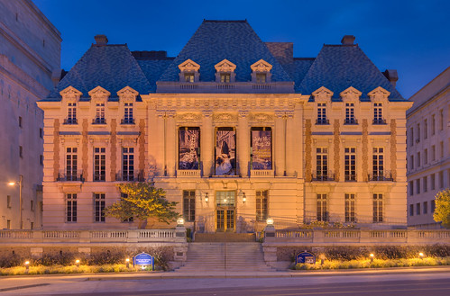
It looks pretty good, and there are hardly any color shifts except for the areas which were overexposed on the darkest base image. Notably, the color on the building and the blue sign have uniform color as needed, and we have excellent detail in the shadows. The major artifact here is the sidewalk light to the right of the stairs: it turned off between the second and third photos and so we get a strange rendering of it here. There is also some roughness along the roofline. You can click on the image to see the full resolution version.
Conclusion
The phenomenon of color shift — when even one channel is overexposed — severely limits quality color photography. Of course, solid studio lighting, or supplemental lighting with fill-in reflectors are frequently used by quality photographers. Or, you can blend multiple exposures, but then the problem is finding the right algorithm or software to do this.
On the contrary, this color problem implies that quality black and white photographs ought to be easier to produce. We can introduce severe changes of contrast without worrying about color shifts.
