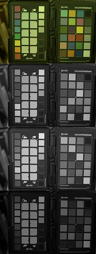
Slowly move your eyes to the square below.

Glorious, isn't it?
You are seeing some colors that are impossible to actually portray in the real world, other than transiently as you see here. These are called “imaginary colors”. You can't make paint that shows those colors, nor can you project a color of that light on a screen, nor show it on a computer monitor. A color meter does not measure these colors.
Here is the problem. The human eye has basically three classes of color sensors or cone cells, one generally sensitive to the red side of the color spectrum, another sensitive to blue on the other side of the spectrum, and green in the middle, along with green-blue sensitive rod cells that work most prominently in dim lighting. There are three color sensors, three only (although there may be some people — probably females only — who have four classes, and very many males, mostly, who have less than three).
There are some deep, rich red colors which do not stimulate either your green or blue cone cells. There are some deep, rich, dark violet colors which do not stimulate green or red. However, there are no green colors whatsoever which do not also stimulate your red or blue cells, or even both.
A camera mimics human vision by also having three classes of sensors, and like the eye, there is no color which will give a signal in the camera's green which will not also give a signal in either red or blue or both. There will be of course reds without blue and blues without red. You can examine your own RAW photos with the excellent RAW Photo Processor, set so as to do minimal processing of the image.

RAW Photo Processor was set with UniWB and no color space assigned, which gives basically the actual signal received by the pixels. No green colors have a dark red or blue signal. That we mathematically represent a pure bright green color in the sRGB color system as Red=0, Green=255, and Blue=0 tells us very little as to how the eye or camera senses the color: you'll never get a green signal without significant amounts of either red or blue or both.
Human color vision as it is has the potential to see these supergreen colors, unadulterated with excess red or blue. Our experiment above shows that you can actually see these colors, if only for a brief moment. Individuals with synesthesia or severe migraine headaches can see them more often.
Apparently, when we stare at a color long enough, our eyes become ‘fatigued’ and lose sensitivity to that color. Staring at the red-blue colors leads to decreased sensitivity to them — and so we can see, ever so briefly, imaginary supergreen. However, I suspect that this mechanism is responsible for the automatic white balance of the eye. We can see gray tones correctly under a wide variety of lighting, while a camera set to a fixed white balance would not, and so the eye must have some mechanism of subtracting out the color of the light.
Since we generally have only three types of color sensors in our eyes, which have well-characterized properties of light absorption, we have the basis for creating a precise mathematical model of color: and this model will have precisely three coordinates. This is despite the intense processing that goes on in our eyes and brains; processing that is hardly known at all, despite the fact that we experience it all of the time. That it is often difficult to put our experiences into words does not mean that we ought not attempt that work.
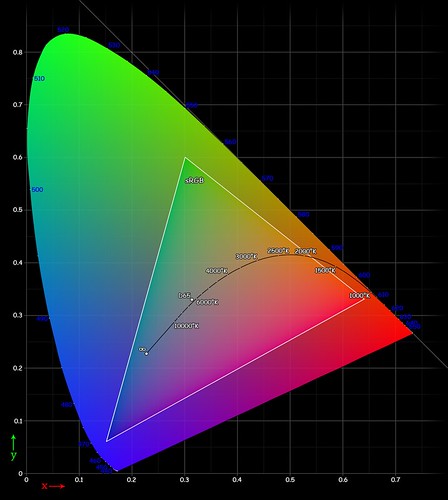
Following is a chart which represents the full gamut of real saturated colors seen by human vision:

Image originally from Wikipedia. Source and attribution is here.
This image approximately illustrates the full range of midtone saturated colors that can be actually reproduced by paint or by colored lights. Notice the straight line between blue and red? That shows that we can in fact get pure red and blue tones, not adulterated by any green at all, along with purple and scarlet mixtures of the two colors. Notice that the hump in the curve is in the green region, which shows that there is no physical green color which is not also a bit red or blue. If a supergreen color actually existed, then this chart would be a perfect triangle. Full human color imagination, including the supergreen colors, very likely is a triangle — for we can predict quite accurately what kind of supercolor we will see in experiments like the one above.
The color gamut shown above is only approximate in color, because the image itself is limited to the gamut of the sRGB color system, which is itself represented by the small triangle inside of the big horseshoe. The corners of the triangle represent the primary colors used by sRGB.
sRGB is quite standard, and is used by most cameras, computer monitors, web browsers, and even High Definition Television, but it can only show about 35% of all possible physical colors, and tends to be lacking in purple, green, and cyan. By using excellent quality color filters, and a bright enough light source, you can display a much wider gamut of colors — the triangle will be bigger and fill up more of the horseshoe — and for a price you can buy a high-gamut monitor that can display more colors than the puny sRGB standard.
This particular standard was chosen by Microsoft and Hewlett-Packard because it works with even cheap computer monitors, and because it uses only 8 bits of data for each red, green, and blue color channel, which was a serious limitation back in the days of expensive computer memory. This standard gives us a large enough gamut of colors, with a small enough spacing between them to avoid banding artifacts. However, I always use 16 bits when working on my pictures — even though I have to eventually reduce them to 8 when I show them on the web. (Computers, by the way, are particularly efficient at using powers-of-two when manipulating data: so we often see 4 bits, 8 bits, 16 bits, 32 bits and so forth; always multiplying by two).
To display a color on a computer or by projection, you need at least three primary colors, and the particular colors you use, and their brightness, determine the final gamut. But notice that you have to use actual, real colors for your projector — they have to be within the horseshoe — and so there will always be colors that cannot be represented. If you want more gamut you eventually will have to add more colors, which is precisely what we see with high quality color printing. This is impractical with monitors, however, which are usually limited to just three primary colors.
In a sense, the three primary colors are a bit arbitrary, and artists have used a variety of primary color systems in their theory. However, some primary color systems are better than others because they have a larger color gamut, or can represent a larger variety of basic colors. Undoubtably, the bottom of the horseshoe is rather pristine, so I would expect that most any color system ought to attempt to get as close to the bottom corners as possible: the open question is to which third color to use. Do you want good greens or good cyans? You can't have both if you use just three colors.
Note that painters use subtractive colors, so their primary colors out of necessity will have to be the opposite of what is shown here: cyan, magenta, and yellow rather than red, green, and blue. In particular, the painters' primary color palette will be especially deficient of good blues, greens, and reds. This is why some pigment colors are highly prized by artists, since they have colors that are otherwise unmixable. In the ancient Mediterranean, the most costly dyes came from various species of Murex snails, and the colors produced were down at the bottom of the horseshoe chart — with the purple or scarlet colors being used for Imperial dress, and the blue used for the fringes of Jewish prayer shawls. These colors are decidedly non-mixable — you have to obtain a pure color and cannot obtain them by mixing other colors.
If you want to represent the entire gamut of colors mathematically, using only three numbers, then you have to go outside of the bounds of the horseshoe. But then some combinations will give colors that cannot be represented by any paint or filter. But remember that a supergreen color can actually be experienced under some circumstances. However, there are some wide-gamut color systems which represent colors that cannot exist even in our imaginations, like a scarlet black or deep blue white. As far as I know a true wide-gamut color system that includes supergreen as one of its primaries does not exist, but it would be useful if it did, since it would closely represent the entire human visual system, including our imagination, while excluding those colors which are impossible to even imagine.
Here are the most commonly used color systems:
- sRGB: 35% of entire gamut
- ColorMatch RGB: a bit larger than sRGB, slightly different primaries
- Adobe RGB: 50.6%
- Wide-Gamut RGB: 77.6%
- CMYK: smaller than sRGB, but not complete overlap.
- ProPhoto RGB: most of the visible color gamut, 13% of the colors are imaginary or impossible.
- L*a*b* colorspace: 100% of visible colors, with lots of impossible colors.
Often I hear the advice that photographers ought to set their cameras to Adobe RGB, and just as often I hear photographers complain that their photos look washed out and unsaturated because they did use Adobe RGB but didn't know how to manage it, and so I recommend using sRGB and nothing else, even though it isn't the ‘best’.
When I do have need of producing colors outside of RGB, for example when preparing images for commercial four color print, then I will use a larger gamut color system, and eventually work directly in CMYK. If you are outputting to a broad-gamut color printer that uses more than four inks, then I'd use a high-gamut color system and load the color profile of the printer into Photoshop, keeping an eye on the gamut warning feature. If you are outputting images to the web, then use sRGB.
In the philosophy of logic, we say that a statement is true if it corresponds with being, with something that actually exists in the entire realm of being. But we say that a statement is meaningful if it does not encompass a logical contradiction — a square circle is not meaningful. If you can imagine something that does not actually exist — see it with your mind's eye — then your imagination still has meaning, even if it doesn't have truth. For example, you can imagine Doberman pincers with wings; these don't actually exist in our world, but you can imagine them without contradiction. Likewise with supergreen colors, which are meaningful even if you can't have a paint of that color.
2 comments:
"There are some deep, rich red colors which do not stimulate either your green or red cone cells."
Did you mean "green or blue"?
Ack! You are correct!
Post a Comment