Most artist's color wheels, as found in art stores and Internet searches are quite misleading. The idea of a color wheel is to show the relationship between the colors. Of great importance is the idea of color opponency: if you mix two colors opposite from each other on the wheel, you will not get a third color, but rather gray. But these color wheels do not work for digital technology. Red, yellow, and blue — the primary colors typically used in these wheels — are not the primary colors used in digital photography.
But like the artist's color wheels, my old color wheel is also misleading:
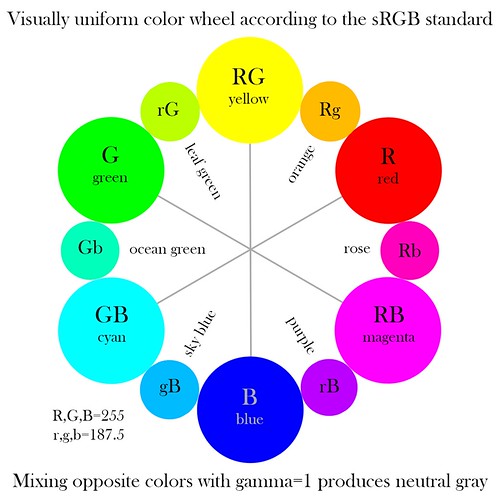
The primary and secondary color relationships shown here are correct. The primary colors of red, green, and blue are opposed to the secondary colors of cyan, magenta, and yellow, and if you mix these opposed colors in Photoshop you will indeed get a neutral gray. But the tertiary colors look wrong. Orange appears to be closer in brightness to red, being much darker than yellow, and likewise sky blue looks darker than it ought to be. There is hardly any differentiation between the green colors.
We are looking for the brightest colors we can as our primaries. Setting R=255, with G and B both equal to 0, we will get the brightest and most saturated pure red that can be represented by the sRGB color system. The opponent color to red is cyan, which we get by setting R=0 and G and B both equal to 255, and this is the brightest and most saturated cyan we can represent in our system. When we mix these colors together, we get a neutral gray color. By default, Photoshop will average all these colors together to gray. As it so happens, the average color number ought to be 127.5, but since fractions are not possible when using Photoshop in 8-bit mode, we get either 127 or 128; but this is close enough.
Click here for an overview of the RGB color system.
The tertiary colors are halfway between adjacent primary and secondary colors. So the tertiary color between red and yellow will be orange. Our red value is equal to (255, 0, 0), while our yellow value is (255, 255, 0). Averaging these numbers together, I get a middle orange tone of (255, 127.5, 0). Rounding the green value up to 128 (since we can't use fractions), I get the orange tone shown in the old color wheel above. But it is too dark, too close to red in tonality than to yellow. The color appears to be correct, but not its brightness. So I set about manually trying to come up with a color that appeared to my eye to be halfway between red and yellow. Using a number of ad hoc methods to blend colors in Photoshop, I attempted to produce a visually continuous range of tones between each primary and secondary color. As it so happens, I found that the new tertiary colors were always brighter than my original estimates, in fact, the middle RGB value for these tertiaries were quite close to each other: I estimated that they all were around 180-190. Now this meant that the tertiary values across from each other on my color wheel were no longer opponents. Mixing my new orange with my new sky blue got me a somewhat dim and unsaturated green color. But I was willing to accept this shortcoming in order to portray my tertiary colors with visual uniformity.
My mistake was assuming that the mathematically intermediate value of 128 was also visually intermediate. This is wrong; I did not account for gamma correction. The human eye sees light in such a way that doubling the intensity of light only makes a scene to appear a bit brighter. Likewise, cutting the intensity of light by half makes the scene appear to be only a bit darker. Our eyes can operate under an extreme range in lighting due to this property. The practice of gamma correction adjusts the color tones in the RGB system so that the range of brightness is more visually uniform: otherwise, most of our RGB numbers would represent only the very brightest of colors and would neglect darker shades; our coding would be inefficient.
Now gamma correction requires more than simple arithmetic, and the sRGB standard uses a non-standard, non-uniform gamma correction to the RGB data, making this whole process murky. I'll spare you the details; instead, read the article linked above. What is important is that gamma correction does not change the values of 0 and 255 in 8-bit RGB color, it only modifies intermediate values, and so our calculations with our primary and secondary colors are unchanged. Only the tertiary colors will change with gamma correction. Intermediate values, after backing out the gamma correction of sRGB, become 187.5, and so in the color wheel above, I set the values to either 188 or 187.
This still leaves us the problem of mixing colors in Photoshop. Blending together opposite tertiary colors does not give us a neutral gray. However, this has already been thought of. If you go to Edit-Color Settings, and then click More Options, we get this:
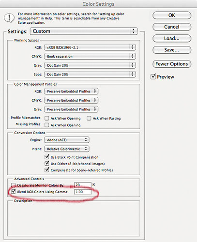
Select Blend RGB Colors Using Gamma 1.00, and the color mixing will be correct. This option subtracts out the gamma correction, allowing more accurate color blending. If we blend together our leaf green and our purple, under a gamma of 1, we will get a neutral gray color, and it will be the same shade of gray that we get if we blend together any of the opposing colors on the wheel. Since I'm not all that sure what other effects this option may have, it probably shouldn't be set at all times. But we do see that it in fact does produce more visually accurate color blends.
How does the wheel look? One problem is that the sRGB color gamut exceeds the capability of my calibrated iMac monitor, and so most of the colors here cannot be presented to my eye in their full glory. I find that I can hardly distinguish rose from magenta — how about you?
3 comments:
This is brilliant! I've been struggling with the same issues - thanks for sharing this insight (^(oo)^)v
Thanks!
Well, I didn’t understand color mixing at all, except for vague memories of art classes where they told us that yellow and blue paint mix to green. I even got a painter’s color wheel to help me to color correct my images, and it was disastrous.
I ought to note that this color wheel is only valid for mixing colors in the sRGB color gamut on the computer for display on a computer screen. It won’t work for paint, watercolor, or any subtractive color process. For subtractive colors, even the idea of a color wheel is highly misleading and problematic for mixing paints.
This requires much more thought and work to get right, to truly be visually uniform for the majority of viewers. First to go is the shape of a circle, and the primary colors will not be evenly spaced at equal angles with each other. I’m somewhat worried that this may make the wheel less usable, however. The current version, which requires Gamma=1 to work properly, is already problematic for beginners.
Post a Comment