DO YOU THINK that your photography is good? Do other people — people that aren't your friends or family — think that it is good? How would you feel if one of your photographs found its way into a junk shop or a flea market, and someone purchased it only because of its frame?
Ultimately, we must be humble enough to realize that no matter how much
artistic vision and effort we put into something, a buyer simply might
like our photograph only because it is nicely framed.
When I did a Google search for the phrase “I bought it for the frame,” I got over ten million search results, with many people telling of some print or painting they found at a junk shop, but which they discarded, simply because they liked the frame. Now we mustn't jump to the conclusion that the frame-buyers are ignorant, tasteless philistines. Perhaps your photograph isn't all that good. Perhaps the frame is really good. [NOTICE: I must admit to having a bit of anxiety whenever I go to a book fair or used book store, thinking that I might find one of my own books being sold cheap.]
Apparently, according to the same Google search, lots of people also buy bicycles only for their frame. They plan to strip the frame of all the seemingly more critically important stuff that actually makes the bicycle work, such as the wheels, gears, and chain. Certainly these working components are more important than the frame? Doesn't the frame just sit there? The answer is that in many respects these components are more important, and the components that just happen to be attached to the frame may not be all that good or fitting for the purchaser. The brakes and tires on a bicycle become gradually worn with use and slowly become less effective over time, and a bicycle rider can choose to replace them whenever it is convenient. But a bicycle frame must be perfectly durable, and it must not ever fail during use, for it cannot be repaired in the field: a frame does not slowly lose its functionality over time, for the welded joints on a frame are either rigid or are broken with no significant intermediate state. A frame, of course, can be repainted as needed.
So what kind of framed photograph would be more valuable to most any given person: an excellent portrait of someone else's child, or a cheap snapshot of their own child? We ought to realize that prints and paintings are more important than a frame, but they tend to be more personally important. If someone buys a framed print at a flea market and then discards the original print, that is because their print is more important than the original. Likewise, someone may purchase a used bicycle, but they might replace the seat for one that is more comfortable for them; they might replace the brakes because they are worn, but if the frame isn't good, they won't buy the bicycle.
A photograph or painting may be chosen because of a particular style of a room, or because of a particular mood expressed, or its use of particular coordinating colors. The subject matter may spark the imagination of the buyer, or the subject may invoke particular memories or devotions. An image may be discarded because it no longer fits the decor of the room, or it may invoke unpleasant memories: maybe it is faded or worn, or it is no longer interesting, or it is out of style.
Now, there are some artists, particularly in the past, who strove to make images that have a more universal, timeless character, that expressed objective beauty and the sublime. This is rare today because modernity rejects the eternal and universal in favor of that which is transitory and cheap. This means, perhaps, that contemporary works are more prone to being quickly discarded.
People may buy a print because of its frame, but the frame is not bought for its own sake, no matter how well it is made or decorated, but because it is ultimately intended to enclose a print or a painting. I know of no museum or gallery that is dedicated to the presentation of frames as objects of art (although this might be an exception), but there are vast numbers of merchants — including art galleries — that sell frames in a wide variety, and the cost of these frames may equal or exceed the cost of the image that is presented within it.
Frames are works of art in themselves (as is anything intentionally well-made by man's intellect), but their purpose is mainly in relationship to the fine art contained within them. The word ‘fine’ in ‘fine art’ is related to Aristotle's understanding of the “final cause” or ultimate purpose of a thing. The final cause of a frame is to support, display, protect, enhance, and delineate the work of art contained within it, as well as provide a visual transition between the work of art and its location. The buck stops at the image contained in the frame, as it is the final cause of the art: the job of art is complete and the viewer's job of looking at the image begins. But this does not mean that the frame is unimportant, for it has important functions, but it is subservient to those things, the images, which are greater. Even though we have differing opinions on what makes a good print or painting, we should not be surprised that most of us would largely agree on what what makes a good frame, for frames have a more definite purpose.
Getting a good understanding of composition is difficult, because it involves human psychology. The many proposed rules of composition seem to rest on shaky theoretical ground, and many of the supposed examples of the use of the rules are unconvincing. However, one element of composition is concrete and objective, that being the framing or the specific crop of the image. See the article Composition, Part 1 - the Frame for a more in-depth discussion of this. The objective framing of an image, due to a specific crop, can be be a powerful tool of composition if used well, and bad framing can certainly harm an image.
As the vast majority of images are rectangles, this suggests the good use of harmonic proportions between the length and width of the image with the proportions of the matting and size of the frame. The common standard print, matte, and frame sizes do express proportions that harmonize well with each other. Attempts at making custom frames and mattes for a non-standard print size will generally be expensive and error-prone. Custom sizes may also look awkward if the maker does not apply the mathematics of proportion ahead of time: for example, it may be possible to harmonize an image with a large aspect ratio within a frame with a smaller aspect ratio if the margins or matting are well-chosen, but if the ratios are not chosen well, the final object may look ridiculous, cheap, or inartistic.
For all these reasons, I think that it would be prudent if photographers give serious consideration to framing, since, after all, nearly every print that will be displayed on a wall needs a frame, and for the simple fact that a purchaser may buy your print because they like its frame.
Showing posts with label composition. Show all posts
Showing posts with label composition. Show all posts
Tuesday, November 27, 2012
Wednesday, August 29, 2012
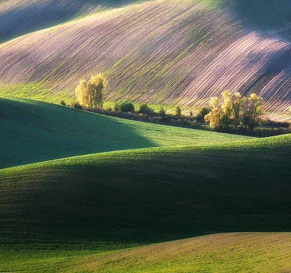
Composition in Landscapes and the Photography of Marcin Sobas
SOME INSPIRATIONAL LANDSCAPE photography, from Polish photographer Marcin Sobas, can be found here.
Sobas has lately gained a lot of positive attention for his remarkable landscapes of Moravia and Tuscany.
A while back, I made an effort to learn why some landscape photography has great appeal, and I attempted to identify the common characteristics of great landscape images. Now, there is no end to advice that can be found on the subject of landscapes, but I desire to discover those characteristics that are more certain and definite. Some of my observations can be found in the article Composition, Part 2 - Composition and Subject in Landscape Photography.
From my analysis of highly-regarded landscape images, I found some characteristics that nearly all of them share. These ought not be considered unbreakable rules, nor should this list be considered exhaustive, for they are not the only things that photographers consider; rather this is simply what I saw, and there could be great landscapes that are otherwise.
1. Almost by definition, a landscape ought to have a superhuman scale. Good landscapes depict scenes that dwarf the human person, and so have the characteristic of sublimity. The sublime describes “a sense of awe, grandeur, or greatness, something that is lofty to an extreme degree, so much so that it dwarfs the human person in insignificance.” See the article On the Sublime for more details. A sublime scene may or may not be a beautiful scene, but it certainly has to be big, and Sobas’ images show rather big scenes that are sublime and beautiful.
Imagine taking a photograph of a small garden; the flowers may be beautiful, but the scene will likely lack sublimity, because the garden is of human scale. This problem of scale concerned the designers of the Victorian-era Tower Grove Park in Saint Louis, Missouri, USA, and they knew that the sublime would not be possible in their park. The results are pretty, but not lofty, as I show in the article here.
2. Unusual use of lenses can make for better landscape photos. Beginning landscape photographers often desire ultra-wide angle lenses so as to “get the whole scene in.” But consider that wide angle lenses not only get in the whole scene, but at the same time they make distant objects recede in size and scale, taking away the impression of sublimity. Wide angle lenses instead emphasize the foreground, which may include objects of a more human scale, while reducing the grand vistas of the background.
Instead, Sobas often uses a telephoto lens, a Canon 70-200mm f/4 L-series lens, which gives a horizontal angle of view of 18.2 to 6.4 degrees on his Canon 40D camera. This narrow angle of view provides foreshortening — making distant objects appear closer to each other — as we see with the hills in the photograph above. The use of a telephoto exaggerates the vertical dimension at the expense of perceived depth. Would the scenes have appeared as sublime if he had stood closer, and had used a wide-angle lens?
You may, however, consider the final size of your image and how close you will view it: if you are creating a panorama that will cover the wall of a room, then small detail becomes more prominent, and so a wider angle of view may not decrease the impression of sublimity.
Also note that Sobas often uses a high camera angle. Instead of just seeing one line of ridges, we can see multiple lines of ridges and hilltops, one behind the other, which increases the grandeur of the scenes.
3. Good landscapes are almost always taken around sunrise or sunset, or at night. I’m not saying that good landscapes can’t be taken at midday, I’m just saying that they typically aren’t. The lighting angle during the extremities of the day is low, and so shadows thrown are long, and serve to model the undulating terrain. In this way, early or late landscape photography is like using Rembrandt lighting for portraiture, which models the human face with shadow. Harsh lighting, like we find at midday, will often underexpose shadows or overexpose highlights; on the contrary, with the sun at a low angle, the sky acts as a great fill-in light. The attenuated orange light from the sun provides a good contrasting color with the blue of the sky, giving us far more color during the preferred times of day.
According to this interview, Sobas prefers cloudless mornings for his shooting. I’ve noticed that while sunsets are often pretty, the sky at sunrise is usually dull, but this makes for a better, more uniform light for this kind of work.
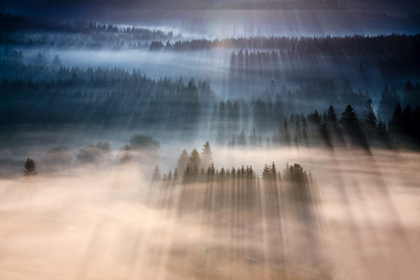
4. Unusual weather can help improve a landscape photo. Dramatic stormy skies and snow on the ground can turn an ordinary landscape into something more special. Sorbas likes foggy mornings to make his photos more interesting:
He recommends getting some knowledge of weather so as to predict the best times for taking photos. The Lawrenceville Weather website includes a fog forecast map for the lower 48 United States; I refer to this map frequently to find interesting shooting conditions. Also of use is The Photographer's Ephemeris, an application that calculates the angle of the sun; this can help to predict the direction of shadows, which may lead to better compositions.
5. Good landscapes usually have a full range of tones or color. Sobas subtly post-processes his images, and the final results do have a broad range of tones. The simple use of the levels tool, and saturation or vibrance — not done too strongly — can enhance a landscape photo without making it look overprocessed. Choosing the right subject, exposure, white balance, time of day, time of year, and weather conditions all contribute to getting good color.
6. Good landscapes typically have a unity and harmony, and avoid distracting details. A certain measure of abstraction works well. Again, many of Sorbos’images are so abstract that they, at first glance, appear to be paintings, but instead they are almost undoubtedly straight camera images with some mild postprocessing.
This is perhaps the most difficult part of landscape photography: what subject, what camera position, and what lens and cropping best suit the image? A good photographer ought to be able to view a scene, taking in both the subject as well as potentially distracting elements, instead of merely doing the same back home on the computer. Especially when an image is to be displayed at a small size on a computer screen, a large measure of abstraction is needed, more so than if the final image is larger.
7. Remember that photographs are made to be viewed by human beings, and adding a bit of human interest to an image may make a photograph more interesting to your viewers. Having a human in a landscape can draw attention to it, and in the best examples, can transform an ordinary landscape photograph into a dreamscape, deepening its emotional impact. From what I've seen, Sobas does not often include humans in his photos, but we do see buildings, boats, roads, and sometimes animals. I might add that most or all of these images depict landscapes that have been heavily altered by humans, perhaps over thousands of years, but in a harmonious way, and so they have an organic look to them.
8. Good landscape photos are usually made with good equipment and good technique. Because landscapes may not be as intrinsically interesting as a human figure, it takes extra effort to attract the eye. Journalistic style images can be rough, and that does not distract from them; indeed, a rough image may have a feeling of immediacy about it. Landscapes, on the other hand, are more timeless, and seem to call for more perfection.
There are any number of rules or principles used in landscape painting and photography, and the brief list above are merely my observations of what most good landscapes definitely seem to share. I haven’t mentioned commonly-cited principles such as the use of diagonals, leading lines, the rule of thirds, balance, avoiding subjects leaving the scene, the use of S curves, having a definite center of attention, and so forth, simply because these principles, in my mind, aren’t certain, or perhaps I simply don’t understand them well enough. Human psychology is complex, but some things are more certain than others; getting the basics right is more important than the subtleties. After knowledge, experience, and inspiration, comes more perfection.
 Ruins by Marcin Sobas |
Sobas has lately gained a lot of positive attention for his remarkable landscapes of Moravia and Tuscany.
A while back, I made an effort to learn why some landscape photography has great appeal, and I attempted to identify the common characteristics of great landscape images. Now, there is no end to advice that can be found on the subject of landscapes, but I desire to discover those characteristics that are more certain and definite. Some of my observations can be found in the article Composition, Part 2 - Composition and Subject in Landscape Photography.
From my analysis of highly-regarded landscape images, I found some characteristics that nearly all of them share. These ought not be considered unbreakable rules, nor should this list be considered exhaustive, for they are not the only things that photographers consider; rather this is simply what I saw, and there could be great landscapes that are otherwise.
1. Almost by definition, a landscape ought to have a superhuman scale. Good landscapes depict scenes that dwarf the human person, and so have the characteristic of sublimity. The sublime describes “a sense of awe, grandeur, or greatness, something that is lofty to an extreme degree, so much so that it dwarfs the human person in insignificance.” See the article On the Sublime for more details. A sublime scene may or may not be a beautiful scene, but it certainly has to be big, and Sobas’ images show rather big scenes that are sublime and beautiful.
Imagine taking a photograph of a small garden; the flowers may be beautiful, but the scene will likely lack sublimity, because the garden is of human scale. This problem of scale concerned the designers of the Victorian-era Tower Grove Park in Saint Louis, Missouri, USA, and they knew that the sublime would not be possible in their park. The results are pretty, but not lofty, as I show in the article here.
2. Unusual use of lenses can make for better landscape photos. Beginning landscape photographers often desire ultra-wide angle lenses so as to “get the whole scene in.” But consider that wide angle lenses not only get in the whole scene, but at the same time they make distant objects recede in size and scale, taking away the impression of sublimity. Wide angle lenses instead emphasize the foreground, which may include objects of a more human scale, while reducing the grand vistas of the background.
Instead, Sobas often uses a telephoto lens, a Canon 70-200mm f/4 L-series lens, which gives a horizontal angle of view of 18.2 to 6.4 degrees on his Canon 40D camera. This narrow angle of view provides foreshortening — making distant objects appear closer to each other — as we see with the hills in the photograph above. The use of a telephoto exaggerates the vertical dimension at the expense of perceived depth. Would the scenes have appeared as sublime if he had stood closer, and had used a wide-angle lens?
You may, however, consider the final size of your image and how close you will view it: if you are creating a panorama that will cover the wall of a room, then small detail becomes more prominent, and so a wider angle of view may not decrease the impression of sublimity.
Also note that Sobas often uses a high camera angle. Instead of just seeing one line of ridges, we can see multiple lines of ridges and hilltops, one behind the other, which increases the grandeur of the scenes.
3. Good landscapes are almost always taken around sunrise or sunset, or at night. I’m not saying that good landscapes can’t be taken at midday, I’m just saying that they typically aren’t. The lighting angle during the extremities of the day is low, and so shadows thrown are long, and serve to model the undulating terrain. In this way, early or late landscape photography is like using Rembrandt lighting for portraiture, which models the human face with shadow. Harsh lighting, like we find at midday, will often underexpose shadows or overexpose highlights; on the contrary, with the sun at a low angle, the sky acts as a great fill-in light. The attenuated orange light from the sun provides a good contrasting color with the blue of the sky, giving us far more color during the preferred times of day.
 Autumn ... by Marcin Sobas |
According to this interview, Sobas prefers cloudless mornings for his shooting. I’ve noticed that while sunsets are often pretty, the sky at sunrise is usually dull, but this makes for a better, more uniform light for this kind of work.
4. Unusual weather can help improve a landscape photo. Dramatic stormy skies and snow on the ground can turn an ordinary landscape into something more special. Sorbas likes foggy mornings to make his photos more interesting:
 Rays by Marcin Sobas |
He recommends getting some knowledge of weather so as to predict the best times for taking photos. The Lawrenceville Weather website includes a fog forecast map for the lower 48 United States; I refer to this map frequently to find interesting shooting conditions. Also of use is The Photographer's Ephemeris, an application that calculates the angle of the sun; this can help to predict the direction of shadows, which may lead to better compositions.
5. Good landscapes usually have a full range of tones or color. Sobas subtly post-processes his images, and the final results do have a broad range of tones. The simple use of the levels tool, and saturation or vibrance — not done too strongly — can enhance a landscape photo without making it look overprocessed. Choosing the right subject, exposure, white balance, time of day, time of year, and weather conditions all contribute to getting good color.
6. Good landscapes typically have a unity and harmony, and avoid distracting details. A certain measure of abstraction works well. Again, many of Sorbos’images are so abstract that they, at first glance, appear to be paintings, but instead they are almost undoubtedly straight camera images with some mild postprocessing.
This is perhaps the most difficult part of landscape photography: what subject, what camera position, and what lens and cropping best suit the image? A good photographer ought to be able to view a scene, taking in both the subject as well as potentially distracting elements, instead of merely doing the same back home on the computer. Especially when an image is to be displayed at a small size on a computer screen, a large measure of abstraction is needed, more so than if the final image is larger.
7. Remember that photographs are made to be viewed by human beings, and adding a bit of human interest to an image may make a photograph more interesting to your viewers. Having a human in a landscape can draw attention to it, and in the best examples, can transform an ordinary landscape photograph into a dreamscape, deepening its emotional impact. From what I've seen, Sobas does not often include humans in his photos, but we do see buildings, boats, roads, and sometimes animals. I might add that most or all of these images depict landscapes that have been heavily altered by humans, perhaps over thousands of years, but in a harmonious way, and so they have an organic look to them.
8. Good landscape photos are usually made with good equipment and good technique. Because landscapes may not be as intrinsically interesting as a human figure, it takes extra effort to attract the eye. Journalistic style images can be rough, and that does not distract from them; indeed, a rough image may have a feeling of immediacy about it. Landscapes, on the other hand, are more timeless, and seem to call for more perfection.
There are any number of rules or principles used in landscape painting and photography, and the brief list above are merely my observations of what most good landscapes definitely seem to share. I haven’t mentioned commonly-cited principles such as the use of diagonals, leading lines, the rule of thirds, balance, avoiding subjects leaving the scene, the use of S curves, having a definite center of attention, and so forth, simply because these principles, in my mind, aren’t certain, or perhaps I simply don’t understand them well enough. Human psychology is complex, but some things are more certain than others; getting the basics right is more important than the subtleties. After knowledge, experience, and inspiration, comes more perfection.
Sunday, June 17, 2012
Composition, Part 2 - Composition and Subject in Landscape Photography
A WHILE BACK, I got a somewhat difficult assignment: I was to photograph a considerable number of city parks for a coffee table photo book. While I liked my architectural photos, I’d always been rather disappointed with my landscapes, as I mentioned in an earlier article, Composition, Part 1 - the Frame. My publisher, Reedy Press, must have thought I was up to the task, even though I was uncertain. But with a year to study, experiment, and shoot, I was able to successfully produce many good photos. Certainly I’m no master of the subject, but I think it might be useful to share some of what I learned while shooting this book.
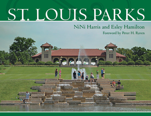
The final book, St. Louis Parks, turned out well, and it is well-recieved by the public. Please click here if you would like to purchase a copy, autographed by me.
My publisher selected the photo above for the cover of the book, and I generally like it. It isn’t perfect — the sky appears to have a slight greenish tone, especially when seen under fluorescent illumination (although it is correctly white-balanced, and I didn’t alter the hue in post-processing), and the image is a bit darker than I’d like. The formal symmetry, with the fountain and building centered with each other and with the frame, is pleasing to me, but it is slightly off — although this is offset by the presence of the spine, not seen here, on the left hand of the book. What makes the photo, I think, is the presence of teenagers enjoying the fountain; having human subjects in a landscape photo is often appealing. The photo is technically OK, has a good subject, and is composed adequately, making it, in the opinion of my publisher, good enough to be on the cover of a book.
Generally speaking, there is a certain lightness of spirit or relief you can get when you leave certain decisions to others — were I to have selected the photos for the book, I think I would have agonized too much over them, seeing little else than flaws. Instead, my publisher selected images that he thought had general appeal, and he usually selected my favorites. Artists are often not the best judges of their works. Getting a sense of what is good takes understanding, time, and experience, as well as receiving the good judgement of others.
The first step towards getting better in photography, or any art, I think, is to understand why your works are disappointing, and understanding what makes good images superior. This can be exceptionally difficult, for oftentimes it is hard to put vague feelings into words. Determining what actions to take can be difficult also, for it requires an understanding of the technology. For example, you may find that your photographs are too yellow, but you have to understand color theory in order to know that you must make the photos more blue to cancel out the yellow, and you have to understand manual white balance on the camera, or the use of post-processing on the computer to correct for this flaw.
Friday, January 27, 2012
Composition, Part 1 - the Frame
I MUST ADMIT that the technical aspects of photography are easiest for me. Color spaces, exposure and lens calculations, f/stops, shutter speeds, and ISO sensitivity are generally objectively certain and quantifiable. On the contrary, artistic considerations such as the use of color itself and composition seem to be subjective, qualitative, and much less certain. However, we must not oppose technique with art: they are not two things, but are different aspects of one thing, and they both must be taken into consideration when making a final image.
When I became serious about photography a number of years ago, I didn't give composition too much consideration, simply due to the fact that I was taking mainly architectural photos:
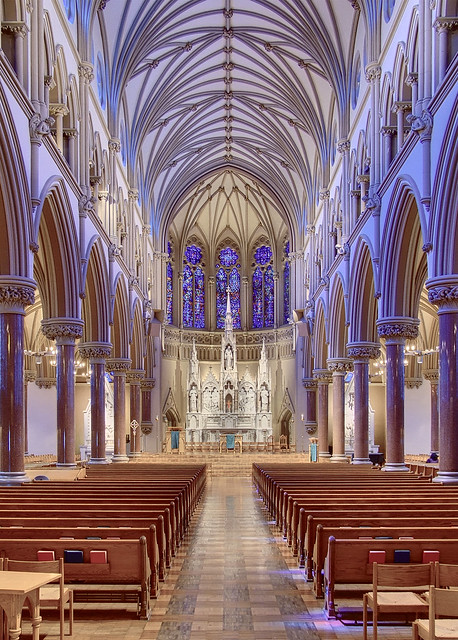
Saint Francis Xavier Church, at Saint Louis University, in Saint Louis, Missouri, USA.
The hard work of composition was already done for me by the architect. I merely had to discover good camera positions and angles, and the kind of post processing that would express the work of the architect in a pleasing manner. Fortunately, these discoveries came rather quickly to me.
Likewise, I found it easy to take pleasing photos of flowers:

Flower, at the Missouri Botanical Garden (Shaw's Garden), in Saint Louis.
Flowers are intrinsically interesting, and nature suggests composition.
When I became serious about photography a number of years ago, I didn't give composition too much consideration, simply due to the fact that I was taking mainly architectural photos:
Saint Francis Xavier Church, at Saint Louis University, in Saint Louis, Missouri, USA.
The hard work of composition was already done for me by the architect. I merely had to discover good camera positions and angles, and the kind of post processing that would express the work of the architect in a pleasing manner. Fortunately, these discoveries came rather quickly to me.
Likewise, I found it easy to take pleasing photos of flowers:
Flower, at the Missouri Botanical Garden (Shaw's Garden), in Saint Louis.
Flowers are intrinsically interesting, and nature suggests composition.
Tuesday, July 6, 2010
Rule of Thirds?
SOMEONE ASKS ABOUT the significance of the Rule of Thirds, a simple compositional rule found in painting, drawing, and photography. Unless he is given proof, he thinks it is mere mythology, and so can be ignored.
Basically, the Rule of Thirds states that the major compositional elements of an image ought to be placed one third of the way between the edges of the image. For example, the horizon in a seascape or sunset ought to be a third of the way from the top or bottom. What is the justification for this?
The principles of classical harmony are of great significance in music, design, and architecture, and were explicitly used from remote antiquity — and ended only with radical modernism.
I agree that much of the language associated with the rule seems to be excessively fuzzy, and purported uses of the rule often seem unconvincing. However, this does not mean that the rule has no merit, and certainly can be used where there are strong compositional elements that can correspond to it. Good composition can improve an image, and good composition often includes simple rules such as this one.
The argument for the rule can be made top-down or bottom-up. Certainly the use of simple ratios of small numbers — the basics of classical harmony — can be justified by mathematical means, especially when we consider the stability and order of harmonic systems and compare them to the instability and disorder of inharmonic systems. Also, we can consider human psychology at its lowest impulses, which seeks out good things for life via their implicit order. Certainly, artists who are revolutionaries produce jarring compositions — which violate the rules of classical harmony — to cause anxiety in the viewer, which proves the rule by its negation.
However, the rules of classical harmony do not state that the Rule of Thirds is an ideal. Rather, this system has a number of ratios, with 1:1, 2:1, 3:2, and 4:3 being considered the most pleasing, and with 5:4 and 6:5 following in value. Note that harmonious ratios are small - between 1 and 2, and are created by dividing one small number into another.
Artist and lecturer David Clayton, on his website The Way of Beauty, discusses this topic in his article, Using Boethian Proportion for Better Web Design. Clayton states that the common emphasis on the Golden Ratio — which is irrational and is not a ratio of small numbers — has only been considered important since the Renaissance, and is not directly involved in good proportion.
Unless the photographer has complete control over his subject, as in a studio, the photographer will likely have less need for classical harmony and the Rule of Thirds; rather, the subject itself is of greater importance. This does not mean that harmony is unimportant, but rather that it is of lesser importance and ought to serve the higher thing. Conversely, if an artist wants to represent the order and harmony found in the cosmos or a higher order of being, then the use of classical harmony is very important: this was commonly found in traditional non-representational abstract art which has been practiced since antiquity.
Ultimately, we ought not to merely promote rules, for this leads to legalism and its inevitable rejection. Rather, we ought to seek the meaning behind them. Here, both the ancient philosophers and modern scientists would agree.
Read the conversation here, on Digital Photography Review.
Basically, the Rule of Thirds states that the major compositional elements of an image ought to be placed one third of the way between the edges of the image. For example, the horizon in a seascape or sunset ought to be a third of the way from the top or bottom. What is the justification for this?
The principles of classical harmony are of great significance in music, design, and architecture, and were explicitly used from remote antiquity — and ended only with radical modernism.
I agree that much of the language associated with the rule seems to be excessively fuzzy, and purported uses of the rule often seem unconvincing. However, this does not mean that the rule has no merit, and certainly can be used where there are strong compositional elements that can correspond to it. Good composition can improve an image, and good composition often includes simple rules such as this one.
The argument for the rule can be made top-down or bottom-up. Certainly the use of simple ratios of small numbers — the basics of classical harmony — can be justified by mathematical means, especially when we consider the stability and order of harmonic systems and compare them to the instability and disorder of inharmonic systems. Also, we can consider human psychology at its lowest impulses, which seeks out good things for life via their implicit order. Certainly, artists who are revolutionaries produce jarring compositions — which violate the rules of classical harmony — to cause anxiety in the viewer, which proves the rule by its negation.
However, the rules of classical harmony do not state that the Rule of Thirds is an ideal. Rather, this system has a number of ratios, with 1:1, 2:1, 3:2, and 4:3 being considered the most pleasing, and with 5:4 and 6:5 following in value. Note that harmonious ratios are small - between 1 and 2, and are created by dividing one small number into another.
Artist and lecturer David Clayton, on his website The Way of Beauty, discusses this topic in his article, Using Boethian Proportion for Better Web Design. Clayton states that the common emphasis on the Golden Ratio — which is irrational and is not a ratio of small numbers — has only been considered important since the Renaissance, and is not directly involved in good proportion.
Unless the photographer has complete control over his subject, as in a studio, the photographer will likely have less need for classical harmony and the Rule of Thirds; rather, the subject itself is of greater importance. This does not mean that harmony is unimportant, but rather that it is of lesser importance and ought to serve the higher thing. Conversely, if an artist wants to represent the order and harmony found in the cosmos or a higher order of being, then the use of classical harmony is very important: this was commonly found in traditional non-representational abstract art which has been practiced since antiquity.
Ultimately, we ought not to merely promote rules, for this leads to legalism and its inevitable rejection. Rather, we ought to seek the meaning behind them. Here, both the ancient philosophers and modern scientists would agree.
Subscribe to:
Posts (Atom)