NIKON RELEASED a new version of their free photo editing software: you can get it here: View NX 2.
In my opinion, this software produces better RAW conversions than does my version of Adobe Camera RAW with Photoshop CS3. I've noticed that it has much better color consistency between differently exposed images of the same subject, which is important for exposure blending — and it produces fewer noisy color artifacts along high-contrast edges. The colors also look much better, and the automatic color aberration removal is a time-saving feature.
But I can't wait to try ACR on Photoshop CS5 — when I can afford it.
A huge problem is that the old View NX is very slow, primarily because it uses lots of memory. The new NX 2 looks much better and has excellent performance. Now I can have all my applications open at one time without my computer grinding to a halt.
I use the D-Lighting feature all the time to boost shadows, but the old version just had a few settings — and the low setting often didn't work at all, or made things worse. The new version has a very smooth slider for continuous adjustment.
UPDATE: There appears to be a bug in the software. When I make edits to a RAW file and save them, I do an output to TIFF, which then I pull into Photoshop for further editing. THIS DOES NOT WORK. The TIFF file has the original RAW image, without the edits. Not good.
CORRECTION: The bug I saw is due to me previously editing the image in Adobe Camera RAW. This creates a sidecar file, which apparently confuses ViewNX. If I delete that sidecar file — it has the file extension .xmp — ViewNX works properly.
Wednesday, August 18, 2010
Monday, August 16, 2010
An RGB Quiz
A LITTLE QUIZ. Guess the color channels in the photo below.

This is a photo of a hot air balloon, taken in a brilliant blue sky. We see here the three color channels of my original color image, along with a black-and-white conversion of the image, using the Photoshop Desaturate tool.
Remember, in the RGB system we have one channel each for red, green, and blue light. For the red channel, if it is black, that means no red is present, and if white, then the red component of color is brightest, and likewise for the other two colors.
This was a typical blue sky, and so that is your only clue. See if you can answer these questions:
This is a photo of a hot air balloon, taken in a brilliant blue sky. We see here the three color channels of my original color image, along with a black-and-white conversion of the image, using the Photoshop Desaturate tool.
Please see my earlier posting, Color Spaces, Part 1: RGB. Mastering the channel structure of color images will give you more control over your final images, since it replaces guesswork and trial-and-error with certain knowledge.
Remember, in the RGB system we have one channel each for red, green, and blue light. For the red channel, if it is black, that means no red is present, and if white, then the red component of color is brightest, and likewise for the other two colors.
This was a typical blue sky, and so that is your only clue. See if you can answer these questions:
- What color is the balloon?
- What color are the stripes on the balloon?
- Actually, there is another band of a different color, near the top of the balloon. What is its color?
- Name each color channel.
- Identify the desaturated image.
Sunday, August 15, 2010
Color Spaces, Part 1: RGB
BLACK AND WHITE photography is a masterful medium. Despite — or perhaps because of — its simplicity, it really shows off a photographer's skill and eye. Digital black and white photography reflects this utter simplicity. Each pixel in a final black and white JPEG image is assigned a value from 0, meaning pure black, to 255, meaning pure white. You can hardly get simpler than that and still call yourself a photographer.
But color is inherently messy. While we do know that most human eyes have three types of light-sensitive cone cells, which generally react to red, green, and blue light, this is a rather simplistic description of what actually exists. But what is really important is the fact that there are three types of color sensors. (And there is a fourth also, but it is sensitive to greenish-blue, and visually appears blue, and then typically only under dim lighting.)
We do know that we can generally represent color accurately by using three numbers, which correspond in some way to the three types of color cells in the eye. You can arrange all known colors into whatever kind of classification scheme you desire, but out of this infinity of schemes, only an infinitesimally small fraction of them display any kind of meaningful objective order: a good color-ordering scheme will be simple, and this simplicity will be expressed by having irreducibly three numbers to describe color. This means that you can arrange all colors into a three-dimentional shape, with the colors varying smoothly in some way in each direction. (There are color systems with four numbers, and some even go up to 10! These are used for printed output. Having more than three numbers for color is said to overspecified or redundant, and so there will usually be more than one way of specifying any unique color.)
There are many schemes used today to represent color, with each one typically using three numbers. The meaning of each of these numbers, however, changes drastically depending on the system used. The most common scheme is called the Red-Green-Blue, or RGB color space:
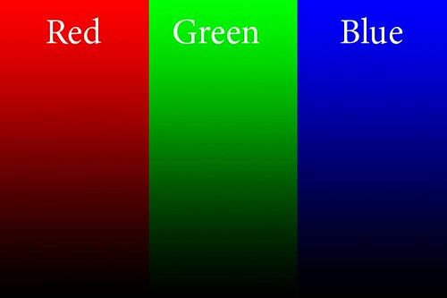
This is the kind of color space used in cameras, and this is also used when editing photos. We have three numbers, one each for the values of Red, Green, and Blue, and these numbers (for 8 bit files) go from 0 to 255. The beauty of this system is that when you continuously vary any one of the RGB colors, the tones you see vary in a natural manner — you typically don't get strange discontinuities in the color you see.
In this example, each slice of the image above has the named color go from 0 at the bottom, to 255 at the top, with the other color values being zero. A mix of numbers gives you different colors.
If all three values are zero, the result is black; if all three numbers are 255, then it is white: whenever all three values are the same, we get no color at all, but varying shades from black through gray to white. This is very useful in Photoshop: if we want to white balance an image, we just have to identify places that ought to be white, gray, and black, and then apply curves to force the three numbers to have equal values in each area.
A bigger number means a brighter pure color. Now, here is the big limit to the RGB color space: what specific color is equal to 255? As it turns out, that choice limits the gamut, or range of colors that can be represented by RGB. And so, we have many RGB color spaces, including the common sRGB color space used here, as well as AdobeRGB, ProPhoto RGB, ColorMatch RGB, and so forth. sRGB has the narrowest gamut of the bunch, while all the others can represent a wider range of colors.
Practical computer science considerations are why we are limited to 256 levels for each color: this is due to the binary arithmetic used by computers and also due to the formerly extreme cost of computer equipment. 256 levels per color gives us a good total number of colors, and is generally adequate for quality photography. Much fewer numbers of colors will likely introduce banding in the final image. But it is for this reason that sRGB is a decent color space to use, even though it can't represent the full range of colors: wide gamut color spaces may introduce banding because they might still use only 8 bits per color, and so the colors are spaced further apart.
When using Photoshop, I recommend using 16 bit mode, especially if you are going to do some extreme edits to your images. This reduces the possibility of banding. However, you still have to reduce your final image to 8 bits per color if you want to display photos for the web. Also, be aware that many web browsers can only view sRGB images accurately: other color spaces will look bad.
Another consideration with RGB is how perceived brightness varies as the values go from 0 to 255. The simplistic idea that 200 will be twice as bright as 100 doesn't work well — for the human eye, twice as much light doesn't look twice as bright, rather it looks only a bit brighter. This phenomenon lets us see over vast ranges of brightness, and so the RGB scheme accounts for this by using gamma correction, which I'll go over in the future. Gamma correction assigns the RGB numbers in a way that appear a bit more more perceptually uniform.
RGB is the most common color space used, but that does not mean that it is the best for all purposes. When using curves, all three colors have to be modified at the same time, otherwise you will get color shifts. Also, how Photoshop determines the brightness of a particular color may not accurately reflect how the human eye sees it.
Photoshop is a bewildering piece of software, with a tremendous number of options. But there really are only a few key concepts that must be understood and mastered. I think the color channel system is essential. Each of the three numbers discussed earlier is broken off into its own channel: each channel is a black and white image made up of only one of the three numbers. Ideally, when you see a color image you should be able to imagine what each of the channels look like; also, if you are given a channel, you ought to be able to determine which color it goes with. For example, here are the RGB channels of the image above:
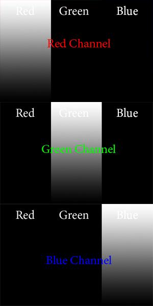
Is this what you imagined? For the red channel, we have no Green or Blue data, and so they are black in the places of the image that are green and blue. A value of 0 is black, and so 255 in the red channel will give you the brightest pure red. Just by looking at the Red channel, you ought to be able to determine that the only color you see on the left is red. Now, this is pretty straightforward for pure colors, but when we have other colors, it gets a bit more complicated.
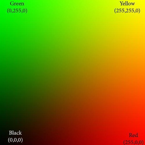
Here we show only the red and green color channels, mixed together in various proportions. Can you imagine what the color channels look like? The blue channel is completely black (except for the white text). The red channel goes uniformly from 0 on the left to 255 on the extreme right, and likewise the green channel goes from 0 on the bottom to 255 on the top.
At the extreme bottom of the image, both green and blue are 0, and so we see pure red tones going from black to bright red. Likewise, along the left side of the image, we have pure green tones.
The upper right hand corner of the image has both red and green at 255, and blue at 0: this is pure, bright yellow. Along the right edge we see orange, which is a mixture of yellow and red, or rather, bright red with some green and no blue. The top edge shows lime green, a mixture of yellow and green, or pure green and some red and no blue.
The diagonal line from black to yellow shows equal portions of red and green. You may notice how very little of this region looks particularly yellow but instead is kind of a muddy color. Actually, the color brown is in reality a dim yellow or orange color, which looks muddy merely because of bright surrounding colors. If you take a brown object, put it on a very black background, and brightly illuminate it, it will likely look nicely yellow or orange, and not brown at all.
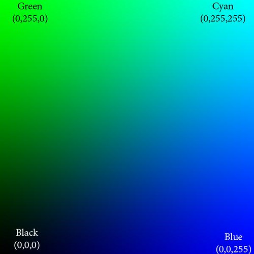
Here we show only green and blue, and the red channel is black.
The upper right hand corner of this image is cyan, which has 0 red, while both blue and green are at 255. These colors are very significant: they are the opponent colors of whatever channel is black. Ideally, those colors would be opposite from each other on a color wheel. So we see that cyan is the anti-red: there is no cyanish-red color possible, rather mixing them together on the computer only gives you gray. Here are the important opponent colors:
Blue — Yellow
Red — Cyan
Green — Magenta
Whenever you see a bright saturated yellow, you will know that the blue channel there is black, and likewise for the other opponents.

Red and blue gives magenta. Magenta is the anti-green.
Isaac Newton's color theory is very deficient because it cannot account for magenta colors; however, even this RGB system is deficient because it cannot give us a pure violet — a color that is ultra-blue, with no red it it whatsoever. But because of how we see, some tones of magenta appear violet to our eyes. Yes, color vision is complicated.
These illustrations show pure colors. If we were to include non-zero values for all three colors, we won't get any new colors, but only grayer and lighter tones of these existing pure colors. Having three RGB colors reduces saturation. Just by looking at the RGB numbers, you ought to be able to tell how saturated a color is; and if all three RGB numbers are equal, then you know you will have a completely unsaturated color: white, black, or shade of gray.
You don't need to see color in order to accurately analyze and color-correct an image in Photoshop. There is much ado made of having a calibrated monitor, and while that is good and useful, it is not absolutely essential. It is better to color-calibrate your images, because your eyes can fool you, especially when you are tired, and also no monitor calibration is perfect. Just remember these rules:
All RGB numbers the same: gray
All RGB numbers high: white
All RGB number low: black
R high, others low: red
G high, others low: green
B high, others low: blue
R and G high, B low: yellow
R and B high, G low: magenta
G and B high, R low: cyan
Any one or two of RGB high; the others medium and equal: light unsaturated color or pastel
Any one or two RGB low; the others medium: unsaturated dark color.
R high, G medium, B low: orange
R high, B medium, G low: rose
G high, R medium, B low: lime
G high, B medium, R low: sea green
B high, R medium, G low: purple
B high, G medium, R low: sky blue
Suppose you take a photo with a ordinary clear blue midday sky. Are the RGB numbers such that B is greater than G, and G is greater than R? If not, is it your artistic intent to make the sky look purple, or some other color than sky blue? If not, and if you intend to share your photos with others, especially on the Internet, then be sure your colors are right. If an objectively purple sky looks like a normal sky blue on your computer monitor, then you need to calibrate your monitor.
Remember, color calibrate your images before you calibrate your monitor!
If you are confident that you understand RGB, then take An RGB Quiz.
For an overview of the CMYK color system: Color Spaces, Part 2: CMYK and Part Two of "Color Spaces, Part 2: CMYK" as well as A CMYK Quiz.
See also Color Spaces, Part 3: HSB and HSL and Color Spaces, Part 4: Lab.
But color is inherently messy. While we do know that most human eyes have three types of light-sensitive cone cells, which generally react to red, green, and blue light, this is a rather simplistic description of what actually exists. But what is really important is the fact that there are three types of color sensors. (And there is a fourth also, but it is sensitive to greenish-blue, and visually appears blue, and then typically only under dim lighting.)
We do know that we can generally represent color accurately by using three numbers, which correspond in some way to the three types of color cells in the eye. You can arrange all known colors into whatever kind of classification scheme you desire, but out of this infinity of schemes, only an infinitesimally small fraction of them display any kind of meaningful objective order: a good color-ordering scheme will be simple, and this simplicity will be expressed by having irreducibly three numbers to describe color. This means that you can arrange all colors into a three-dimentional shape, with the colors varying smoothly in some way in each direction. (There are color systems with four numbers, and some even go up to 10! These are used for printed output. Having more than three numbers for color is said to overspecified or redundant, and so there will usually be more than one way of specifying any unique color.)
There are many schemes used today to represent color, with each one typically using three numbers. The meaning of each of these numbers, however, changes drastically depending on the system used. The most common scheme is called the Red-Green-Blue, or RGB color space:
This is the kind of color space used in cameras, and this is also used when editing photos. We have three numbers, one each for the values of Red, Green, and Blue, and these numbers (for 8 bit files) go from 0 to 255. The beauty of this system is that when you continuously vary any one of the RGB colors, the tones you see vary in a natural manner — you typically don't get strange discontinuities in the color you see.
In this example, each slice of the image above has the named color go from 0 at the bottom, to 255 at the top, with the other color values being zero. A mix of numbers gives you different colors.
If all three values are zero, the result is black; if all three numbers are 255, then it is white: whenever all three values are the same, we get no color at all, but varying shades from black through gray to white. This is very useful in Photoshop: if we want to white balance an image, we just have to identify places that ought to be white, gray, and black, and then apply curves to force the three numbers to have equal values in each area.
A bigger number means a brighter pure color. Now, here is the big limit to the RGB color space: what specific color is equal to 255? As it turns out, that choice limits the gamut, or range of colors that can be represented by RGB. And so, we have many RGB color spaces, including the common sRGB color space used here, as well as AdobeRGB, ProPhoto RGB, ColorMatch RGB, and so forth. sRGB has the narrowest gamut of the bunch, while all the others can represent a wider range of colors.
Practical computer science considerations are why we are limited to 256 levels for each color: this is due to the binary arithmetic used by computers and also due to the formerly extreme cost of computer equipment. 256 levels per color gives us a good total number of colors, and is generally adequate for quality photography. Much fewer numbers of colors will likely introduce banding in the final image. But it is for this reason that sRGB is a decent color space to use, even though it can't represent the full range of colors: wide gamut color spaces may introduce banding because they might still use only 8 bits per color, and so the colors are spaced further apart.
When using Photoshop, I recommend using 16 bit mode, especially if you are going to do some extreme edits to your images. This reduces the possibility of banding. However, you still have to reduce your final image to 8 bits per color if you want to display photos for the web. Also, be aware that many web browsers can only view sRGB images accurately: other color spaces will look bad.
Another consideration with RGB is how perceived brightness varies as the values go from 0 to 255. The simplistic idea that 200 will be twice as bright as 100 doesn't work well — for the human eye, twice as much light doesn't look twice as bright, rather it looks only a bit brighter. This phenomenon lets us see over vast ranges of brightness, and so the RGB scheme accounts for this by using gamma correction, which I'll go over in the future. Gamma correction assigns the RGB numbers in a way that appear a bit more more perceptually uniform.
RGB is the most common color space used, but that does not mean that it is the best for all purposes. When using curves, all three colors have to be modified at the same time, otherwise you will get color shifts. Also, how Photoshop determines the brightness of a particular color may not accurately reflect how the human eye sees it.
Photoshop is a bewildering piece of software, with a tremendous number of options. But there really are only a few key concepts that must be understood and mastered. I think the color channel system is essential. Each of the three numbers discussed earlier is broken off into its own channel: each channel is a black and white image made up of only one of the three numbers. Ideally, when you see a color image you should be able to imagine what each of the channels look like; also, if you are given a channel, you ought to be able to determine which color it goes with. For example, here are the RGB channels of the image above:
Is this what you imagined? For the red channel, we have no Green or Blue data, and so they are black in the places of the image that are green and blue. A value of 0 is black, and so 255 in the red channel will give you the brightest pure red. Just by looking at the Red channel, you ought to be able to determine that the only color you see on the left is red. Now, this is pretty straightforward for pure colors, but when we have other colors, it gets a bit more complicated.
Here we show only the red and green color channels, mixed together in various proportions. Can you imagine what the color channels look like? The blue channel is completely black (except for the white text). The red channel goes uniformly from 0 on the left to 255 on the extreme right, and likewise the green channel goes from 0 on the bottom to 255 on the top.
At the extreme bottom of the image, both green and blue are 0, and so we see pure red tones going from black to bright red. Likewise, along the left side of the image, we have pure green tones.
The upper right hand corner of the image has both red and green at 255, and blue at 0: this is pure, bright yellow. Along the right edge we see orange, which is a mixture of yellow and red, or rather, bright red with some green and no blue. The top edge shows lime green, a mixture of yellow and green, or pure green and some red and no blue.
The diagonal line from black to yellow shows equal portions of red and green. You may notice how very little of this region looks particularly yellow but instead is kind of a muddy color. Actually, the color brown is in reality a dim yellow or orange color, which looks muddy merely because of bright surrounding colors. If you take a brown object, put it on a very black background, and brightly illuminate it, it will likely look nicely yellow or orange, and not brown at all.
Here we show only green and blue, and the red channel is black.
The upper right hand corner of this image is cyan, which has 0 red, while both blue and green are at 255. These colors are very significant: they are the opponent colors of whatever channel is black. Ideally, those colors would be opposite from each other on a color wheel. So we see that cyan is the anti-red: there is no cyanish-red color possible, rather mixing them together on the computer only gives you gray. Here are the important opponent colors:
Blue — Yellow
Red — Cyan
Green — Magenta
Whenever you see a bright saturated yellow, you will know that the blue channel there is black, and likewise for the other opponents.
Red and blue gives magenta. Magenta is the anti-green.
Isaac Newton's color theory is very deficient because it cannot account for magenta colors; however, even this RGB system is deficient because it cannot give us a pure violet — a color that is ultra-blue, with no red it it whatsoever. But because of how we see, some tones of magenta appear violet to our eyes. Yes, color vision is complicated.
These illustrations show pure colors. If we were to include non-zero values for all three colors, we won't get any new colors, but only grayer and lighter tones of these existing pure colors. Having three RGB colors reduces saturation. Just by looking at the RGB numbers, you ought to be able to tell how saturated a color is; and if all three RGB numbers are equal, then you know you will have a completely unsaturated color: white, black, or shade of gray.
You don't need to see color in order to accurately analyze and color-correct an image in Photoshop. There is much ado made of having a calibrated monitor, and while that is good and useful, it is not absolutely essential. It is better to color-calibrate your images, because your eyes can fool you, especially when you are tired, and also no monitor calibration is perfect. Just remember these rules:
All RGB numbers the same: gray
All RGB numbers high: white
All RGB number low: black
R high, others low: red
G high, others low: green
B high, others low: blue
R and G high, B low: yellow
R and B high, G low: magenta
G and B high, R low: cyan
Any one or two of RGB high; the others medium and equal: light unsaturated color or pastel
Any one or two RGB low; the others medium: unsaturated dark color.
R high, G medium, B low: orange
R high, B medium, G low: rose
G high, R medium, B low: lime
G high, B medium, R low: sea green
B high, R medium, G low: purple
B high, G medium, R low: sky blue
Suppose you take a photo with a ordinary clear blue midday sky. Are the RGB numbers such that B is greater than G, and G is greater than R? If not, is it your artistic intent to make the sky look purple, or some other color than sky blue? If not, and if you intend to share your photos with others, especially on the Internet, then be sure your colors are right. If an objectively purple sky looks like a normal sky blue on your computer monitor, then you need to calibrate your monitor.
Remember, color calibrate your images before you calibrate your monitor!
If you are confident that you understand RGB, then take An RGB Quiz.
For an overview of the CMYK color system: Color Spaces, Part 2: CMYK and Part Two of "Color Spaces, Part 2: CMYK" as well as A CMYK Quiz.
See also Color Spaces, Part 3: HSB and HSL and Color Spaces, Part 4: Lab.
Monday, August 2, 2010
Baroque Image Processing
THE MORE I STUDY photography, the more I am convinced that photographers can learn from the older art forms.
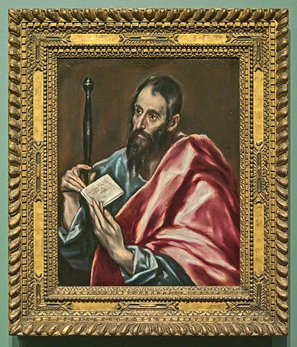
This is a painting of Saint Paul by Domenikos Theotokopoulos ‘El Greco’, found at the Saint Louis Art Museum.
Traditional painting is inherently a low-contrast medium — a similar plight found by photographers in their medium. In order to produce an acceptable image with a limited range of contrast, painters would use contrasting color and tones, and outlines to visually divide areas in their paintings. Here we can see halos of bright and dark paint along outlines, a technique similar to sharpening found in photography.
The folds of Paul's garments have strong contrast applied, and the great difference in brightness is used to good effect to imply three-dimentionality. This is similar to local contrast enhancement, a photographic post-processing technique similar to sharpening. By exaggerating the contrast in local areas of a photo, we can bring out detail in a way that looks plausible; this effect can be strongly applied, as is found in some High Dynamic Range tone-mapping techniques, or as we seen in this painting.
Sunday, August 1, 2010
Unsharp
I WAS DISTRACTED. My mind was wandering, and I found myself distracted by a flickering candle flame. It caught my eye — for it looked funny. The flame was about forty or so feet away, it was tiny to my eye, but I noticed a strange effect. The room was bright, and the flame was brighter still, but surrounding the flame, very distinct, was a black halo. That was very odd. Distracted even more, I looked more carefully. Yes, I saw a thin black halo. No doubt about it.
Have you ever hit ‘pause’ on a DVD or video tape, and have you noticed how bad the image on your screen looks? Really, even decent quality video looks rather poor in image quality when still. It looks fuzzy. Beginner photographers can take better still images than even big-budget Hollywood filmmakers.
But Hollywood doesn't normally do fantastic image quality because it doesn't have to. This is due to a phenomenon called motion sharpening. Moving images look sharper that static ones. Once a video is playing, perceived image quality goes up tremendously. The same thing occurs when we look at moving objects around us.
This seems rather paradoxical, when you consider that the human eye has a latency which is roughly equivalent to a camera shutter speed of not much more than 1/10th of a second. We would expect moving things to look blurry. But the visual mechanism of motion sharpening makes up a bit for this slow “shutter speed.” Or perhaps our eyes have motion sharpening because of this inherent latency.
This isn't a well-understood process. In fact, if you do a Google search of motion sharpening, all the top articles listed are fairly recent scientific peer-reviewed articles, hardly suitable for the layman. It is apparent that this field of study is fairly recent and not settled. Even though we don't understand this, it is a fact that the human eye adds the impression of sharpness to moving objects. Very likely this is what was happening when I was looking at the candle flame: the black halo around the flame was a sharpening artifact of my eyes, which made the flame more visually prominent, more sharp.
But if we look at an object that isn't moving, then we can expect that it will not be sharp. That is very bad news for photographers. Because we produce static images, we don't get the great sharpening advantage found by cinematographers or videographers, or even the advantage of what we see in real life, when things are moving around us. We are stuck with the job of producing relatively small images, which will be inherently soft — and not sharp — in visual quality.
An image without any contrast will be all one uniform tone, and so contrast is by definition what makes a photographic image. No contrast, no image. Sharpness is an example of contrast on a local scale within an image: lots of contrast near edges make them look sharp.
There are many sharpness woes for the digital photographer related to lack of contrast. I mentioned the static quality of photographs, and here are others:

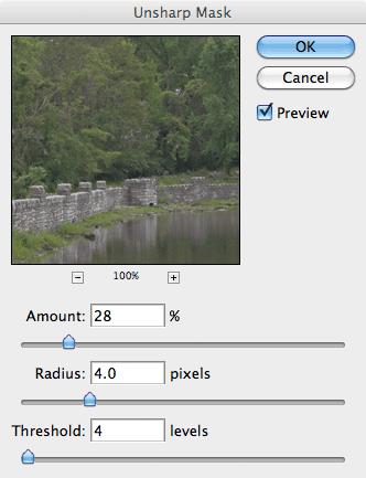
The noise is enhanced, and we need to reduce this problem. Raise the Threshold slider until the noise is not sharpened all that much:

We have a trade-off here. If we don't want to sharpen any noise whatsoever, then we will do no sharpening. But if we have to set the Threshold slider above, say, 25, then the image is likely too noisy to sharpen. It is a poor image and needs other work before sharpening. Here I got rid of a lot of the noise, but not all of it.
Ok, now click on a part of your image that has good, in-focus detail; this will sharpen the best. I usually zoom in to 200% on Unsharp Mask's preview. Move the slider to a Radius of 0.1 and move it slowly higher; keep an eye on the edges.
There will be a point where the detail will visually ‘pop’; this is the point where Unsharp Mask overcomes the inherent digital softness of the image, and it will likely vary between images. This is a step, which for best work, ought to be done on an image-by-image basis. For me it is a Radius of 0.3:
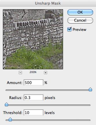
Now reduce the Amount until the image still looks sharp, but does not have obvious artifacts. The sharpness should be almost unconscious.

This was sharpened to 423% and may be a bit over done, but this is representative of the kind of crude in-camera sharpening done by many inexpensive compact cameras. This method does increase the sharpness of edges, making them more distinct. This isn't great, and could be better, but it is a start.
Have you ever hit ‘pause’ on a DVD or video tape, and have you noticed how bad the image on your screen looks? Really, even decent quality video looks rather poor in image quality when still. It looks fuzzy. Beginner photographers can take better still images than even big-budget Hollywood filmmakers.
But Hollywood doesn't normally do fantastic image quality because it doesn't have to. This is due to a phenomenon called motion sharpening. Moving images look sharper that static ones. Once a video is playing, perceived image quality goes up tremendously. The same thing occurs when we look at moving objects around us.
This seems rather paradoxical, when you consider that the human eye has a latency which is roughly equivalent to a camera shutter speed of not much more than 1/10th of a second. We would expect moving things to look blurry. But the visual mechanism of motion sharpening makes up a bit for this slow “shutter speed.” Or perhaps our eyes have motion sharpening because of this inherent latency.
This isn't a well-understood process. In fact, if you do a Google search of motion sharpening, all the top articles listed are fairly recent scientific peer-reviewed articles, hardly suitable for the layman. It is apparent that this field of study is fairly recent and not settled. Even though we don't understand this, it is a fact that the human eye adds the impression of sharpness to moving objects. Very likely this is what was happening when I was looking at the candle flame: the black halo around the flame was a sharpening artifact of my eyes, which made the flame more visually prominent, more sharp.
But if we look at an object that isn't moving, then we can expect that it will not be sharp. That is very bad news for photographers. Because we produce static images, we don't get the great sharpening advantage found by cinematographers or videographers, or even the advantage of what we see in real life, when things are moving around us. We are stuck with the job of producing relatively small images, which will be inherently soft — and not sharp — in visual quality.
An image without any contrast will be all one uniform tone, and so contrast is by definition what makes a photographic image. No contrast, no image. Sharpness is an example of contrast on a local scale within an image: lots of contrast near edges make them look sharp.
There are many sharpness woes for the digital photographer related to lack of contrast. I mentioned the static quality of photographs, and here are others:
- The restricted contrast range of printed images. For black and white photography, you might have a 100:1 contrast range for even nice glossy prints. Compare this to the enormous contrast range found out in the real world. Ordinary computer monitors also have a rather limited contrast range.
- The limited degrees of contrast that can be mathematically represented by JPEG, the most common image format. With only 8 bits per color channel, you really can't subdivide the range of contrasts too much and you always risk banding in the final image.
- Small image sensors typically produce inferior images, often due to the poor resolving power of the tiny lenses found in those cameras. Rule number one for getting sharper images is using a larger sensor. But if you have too large of a sensor, you may have depth-of-field problems; stopping down the aperture to get decent range of focus may lead to diffraction, which introduces softness.
- You can't get enough sharpness if you don't have enough megapixels — a low megapixel camera can only be enlarged so much before you no longer see crisp detail.
- You can't get enough sharpness if you have too many megapixels for the size of your sensor. First, your lens may not resolve sharply enough to actually use those pixels effectively; and second, tiny pixels produce noise. Lack of sharpness from inferior cameras is often evident even when a small image is presented on a computer screen.
- Aggressive noise reduction found in some consumer grade digital cameras typically soften the image by decreasing detail in the image.
- The ‘grain structure’ of digital photographs is markedly different from what we find in film. Pixels are typically square in shape, while film grain is rather pointy. The sharp edges of film grain can give a photograph the impression of overall sharpness, and this is lacking in digital technology.
- Many types of image manipulation introduce softness, in particular image rotation, lens distortion correction, and any type of shear and perspective correction. This is ultimately a mathematical problem, and there are improved techniques that can partially correct for this.
- Downsizing an image will tend to make it look soft. There are many algorithms for recalculating an image upon resize, and some do a better job than others, while others produce an artificial oversharpening. The algorithms found in Photoshop CS5 are rather limited.
- Digital cameras have an anti-alias filter which intentionally adds softness to an image in order to avoid a specific kind of digital artifact. Pro-level cameras typically have a weaker filter than inexpensive consumer cameras, and medium format sensors have none. More megapixels help reduce this problem, but this may lead to more noise.
- Unless you use short shutter speeds, or have a very sturdy tripod, images will likely be blurred — less sharp — due to camera motion. This kind of blur will ruin the images of even the highest quality cameras and optics, and is only partially correctable by anti-vibration technology.
Photographers have the problem of producing an image that looks sharp, in a medium that is inherently low-contrast — unsharp.
Would a relentless purist image, taken with superb optics, high-end sensor, and impeccable shooting technique be sharp without any artificial processing? Sadly, the answer is likely NO; better, but perhaps still a bit soft, or at least open to improvement. As my initial experience with the candle flame shows, there is a sort of sharpening that occurs in the eye around moving objects, and pure digital images lack this kind of sharpening.
As it happens, digital cameras add artificial sharpening to images. They have to, otherwise their images would look soft. Better digital cameras let you adjust the amount of artificial sharpening, or turn it off altogether if you want to do your own sharpening during post-processing.
Sharpening is just one end of a wide range of techniques for adjusting local contrast in an image. Sharpening adjusts the contrast of edges, while closely related techniques adjust the contrast over larger parts of the image, like the shadows. Sharpening is a fine art, with many subtleties, and as mentioned, the natural mechanism is not well understood.
So I will whet your appetite with the most basic sharpening tool in Photoshop, Unsharp Mask, which gives us a measure of control over the sharpening process, and which can be used as a basis for more subtle and powerful techniques. That a sharpening tool is called Unsharp Mask is curious, but that will have to wait for another day. Let's just say that blurriness can lead to sharpness.
The problem with technology in generally is that we are often presented with a tool, yet with no real knowledge on how to use it; Unsharp Mask is no exception.
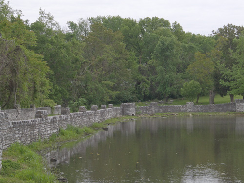
Here is an unremarkable photo, taken with a low-quality digital camera with no in-camera sharpening applied, and reduced in size using Photoshop's Bicubic algorithm, which is known to soften images:
I open Unsharp Mask, and am presented with three parameters:
Now what? Too often, Photoshops' own documentation just lists features, and so do many Photoshop books. These usually don't say how a tool ought to be used. Too many beginners seek formulae instead of understanding, and ask “what settings should I use?” rather than “how and when should I use this?”
OK, I am only interested in final sharpening, which should be done after resizing your image to its final size. As I mentioned, there are lots of sharpening-like methods we can do to increase local contrast, but here I am interested in making the smallest edges more prominent: this is the kind of sharpening done in-camera, and is the roughly the kind of sharpening done by the eye around moving objects.
There are three parameters here:
Would a relentless purist image, taken with superb optics, high-end sensor, and impeccable shooting technique be sharp without any artificial processing? Sadly, the answer is likely NO; better, but perhaps still a bit soft, or at least open to improvement. As my initial experience with the candle flame shows, there is a sort of sharpening that occurs in the eye around moving objects, and pure digital images lack this kind of sharpening.
As it happens, digital cameras add artificial sharpening to images. They have to, otherwise their images would look soft. Better digital cameras let you adjust the amount of artificial sharpening, or turn it off altogether if you want to do your own sharpening during post-processing.
Sharpening is just one end of a wide range of techniques for adjusting local contrast in an image. Sharpening adjusts the contrast of edges, while closely related techniques adjust the contrast over larger parts of the image, like the shadows. Sharpening is a fine art, with many subtleties, and as mentioned, the natural mechanism is not well understood.
So I will whet your appetite with the most basic sharpening tool in Photoshop, Unsharp Mask, which gives us a measure of control over the sharpening process, and which can be used as a basis for more subtle and powerful techniques. That a sharpening tool is called Unsharp Mask is curious, but that will have to wait for another day. Let's just say that blurriness can lead to sharpness.
The problem with technology in generally is that we are often presented with a tool, yet with no real knowledge on how to use it; Unsharp Mask is no exception.
Here is an unremarkable photo, taken with a low-quality digital camera with no in-camera sharpening applied, and reduced in size using Photoshop's Bicubic algorithm, which is known to soften images:
I open Unsharp Mask, and am presented with three parameters:
Now what? Too often, Photoshops' own documentation just lists features, and so do many Photoshop books. These usually don't say how a tool ought to be used. Too many beginners seek formulae instead of understanding, and ask “what settings should I use?” rather than “how and when should I use this?”
OK, I am only interested in final sharpening, which should be done after resizing your image to its final size. As I mentioned, there are lots of sharpening-like methods we can do to increase local contrast, but here I am interested in making the smallest edges more prominent: this is the kind of sharpening done in-camera, and is the roughly the kind of sharpening done by the eye around moving objects.
There are three parameters here:
- Amount: how much sharpening is applied. 0% is no sharpening at all, 500% is lots.
- Radius: the distance over which sharpening is applied. This can vary from fine edges to broad areas.
- Threshold: this limits the effect to only more prominent edges, and is used to prevent enhancing noise.
The noise is enhanced, and we need to reduce this problem. Raise the Threshold slider until the noise is not sharpened all that much:
We have a trade-off here. If we don't want to sharpen any noise whatsoever, then we will do no sharpening. But if we have to set the Threshold slider above, say, 25, then the image is likely too noisy to sharpen. It is a poor image and needs other work before sharpening. Here I got rid of a lot of the noise, but not all of it.
Ok, now click on a part of your image that has good, in-focus detail; this will sharpen the best. I usually zoom in to 200% on Unsharp Mask's preview. Move the slider to a Radius of 0.1 and move it slowly higher; keep an eye on the edges.
There will be a point where the detail will visually ‘pop’; this is the point where Unsharp Mask overcomes the inherent digital softness of the image, and it will likely vary between images. This is a step, which for best work, ought to be done on an image-by-image basis. For me it is a Radius of 0.3:
Now reduce the Amount until the image still looks sharp, but does not have obvious artifacts. The sharpness should be almost unconscious.
This was sharpened to 423% and may be a bit over done, but this is representative of the kind of crude in-camera sharpening done by many inexpensive compact cameras. This method does increase the sharpness of edges, making them more distinct. This isn't great, and could be better, but it is a start.
Subscribe to:
Posts (Atom)