IMAGINE A light source, which can automatically match the color of ambient light.
So many times I've taken interior photos, with the room illuminated by tungsten lighting; however, some light comes through the windows, but that looks strongly blue and so harms the photo. For my best work, I adjust the color of the window lighting and the artificial lighting separately in Photoshop, but this is time-consuming and error-prone. Big-budget cinematographers will put colored gels over the windows to get the light colors to match, or they will put gels over their lights. But the use of gels has the unfortunate side-effect of decreasing the light intensity, requiring even brighter and hotter light sources, much to the dismay of the actors.
Rift Labs is developing a three-color lighting panel which has variable color temperature. Using low-power, three-color light-emitting diodes, their forthcoming light panels will automatically be able to match any lighting situation. Or, any color of light can be dialed-in, and the brightness of the lighting does not change.
So photographers and cinematographers can have a portable, battery-operated, low-cost lighting system which can quickly and conveniently produce the color of lighting needed. A good use of this would likely be for fill-in lighting, an augment to ambient lighting. Portable, battery-operated white-light LED panels have appeared in the last couple of years, causing much excitement, but Rift is taking this to the next level.
The organization is making these lighting units open-source, and provide the circuit diagrams and controller software free of charge; if their concept proves usable, we ought to see many similar designs produced at low cost in the near future.
I noticed that they are having trouble finding the correct method of producing a uniform illuminance under a change of color temperature. This is likely to be problematic for them, since the sensitivity of digital cameras to various color temperature conditions is variable across manufacturers and models of cameras. See here. They may need to adapt their system to include color calibration data specific to particular kinds of cameras. Likely this will merely require a custom color transfer matrix — nine numbers — that will provide closer mapping between what the camera sees and what the light source delivers. This color matrix could either be encoded as a camera model database in the device firmware, or the user could type in the numbers if they know them. A more clever method could be a built-in algorithm for color calibrating the camera: this little feature could be a strong selling point.
I also wonder about the color quality produced by this kind of unit. Since it uses only three colors — red, green, and blue — it may not operate equally well under all color gamuts used by digital cameras. Please recall that it is impossible to mix all possible colors from only three primary colors. However, if they concentrate on getting sRGB right, then this unit ought to operate well for 99% of uses. But there will still be metamerism problems: colors that look identical to the human eye will look different to the camera, and this kind of three-color lighting will make metamerism failure even more prominent. They may find they get better performance if they also include some other colors in their LED array to provide a more uniform spectrum.
This kind of lighting could be of great benefit for those who shoot RAW. Digital cameras have a fixed white balance: this raw data is processed to produce images correctly balanced according to the color of the light. However, lots of the RAW data is thrown away during this processing, which leads to increased digital noise, particularly in the red and blue channels. The Rift Labs product can be adjusted to produce a magenta light which will accurately produce an accurate RAW light balance: no data is thrown away, and the noise level is reduced to its practical minimum. This is likely only of interest to specialists, but it does show how useful this device can be.
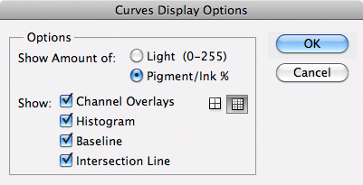
UPDATE: Click here to read an article on color rendition under LED lamps. You may expect color shifts with using these kinds of products.
Thursday, July 7, 2011
Friday, July 1, 2011
Contrast, part 1: Black and White
A FRIEND ASKS, “What is contrast?”
Simply, contrast in photography is what differentiates one thing from another because of differences in tone. A contrasty image will have lots of black and white tones, while a low-contrast image will have lots of medium gray.
The English word ‘contrast’ comes from the Latin contrastare, meaning ‘stand against’, and so in a contrasty image, some elements will strongly stand against others, instead of blending together.
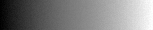
Here is a more-or-less visually uniform grayscale image that I'll be using as the basis for examples:
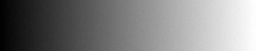
It goes from black on the left, to white on the right. I threw in a little bit of noise to illustrate my examples better. I used this contrived image instead of a real photograph in order to more accurately show what is going on. Please don't get too bored with this repetition.
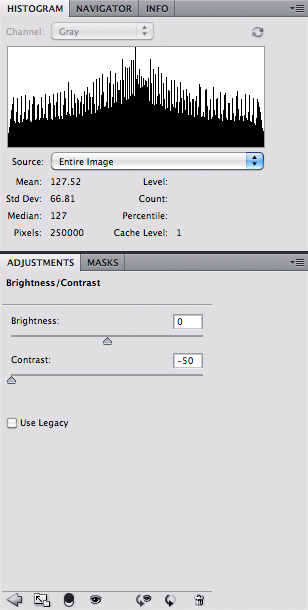
Here is this grayscale's histogram in Photoshop:
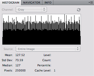
The grayscale illustrate how many pixels are in each range of tone; with black pixels on the far left, and white pixels on the far right. The noise adds lots of jitter to this histogram, but please note that it is otherwise fairly uniform going across; on average, there is just as much black as there is white, and just as much middle gray as either of those.
Photographically, we can use the word contrast in various ways. Global contrast — which is what we are mainly concerned with here — tells us how the total range of tones are divided up in an image; how much strong black and strong white are found in an image? Since our example image is uniform, we can say this has neutral global contrast.
Here I use the Brightness/Contrast tool in Photoshop:
I made this image with this Photoshop setting:
Setting the slider to 100 contrast gives us simultaneously more dark and more light tones, at the expense of midtones. Take a look at the histogram: we have more pixels at the far left and right.
Setting the slider to -50 gives us low contrast:
Now notice how we have more midtones, at the expense of fewer dark and light pixels. The histogram shows the pixels more clumped together in the middle:
Here are all three together:
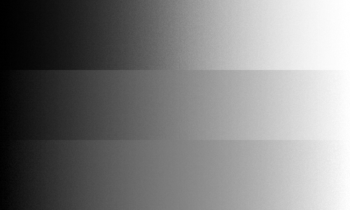
High contrast on top; low contrast on bottom.
Now I don't normally use the Brightness/Contrast tool, since I can get more control over the final results when I use the Curves tool.
Here I apply Curves to make the image appear to be basically the same as the Brightness/Contrast 100% setting:
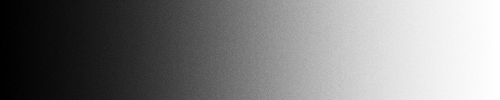
Note that the histogram looks pretty much the same. But also notice that the curve is a bit complex:
Here is how we interpret the curves:
Now let us define a new term, ‘differential contrast’. Take a look at the curve above: notice how it is steeper at the midpoint, and less steep at the endpoints of black and white? If you were climbing a hill with that slope, you would likely have the most difficulty in the midsection, where the curve is steeper. What this means is that there is more differentiation in the midtones; visually they appear more distinct from each other. Also note that there is less differentiation between the various dark tones and the light tones.
Whenever we get more differential contrast in one range of tones, inevitably we will get less differential contrast in other range of tones. As a photographer with Photoshop, you have control over adjusting which range of tones get the greatest differential contrast. You ought to consider adding differential contrast to those most important tones in your image, by making sure that the steepest part of your curve extends over that range of tones. But this can only be done by sacrificing other ranges of tones.
From what we can see with the curve above, it is apparent that the standard Photoshop Contrast tool adds differential contrast to midtones, at the expense of both shadows and highlights.
If we adjust the curve so that the line is steepest at the endpoints, and less steep in the middle, then we will get a low contrast image; it will have greater differential contrast in the shadows and highlights at the expense of the midtones. The overall global contrast will be less because we will have less dark and less light, with a lot more middle gray.
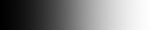
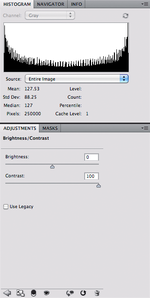
From our little experiments here, we can see that the Photoshop Contrast tool is a bit like Curves, but only where the endpoints and middle are fixed. We don't have to keep our endpoints fixed in Curves. For example, I can get much lower contrast in Curves:

This image does not go from pure black to pure white, rather, its range is significantly reduced.
Note that the histogram does not go all the way to the edges; indeed we are using only half of the dynamic range available. In our curve, 100% white is transformed to only 75% white, and likewise for black. Our total global contrast has been reduced greatly. But unlike the curved curve shown above, the differential contrast between tones is the same across all tones, since our curve is straight here.
If we make the curve completely horizontal, we lose all contrast:

Our histogram is now simply a spike at middle gray. Our image has no contrast whatsoever.
If we make the curve vertical, we get maximal contrast:

Please note that I added some noise in the image to simulate texture.
Actually Photoshop does not let us make a true vertical line, but this is pretty close. On the histogram, we have spikes at pure black on the left and pure white on the right. We have lots of differential contrast at the middle gray, with none for darker and lighter tones.
Take a look at the data found in the Histogram boxes in the images above. Note that in all cases, the Mean value is close to 127.5, which is medium gray. We did not change the overall brightness of the image with our adjustments. The next value, ‘Std Dev’ (or Standard Deviation) is a measure of how much the pixel values deviate from the mean. A large standard deviation is high contrast, while a low standard deviation indicates low contrast.
One of the great powers of Curves is that we can increase or decrease differential contrast in whatever range of tones we desire. In our examples above, the middle point is always fixed, and so differential contrast is adjusted only for the midtones. With Curves, we can adjust the contrast in the highlights:

Note that here we have greater distinction in the brightest tones in the image (you can see lots of my added noise there), and we have essentially created a low-key image.
But this distinction in the highlights comes at the expense of losing lots of our shadow detail. The tall spike at the leftmost part of the histogram unfortunately does not give us a good impression of how much of the image is lost in black without significant texture: roughly 40% of the pixels are pure black.
We can also increase visual detail in the shadows at the expense of the highlights:

We now have a high-key image.
Here our curve and histogram are reverse of what we had before, and 40% of our highlight detail is lost as pure white.
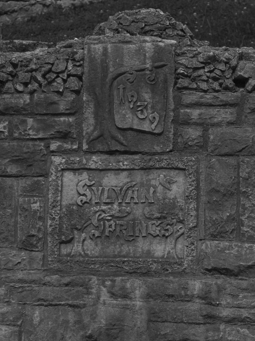
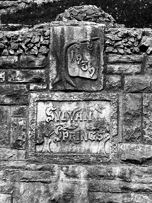
OK, let's try these techniques with a real image. This is a low-contrast, dim, black and white image of a monument found in Sylvan Springs Park, in Saint Louis County, Missouri, USA.
Bleh. Looks poor, and here is its histogram:
Most of the image's pixels are on the dark side of the histogram. Unless this is an exercise in conceptual art, most photo editors at magazines would reject this image: most would probably like to see a broad histogram, with significant contrast and a full range of tones from black to white.
Merely using the Contrast tool in Photoshop does not help:
However, boosting the brightness here would help a lot.
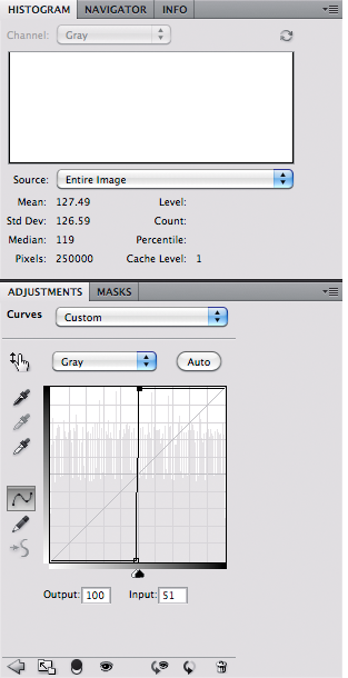
Instead, I will adjust the image using curves. First I put in an initial curve, which will expand the range of the significant part of the image:
Straight line curves are equivalent to using the Levels tool in Photoshop.
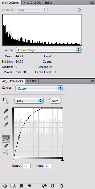
Then I add a strong curve to the most significant part of the image, which I think are the tones around the carved lettering:
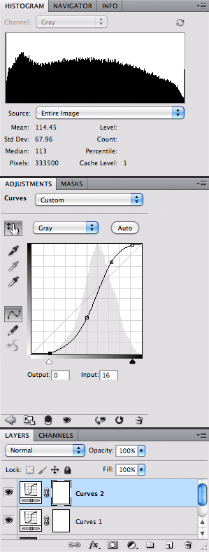
The steepest part of the curve, and therefore the greatest amount of differential contrast can now be found at the tones surrounding the text “1939”. I don't care to see texture in the darkest part of the grass or in the shadows between the rocks; I think that overexposing the patch to the left of “Sylvan” is also acceptable.
I added some sharpening, and the photo is basically complete.
Sharpening is a kind of local contrast enhancement, which is a powerful technique for improving images; but that is for another day.
Adding contrast — and using curves — in a color image is far more problematic, since we can easily change the hues of our colors. That is also a topic for later.
Simply, contrast in photography is what differentiates one thing from another because of differences in tone. A contrasty image will have lots of black and white tones, while a low-contrast image will have lots of medium gray.
The English word ‘contrast’ comes from the Latin contrastare, meaning ‘stand against’, and so in a contrasty image, some elements will strongly stand against others, instead of blending together.
Here is a more-or-less visually uniform grayscale image that I'll be using as the basis for examples:
It goes from black on the left, to white on the right. I threw in a little bit of noise to illustrate my examples better. I used this contrived image instead of a real photograph in order to more accurately show what is going on. Please don't get too bored with this repetition.
Here is this grayscale's histogram in Photoshop:
The grayscale illustrate how many pixels are in each range of tone; with black pixels on the far left, and white pixels on the far right. The noise adds lots of jitter to this histogram, but please note that it is otherwise fairly uniform going across; on average, there is just as much black as there is white, and just as much middle gray as either of those.
Photographically, we can use the word contrast in various ways. Global contrast — which is what we are mainly concerned with here — tells us how the total range of tones are divided up in an image; how much strong black and strong white are found in an image? Since our example image is uniform, we can say this has neutral global contrast.
Here I use the Brightness/Contrast tool in Photoshop:
I made this image with this Photoshop setting:
Setting the slider to 100 contrast gives us simultaneously more dark and more light tones, at the expense of midtones. Take a look at the histogram: we have more pixels at the far left and right.
Setting the slider to -50 gives us low contrast:
Now notice how we have more midtones, at the expense of fewer dark and light pixels. The histogram shows the pixels more clumped together in the middle:
Here are all three together:
High contrast on top; low contrast on bottom.
Now I don't normally use the Brightness/Contrast tool, since I can get more control over the final results when I use the Curves tool.
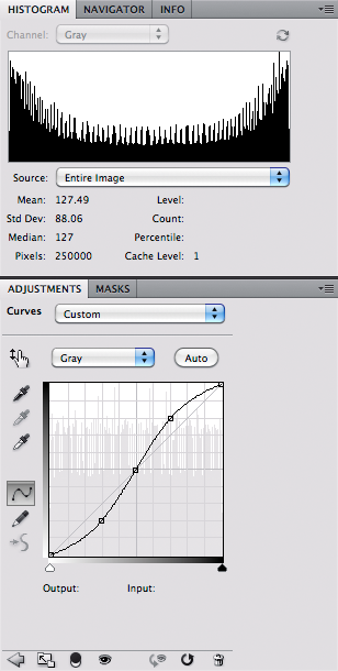
Here I apply Curves to make the image appear to be basically the same as the Brightness/Contrast 100% setting:
Note that the histogram looks pretty much the same. But also notice that the curve is a bit complex:
Here is how we interpret the curves:
- The bottom axis shows us the tones of our original image; while the vertical axis shows us which tones are changed by Curves.
- Note there is a diagonal line going from the lower left to upper right; any time the curve touches this line, that means that the corresponding tones are not changed. In our example here, pure white, black, and middle gray are not changed. Whatever is white, black, or middle gray in the original image will remain unchanged in the final image.
- Whenever the curve drops below the diagonal line, that means the tones are brightened. Whenever the curve raises above the line, those tones are darkened. In this example, the light tones between middle gray and white become brighter, while the dark tones between middle gray and black become darker. The image has greater global contrast, because we simultaneously get more darks and more brights.
- In this curve, 70% white in the original image becomes 80% white in the final image; likewise 30% white (= 70% black) becomes 20% white (or 80% black). 0%, 50%, and 100% remain unchanged.
Now let us define a new term, ‘differential contrast’. Take a look at the curve above: notice how it is steeper at the midpoint, and less steep at the endpoints of black and white? If you were climbing a hill with that slope, you would likely have the most difficulty in the midsection, where the curve is steeper. What this means is that there is more differentiation in the midtones; visually they appear more distinct from each other. Also note that there is less differentiation between the various dark tones and the light tones.
Whenever we get more differential contrast in one range of tones, inevitably we will get less differential contrast in other range of tones. As a photographer with Photoshop, you have control over adjusting which range of tones get the greatest differential contrast. You ought to consider adding differential contrast to those most important tones in your image, by making sure that the steepest part of your curve extends over that range of tones. But this can only be done by sacrificing other ranges of tones.
From what we can see with the curve above, it is apparent that the standard Photoshop Contrast tool adds differential contrast to midtones, at the expense of both shadows and highlights.
If we adjust the curve so that the line is steepest at the endpoints, and less steep in the middle, then we will get a low contrast image; it will have greater differential contrast in the shadows and highlights at the expense of the midtones. The overall global contrast will be less because we will have less dark and less light, with a lot more middle gray.
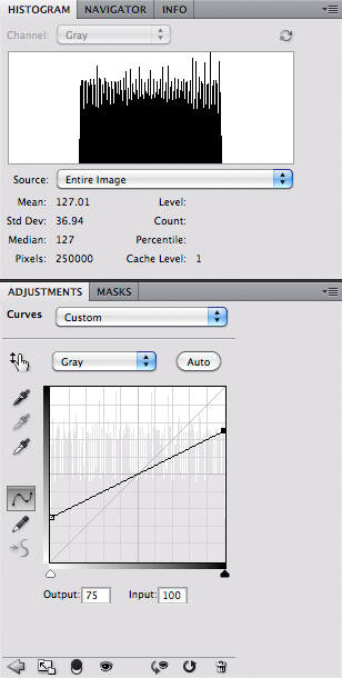
From our little experiments here, we can see that the Photoshop Contrast tool is a bit like Curves, but only where the endpoints and middle are fixed. We don't have to keep our endpoints fixed in Curves. For example, I can get much lower contrast in Curves:
This image does not go from pure black to pure white, rather, its range is significantly reduced.
Note that the histogram does not go all the way to the edges; indeed we are using only half of the dynamic range available. In our curve, 100% white is transformed to only 75% white, and likewise for black. Our total global contrast has been reduced greatly. But unlike the curved curve shown above, the differential contrast between tones is the same across all tones, since our curve is straight here.
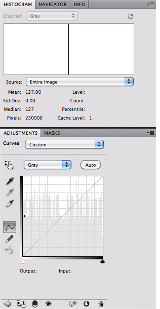
If we make the curve completely horizontal, we lose all contrast:
Our histogram is now simply a spike at middle gray. Our image has no contrast whatsoever.
If we make the curve vertical, we get maximal contrast:
Please note that I added some noise in the image to simulate texture.
Actually Photoshop does not let us make a true vertical line, but this is pretty close. On the histogram, we have spikes at pure black on the left and pure white on the right. We have lots of differential contrast at the middle gray, with none for darker and lighter tones.
Take a look at the data found in the Histogram boxes in the images above. Note that in all cases, the Mean value is close to 127.5, which is medium gray. We did not change the overall brightness of the image with our adjustments. The next value, ‘Std Dev’ (or Standard Deviation) is a measure of how much the pixel values deviate from the mean. A large standard deviation is high contrast, while a low standard deviation indicates low contrast.
One of the great powers of Curves is that we can increase or decrease differential contrast in whatever range of tones we desire. In our examples above, the middle point is always fixed, and so differential contrast is adjusted only for the midtones. With Curves, we can adjust the contrast in the highlights:
Note that here we have greater distinction in the brightest tones in the image (you can see lots of my added noise there), and we have essentially created a low-key image.
But this distinction in the highlights comes at the expense of losing lots of our shadow detail. The tall spike at the leftmost part of the histogram unfortunately does not give us a good impression of how much of the image is lost in black without significant texture: roughly 40% of the pixels are pure black.
We can also increase visual detail in the shadows at the expense of the highlights:
We now have a high-key image.
Here our curve and histogram are reverse of what we had before, and 40% of our highlight detail is lost as pure white.
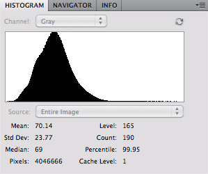
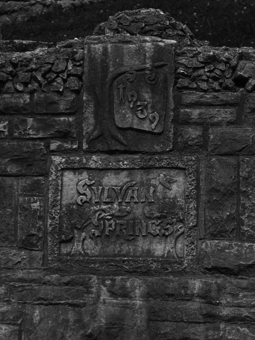
OK, let's try these techniques with a real image. This is a low-contrast, dim, black and white image of a monument found in Sylvan Springs Park, in Saint Louis County, Missouri, USA.
Bleh. Looks poor, and here is its histogram:
Most of the image's pixels are on the dark side of the histogram. Unless this is an exercise in conceptual art, most photo editors at magazines would reject this image: most would probably like to see a broad histogram, with significant contrast and a full range of tones from black to white.
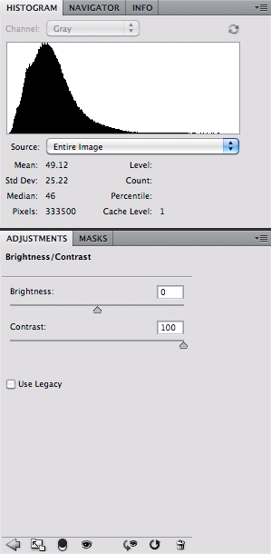
Merely using the Contrast tool in Photoshop does not help:
However, boosting the brightness here would help a lot.
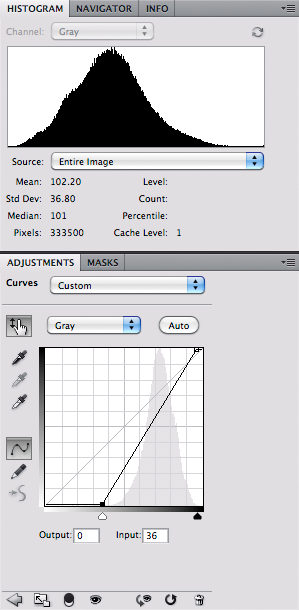
Instead, I will adjust the image using curves. First I put in an initial curve, which will expand the range of the significant part of the image:
Straight line curves are equivalent to using the Levels tool in Photoshop.
Then I add a strong curve to the most significant part of the image, which I think are the tones around the carved lettering:
The steepest part of the curve, and therefore the greatest amount of differential contrast can now be found at the tones surrounding the text “1939”. I don't care to see texture in the darkest part of the grass or in the shadows between the rocks; I think that overexposing the patch to the left of “Sylvan” is also acceptable.
I added some sharpening, and the photo is basically complete.
Sharpening is a kind of local contrast enhancement, which is a powerful technique for improving images; but that is for another day.
Adding contrast — and using curves — in a color image is far more problematic, since we can easily change the hues of our colors. That is also a topic for later.
Subscribe to:
Posts (Atom)