Very many beginning photographers (and I was certainly one of them) are quite disappointed with the quality of their images. Although they may find it hard to put into words just what precisely is wrong with their images, bad color or a color cast may be a significant problem. When I learned about white balance and how to correct for it, I immediately thought that my photos looked much better.

Bad versus better white balance, among other things. Saint Vincent de Paul Chapel, in Shrewsbury, Missouri.
Clearly, the color of light is often variable, and the color my camera captures is usually somewhat different from what I see in real life. However, if I am careful to set the white balance, then typically my colors look much better under most circumstances.
There are some principles that we ought to keep in mind:
- Our eyes do white balancing naturally. This leads to color constancy, where particular shades of color appear to be subjectively similar under a wide variety of objectively different lighting conditions.
- White balance in photography corrects for extreme changes in the color of light; it is not a slight adjustment.
- For the best results, we ought to do white balancing early in the photographic process.
- We cannot rely on the camera or software automatic white balance function to give good results.
Our eyes have built-in white balancing which strongly subtracts out the color of the lighting. While this mechanism also works when we are looking at photographs, the fact that most photos are relatively tiny and low-contrast means that our eyes will adjust to the room condition more than our images. This means that we have to color-correct our photos to subtract out the color casts due to the color of light at the time of capture.
For an overview, see my article, White Balance, Part 1.
Please recall that digital cameras have a fixed white balance, a balance that is not particularly optimized for any typical lighting condition. For most cameras, this white balance is biased towards green, and is deficient in red and blue; most particularly, cameras are highly deficient in capturing blue light under incandescent lighting.
For example, here is an image taken with my digital camera using its native white balance:
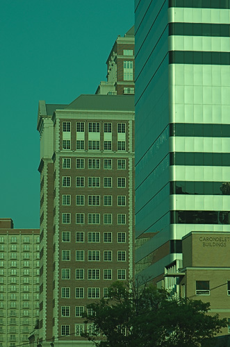
Buildings in downtown Clayton, Missouri. Image presented with the camera’s native white balance.
I processed this image in Raw Photo Processor, and used the UniWB setting which does not adjust the white balance. Notice how green the image appears! White balance is an intrinsic operation of digital cameras: some sort of white balance is always applied to your image, and be aware that your camera may not always give you a good balance.
Now, I recommend setting white balance at the time of capture, either using one of the white balance presets, or manually setting it using a neutral gray card. Automatic white balance usually works rather well in daylight but can be problematic especially under incandescent lighting, on overcast days, around sunset, or in mixed lighting conditions. Setting your white balance at capture time also means that you can get better exposure and can rely more on your camera's histograms. Setting white balance at capture time is less critical when you shoot RAW, but it is extremely important to get right if you shoot JPEGs.
Although it is hard to give good numbers, I do think that the majority of photos — especially editorial photos produced for publication — ought to have a good white balance. An object that is objectively white, gray, or black in the scene ought to be objectively represented in your image with RGB values that are objectively white, gray, or black; that is, all RGB numbers are equal on a neutral subject. Click here for an overview of the RGB color system. Even if you need to reproduce a color cast, for example the color of sunset or candlelight, only slight color casts are usually desirable, otherwise you risk washing out the detail in your image, making it look flatter without texture. Knowing how to make a good white balance will also give you the ability to precisely add tones to your image for an effect.
Knowing some theory can help your photography. Understanding how white balance works will help you to make better photographs. Being able to control your color will allow you to make a photo look as you want it to look.
We first need to understand that white balance is usually a very simple arithmetic adjustment, with little to no higher math. Typically all of the red values are multiplied by a fixed factor, and the same goes for all the blue values. Now these numbers will vary by lighting conditions, the camera make and model, and there are other things that happen behind the scenes in your camera or RAW processor. But this multiplication is the basic correction for white balance. Many digital cameras, in daylight, will multiply the red channel by about 2, and the blue channel by about 1.5; under incandescent lighting, red might not be adjusted much at all, but the blue channel might be amplified 2.5 times, increasing noise greatly.
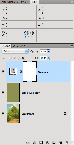
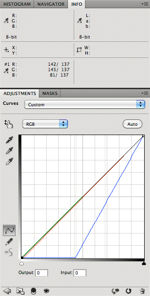
For example, here is the familiar X-Rite Colorchecker target, photographed in bright daylight:
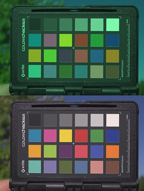
On top is the camera native white balance, and on the bottom is the white balanced version, created from the native white balance using the curves tool:
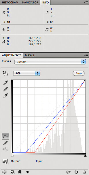
Photoshop's simple Curves or Levels tools are sufficient for doing a white balance, although there are other clever tricks you can do for a better job. But ultimately, white balance is linear: the adjustment is the same for all of the pixels in an image. [UPDATE: in Photoshop I go to Color Settings and set 'Blend RGB Colors Using Gamma 1.00', which undos the image gamma correction.]
Now sometimes you don't get good white balance for whatever reason, and you have to adjust it after the fact on the computer. On the photo above, I know that the squares on the top row of the X-Rite target are approximately neutral, and I could have adjusted my curve much more precisely than shown here. But what if you take a photo and have no idea what white balance settings you should use? What if you don't have any particular patches in your photo which are guaranteed to be neutral? Also, how do cameras perform the automatic white balance?
For a long time, when I was puzzling about how a camera does white balance (and why it fails), I assumed that the camera simply measured the overall color cast and then corrected for it. Clearly, when I took photos under incandescent lighting, the colors tend towards yellow; subtracting out that yellow (I thought) ought to produce a nicely white balanced image. Likewise, photos taken in the shade tend to look blue, and so this blue ought to be removed. Photos taken under fluorescent lighting are often too green.
The Gray World Assumption is a white balance method that assumes that your scene, on average, is a neutral gray.
Imagine you are given this JPEG image, and your task is to correct the white balance:
Old sink-hole iron mine, at Maramec Springs Park.
This appears to have an overall yellowish-green color cast.
Gray World assumes that all the colors in an image ought to average out to a neutral gray: for every blue there is a yellow, for every red there is a cyan, and for all greens there are magentas. For this image, using Photoshop's Average function, we get:

Here is how you can use the Gray World Assumption in Photoshop:
- Duplicate the image layer
- Do a Filter-Blur-Average on the top layer.
- Place an eyedropper anywhere on the image.
- Create a Curves layer on top.
Now adjust the curves until all the RGB values are equal. You may have to change the Curves blending mode to Color, to avoid blowing a channel, but this makes adjusting curves a bit less straight-forward.
You should see that the image now looks perfectly gray — if not, then your monitor needs calibrating.
Remove the gray layer, and you have a white balanced image:
This process worked pretty well for this image. But certainly we cannot hope that this will work for all images; what if the subject is brightly colored?
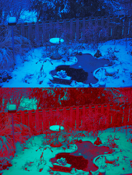
A view of my parents’ back yard, in the snow.
The Gray World is not a good assumption for this image; it simply has too much blue and too little red to reconstruct a plausible image. Now it so happens that I captured this image in RAW, but had inadvertently set the white balance to incandescent lighting. While this wrong white balance is what is presented here, the RAW processor can be adjusted to use a better balance. This is a strong reason to shoot RAW instead of the compressed 8-bit JPEG format.
But not everyone shoots RAW, nor does every camera offer it, nor can we always have access to the original RAW image file. We can have some other assumptions besides the Gray World. First, it would seem that the very brightest highlights in an image might reflect the color of the light source in a rather pure way. Likewise, the very darkest shadows in an image could be assumed to be pure black.
The Retinex Theory was developed by Edwin H. Land, the inventor of Polaroid cameras and polarizing filters. Since humans can identify colors under a wide range of lighting conditions, Land theorized that the very brightest patches of light are used by human vision to determine the color of the light, to automatically compensate for this color cast. Like Land, we can identify the brightest patches of the red, green, and blue channels in an image, and adjust our colors based on these.

A dinosaur exhibit at the Saint Louis Science Center. This image has an orange color cast.
Using the Retinex Theory, we examine the red, green, and blue channels separately and put eyedroppers on the places where each of these channels is brightest.
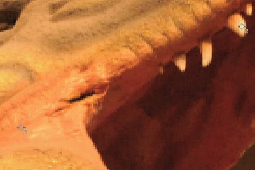
On each color channel, I used the Threshold tool to determine the brightest patches. Dropper #1 is on the brightest part of the red channel, and dropper #2 has the brightest part of both the green and blue channels. I used 3x3 droppers, but you can experiment with using larger droppers, or single pixel droppers.
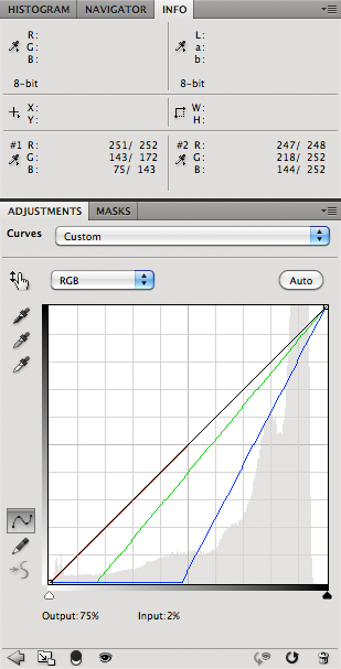
I adjusted the image with Curves so that the brightest parts of the red, green, and blue channels were all equal. The result isn't bad:

We can extend the Retinex Theory to not only identify the brightest colors, but also the darkest. We make all the bright colors equally bright, and all the dark colors equally dark. And while we are at it, why don't we force the very brightest colors to their maximum value, and why don't we adjust the darkest colors to their minimum value? This will expand the dynamic range of our image, which is usually considered good practice for commercial photography.
[However, please note that some artists state that we ought to retain color in deep shadow, since this more closely models what we actually see, and it is also pleasing. In this case, we ought not adjust the darkest shadows to be a perfect black color. A problem with this is that the RGB color models allocate very few bits to this kind of shadow detail; on the contrary, CMYK and other printer profiles, since they use black ink in combination with colors, can in fact nicely show textured shadows with color casts.]
Forcing the brightest pixels of the red, green, and blue channels to a value of 255, and the darkest pixels of each channel to 0 happens to be precisely what Photoshop's Auto Levels does:
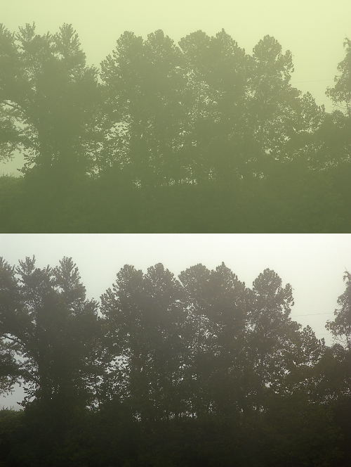
Trees in fog, illumined by the rising sun, on the Meramec River near Eureka, Missouri.
The bottom image was corrected with Auto Levels. While a color cast may or may not be desirable with this particular image, Auto Levels often does a surprisingly good job of automatic white balance. Here are the settings I used:
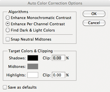
Selecting “Enhance Per Channel Contrast” will identify the brightest and darkest bits of each color channel, (like we did with the dinosaur) and adjust the image from there. This option will produce the strongest correction. “Find Dark and Light Colors” will rather select the brightest and darkest pixels as a basis for adjustment — this is similar to the Perfect Reflector (or White World Assumption) algorithm for automatic white balance, which assumes that the very brightest patch in an image reflects the color of the light source, and so forces it to be white.
The Photoshop menu items “Auto Tone” “Auto Contrast” and “Auto Color” are all shortcuts to various settings in this window.
Be aware that Retinex or Auto Levels will not work properly, or at all, if any of your color channels are over or underexposed. Auto Levels, using the settings above, does nothing to this image:
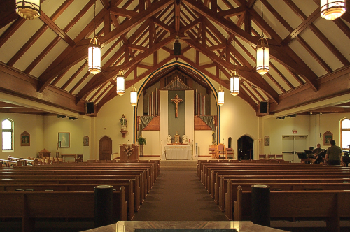
Saint Patrick Church, in Rolla, Missouri.
Here the camera's white balance was set to Auto, and it failed to adjust for the color of the light. I suspect that my Nikon may use some sort of Retinex algorithm, although that can't be the whole story since overexposed daylight images usually appear to have good white balance. Typically, when I shoot indoors, I do a manual white balance in the camera.
I attempted to produce a good manual white balance of this photo. Alas, after examining this photo, I conclude that the light shining on the altar at center is undoubtably incandescent, while the light fixtures hanging from the ceiling have fluorescent lamps. The corrected result shows green and magenta color casts all over the image, which looks rather worse than the yellow image shown above. If I can, I turn off fluorescent lights before photography: blue and yellow color casts look natural, while magenta and green color casts look sickly. If I were seriously interested in improving this photo, I'd put down some masking and color-correct the altar area separately from the rest of the nave. Mixed lighting will harm every automatic white balance, and will make life difficult for a conscientious color retoucher.
If we have a RAW image file with strong red and green channels, and a weak blue channel, then we can probably guess that it was taken under incandescent lighting; likewise, if we have strong blue and green channels but weak red, then we can conclude that the image was mostly likely taken in open shade, while a strong green but weak red and blue channels is probably daylight. If you have looked at tens of thousands of images you start seeing obvious patterns.
These Photoshop histograms show data from two photographs of the same object, taken under widely different lighting:
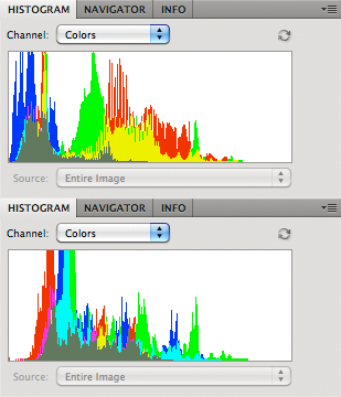
These show the channel structures of two RAW images, uncorrected for white balance: the top is from an image taken under incandescent lighting (which is deficient in blue light), while the bottom image was taken outside during an overcast day (and so is deficient in red light). Recall that the histograms show the darkest bits on the left side, and the brightest on the right. Looking at the histograms we can conclude that the top image has an orange or yellow cast, while the bottom image has a cyan color cast.
This observation gives us another method of white balance, called Color by Correlation, which makes assumptions about typical light sources. It attempts to determine if a particular image was plausibly taken under a wide variety of light sources. It is highly implausible that the first histogram above was taken in the shade or on an overcast day, but if we assume that we have incandescent lighting, that histogram becomes quite likely. We can even analyze individual colors: can we be really confident that a bright blue object (according to the RAW channels) can be found under incandescent lighting? Unless it is a light source within the image, bright blue is impossible. If we go over a broad range of colors and ignore outliers in our data, then we can estimate the quality of light in an image.
This type of method can confidently estimate a range of lighting conditions that could plausibly produce a given image. But unfortunately, we cannot be satisfied by a range of plausible white balances, for an in-camera automatic white balance algorithm must produce one and only one result. Color by Correlation, by design, uses only a discrete number of specific light sources, and not the full range of all theoretically possible lights. The Law of Parsimony or Occam's Razor may lead a software designer to severely limit the choices for light sources: after all, nobody uses green lights to illuminate the inside of a home, so why even consider it? Right? And so I would expect that this method will select a white balance based on one of the limited number of light sources used in its model.
I suspect that Adobe Camera RAW's Auto White Balance feature uses a variant of Color by Correlation: very often it will select a white balance equal to one of the standard white balance options, most notably Incandescent. Considering the wide range of color adjustments you can make in ACR, it seems highly unlikely that it will so often choose a standard preset so precisely if it weren't using this method. ACR Auto will never produce a horribly bad white balance — as we so often see in the other methods described earlier — but it very often produces a mediocre white balance. On the other hand, Retinex Theory, when it works at all, it works very well, but when it works poorly it is bad, while the Gray World Assumption can give us nearly anything from OK to horrid.
There are other white balance algorithms, but I don't know enough about them to comment, and I've come up with a few automatic methods which tend to generate results ranging from OK to dismal. From what I've read, Color by Correlation is the best automatic method, but you can do better yourself.
I hope this exercise demonstrates that we cannot rely on automatic white balance. According to a major scholarly article, “Automatic white balance is an under-determined problem and thus impossible to solve in the most general case.” There are technical methods that could improve automatic white balance significantly, but they would require modifications to existing camera designs.
Manual white balance is something photographers ought to consider when doing their best work, as well as being aware of the quality of light in their image. As I mentioned earlier, even though precise white balance is typically needed for commercial work, an understanding of the principles involved can help those who want to move away from neutral balance for artistic purposes.
Here are some hints for getting excellent colors and white balance:
- Have uniform lighting on your subject. Use a good incandescent light source like the sun or bright incandescent light bulbs. Avoid fluorescent lights, and especially avoid mixing incandescent and fluorescent lights together. The newer light emitting diode (LED) lighting also have poor spectra for photography.
- You get the best color and best white balance when you use your camera's native ISO; this is usually, but not always the lowest setting.
- When shooting outdoors in the sunshine, you can hardly go wrong if you set your camera to its fixed Daylight white balance, and this will retain the pleasing warmth of late afternoon light. When indoors, using the Incandescent or Tungsten setting may work well; but be aware that gas discharge lights (which include fluorescent lamps and sodium vapor lamps used for street lighting) will generally make your photos look poor and they may not be fully correctable. [UPDATE: this is not generally true, since the color of daylight on a sunny day at midday varies according to latitude and season. High latitudes usually need warmer white balances, such as Cloudy or even Shade. Experiment to find what setting works best for you.]
- Do a white balance as early in your workflow as possible. The best time is when you take the photo. Do a manual white balance at your subject, with the white balance card facing the camera.
- Photograph a white balance target within your scene to double-check your settings.
- If you don't have a white balance target, examine the scene closely for objects that appear to be neutral in color; you can use these for white balance in the camera or later in post-processing. Be aware that white paper or fabrics may have ultraviolet dyes to brighten them, and so this may throw off your white balance.
- The best white balance after the fact is done using the camera's original RAW channels. RAW conversion software may use these channels directly for white balance.
- If you have a lot of time on your hands and are mathematically proficient, you can create your own color transfer function to convert your camera's RAW channels into a precisely color-calibrated image for specific lighting conditions. This would also facilitate accurate white balances. That is what I did in the Colorchecker photo above. See the article Examples of Color Mixing.
- If you color-correct in Photoshop, use 16 bits and a broad color space like ProPhoto or Wide Gamut RGB, even if you have to convert to a smaller color space later.
- If you have three objectively neutral colors in your image: one dark, one light, and one medium, you can edit your curves to make a very precise and uniform white balance. However, if your curves are very curvy instead of being straight, then be aware that your neutral colors may not be illuminated by a uniform color of light, or your colors may not be as neutral as you think.
- When adjusting white balance using Curves, you typically only need to modify the red and blue channels.
- The Lab color space at first seems to be a good space to do color correction, since it separates luminosity information from color. However, it is not precisely uniform: doing white balance adjustments in Lab will throw severe color casts into the shadows.
- Another bad space for doing white balance is the standard sRGB color gamut. Editing in 8 bits also will give you more problems. But this is very common; many cameras only produce 8-bit, sRGB images, and some software packages can only process 8 bits per color channel.
- The best book for learning color correction is Dan Margulis' Professional Photoshop. Although this book is slightly dated and notoriously difficult, if you diligently work through it several times you will learn a lot. Dan isn't always right, but this book is definitely worth the effort: you will thoroughly learn how to best use the basic tools of Photoshop. [UPDATE: Dan has a new book out, which I've heard is very good.]
- Examine the separate color channels of your image to see if there is sufficient color information to do a good correction. If all three channels exhibit good detail and have a wide range of tones that do not go all the way to black and to white, then you likely can do an excellent white balance. If one of your color channels is nearly all black or white over large areas then there is little hope for a good white balance; we see this in the snow picture above, where the red channel is largely black. Sometimes it is possible to reconstruct parts of a channel by using data from other parts of the image and by careful use of the painting tools.
- Don't rely on your eyes. Your monitor may be defective, your eyes may be tired, and changes in room lighting can cause variation between images. Rather, measure objects in your image that are objectively neutral in real life and then modify these colors so that they are objectively neutral in your color space (typically when R=G=B). Even if you want an overall color cast, precisely add this color in reference to an objectively neutral object; this is essential when you have to put the same color cast on a number of different images. By using these objective techniques, someone who has color-deficient vision or who has a terrible monitor or bad working conditions ought to be able to do excellent color corrections.
- Rely on your eyes. Don't trust any automatic method of white balance: if you think the colors are bad, then they most likely are bad. Also, ‘perfect’ white balance, for some images, simply looks wrong. In dim lighting, cameras will not produce images that have tonalities that we see with our eyes, due to the Purkinje Effect. An overall color cast is perfectly acceptable or even desirable for many images.
- If a large neutral gray object filling your screen does not appear to be neutral gray to your eyes, then you probably ought to calibrate your monitor. Mac computers have a built-in calibration that often works rather well, and there are hardware devices that can do a more thorough job. However, calibrating your images is more important than calibrating your monitor, especially if you are going to share your photos on the Internet or submit the photos for printed publication.
No comments:
Post a Comment