 Ruins by Marcin Sobas |
Sobas has lately gained a lot of positive attention for his remarkable landscapes of Moravia and Tuscany.
A while back, I made an effort to learn why some landscape photography has great appeal, and I attempted to identify the common characteristics of great landscape images. Now, there is no end to advice that can be found on the subject of landscapes, but I desire to discover those characteristics that are more certain and definite. Some of my observations can be found in the article Composition, Part 2 - Composition and Subject in Landscape Photography.
From my analysis of highly-regarded landscape images, I found some characteristics that nearly all of them share. These ought not be considered unbreakable rules, nor should this list be considered exhaustive, for they are not the only things that photographers consider; rather this is simply what I saw, and there could be great landscapes that are otherwise.
1. Almost by definition, a landscape ought to have a superhuman scale. Good landscapes depict scenes that dwarf the human person, and so have the characteristic of sublimity. The sublime describes “a sense of awe, grandeur, or greatness, something that is lofty to an extreme degree, so much so that it dwarfs the human person in insignificance.” See the article On the Sublime for more details. A sublime scene may or may not be a beautiful scene, but it certainly has to be big, and Sobas’ images show rather big scenes that are sublime and beautiful.
Imagine taking a photograph of a small garden; the flowers may be beautiful, but the scene will likely lack sublimity, because the garden is of human scale. This problem of scale concerned the designers of the Victorian-era Tower Grove Park in Saint Louis, Missouri, USA, and they knew that the sublime would not be possible in their park. The results are pretty, but not lofty, as I show in the article here.
2. Unusual use of lenses can make for better landscape photos. Beginning landscape photographers often desire ultra-wide angle lenses so as to “get the whole scene in.” But consider that wide angle lenses not only get in the whole scene, but at the same time they make distant objects recede in size and scale, taking away the impression of sublimity. Wide angle lenses instead emphasize the foreground, which may include objects of a more human scale, while reducing the grand vistas of the background.
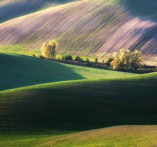
Instead, Sobas often uses a telephoto lens, a Canon 70-200mm f/4 L-series lens, which gives a horizontal angle of view of 18.2 to 6.4 degrees on his Canon 40D camera. This narrow angle of view provides foreshortening — making distant objects appear closer to each other — as we see with the hills in the photograph above. The use of a telephoto exaggerates the vertical dimension at the expense of perceived depth. Would the scenes have appeared as sublime if he had stood closer, and had used a wide-angle lens?
You may, however, consider the final size of your image and how close you will view it: if you are creating a panorama that will cover the wall of a room, then small detail becomes more prominent, and so a wider angle of view may not decrease the impression of sublimity.
Also note that Sobas often uses a high camera angle. Instead of just seeing one line of ridges, we can see multiple lines of ridges and hilltops, one behind the other, which increases the grandeur of the scenes.
3. Good landscapes are almost always taken around sunrise or sunset, or at night. I’m not saying that good landscapes can’t be taken at midday, I’m just saying that they typically aren’t. The lighting angle during the extremities of the day is low, and so shadows thrown are long, and serve to model the undulating terrain. In this way, early or late landscape photography is like using Rembrandt lighting for portraiture, which models the human face with shadow. Harsh lighting, like we find at midday, will often underexpose shadows or overexpose highlights; on the contrary, with the sun at a low angle, the sky acts as a great fill-in light. The attenuated orange light from the sun provides a good contrasting color with the blue of the sky, giving us far more color during the preferred times of day.
 Autumn ... by Marcin Sobas |
According to this interview, Sobas prefers cloudless mornings for his shooting. I’ve noticed that while sunsets are often pretty, the sky at sunrise is usually dull, but this makes for a better, more uniform light for this kind of work.
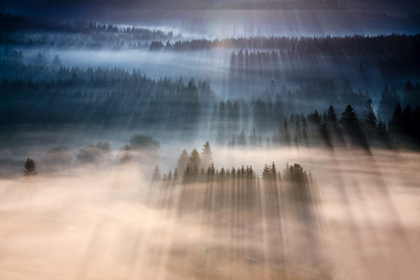
4. Unusual weather can help improve a landscape photo. Dramatic stormy skies and snow on the ground can turn an ordinary landscape into something more special. Sorbas likes foggy mornings to make his photos more interesting:
 Rays by Marcin Sobas |
He recommends getting some knowledge of weather so as to predict the best times for taking photos. The Lawrenceville Weather website includes a fog forecast map for the lower 48 United States; I refer to this map frequently to find interesting shooting conditions. Also of use is The Photographer's Ephemeris, an application that calculates the angle of the sun; this can help to predict the direction of shadows, which may lead to better compositions.
5. Good landscapes usually have a full range of tones or color. Sobas subtly post-processes his images, and the final results do have a broad range of tones. The simple use of the levels tool, and saturation or vibrance — not done too strongly — can enhance a landscape photo without making it look overprocessed. Choosing the right subject, exposure, white balance, time of day, time of year, and weather conditions all contribute to getting good color.
6. Good landscapes typically have a unity and harmony, and avoid distracting details. A certain measure of abstraction works well. Again, many of Sorbos’images are so abstract that they, at first glance, appear to be paintings, but instead they are almost undoubtedly straight camera images with some mild postprocessing.
This is perhaps the most difficult part of landscape photography: what subject, what camera position, and what lens and cropping best suit the image? A good photographer ought to be able to view a scene, taking in both the subject as well as potentially distracting elements, instead of merely doing the same back home on the computer. Especially when an image is to be displayed at a small size on a computer screen, a large measure of abstraction is needed, more so than if the final image is larger.
7. Remember that photographs are made to be viewed by human beings, and adding a bit of human interest to an image may make a photograph more interesting to your viewers. Having a human in a landscape can draw attention to it, and in the best examples, can transform an ordinary landscape photograph into a dreamscape, deepening its emotional impact. From what I've seen, Sobas does not often include humans in his photos, but we do see buildings, boats, roads, and sometimes animals. I might add that most or all of these images depict landscapes that have been heavily altered by humans, perhaps over thousands of years, but in a harmonious way, and so they have an organic look to them.
8. Good landscape photos are usually made with good equipment and good technique. Because landscapes may not be as intrinsically interesting as a human figure, it takes extra effort to attract the eye. Journalistic style images can be rough, and that does not distract from them; indeed, a rough image may have a feeling of immediacy about it. Landscapes, on the other hand, are more timeless, and seem to call for more perfection.
There are any number of rules or principles used in landscape painting and photography, and the brief list above are merely my observations of what most good landscapes definitely seem to share. I haven’t mentioned commonly-cited principles such as the use of diagonals, leading lines, the rule of thirds, balance, avoiding subjects leaving the scene, the use of S curves, having a definite center of attention, and so forth, simply because these principles, in my mind, aren’t certain, or perhaps I simply don’t understand them well enough. Human psychology is complex, but some things are more certain than others; getting the basics right is more important than the subtleties. After knowledge, experience, and inspiration, comes more perfection.

