But please notice that I wrote that three numbers suffice. Normally we think of color theory in terms of mixing colors: for example, computer monitors typically have three kinds of dots, each a certain precise shade of either red, green, or blue. Various mixtures of these color dots at various intensities will produce all the shades of color viewable on the screen, from dark gray or black, to white, and with a rainbow of colors throughout. Alas, although we can accurately characterize every known color by three numbers, we cannot mix all known shades with three primary colors. Three colors do not suffice, and this is the color gamut problem. If you choose three colors for your primaries, then no matter which colors you chose, there will still be colors that you are unable to mix.
For more information, see my article on imaginary and impossible colors.
For reasons of cost and practicality, most color devices use just three colors, and these provide a limited gamut of colors. Most computer monitors and High-Definition televisions use the sRGB color gamut, which can display about 35% of possible colors. Expensive high-gamut monitors can approach 50% of possible colors. Generally missing in these color output devices are rare colors such as scarlet and Imperial purple. Good cyans and some greens are also missing, but the system is generally adequate for most uses.
In the RGB color system, red, green, and blue lights are mixed together to provide a wide range of colors and shades. But we cannot use only red, green, and blue inks on a page to produce a similar range of colors. See my article, Color Spaces, Part 1: RGB, for examples of how these additive colors work together: for example, if you shine a red and green light together, you will get a bright yellow color, but if you mix red and green paints together, you will get a dark muddy mess. You cannot get a bright color by mixing RGB inks. Mixing saturated colored lights together will always produce a brighter color; mixing saturated colored paints together will always produce a darker color. So when we put ink to paper we have to use a subtractive color system, which chooses pure light primary colors for mixing.
Recall the discussion in the RGB article about the opponent color relationships. These are opposite color pairs, which produce shades of gray when you mix them, and not a unique color.
Red is opponent to cyanAnd since we are working with ink on paper, I might add:
Green is opponent to magenta
Blue is opponent to yellow
White is opponent to blackThe three primary colors in the RGB or additive color system are red, green, and blue, while the three primary colors in the CMY or subtractive color system are cyan, magenta, and yellow. RGB and CMY are therefore opponent to each other.
Consider the following image:

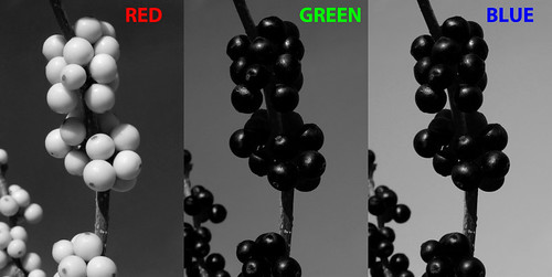
We have red berries against a blue sky. In the RGB system, the red berries will be bright in the red channel, and dark in the green and blue channel, since pure reds have little to no green or blue in them. If we examine the color channels separately, we see this:

Red berries are almost white here, because in the RGB color system white is a strong color, while black means the absence of a particular color. Since the berries are nearly pure red, they are white in the red channel, and black in the other channels. Since we have a nice blue sky, the sky is suitably lightest in the blue channel; and since midday blue skies tend towards cyan and not magenta, the green channel is brighter than the red.
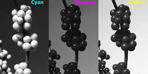
The CMY color system works a bit differently. White indicates an absence of ink, while black means that a particular ink has 100% coverage. So a part of an image where all three channels are white means that no ink is put on the page, and so the white color of the page shows through. The same image in the CMY color system is this:

Red berries have no cyan color in them, and so are white in the cyan channel. Magenta and yellow ink mixed together makes red, so the berries are dark in both those channels. Likewise, blue skies have little or no yellow in them, and so the sky in the yellow channel is light, and is dark in the cyan channel, meaning there is lots of cyan ink there. Cyan plus magenta equals blue, and since our cyan channel is darker than the magenta, the blue sky will properly be a greenish blue shade and not purple.
Please note that the RGB and CMY channels look nearly identical. Working in the CMY color system is hardly different than working in the RGB color system because of the opponent colors used. Please note that the channels are not identical because the printing and television industries use slightly different color standards. But they are close.
Recall the discussion above about limited color gamuts, and how three primary colors cannot produce the full gamut of colors visible to the human eye. Computer monitors really have it easy, since they have powerful back-lighting which can produce bright colors much brighter than the artificial illumination typically found indoors. But poor printed pages do not have that advantage: the brightest tone available will always be the paper itself, and that paper will be duller than the room lighting. And so, printed output will generally have a poor color gamut.
But we can expand the color gamut if we add more colors of ink. Full-color printing always adds at least one additional color to expand the gamut, and in commercial printing, that color is black:

The standard cyan, magenta, and yellow inks used in the printing industry really don't mix together well to make a good black, rather they look muddy. Another problem is that commercial printers have what is called an ink limit: some presses just can't have too much ink on the page without causing problems, and so printers will insist on a limit to the total ink coverage on any given spot on the page. Some shoddy printing may even have an ink limit of 240%, which means that you can't mix together full coverage of our three colored inks, since that would gives us a 300% coverage, which is over the ink limit. 100% black ink will replace 300% colored ink, which is quite a savings, and the black ink looks much better than an equal mixture of colors. Adding black expands the color gamut of the printed page, and does it while ensuring a cleaner press run with less chance of smudging ink.
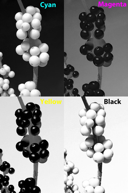
Here is our image in CMYK (where 'K' means 'key' or black):

The twig is dark brown, and much of its tone now comes from the black channel, as do the shadows. See also how Photoshop removed ink from the color channels: shadows there are now a medium gray.
The CMYK color gamut is considerably smaller than the sRGB gamut most often used in the computer industry and by digital cameras. However, the CMYK gamut is not completely contained within sRGB: printing can produce better cyan, magenta, and yellow, whereas sRGB produces better red, green, and blue.
We can expand our color gamut by adding colored ink. In the printing industry, these are called spot colors. If you don't think that the standard color mixtures are good enough, you can pay the printer to add spot colors. Be aware that this can be quite expensive, and is typically only used for the finest work. Were I to use an accurate spot color for the red berries, they would then become white in the CMY channels — since most of the color would be transferred to the new spot channel.
Cheap computer printers use the CMYK color system. Quality computer printers will have more than three colors, and there are some models that use ten colors. But if you use a desktop color printer to output photographs, be aware that you will be paying several dollars per page for the ink alone. Your costs may be fifty times higher than what a commercial printer charges in bulk.
For a further discussion of CMYK, click here for part 2.
If you think you understand CMYK, then take A CMYK Quiz.
For an overview of the RGB color system: Color Spaces, Part 1: RGB
For color spaces more natural to artists, see Color Spaces, Part 3: HSB and HSL.
For a color space designed to be visually uniform, see Color Spaces, Part 4: Lab.
No comments:
Post a Comment