But color is inherently messy. While we do know that most human eyes have three types of light-sensitive cone cells, which generally react to red, green, and blue light, this is a rather simplistic description of what actually exists. But what is really important is the fact that there are three types of color sensors. (And there is a fourth also, but it is sensitive to greenish-blue, and visually appears blue, and then typically only under dim lighting.)
We do know that we can generally represent color accurately by using three numbers, which correspond in some way to the three types of color cells in the eye. You can arrange all known colors into whatever kind of classification scheme you desire, but out of this infinity of schemes, only an infinitesimally small fraction of them display any kind of meaningful objective order: a good color-ordering scheme will be simple, and this simplicity will be expressed by having irreducibly three numbers to describe color. This means that you can arrange all colors into a three-dimentional shape, with the colors varying smoothly in some way in each direction. (There are color systems with four numbers, and some even go up to 10! These are used for printed output. Having more than three numbers for color is said to overspecified or redundant, and so there will usually be more than one way of specifying any unique color.)
There are many schemes used today to represent color, with each one typically using three numbers. The meaning of each of these numbers, however, changes drastically depending on the system used. The most common scheme is called the Red-Green-Blue, or RGB color space:
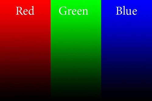
This is the kind of color space used in cameras, and this is also used when editing photos. We have three numbers, one each for the values of Red, Green, and Blue, and these numbers (for 8 bit files) go from 0 to 255. The beauty of this system is that when you continuously vary any one of the RGB colors, the tones you see vary in a natural manner — you typically don't get strange discontinuities in the color you see.
In this example, each slice of the image above has the named color go from 0 at the bottom, to 255 at the top, with the other color values being zero. A mix of numbers gives you different colors.
If all three values are zero, the result is black; if all three numbers are 255, then it is white: whenever all three values are the same, we get no color at all, but varying shades from black through gray to white. This is very useful in Photoshop: if we want to white balance an image, we just have to identify places that ought to be white, gray, and black, and then apply curves to force the three numbers to have equal values in each area.
A bigger number means a brighter pure color. Now, here is the big limit to the RGB color space: what specific color is equal to 255? As it turns out, that choice limits the gamut, or range of colors that can be represented by RGB. And so, we have many RGB color spaces, including the common sRGB color space used here, as well as AdobeRGB, ProPhoto RGB, ColorMatch RGB, and so forth. sRGB has the narrowest gamut of the bunch, while all the others can represent a wider range of colors.
Practical computer science considerations are why we are limited to 256 levels for each color: this is due to the binary arithmetic used by computers and also due to the formerly extreme cost of computer equipment. 256 levels per color gives us a good total number of colors, and is generally adequate for quality photography. Much fewer numbers of colors will likely introduce banding in the final image. But it is for this reason that sRGB is a decent color space to use, even though it can't represent the full range of colors: wide gamut color spaces may introduce banding because they might still use only 8 bits per color, and so the colors are spaced further apart.
When using Photoshop, I recommend using 16 bit mode, especially if you are going to do some extreme edits to your images. This reduces the possibility of banding. However, you still have to reduce your final image to 8 bits per color if you want to display photos for the web. Also, be aware that many web browsers can only view sRGB images accurately: other color spaces will look bad.
Another consideration with RGB is how perceived brightness varies as the values go from 0 to 255. The simplistic idea that 200 will be twice as bright as 100 doesn't work well — for the human eye, twice as much light doesn't look twice as bright, rather it looks only a bit brighter. This phenomenon lets us see over vast ranges of brightness, and so the RGB scheme accounts for this by using gamma correction, which I'll go over in the future. Gamma correction assigns the RGB numbers in a way that appear a bit more more perceptually uniform.
RGB is the most common color space used, but that does not mean that it is the best for all purposes. When using curves, all three colors have to be modified at the same time, otherwise you will get color shifts. Also, how Photoshop determines the brightness of a particular color may not accurately reflect how the human eye sees it.
Photoshop is a bewildering piece of software, with a tremendous number of options. But there really are only a few key concepts that must be understood and mastered. I think the color channel system is essential. Each of the three numbers discussed earlier is broken off into its own channel: each channel is a black and white image made up of only one of the three numbers. Ideally, when you see a color image you should be able to imagine what each of the channels look like; also, if you are given a channel, you ought to be able to determine which color it goes with. For example, here are the RGB channels of the image above:
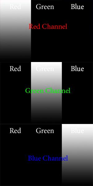
Is this what you imagined? For the red channel, we have no Green or Blue data, and so they are black in the places of the image that are green and blue. A value of 0 is black, and so 255 in the red channel will give you the brightest pure red. Just by looking at the Red channel, you ought to be able to determine that the only color you see on the left is red. Now, this is pretty straightforward for pure colors, but when we have other colors, it gets a bit more complicated.
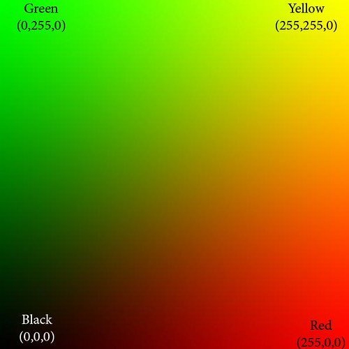
Here we show only the red and green color channels, mixed together in various proportions. Can you imagine what the color channels look like? The blue channel is completely black (except for the white text). The red channel goes uniformly from 0 on the left to 255 on the extreme right, and likewise the green channel goes from 0 on the bottom to 255 on the top.
At the extreme bottom of the image, both green and blue are 0, and so we see pure red tones going from black to bright red. Likewise, along the left side of the image, we have pure green tones.
The upper right hand corner of the image has both red and green at 255, and blue at 0: this is pure, bright yellow. Along the right edge we see orange, which is a mixture of yellow and red, or rather, bright red with some green and no blue. The top edge shows lime green, a mixture of yellow and green, or pure green and some red and no blue.
The diagonal line from black to yellow shows equal portions of red and green. You may notice how very little of this region looks particularly yellow but instead is kind of a muddy color. Actually, the color brown is in reality a dim yellow or orange color, which looks muddy merely because of bright surrounding colors. If you take a brown object, put it on a very black background, and brightly illuminate it, it will likely look nicely yellow or orange, and not brown at all.
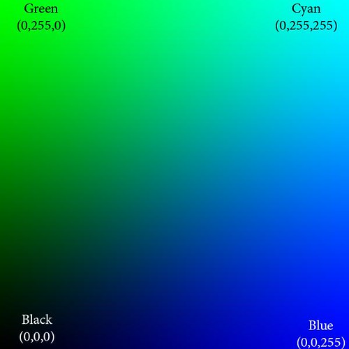
Here we show only green and blue, and the red channel is black.
The upper right hand corner of this image is cyan, which has 0 red, while both blue and green are at 255. These colors are very significant: they are the opponent colors of whatever channel is black. Ideally, those colors would be opposite from each other on a color wheel. So we see that cyan is the anti-red: there is no cyanish-red color possible, rather mixing them together on the computer only gives you gray. Here are the important opponent colors:
Blue — Yellow
Red — Cyan
Green — Magenta
Whenever you see a bright saturated yellow, you will know that the blue channel there is black, and likewise for the other opponents.

Red and blue gives magenta. Magenta is the anti-green.
Isaac Newton's color theory is very deficient because it cannot account for magenta colors; however, even this RGB system is deficient because it cannot give us a pure violet — a color that is ultra-blue, with no red it it whatsoever. But because of how we see, some tones of magenta appear violet to our eyes. Yes, color vision is complicated.
These illustrations show pure colors. If we were to include non-zero values for all three colors, we won't get any new colors, but only grayer and lighter tones of these existing pure colors. Having three RGB colors reduces saturation. Just by looking at the RGB numbers, you ought to be able to tell how saturated a color is; and if all three RGB numbers are equal, then you know you will have a completely unsaturated color: white, black, or shade of gray.
You don't need to see color in order to accurately analyze and color-correct an image in Photoshop. There is much ado made of having a calibrated monitor, and while that is good and useful, it is not absolutely essential. It is better to color-calibrate your images, because your eyes can fool you, especially when you are tired, and also no monitor calibration is perfect. Just remember these rules:
All RGB numbers the same: gray
All RGB numbers high: white
All RGB number low: black
R high, others low: red
G high, others low: green
B high, others low: blue
R and G high, B low: yellow
R and B high, G low: magenta
G and B high, R low: cyan
Any one or two of RGB high; the others medium and equal: light unsaturated color or pastel
Any one or two RGB low; the others medium: unsaturated dark color.
R high, G medium, B low: orange
R high, B medium, G low: rose
G high, R medium, B low: lime
G high, B medium, R low: sea green
B high, R medium, G low: purple
B high, G medium, R low: sky blue
Suppose you take a photo with a ordinary clear blue midday sky. Are the RGB numbers such that B is greater than G, and G is greater than R? If not, is it your artistic intent to make the sky look purple, or some other color than sky blue? If not, and if you intend to share your photos with others, especially on the Internet, then be sure your colors are right. If an objectively purple sky looks like a normal sky blue on your computer monitor, then you need to calibrate your monitor.
Remember, color calibrate your images before you calibrate your monitor!
If you are confident that you understand RGB, then take An RGB Quiz.
For an overview of the CMYK color system: Color Spaces, Part 2: CMYK and Part Two of "Color Spaces, Part 2: CMYK" as well as A CMYK Quiz.
See also Color Spaces, Part 3: HSB and HSL and Color Spaces, Part 4: Lab.
2 comments:
I find it interesting that (at least on my mac) the example images in your post have noticeable artifacts (especially the blue/red one). Clicking through to your flickr page, the "medium" image does not sufffer from them, but the "original" image does. Odd.
Ugh, you a right. That is what happens when I am in a hurry and don't triple check everything! I put in better looking sizes of the images.
Post a Comment