Autochrome plates had a layer of starch grains, dyed to three primary colors. These tiny grains acted as color filters during both exposure and when viewing. The plate used standard silver chemistry, and was developed so as to remove the silver that was exposed to the light — which is the reverse of the normal process. The completed plate then had a positive color image when viewed with a back light.
Autochrome Lumière plates were first marketed in 1907, at a cost a number of times more than standard black and white plates. This proved to be the most practical color photography method until the 1930s.
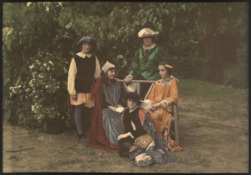
Children in Medieval Costume, by Mrs. Benjamin F. Russell, ca. 1910. George Eastman Collection.
Autochrome was used to create slides, viewed either by a slide projector, or through a hand-held viewer. It is said that printed reproductions of Autochromes — especially those made during the era when the process was used — do not do justice to the medium; the original colors are delicate, with excellent color separation and balance. But autochromes are sensitive to light, heat, and oxygen, with surviving images often being in poor condition.
While there are many differences between Autochrome and newer color photography methods, the most striking difference is that Autochrome used orange, green, and violet dyes as the primary colors of its palette, in contrast to the now-standard red, green, and blue primary colors. This inevitably and severely limits the range of colors that can be represented by this method.
But muted colors are not necessarily a bad thing. Autochrome remained popular until the 1950s, especially in France, because it produced more subtle color than newer films. The American film Kodachrome (produced from 1935 to 2009) was known for producing excessively bright color, while the Japanese Fujichrome Velvia (introduced in 1990) produces colors very often criticized as garish. The contemporary digital photography color standard also produces colors which can be excessively saturated. Can an understated, limited, and muted use of color be sometimes superior?
As it so happens, the range of colors produced by Autochrome ought to be accurately reproducible by modern digital cameras, since their native color gamut is so large. Intrigued by Autochrome, I set about devising a method of reproducing its color range. Here are some experimental digital photos, limited to use only my estimate of Autochrome's color palette:
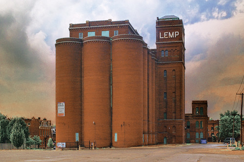
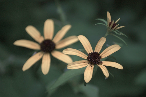
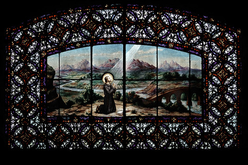
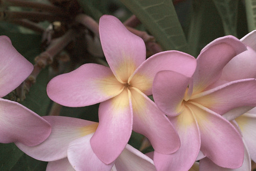
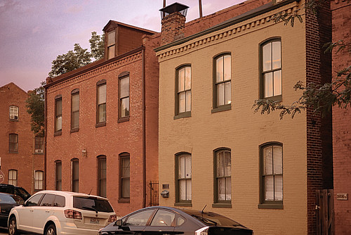
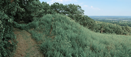

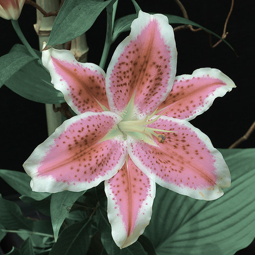
I reduced the color gamut of these photos to my estimates of the primary colors used by Autochrome. As these primary colors are more limited than the sRGB primaries, we ought to be able to reproduce them more or less faithfully here. There are plenty of Autochrome images on the Internet, but many of them are scans from printed images, which will throw the colors off. I attempted to find only direct digital images of Autochrome slides, and used those to estimate the primary colors. Clearly there is lots of variation among my sample photos, not the least of which is changes in exposure and white balance, as well as the color response of the various digital cameras or scanners. But I did the best that I could. Here is the process I used:
- I collected dozens of Autochrome images from the Internet, and put them together into a large photomosaic.
- Using selection and threshold tools in Photoshop, I eliminated colors that were not saturated, changing these to a uniform neutral gray.
- Using Indexed Color, I was able to reduce the color palette gradually until I was left with several clusters of colors, which corresponded to the three Autochrome primary colors, three secondary colors, and black and white.
- From the sample colors found in the Color Table, I picked out the brightest, most saturated typical-looking colors from each cluster as the primaries.
- Using a color conversion tool (ColorSync can do this), I determined the Yxy color values associated with the RGB numbers found in the Color Table.
- I created an Autochrome ICC profile in Photoshop using these Yxy values.
- Converting an sRGB image to the Autochrome profile may or may not make a big difference, depending on the brightness of the colors found in the original images. However, you can edit the image considerably to bring out the colors better, and never leave the Autochrome gamut.
- I have no way of knowing if I got the colors right, and there obviously is a lot more work that can be done with this, but this limited palette still has a certain beauty and opportunity.
Some Frenchmen, using original Lumière equipment and notes, are attempting to duplicate the process in its full glory. While not likely to become widely used, this is still a worthy medium for color photography.
UPDATE: see the article Using ICC Profiles for Creative Color Control for specific instructions on converting images to the estimated Autochrome color gamut. For the photographs in this article, I used the Old Autochrome ICC profile. I’ve made an attempt at simulating the grain and dark tones of Autochrome. See the article An Imitation of the Autochrome Lumière Process.
6 comments:
I’m working on that right now!
Have you tried using Adobe's DNG Profile Editor to create an Autochrome camera profile rather than a preset?
https://www.adobe.com/cfusion/entitlement/index.cfm?e=labs%5Fdngprofileeditor
maralatho,
Dunno. I haven’t looked into it. The method devised in the article linked below has a certain practical ease associated with it.
I think that better results can be had if a transfer function is created for each model of camera, directly mapping a camera’s native gamut with Autochrome. But that is a lot of work.
I’ve been working on a fairly fundamental method of giving a pointillist look to these pseudo-Autochromes, and the results look much more authentic than what is described in this article, particularly with the tonal curves of the images.
http://therefractedlight.blogspot.com/2011/11/using-icc-profiles-for-creative-color.html
Wow. That is so great.
How is work on that preset coming along?
Gracie,
See here:
http://therefractedlight.blogspot.com/2011/11/using-icc-profiles-for-creative-color.html
Post a Comment