When I became serious about photography a number of years ago, I didn't give composition too much consideration, simply due to the fact that I was taking mainly architectural photos:
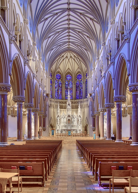
Saint Francis Xavier Church, at Saint Louis University, in Saint Louis, Missouri, USA.
The hard work of composition was already done for me by the architect. I merely had to discover good camera positions and angles, and the kind of post processing that would express the work of the architect in a pleasing manner. Fortunately, these discoveries came rather quickly to me.
Likewise, I found it easy to take pleasing photos of flowers:

Flower, at the Missouri Botanical Garden (Shaw's Garden), in Saint Louis.
Flowers are intrinsically interesting, and nature suggests composition.
But I always had a problem with landscapes. So many times, I'd take some photo of a scene that I thought was interesting, but my end results were usually dull:
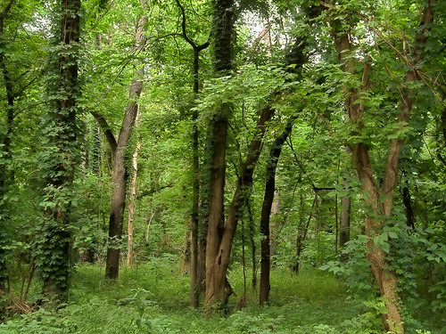
Bottomland forest, at Castlewood State Park, in Saint Louis County.
With my eyes, this scene pleased me enough that I took the time to set up my tripod, take a series of exposures, and then I spent significant time on the computer attempting to make this image look good. Now when I view this, I cannot imagine what I thought I saw when I was in the forest. This appears to be a waste of my time.
A while back, I was hired to photograph a book on the public parks in my city. This caused me no small amount of anxiety; now, my publisher must have thought that I was up to the task, and many of the photos were to be somewhat like this:
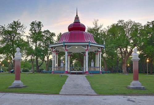
Bandstand, at Tower Grove Park, in Saint Louis.
As this is an architectural landscape, much of the composition was already done for me by the building and landscape architects, and with some judicious cropping, this ought to become a pleasing image. But what about a natural landscape?
Looking back at the dull forest photo above, I knew that something interesting must have been in that image, otherwise I would not have spent so much time on it. But why does this image fail to show this interest? I conclude that either the post-processing is wrong, or more likely, the composition of the final image is wrong.
I am not so naïve to believe that all I need to do is to learn rules of composition, which will automatically produce pleasing images. But neither am I satisfied the advice that I ought to simply adjust my image until it looks good to me. What if all my adjustments are unsatisfactory? Why are they not satisfactory? But I was in the forest, and what I saw from my camera position pleased me. How do I discover a pleasing composition in this image?
It is the goal of this blog to provide objective information on photography. In my very first article here, I wrote:
…I intend to write about the more certain, objective factors in photography, things that are less a matter of personal taste and legitimate varying opinion. The laws of physics are objective, the operation of specific cameras is in principle knowable, but even some subjective factors can be known objectively to a good degree, such as the properties of vision that are fairly uniform among persons…So how can composition be objective? Is this not something that is completely subjective, varying between individuals? Yes and no. One compositional element is absolutely objective, and this element is a basic element of composition in photography.
Please consider that nearly all photographs are rigidly bound by a fixed frame. For nearly all images, we can determine with high precision what precisely is a part of the photograph and what is not a part of it. All of the photographs above are rectangular, being at most 500 pixels wide. The fixed frame is therefore the basic element of composition, or at least is the most objective element. It is the most certain, most rigid, most obvious, most purely geometrical part of a photograph. The frame defines and bounds the photograph. Please note that I use the term ‘frame’ here to denote the outside edges of the photo, but picture frames also serve the important function of making a distinct, yet broad transition between the image and the wall.
Also note that all consumer digital cameras produce rectangular images. This is significant, but I won’t go into it further here.
[On the contrary, irregular cutouts are more ambiguous, as are feathered edges that fade to transparency. These effects are used at times, but largely in designs where a photograph is a part of a larger composition. Occasionally, an image element will break out of the frame, but this is typically used sparingly as a gimmick. But the frame is fixed for the vast majority of casual or serious photographs.]
OK, so the frame of an image has an undeniable influence over the content of an image. You may re-crop an image in a large number of ways, and every crop excludes a different part of the image. What are we to make of this? Here are some possible opinions:
- Every crop of an image is equally valid. Every frame is as good as any other.
- You merely have to crop an image so that it looks good to you.
- If you fill the frame of your camera when shooting, then you don't need to crop.
- You should crop your images so that the ratio of the long to short side is equal the golden mean φ (phi), or 1.61803:1
- You should crop your images to fit the standard sizes of the media used; for example, 4:3 or 16:9 for television or computer monitors, 5x7 or 8x10 inches for prints, or the ISO 216 series of standard paper sizes.
- You should crop your image according to the Rule of Thirds.
- If you don't compose your image according to the Canons of Proportion, then you won't have a good image.
- Various systems of harmonic proportion have been developed over the millennia. Certain ratios have long been considered pleasing, and others displeasing. An image ought to be cropped to one of these ratios, such as 1:1, 2:1, 3:2 or 4:3.
- The subject of the image and its internal composition is more important than the outside edge of the image. The crop ought to serve the image, reinforcing the compositional elements within the image itself.
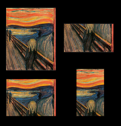
The subject of Edvard Munch’s The Scream was driven insane by bad theories of art.
Regarding #2, why do you like any given crop? Do you know why, or does a good crop just feel good? According to ancient Greek philosopher Plato, “An unexamined life is not worth living.” How can you expect to grow in your art unless you can intellectually discern why you do one thing instead of another? I am not saying that this kind of discernment is easy, only that it is highly recommended in order to perfect art.

I cropped the photo this way because that’s the way I liked it. Certainly, I wanted to show the leaf margins on the right and bottom, but why did I leave as much room as I did? How did I determine the top and left crops? This photo was taken within the Climatron greenhouse at the Missouri Botanical Garden in Saint Louis.
In rule #2 is the notion that the artist only has to please himself. But what if an important client requests another crop, different from your preferred one? Would you rather starve than compromise your artistic vision? Is this a battle worth fighting for? Have you considered that your client may actually have a better artistic vision than you do? Why don’t you instead produce an image that is robust enough to survive a wide variety of crops?
#3 is often claimed that filling your cameras frame is the most efficient use of pixels, and certainly if your subject takes up more of your camera’s frame, then you will likely have better image quality. However, there are two limitations. First, very tight framing limits your cropping options, particularly if you have to make a standard size print that may not have the same aspect ratio as your camera. For example, my publisher often crops my images severely when my framing is too tight; better compositions may be had if I do looser framing. Second, the aspect ratio of your camera is likely not ideal for every subject: many photographers prefer an image taller than it is wide when doing portraits, and likewise produce an image wider than it is tall when doing landscapes. Square format is considered to be particularly powerful, but it would need to be cropped in these circumstances.
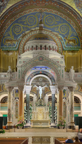
This is a very tight composition, and would not, to me, be satisfactory if recropped as an 8x10 image.
On #4, or the Golden Mean or Golden Ratio. First, it is generally understood that not all frame aspect ratios suit all images. When I’m taking photos of flowers that show some degree of radial symmetry, as seen in the flower image above, I often find that a square aspect ratio is pleasing for the subject. An aspect ratio of approximately 1.6180339887:1 can’t always be optimal.

An approximate golden rectangle; 500x309 pixels in size, giving an aspect ratio of about 1.618:1.
Furthermore, phi is an irrational number, and its decimal digits go on forever, and so that isn’t well suited for digital photography where we deal with discrete numbers of pixels. But this is a petty complaint. It is claimed that a golden rectangle has the most pleasing aspect ratio of all rectangles, but it is hard to find data that substantiates that claim, and anyway human eyes aren’t good at making precise measurements.
A practical consideration is that cropping your images to this aspect ratio makes printing and framing your prints more expensive and time-consuming.
It is claimed the golden mean has remote antiquity, and was used as an aesthetic number by the ancient Greeks. There is no evidence of this. Where the number is definitely found in antiquity, it was of mathematical use only, and only incidentally found in art, since phi does appear in some geometric constructions such as the pentagram and the Platonic solids. We can be pretty certain that phi, before the modern age, was never used directly as an aesthetic proportion.
You can find an extremely critical article against the golden ratio here.
By the way, the Greek philosophers did use the term ‘golden mean’ but only in discussions of virtue. According to the philosophers, a virtuous action is the ‘golden mean’ between two vices; for example, justice is the golden mean between leniency and severity, and courage is the mean between being a coward and being foolhardy.
#5 is practical advice. If you are selling prints, it is prudent to size and crop them to fit within one of the standard print sizes. Because frames and mattes are pre-cut to a series of fixed sizes, you can save much money and time by doing a standard crop.
But herein lies the problem. Who says that that standard print sizes are going to work with your images? Some compositions are very tight, and if you have a pattern of repeating elements in your image, a bad crop can make it look disharmonious. Also, you probably don’t want to crop out the top of the bride’s hair just to make it fit within an 8x10 inch print. Finally, putting a non-standard image size in a standard frame — where there are gaps outside of either the long or the short edges of the print — looks very unprofessional.
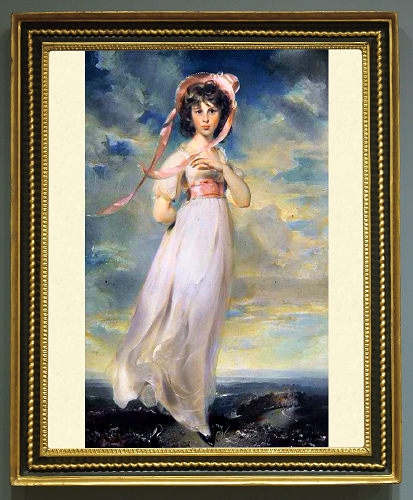
Pinkie, by Thomas Lawrence, badly framed.
Its quite frustrating, but many of the standard American and Japanese print sizes have different aspect ratios; so if you want to produce a small, medium, and large standard print, you have to crop them differently for each size. The three most standard print sizes, 4x6, 5x7, and 8x10 inches all have different aspect ratios, and so different crops are required. Supporting all of these print sizes means that you have to shoot loosely and compose your images so that no one of these three crops looks bad, which may be difficult to do well with some subjects.
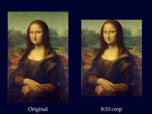
Mona Lisa, cropped to the 8x10 inch aspect ratio. The original is approximately 3:2. I am pretty sure that Da Vinci neither put a code nor phi in this painting, and I am positive that an 8x10 crop doesn’t help it.
However, I might mention that any given standard print, matte, and frame combination is usually harmonious. These sizes aren’t arbitrary.
Contrary to the Japanese-American standard print sizes, the ISO 216 standard uses a fixed aspect ratio for all sizes. Different cropping isn’t needed for each size. But the aspect ratio is irrational, with the long size being the square root of 2 times the size of the short one (approximately 1.4142135623731:1). As with the suggestion that the golden mean be the aspect ratio (see #4), this may be misguided. This system gives no choice of aspect ratio in order to harmonize with the subject, nor has this ratio ever been widely considered to be aesthetically pleasing. In practice, the numbers for the paper sizes are rounded off to the nearest centimeter, with different manufacturers rounding off the numbers in various ways. By the way, the ISO 216 standard was designed so that the next size is half that of the one that came before it, so an A3 print is half the size of an A2 print. The standard includes an A, B, and C series, each having a different starting point so as to allow for a larger number of standard sizes, closer to each other.
The alternative to using standard sizes is to crop your images to whatever aspect ratio serves your composition. If you are making images for display on the Internet, there isn’t anything else you need to do besides resizing them.
If you are making a print, you can make a custom matte and frame to harmonize with it. Custom-cut frames and mattes are quite expensive in retail stores, and if you aren’t watching the person cutting them, and help them with the measurements, you might very well get the wrong sizes. Or you can do this yourself, if you are good with cutting tools, but still this isn’t cheap. Although some sort of framing is almost always needed for art prints, be aware that some fine art photography in the past was displayed without frames, tacked on cardboard. Whether or not your spouse or your client will buy this, however, is not for me to decide.
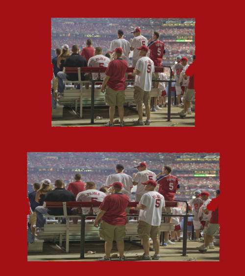
All Star game, in Saint Louis, in A.D. 2009. The 4:3 image at top is stretched to 16:9 on the bottom. Never, never, never, never do this.
Ah, the famous Rule of Thirds, rule #6. Is there any other rule of composition? This one gets repeated constantly. This rule states that main compositional elements ought to be placed one-third of the way between the edges of the photo. I wrote about that rule (see the article Rule of Thirds?), and I do sometimes use it, if I think it makes for a stronger composition.
Many folks say that this rule should be followed in all photos, but when someone claims that it doesn’t work, then they say “rules are meant to be broken”. Ugh. No no no no no. You do not tell a police officer, who is arresting you, that “rules are meant to be broken” nor do you tell that to the judge. You do not break the rules of gravity. Either it is a rule that has significant real consequences if it is broken, or it isn’t a rule at all.
Ancient proportional systems have very many “rules” but in such a wide variety that they aren't rules at all, but rather are harmonious design guidelines. Like painters’ color palettes, the musical scales, or poetic forms, you have a broad freedom to select whatever system that works for your composition. If you are really good, you can devise your own systems. Based on the classical harmonies, I could say that this or that composition follows the “rule of unities”, the “rule of halves”, the “rule of fifths”, the “rule of octaves”, the “rule of increments”, “the rule of inverses" and dozens or hundreds of other so-called rules. Adding harmony to your image is usually accepted as a way of improving it. What particular harmony to add to an image can be a problem.

Flooding on Smallpox Island, near Alton, Illinois. I explicitly used the Rule of Thirds here, as well as the Rule of Halves (which is a rule I made up). I got a number of positive compliments about this composition.
Rule #7: if you don’t follow the canons of proportion, your result will be bad. The Age of Enlightenment was also the Age of Science. Prominent scientists and philosophers determined that certain artistic rules were good for the visual arts, and so academia taught artists to follow these rules. This process was accepted in the 18th century and it is accepted today, although of course the rules are different. What was absurd was the claim that if art did not follow such rules, it couldn’t be good; also absurd would be the claim that any art that followed those rules must be necessarily be good. In juried competitions, excellent paintings were rejected only because they violated some unreasonable rule or another. Please remember that an unjust rule isn’t a rule at all.
While the state-sponsored academies were perhaps wrong in limiting artistic latitude so strongly, the opponents of these academies were wrong in claiming that there were no rules, that freedom must be total. One of the most absurd claims by the Impressionists was that composition of paintings was not necessary, because nature has her own composition. If this is true, then why is my forest photo above so bad? That there is an intrinsic order to nature cannot be denied, but this order usually exceeds human reason.
An example of these kinds of artistic rules can be found in the “Classical unities,” inspired by The Poetics by Aristotle; these rules state that a tragic play ought to have one plot, one location, and take place over the course of not much more than one day. But Aristotle himself, in the same book, didn’t say that his rules were inviolable; he simply said that the best tragic plays of his day conformed to some rules, and that certainly tragedy could be further improved.
As a general principle, never confuse “is” with “ought”. The great Gothic Revival theorist A.W.N. Pugin said that the Gothic is the greatest Christian style of architecture, worthy of imitation; he also said that some other style in the future could be even greater.

I reject this painting, The Oath of the Horatii, by Jacques-Louis David, because it invokes Godwin’s Law.
Unlike the Modernists, I see no problem with working within the old classical harmonies and canons of proportion. For example, Byzantine iconography has seen a great resurgence, and there are artists who are trying to recover the canons of Gothic painting. Photography is certainly an art form of the Modern period, but that does not limit me from appreciating art in the Western classical tradition, nor prevent me from incorporating these principles into my art.
Classical harmony, #8, is a topic near and dear to my heart. It is certain that many of the great architectural achievements of the past were explicitly constructed using these harmonies. David’s painting above depicts three arches made with harmonious proportion.
We have no evidence that the ancient Greeks or the Gothic cathedral builders used the golden mean as a proportional ratio, and the square root of two was used only as a consequence of that number being the diagonal of a unit square. Rather, we do know very well what kind of proportions in art were preferred by them: ratios of small whole integers. Derived from the musical experiments of Pythagorus and commented on by the philosophers Plato and Aristotle, the theory of numbers and their harmonic proportions was preserved and elaborated during the Medieval period, and served European civilization until Modernism. This number theory, coupled with the geometry of Euclid and his use of the compass and straightedge, led to some of the most awe-inspiring buildings in history. Classical harmony is also the foundation of music, and ought to be seriously considered by every artist.
See the article, Harmonious Proportion and Ratio, for an overview on the classical harmonies.
#9, the value and importance of the frame.
Let’s face it. Photography is an inferior medium. We do not have the great control over our subject as do painters or architects, and even if we use Photoshop to its fullest extent, we end up with digital art rather than photography. Now if I had a photo studio, perhaps I could compose my images precisely and harmoniously, but instead if I’m taking photos of landscapes, I have to take what I see and work from there. I simply cannot compose my images as well as I would like. Photography is a powerful medium, but composition is not one of its strengths. Ironically, much contemporary compositional theory was developed by photographers as they attempted to improve their medium.
There are some situations where framing can harmonize precisely with an image, for example, see the following photograph of metal panels, found at an exhibit at a car show:
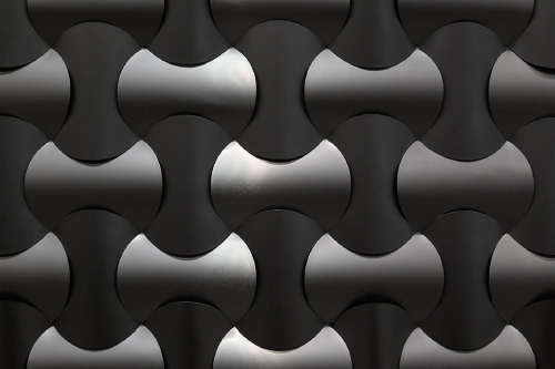
The proportion of the sides of this image is 3:2, and this harmonizes with the regular metal pattern found in the image. If I didn’t keep the camera level, or if I cropped it contrary to the pattern in the metal, this would likely be a poorer image.
If your subject has a strong symmetries — like the church in the top photo above — then certainly do your best to conform the frame to the symmetry expressed in the subject. You are given a good subject, and so give it a good frame. Make the frame harmonize with the subject.
But many subjects aren’t so tractable. For a blunt — and very crude — list of things that make bad photos, see 7 things you really don’t need to take a photo of. Included in this list of seven bad subjects is scenery.
We are often told that “beauty is in the eye of the beholder,” that there is no artistic method that will lead to beauty. However, many of these theorists also praise works that are “jarring” and “subversive,” and so by implication there are principles of disharmony and ugliness that these artworks must obviously follow. What is certain, it is impossible to produce a work of art that follows no rules or principles at all. See the article “The Tropeless Tale” for a humorous refutation of this nihilism.
Perhaps the very best landscape photographers select those subjects that they know will produce good photos, by intellectually analyzing the scene before them, and not allowing their instincts or baser passions to influence their decision to take the photo. There is a huge difference between feeling that a scene will make a good photo, and knowing that it will. If you have a prime subject, say, a mountain surround by a featureless plain, then your composition is easier, and multiple kinds of harmonious crops may be adequate. This kind of analysis does not have to be labored; I think that long study and extensive practice can make this kind of scene analysis second nature.
Perhaps the problem is with human perception. What do our eyes concentrate on? Perhaps in my forest photo above, I saw some tiny detail that is now lost among the leaves. Perhaps I was influenced by the buzzing insects, the humidity in the air, the chirping of birds, and the rustling of leaves when I had my camera in hand. Perhaps I can’t make a good crop of that photo.
[I ought to note that beginning landscape photographers often think that they must use the widest angle lens that they can find, to “get the whole scene in”; but professionals say that a telephoto lens is often better, to focus on a single interesting detail in the scene.]
Our vision picks out patterns, or even imagines some pattern where none exists, like seeing faces and animals in the shapes of clouds. We look for order and we analogize what we see with what we already know, which is sometimes called the ‘associative imagination.’ This is essential for survival: if something appears dangerous, even marginally so, it is prudent that we avoid this imagined, and potentially actual, danger. We are also drawn to good things by a slight glimpse of a shape or a subtle curve in the distance, or a distinctive color. Photography and all of the representational arts would be impossible without the associative imagination: we can recognize a portrait of someone famous, or a loved one, even if it is highly abstracted. I cannot imagine how vision would be useful if it weren’t for the associative imagination. Perhaps a good image reinforces our imagination, and makes it more concrete, by abstracting away distracting details, leaving us with our primary associations.
I think this associative imagination is likely one of the reasons why abstract painting of the mid-20th was so highly disliked and mocked by the general public. If an artist intentionally paints something that appears if it may have associations — but does not — then this kind of art is a cruel joke or is dishonest if it is intended to be displayed to the public. Of course, this kind of art was originally intended to be revolutionary — in the art and in the political sense. But this does not mean that all abstract art is destructive: decorative geometric patterned art is also abstract, but has been wildly popular throughout history, and it is this kind of art that harmonic proportion reigns supreme. See the article Abstraction and the “Grammar of Ornament”.
I think that good composition in photography is the intersection between realism and the kind of geometric abstraction found in the decorative arts, and the ubiquitous frame is the most abstract element in images. But investigating this will be left to a future article.
No comments:
Post a Comment