The main method of making color photographs was suggested in 1855 by the Scottish physicist James Clerk Maxwell. By exposing three photographic plates separately through red, green, and blue filters, and then projecting those images, overlapping, through the same filters, would then produce a color image on a screen. Or the same images could be printed on paper using various colored inks.
The main problem was determining how to do the same thing with cinematography. Any method devised would have to be visually impressive, relatively inexpensive, and would have to be extremely reliable, especially during projection at the theater. Using three cameras with three color filters was out of the question, due to parallax problems, and worse was the great expense and difficulty of aligning three separate projectors.
Compromises had to be made, and one such compromise was using only two colors: some color, perhaps, is better than no color. Film stock is transparent and has two sides, and many methods were devised so that one side would be sensitive to one range of colors, with the other side being sensitive to another range of colors. The film would be developed, producing an image on both sides, which were then dyed to the appropriate colors. The film could then be projected through standard projectors with no additional equipment needed. Surprisingly, very many films were created with the two-color method, starting in 1908, becoming common in the 1920s, and this was still used until the 1950s. But few of these color films remain with us today, and many of those survivors are now only available in monochrome versions specially made for early television.
While the two-color method died out in favor of three-color cinematography, by no means should we think that these kinds of methods are completely obsolete, being only temporary solutions limited to a particular place and time in history. Instead, I think that these methods, reinvented with digital technology, are interesting in their own right and can be used by contemporary photographers for artistic purpose. My related research on imitating Autochrome, an early color photographic process with a more limited color palette than is now standard, can be found here.
Consider this photograph taken in Forest Park, in Saint Louis, Missouri, during a ballon race:

Many of the early two-color process films used green and red filters. My first naïve attempt at two-color photography was simply to eliminate the blue channel in Photoshop, by filling it with black:

Instead of mainly red and green colors, we here have mainly yellow. As yellow is the opponent color to blue, and since we eliminated the blue color, we should expect to get lots of yellow. Oddly enough, my eye still sees some blue here when none exists, but is this simply because I know what the colors ought to be, or because some other subtle effect is happening? I do know that Edwin Land, the inventor of polarizing filters and Polaroid instant picture film, thought that he could get full-color images from only two color filters, although his research remains seemingly impossible and is controversial to this day, was never put into a commercial product, and I’ve never seen a convincing demonstration of it — but still I am not sure.
Now I can’t say that this yellow image simulates a two-color film process, for I can’t say that I’ve ever seen a two-color film. In a darkened theater, the eye’s own automatic white balance function would be active: but would the yellow colors appear to be closer to white? I have no way of verifying this. Now, normal attempts at white balancing this image in RGB — leaving us only green and red tones — is not possible, since we don’t have a blue channel.
Now, I can bring the white colors in the original scene back to neutral by adding a blue layer on top of this image in color mode and 50% opacity, but the shadows are then given a blue color, which is not what we want here.
Alternatively, I can use Photoshop’s Photo Filter function, which simulates the use of color filters placed in front of a camera lens while shooting. I must admit that I find this function to be rather mysterious, for as far as I can tell, it does things that cannot be reproduced by the use of curves and levels or any other type of processing in the RGB color space. Perhaps it moves the image into another color space, such as Lab, but I cannot verify this.
What I did with this image is use a Photo Filter layer, using the RGB primary blue color (0, 0, 255), at 100% Density, 50% opacity, and checked Preserve Luminosity. The image still had an overall color tone, but I was able to white balance it easily using Curves:

This is almost precisely what I expected to get. Now what use is this kind of processing? I leave that up to you.
We can get two more variations of this method by blacking out the red or green channels, and using the Photo Filter with the color of whatever channel is eliminated, but the expected results we got with red-green colors are not duplicated:
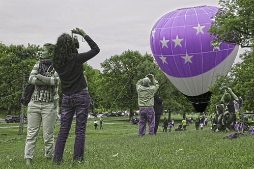
Using only the blue and green channels does not give us a blue and green image, but rather green and violet. What is going on here? Clearly I don’t understand color vision as well as I’d like, nor do I understand the processing used by Photo Filter.
Likewise, using only the red and blue channels does not give us an image in those colors, but rather blue and yellow:

My apologies to the young ladies for the horrible skin tones on the last two images.
The Photo Filter function of Photoshop seems to be rather powerful, and I am convinced that it transcends the RGB color model, but it does not work in a manner that I consider predictable or in a way that I understand. Far more understandable is the Lab colorspace in Photoshop, which implements a color system based on studies of human color vision. See the article “Color Spaces, Part 4: Lab” for more information. Like RGB, Lab describes color with three numbers, but instead of specifying the amount of red, green, and blue light, it uses one number for lightness, and two others for specifying color.
The two Lab color axes are a, which specifies a range of colors going from a slightly bluish green to magenta, and b, which goes from a slightly orangish yellow through a sky blue color. These color pairs are opponent colors: if you would mix a negative ‘a’ color with a positive ‘a’ color of equal value, you should get a neutral gray.
RGB uses three fixed primary colors, and the specific primary colors used by any RGB color model is specified by the color standard used: sRGB uses primary colors that are closer together than does Adobe RGB. The choice of primary colors limits our color gamut. Lab, on the contrary, does not use primary colors, but instead the two color axes are theoretically unlimited, thereby allowing any color whatsoever to be represented.
Moving the image to Lab, and then by setting either the a or b channels to 50% Gray, we can quickly get a two-color (or alternatively, a one-axis) image. Here are the colors of the a channel:
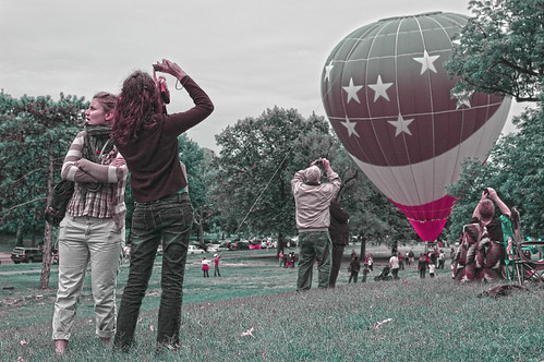
In the photo above, the b channel is neutral, and this shows us a range of colors available in the a channel. If we neutralize the a channel instead, we get a different range of colors:
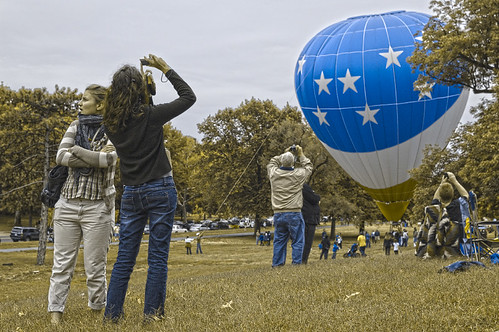
Good results, with an unchanged white balance, with very little effort. But what if we want to target colors other than the ones given us here? By using the Lab color space, we can have very precise control over color, as long as we are willing to do a lot of hard work, but the results are reliable and predictable. The following discussion includes extensive use of algebra, trigonometry, and geometry: proceed at your own risk.
Consider this photo, taken at a graduation ceremony last year, at the University of Missouri - Saint Louis:
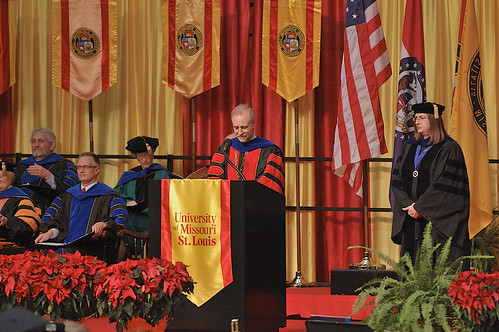
Suppose we want to convert this to a two-color image, but we want to preserve the red color on the robes of the speaker. We can do this by algebraically transforming the Lab a and b coordinates.
Please consider this rather complicated diagram:
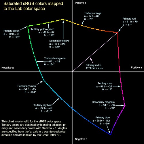
Click on the image to examine this chart at its largest size.
This shows the relative locations of sRGB colors within the Lab color space. Although Lab can represent all visible colors, the sRGB space can only display about 35% of the color range visible to the human eye, but it closely models the gamut of colors displayable on ordinary computer screens or flat-panel televisions. The colored, irregular line shows the colors where one RGB color channel is equal to its maximum value of 255, another channel is 0, and where the third channel takes on all values — therefore this shows only the brightest, most saturated colors of sRGB. The Lab color space was designed to be fairly visually uniform — that is, equal changes of Lab coordinates will produce visually equal changes in color throughout the chart — whereas sRGB was not designed to be particularly uniform across all colors
Like standard artists’ color wheels, this image portrays colors arranged in a cyclical form — you can start at red, continuously change the hue, go through the set of common hues, and then return back to red where you started. But unlike the color wheels, this shows that the primary colors are perhaps not quite as absolute nor as uniformly spaced as we may like. (I created a color wheel specifically using the sRGB primary colors, which can be seen here.)
When editing in Lab in Photoshop, we can set either the a or b channels to 50% gray, which will eliminate that color axis from the image. The key to our processing is to rotate the colors in a way that will bring our key color to lay either on the a or b Lab axis, and then to eliminate the colors on the other axis by setting it to 50% gray. We then rotate the colors back to where they were before.
OK, back to the graduation sample image. The red value that I want to preserve has a value of R = 223, G = 51, and B = 44; the equivalent Lab color is L = 51, a = 65, and b = 48. I calculate that my color of red is located at an angle of about artangent(b/a) = or about 36 degrees above the a axis.
What we do next is rotate all of the colors around — by negative 36 degrees — so that my red is now on the a axis. We use the Greek letter theta (θ) as the symbol of the amount of rotation:
New a value = cosine(θ) x (old a value) - sine(θ) x (old b value)
New b value = sine(θ) x (old a value) + cosine(θ) x (old b value)
More information on this algebraic transformation can be found here.
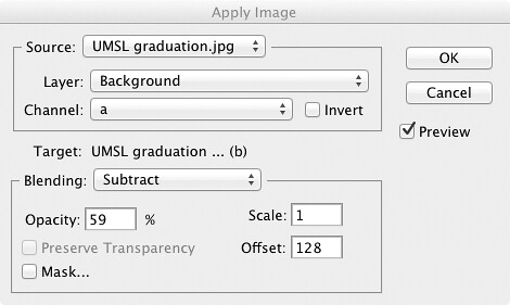
For this example, where θ = −36 degrees, then sine(θ) = about -.59 and cosine(θ) = about .81. I move my image to the Lab color space, make a copy of the image, and then desaturate the copy, turning both the a and b channels to 50% gray. Using the Apply Image command in Photoshop, I’ll either add or subtract the a and b color channels of the old image to the channels of my new image. Here is an example of one of the Apply Image commands:
This is a somewhat complicated procedure if you try to follow the steps in your head, but here is the result of the color rotation:
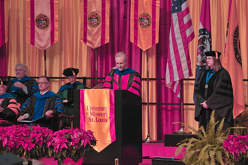
Every color was rotated by the same amount in Lab, and the red color of the robe is now equal to a = 80 and b = 0, showing us that this color is now along the a axis. Now since we are eliminating the b axis, there is no need to create a new rotated b, saving ourselves two Apply Image operations, but I thought you’d like to see all the colors here.
Now we can eliminate the b axis, and then rotate the colors by the same amount, but in the opposite direction:
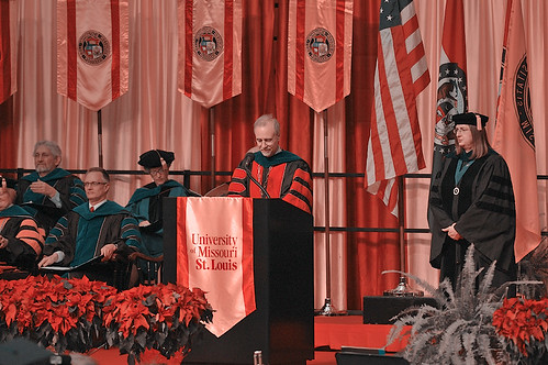
Here we have the colors rotated back to where they used to be, and the red color is preserved, within the limits of rounding errors. Here I did the same thing, but this time preserving the Ph.D. blue color on the robes of the seated scholars:
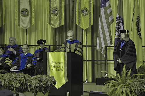
And for fun, I mixed these images together, using the “Blend If” sliders within the Layer Style box, preserving both the red and blue, but eliminating green altogether:

Photoshop is a bit more powerful than we would expect. Direct algebraic manipulation of images is a powerful method; undoubtably similar techniques could be used with digital cinema for interesting special effects.
No comments:
Post a Comment