This is the color gamut problem: inexpensive desktop printers — those with four ink colors (cyan, magenta, yellow, and black) — cannot reproduce all of the colors that are produced by a digital camera. The best way around this is to get a printer that has more ink colors — but these can be expensive. And so the best alternative is to process your images to make the most of your printer's limited color gamut.
Here are the three primary colors in the sRGB color system:
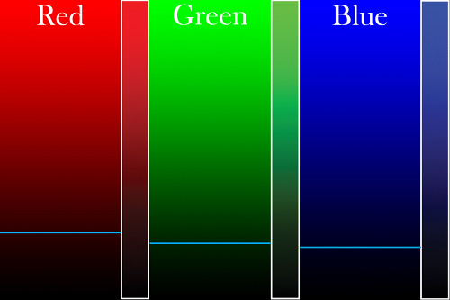
In the wide strips, we have one of the pure sRGB primary colors going from a value of 0, which is black, to 255 which is the brightest pure color that can be represented by the sRGB system.
Do you see the blue line at the bottom of each strip? This is the color gamut limit of four-color commercial printing presses and inexpensive desktop printers (this color space is abbreviated CMYK, after the four ink colors used: cyan, magenta, yellow, and black). Everything above the lines cannot be accurately printed — which is most of the image. Note that all the bright primary colors are out of the CMYK gamut. The narrow strips on the right are an approximate representation of the colors you will get from an inexpensive printer. Note that greens and blues are particularly poor and relatively unsaturated.
When we mix colors together in sRGB, we still see the same problem:
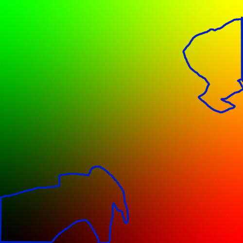
Here, red goes from zero on the left to 255 on the right; from the bottom, green goes from zero to 255 on the top. Red and green mix together to make yellow. The areas surrounded by the blue lines are colors that are within the CMYK color gamut! Reds, oranges, greens, and some leaf green colors cannot be accurately portrayed by CMYK, in fact, most of the colors in this mixture cannot be printed.
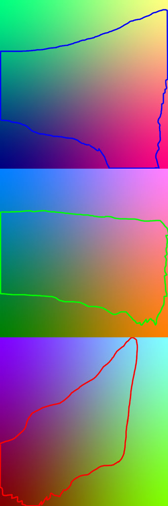
Other color mixtures are hardly better:
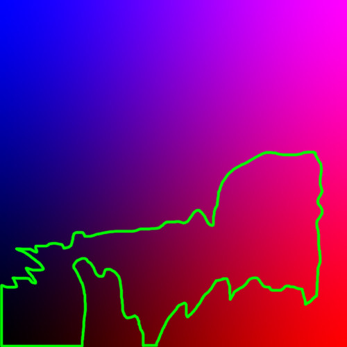
Red going across, blue going up. Again, most of the image is not accurately printable.
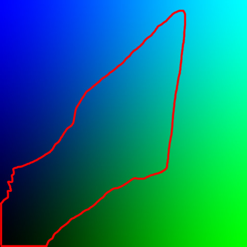
Green across, blue going up. This is somewhat better, but you still can't print decent primary colors.
Things do get better when we have mixtures of all three colors. Here are mixtures of two colors; in each, the third color is set to 50% of its maximum value:
The top image has dark blue mixed in, the middle dark green, and the bottom a dark red. The printable color gamut is expanded by the addition of the third color. If we had a pure grayscale image, then all the gray tones will be printable.
Real-world photos typically don't have too many pure, saturated reds, greens, and blues, and so the out-of-gamut problem may be a bit less prominent that what we see here. But most images will have at least some colors that can't be printed:
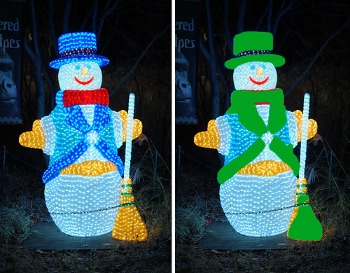
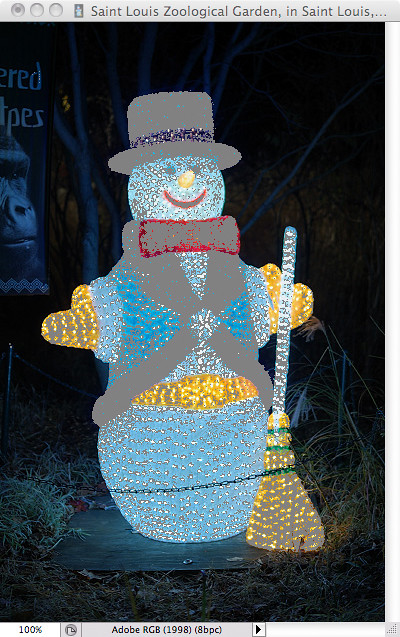
In this image of a snowman the out of gamut regions are seen on the right, painted in green. If you were to print this image on a four-color printer, these color regions would look a bit flat and unsaturated. You will lose detail also.
But CMYK gives as well as takes away. Even though we can not print the bright red, green, and blue primary colors, CMYK has its own primary colors: cyan, magenta, and yellow, which are typically brighter and more saturated than what you have with sRGB. You could process your images to take advantage of these colors.
To get an overview of these color systems, you may want to take a look at some of these articles:
Color Spaces, Part 1: RGBWhen processing for print, you want to emphasize the colors the printer can print, while toning back the colors that are out of the printer's gamut. Following is a relatively simple process where you can make the most of your images in Photoshop.
An RGB Quiz
Color Spaces, Part 2: CMYK
Part 2 of "Color Spaces, Part 2: CMYK
A CMYK Quiz
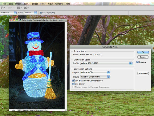
Convert your image to a wide-gamut color space. Typically Adobe RGB is used. If you shoot RAW, Photoshop's Adobe Camera RAW (ACR) program can select this color space upon import — this would be useful for best quality. Some cameras can shoot JPEG images in Adobe RGB, but I would suggest not using it unless you really know what you are doing. Select the menu item Edit, Convert to Profile...
Turn on the Gamut Warning feature in Photoshop:
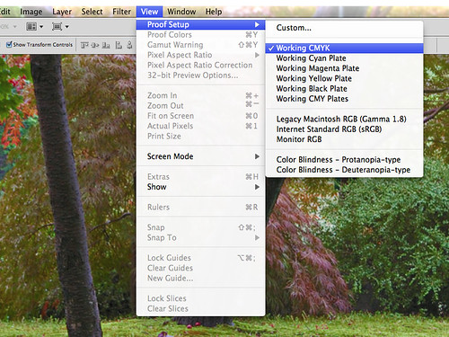
If your target printer has a color profile installed in Photoshop, go to the Custom... menu and select it instead of CMYK. Following shows an image with the gamut warning on; here I have the warning set to gray, but you can change the color to be more visible on a particular image.
Select the Image, Adjustments, Hue/Saturation... menu item:
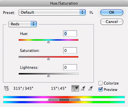
Note that the drop-down list has both the RGB and CMYK primary colors. For each of the color classes which are out-of-gamut, adjust the Saturation and Lightness sliders until the Gamut Warning turns off. You can be as careful or as sloppy as you want here, by adjusting the slider on the bottom. You can also select individual colors with the eyedropper tool. (The middle part of the slider shows the colors that will be fully corrected. You can adjust the outside parts of the slider for good blending.)
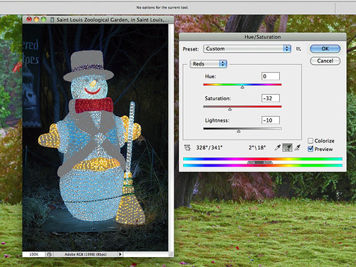
Here I brought the red bow tie into the CMYK color gamut by darkening and desaturating the color range; but be aware that there may be more than one way to bring it into gamut, with some being better than others. Were I being more careful, I would have done this on a layer with a mask so as not to also desaturate the snowman's smile. Then I corrected the the blue part of the image to bring it within the CMYK gamut. In other images you may also have to tone down the bright primary green colors.
Next we can enhance the printer's primary colors. We go through the same process as before, but we work with the cyan, magenta, and yellow color ranges, increasing brightness and saturation. The major improvement we can make here are with the yellow colors, which I was able to saturate and brighten considerably. You can brighten and saturate until the Gamut Warning turns on; then you've gone too far. (However, it is OK if some small parts of your image are out of gamut... you just don't want too much over a broad area, otherwise you will lose detail.)
This is a bit of a leap of faith, since you most likely cannot see the final results of your editing: it is out of your monitor's gamut. If you have areas of your image that ought to have lots of bright cyan, magenta, or yellow ink, you can place an eyedropper tool on the spot and measure the CMYK values directly. If a spot is supposed to have a very bright yellow component, the brightest you can get, then that spot, after your processing, ought to be rather close to having 100% yellow ink.
Purists may insist that all this manipulation is ‘inauthentic’ but in reality this scene greatly exceeded the color gamut and dynamic range of my digital camera; in fact this is a blend of three separately exposed images. So we are justified in making the colors of the snowman as bright and as saturated as we are able to. Likewise, if we are printing a full-color image to a narrow-gamut CMYK printer, we are justified in printing as much of a full-range of color as we are able.
There are many ways of accomplishing a goal in Photoshop, and this one is particularly straight-forward. The most visually accurate color corrections can be made using the Lab color space. Also of use is the Vibrance tool, layers, masking, and most notably Levels and Curves.
When I am preparing images for commercial press, I eventually manipulate the images directly in the CMYK color space, making the most of that limited range of color. Unfortunately we cannot do the same with desktop printers, since they use different inks than are found in commercial presses, and so they typically require the image to be in RGB format. The Gamut Warning feature is the most powerful tool for this purpose.
No comments:
Post a Comment