When you photograph brightly colored flowers, be aware that you risk overexposure:
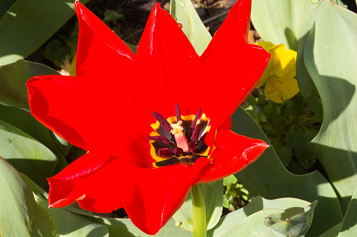
Overexposing bright colors is easy with digital photography — and also when using film for slides. This red color really isn't all that bright compared to pure white, for it is only a bit more luminous than a middle gray. But digital cameras can only record so much red before they become overwhelmed. Blue skies are often overexposed, as we see in the article Three Opportunities for Overexposure.
As we see here, even a slight overexposure can ruin an image; adding contrast or saturation (common settings in a camera that usually make images look better) will make matters worse. Just by looking at this photo you should be able to tell that it is overexposed: we have a large, nearly featureless areas of bright primary and secondary colors, namely the red tulip as well as section of the yellow flower on the right.
The color of each pixel in this image is determined by three numbers, each of which range in value from 0 to 255, with the numbers determining the amount of red, green, and blue light at each pixel. For an overview of this RGB color system, see the article Color Spaces, Part 1: RGB. Variation of the RGB color numbers across the image gives us detail: but here, much of the red tulip has its red value pegged at 255. So the flower looks flat and largely void of detail.
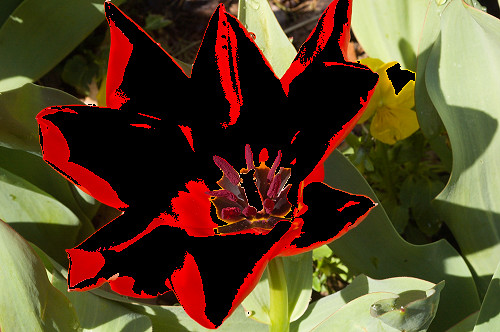
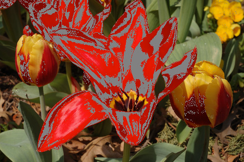
Overexposure in and of itself is not necessarily bad, and it is often unavoidable, but you likely will want to avoid overexposing even a single color channel on your main subject, like this tulip. If your digital camera offers three separate color histograms, you may want to check it to avoid this problem. Here are the overexposed portions, shown masked in black:
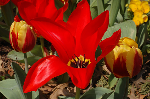
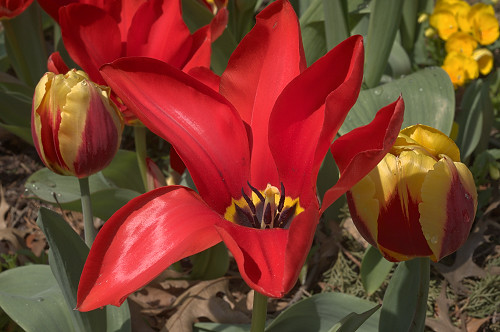
I took another photo nearby, using better exposure:
I took these photos the other day at the Missouri Botanical Garden in Saint Louis. You can see more of my photos taken that day here.
The red channel just barely kisses 255 in the brightest red areas, and so this flower, unlike the one above, is not overexposed. But this image is still disappointing. While we do see detail and texture in the flower, it still looks somewhat flat, especially compared to the adjoining tulips. The yellow parts of those tulips look more interesting and textured. What is going on here?
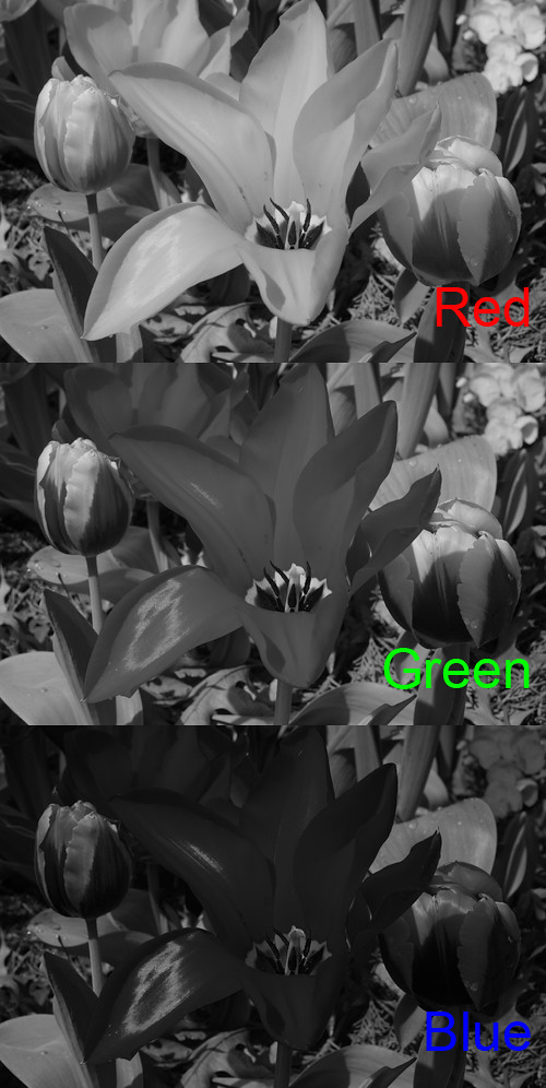
Here are the three color channels of this image:
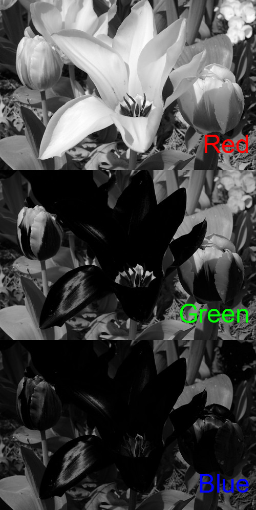
Please note that nearly all of the red tulip is black in the green and blue channels. As we would expect, there is good detail in the red channel. Take a look at the yellow parts of the tulip on the left; it shows good detail in all three channels, and so it has nice texture in the final color image.
We see texture when there is variation of the RGB color channels across an area. If there is little variation around a point, we see little texture at that point. Variation in color shows texture, but we have little to no variation in color with the red tulip. Variation in luminosity or brightness is typically more important when you want to show texture. See my article Luminance is More Important than Color.
A rough model of luminosity is:
Luminosity = 30% red + 59% green + 11% blueIf you want to show lots of texture or detail, then this calculated luminosity has to strongly vary over an area. With our tulip the majority of the green and blue color values are zero — seen as black in the above illustration — and so these color channels do nothing to give us texture. The texture in the red channel is attenuated by more than two thirds, and so the image looks somewhat flat.
Underexposure then is not one thing, but rather is three things, for we need to be concerned with the exposure of all three color channels. Typically we do not expect to see detail in black or white areas of a photograph, but certainly we would like to see texture in mid tones. But as we see here, we cannot count on that. Because two of our channels are underexposed, we lost texture.
I might add that the color of the tulip is wrong. It was not that particular shade of red, rather it was more intense, closer to scarlet, closer to the far edge of human color perception.
Just by looking at the RGB color numbers, we see that G and B are zero, and so all color is determined by R alone. This means that the color of the tulip is fixed to the color of the sRGB red primary. The sRGB standard is used by most digital cameras and most computer monitors.
The sRGB color standard can display only about 35% of all possible colors, as illustrated here:
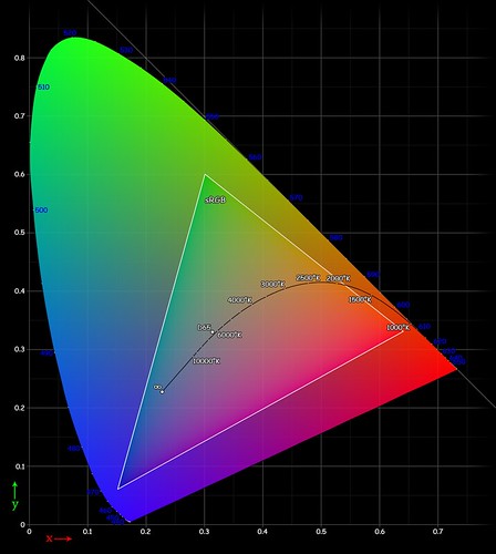
This image originally appeared on Wikipedia. Source and attribution: http://en.wikipedia.org/wiki/File:Cie_Chart_with_sRGB_gamut_by_spigget.png
The horseshoe shape shows the limit of human color vision. The sRGB color gamut is represented by the triangle in this diagram. Our tulip color is somewhat near the lower righthand corner of this chart. Of course, this chart itself is not accurate in color, because it uses the sRGB standard, and so the outlying colors, outside of the triangle, cannot be displayed.
In photography, whenever you get one or two RGB colors at 255, while the other color is zero, then you know that you are out of gamut. We even see this in our first, overexposed photo. Red is largely fixed at 255, while blue and green are zero.
One solution is to capture the image using a color standard that is larger than sRGB. We won't be able to see these extra colors here, because lots of web browsers and computer monitors are limited to the sRGB standard. We can use a wider color gamut when printing, especially if use a higher-end printer than uses more than three color inks.
As it happens, I took this image using Camera RAW, and my Nikon can capture a very broad range of colors. During post-processing on my computer, I can convert the RAW file to sRGB, or I can convert it to the ProPhoto colorspace, which can represent more colors:
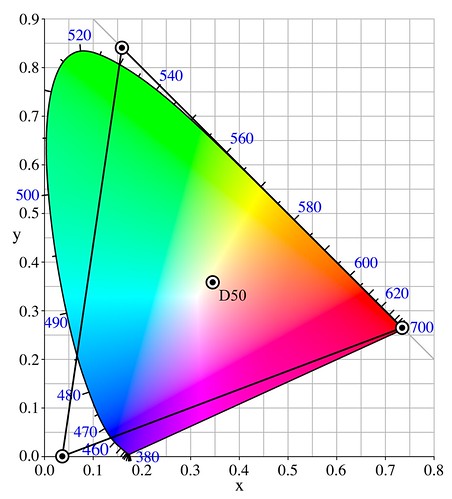
Image originally appeared on Wikipedia. Source and attribution: http://en.wikipedia.org/wiki/File:CIExy1931_ProPhoto.png
Notice the much larger triangle here, and also note that the red primary goes all the way to the limit of human vision; undoubtably our tulip can be accurately captured.
Here I edited the photo after converting the RAW image to the ProPhoto colorspace.
The gray here approximately indicates the areas which cannot be represented by sRGB. If we look at all three color channels, we can see that there is good texture in the tulip:
While we cannot show the ProPhoto image on the computer screen in all its glory, it may be printable, depending on the kind of printer we use. The final image ought to have better texture than what we had before.
We could process this image for computer display if we are willing to desaturate the red in the ProPhoto image. This would give us better texture at the expense of color.
Here I used the good green and blue channels from the ProPhoto color gamut to add texture back into the tulip. The flower is no longer intensely red, but I think it is otherwise a slight improvement.
No comments:
Post a Comment