COLOR MANAGEMENT has become far easier since the introduction of standard ICC profiles, developed by the International Color Consortium, a group of various computer, digital camera, and imaging companies. ICC profiles describe the color handing characteristics of cameras, scanners, printers, and computer monitors, as well as allowing for uniform methods of converting the colors from one device to another. For example, ICC profiles are used to convert the colors captured by a camera to those colors available on a printer.
ICC profiles define a mapping from the typically limited color spaces of devices into a universal color space (which can describe all colors), such as CIELAB or CIEXYZ; from these universal spaces, the colors can then be mapped to an output device. As such, ICC profiles recognize limits of what is possible with any given device, and allows us to compare the capabilities of one device with another. If an output device, like a computer display or digital printer, cannot show particular colors, then the software will use the ICC profile to change the colors to the closest ones available (this will often cause the image to lose detail or saturation).
ICC profiles are also stored in image files, thereby interpreting the colors of the file, and these profiles are used during image editing. Typically, JPEG image files delivered by cameras are encoded into standard color spaces which are independent of the particular make and model of camera. The most common color spaces are sRGB and AdobeRGB; these provide a wide enough gamut of color for practical use, while being compact enough to produce reasonably small file sizes. ICC calls these "three component color encoding" standards. Using these standards are convenient because we can use JPEG or TIFF images from a wide variety of cameras without worrying about the specific characteristics of each. For example, an sRGB color value of (255, 0, 0) will describe the same bright red color, no matter where the image came from. Some software, including web browsers, actually assume that all image files are encoded in the sRGB standard.
Click here for an overview of RGB color spaces.

I did not create this image. Click here for source and attribution. This shows the relative color gamuts of various RGB color profiles, as well as the color gamut of the Epson 2200 printer.
Each of the standard RGB ICC profiles defines three primary colors: particular shades of red, green, and blue. A narrow standard such as sRGB can describe about 35% of all colors, and so will have primary colors that aren't quite as bright, colorful, or saturated as the Wide Gamut RGB standard, which can describe about 77.6% of all colors. The ProPhoto standard is even bigger and has mathematical primaries that aren't even real colors. However, be aware that most computer monitors and digital printers cannot display or print color much beyond the sRGB standard, and so sRGB is generally recommended for most uses on the Internet and for consumer-grade printing.
So ICC profiles have these uses:
- Describing the color capability of a device.
- A standard method of converting the colors from one device to another.
- Describing the colors in an image file such as a digital photograph.
- A widely accepted color standard for cross-platform image interchange.
- Creative use. Artists can use ICC profiles to precisely manipulate and control the gamut of color in images.
Estimating the colors of Autochrome
Now, while I made note of the false profile method, I rarely used it nor did I fully appreciate the wider potential of this method. But some months ago, I became interested in the old Autochrome Lumière method of color photography, released in the early years of the 20th century. These color slide plates produced somewhat muted colors, but the color palette produced was beautiful and lacked the often garish colors found in later slide films:
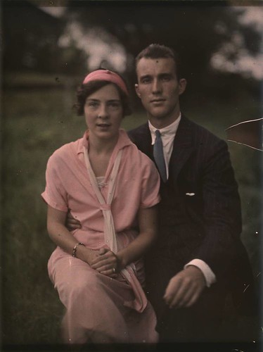
Couple, by Mrs. Benjamin F. Russell, ca. 1910; George Eastman House Collection. Source.

Woman in floral silk robe, by Charles Spaeth, ca. 1915; George Eastman House Collection. Source.
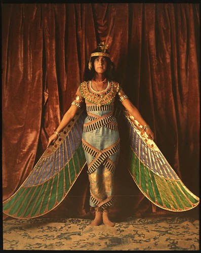
Dancer wearing Egyptian-look costume with wings reaching to the floor, unknown photographer, ca. 1915; George Eastman House Collection. Source.
I wanted to reproduce the colors produced by Autochrome, and thought that if I could determine the primary colors used by the Autochrome process, then I could create an ICC profile that could produce digital images with the approximate color gamut of Autochrome.
By collecting together a number of Autochrome images taken from the Internet, I was able to get a very rough idea of the range of colors found in the these images.
Now there are a lot of problems with my method:
- Did Autochrome fall within the sRGB color gamut? Is the full gamut of color captured by these reproductions?
- Are these direct photographs of Autochrome slides, or are these scans of printed reproductions?
- Are these photos a representative sample of Autochrome?
- What color of light was used when these slides were exposed? What color of light was used when these slides were digitally photographed? What white balance was used by the digital camera? How accurate is the camera color rendering?
- How much have the color dyes faded with time? How much variation was there in the Autochrome process?
- Autochrome is made up of small, visible colored grains; how do I reproduce the pointillist-like appearance of the method? [Update: see An Imitation of the Autochrome Lumière Process for one method.]
- So forth and so on.
According to some authorities, the Autochrome process used orange, green, and violet primary colors; based on my inspection of these derivative images, I am convinced that orange and green are correct, but I'm not so sure about violet; it is only marginally violet at best, and unsaturated. Based on these primary colors, we ought to get pink, dull yellow, and dull cyan as secondary colors, and we do see these as prominent colors. Orange is often blown in these images (that is, it lacks detail and texture), something that I don't regularly see with any other saturated Autochrome color; this leads me to believe that the orange primary color is outside of the sRGB gamut. I also looked up the chemical dyes used in the Autochrome process, and those used can produce these primary colors.
Using the ImageJ software package, I was able to produce statistical plots of the colors found in the example Autochrome images.
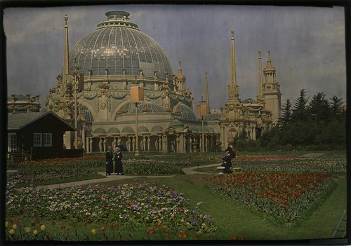
Palace of Horticulture, Pan American Exposition, unknown photographer, 1915; George Eastman House Collection. Source.
Here is a CIE xy chromaticity diagram of the colors in the image above:
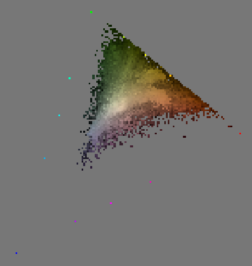
The chromaticity diagram is a standard method of showing color gamut. All of the lightest pixels of any given hue and saturation are plotted. The bright colorful pixels that form a triangle around this diagram are the primary, secondary, and tertiary colors of the sRGB color space: the primary colors are blue at the bottom left; green at top, and red on the right. See the chromaticity diagram, above on this page, which shows various standard color spaces.
Whenever we are mixing together three primary colors of light — additive color mixing — the chromaticity diagram will always be contained within a triangle, with the primaries being the corners of the triangle. Notice that the Autochrome colors also roughly form a triangle. We ought to expect that the corners of this Autochrome triangle are the primary colors of the Autochrome process.
Note that the blue corner of the Autochrome is well within sRGB, but the line between orange and green is right up against the sRGB gamut line. Now perhaps the Lumière brothers were precient way back in 1904, anticipating the ITU-R BT.709 standard of 1990 and choosing primary colors compatible with High Definition Television, or perhaps (more likely) the Autochrome gamut exceeds the sRGB standard. As it happens, I've found some Autochrome images stored in wider gamuts than sRGB, and indeed the orange color is beyond what sRGB can represent.
Now, if all my example Autochrome images had chromaticity diagrams bound by the same triangle, then my work would be done, and I could confidently establish the Autochrome primary colors. Rather, the chromaticity diagrams are variable:

Be aware that since the example Autochromes were digitally captured, the camera itself, plus any processing done on them could alter the final colors. The colors would be different if these were scans of printed Autochromes, or if the dyes faded, or if variable illumination was used to capture these images, or if these images were over or underexposed.
But in many cases, orange is likely blown, and blue is nowhere even close to the sRGB blue primary. These images do not approach pure green and they never show pure red. The Autochromes all generally fall within a particular limited range.
If we can assume that the colors used in Autochrome were uniform, then we can select primary colors that would pretty much give us an 'Autochrome look' to images. Be aware that it is not my intention to precisely characterize Autochrome, for that would be a large university- or industrial-level multidisciplinary research project, and while I would be happy to accept a grant for pursuing this research further, I really just want to make pretty pictures. I want to choose primary colors that are good enough, that give my images the right 'look’.
I went about estimating the Autochrome gamut by two methods. First, I got estimates from the color gamut diagrams, as seen above. Stacking the images in ImageJ, I was able to get both the total and the average gamuts using the "3D Project” tool:

Note that since these images were in the sRGB gamut, we have an outside triangle made up of accidental colors: this is the sRGB gamut triangle. These are due to calibration colors I inserted in the images, as well as artifacts due to low-quality JPEG compression and variation in digital capture. However, we can clearly see that the example Autochromes do not fill the sRGB color gamut, and likely exceed it along the red-green axis. Interestingly, note how the line between orange and green slopes in the bottom diagram: I suspect that orange is farther out of the sRGB gamut than the green primary, and that even possibly that the green primary is within sRGB.
To get a good Autochrome look, we probably need to go with a tighter triangle rather than a looser one; also, there is evidently very much variation in the digital captures of these images. Some images have strong blues, but most do not, even where we would expect to find them. I would think that in those cases, the blue colors come from the digital camera or post processing, and not from Autochrome.
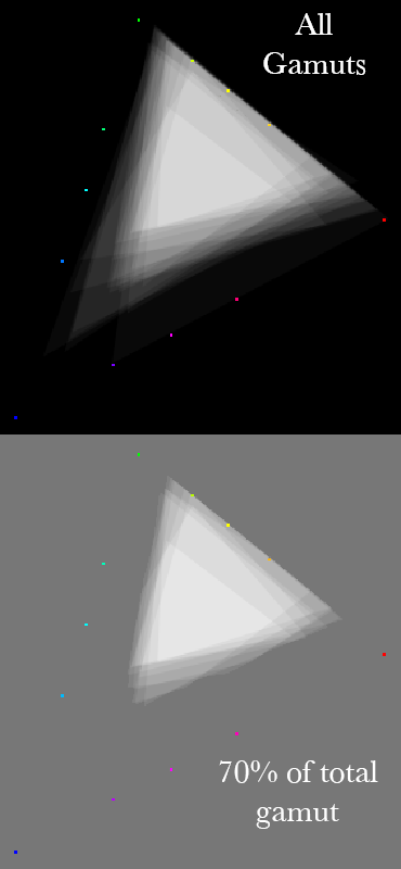
I did an alternative method of estimating gamut. For each chromaticity diagram, I plotted the smallest area triangle that would contain all of the colors in the image. Then, I averaged together all of the gamut triangles, and took the resulting area that encompassed roughly 70% of the total gamut: it formed a very neat, regular triangle, which leads me to think I’m on the right track:
I then plotted these diagrams on a grid, allowing me to read the approximate chromaticity numbers for each primary color:

We can read the CIE xy numbers off of this grid, and create an ICC profile estimating the Autochrome gamut. Here I show two gamuts — both surrounded with red triangles — one shows my total estimated Autochrome gamut, which exceeds sRGB, and another one is bound to sRGB.
Please note that while I worked to estimate the Autochrome gamut, I did nothing to determine a white point for the medium, nor did I do any work to reproduce the pointillistic or impressionistic effect found in Autochrome slides due to their colored film grain, nor did I attempt to reproduce the tonal response or gamma of Autochrome. I only attempted to find the primary colors used in the process. [Update: see the article An Imitation of the Autochrome Lumière Process]
Using ICC profiles for creative color control
I created two ICC profiles. Click the following links to download:
You may also be interested in an older Autochrome estimate of mine. It is smaller and has a blue primary that is less violet than my newer one:
Put the files into whatever folder where Photoshop or your software accesses ICC profiles. On my Mac, it is ~/Library/ColorSync/Profiles.The Autochrome.icc file uses Autochrome-like primary colors while remaining in the sRGB color gamut; you can use this to process images for display on the Internet. The "Autochrome Wide.icc" file has a gamut that exceeds sRGB; while the extra colors typically can’t be displayed on most monitors, they may be able to be printed, depending on the gamut of your printer: I wouldn’t suggest using the Wide gamut if you intend to display the images on the Internet.
Once the profile is in your system, you can edit image files with them. Using Photoshop, your image colors, no matter how much manipulation you do to them, will remain within the Autochrome gamut.
Please be aware that these ICC profiles are editing profiles, not device profiles, and are not what the ICC calls a "three component color encoding standard,” for it isn’t a standard at all, nor does it characterize any device. Only use this profile while editing your file, do not display files with these profiles on the Internet, and be careful when making prints from files with these profiles assigned. Far too many web browsers or consumer grade printers assume that image files are in the sRGB gamut.
Here is how these profiles are used:
- In Photoshop, do either Edit->Convert to Profile or Edit->Assign Profile to use the Autochrome gamut. You may notice that your colors change either dramatically or slightly.
- Edit your photo as you normally would edit it— adding curves, sharpening, saturation, vibrance, whatever you want. Your image will remain in the Autochrome gamut.
- When you complete your edits, use Convert to Profile to put the image back into a standard color gamut: most typically, you’ll want to convert to sRGB for maximum compatibility. Again, this is an important step, for these ICC profiles are intended only for editing files, not for display.
- The images may be a bit dark, and you may want to brighten them after the conversion to sRGB.
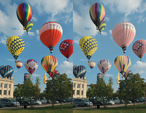
The image on the left is the original sRGB, the one on the right was Autochromed. Since the gamut of this image is rather small, there is little or no apparent change in the image. However, the following image shows a striking difference:
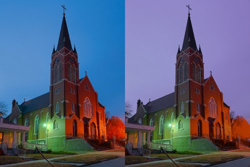
The weak Autochrome blue is quite evident, and it shifted to violet. Also, much of the detail on the tree on the right is now lost, due to the color being driven out of gamut.
Please note that we can either Convert or Assign a profile. This has a distinct difference:
- Converting to a profile causes the pixels’ color values to change; if a color is out of the new profile’s gamut, it will be adjusted, often causing loss of texture and detail. Typically, any color that is already in the new profile’s gamut will not be changed visually, but the numbers used to describe that color will change. For example, the red sRGB primary color is (255,0,0), but the same shade of red in ProPhoto is (179,70,26).
- Assigning a profile does nothing to the pixels, but they are interpreted according to the new profile. An sRGB value of (255,0,0) is interpreted as a the pure red primary color; after assigning it to Autochrome, the value will still be (255,0,0), but instead will be interpreted as being the Autochrome primary orange color. This technique will change your colors, but is the quickest way to make an Autochromey-looking image. This also has the advantage of preserving all of the original detail and texture in your image.
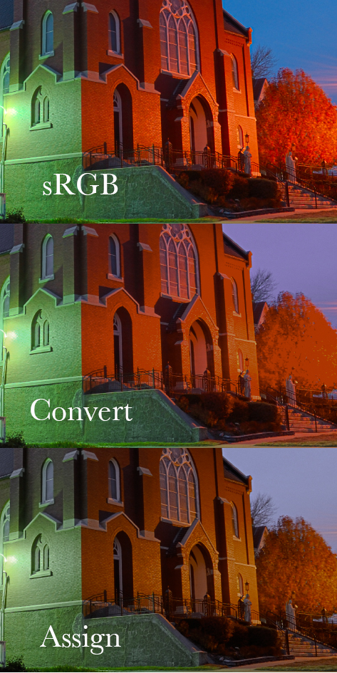
Note that Assign kept the texture in the tree, but did change all of the colors, as well as making them less saturated. Be sure to convert your images back to sRGB when you are done processing them.
Using orange, green, and violet primary colors means our color wheel is rather unfamiliar:

The colors in this color space aren’t as brilliant as those found in sRGB, but you cannot get the same effect simply by desaturation. Any color space becomes quite distinctive when you push it to the limits, when you try to represent something that is near or exceeds the bounds of what is possible. If you push this color space too much, you will get large areas of orange and pink and violet, which is the Autochrome ‘look’.
However, I must admit that after playing with a number of images in this color space, I think that I made it too broad, and the primary ‘blue’ color too violet. I’m not sure as yet. I think that I may prefer my Old Autochrome ICC profile.
The sCMY colorspace
The attempt to replicate the Autochrome color space was an interesting exercise, and led me to consider limited color spaces in general, ones which would give photographers and graphic artists a new way of controlling the use of color. After all, when you have an ICC profile fixed to a particular palette of colors, the use of color is strictly controlled: you can’t go beyond the fixed limits.
The sCMYcolorspace uses dull cyan, magenta, and yellow primaries — dimmer tones, but of the same hue and saturaton as the sRGB secondary colors. Since this is an additive color space, the secondary colors are brighter than the primaries, so this does not work the same way as does the subtractive CMYK color space used in commercial printer. However, the color channels do have similarities.
In sCMY, the red channel is cyan; the green channel magenta; and the blue channel yellow: the opponents of the sRGB primary colors. And so, the green channel is black where we would expect to see lots of green ink if we were to print the image, and it is white where we would not expect to see any green printed.

This colorspace is unique in that there are no pure saturated red, green, or blue colors whatsoever; we do see pale tints of these at best.
How useful is this colorspace? For general use, not very. However, if there is a need or desire to limit the colors used, it can be interesting.
Due to the inverse quality of this colorspace, we cannot assign sCMY to an image and expect it to look anything close to being natural; instead, you typically want to convert to this profile before editing.
You can download sCMY by clicking here.
This exercise in editing color spaces can be explored much farther by the artful selection of primary colors, or alternatively, selecting bright secondary colors and deriving the primary colors from them.
UPDATE: I’ve also come up with a method to simulate the dark tonality and grain of Autochrome; see the article, An Imitation of the Autochrome Lumière Process.
8 comments:
Thank you for you work. I'd like to test your profiles but minus.com is not working at the moment. Is there any other way to get all of them? Thank you in advance!
Leave me your email address (or send it to me at marcusscotus@sbcglobal.net) and I will email them to you.
Thank you for your answer. Anyway in the meantime minus was working again, so I could download them. I will try to use them and let you know! Thanks again.
Maurizio,
If you find this useful, would it be possible for you to share some of your results? And your thoughts about the process?
As I mentioned in the article, I think the ‘Old Autochrome’ profile looks better than the one I estimated.
Best regards.
what program did you use to create or edit an ICC profile???
Stefan - stefan.chirila@gmail.com
I use Photoshop CS5. I create ICC profiles from within Color Settings.
Thank you very much Mr. Abeln.
I never came up with the idea of using ICC profiles to limit the color spectrum of an image.
I've tried to make a Lightroom-Preset just by watching Autochrome images, guessing the color shifts and came up with a result that is pretty close to your "Old Autochrome-ICC-profile" Here is an image: http://i.imgur.com/0jdxWdU.jpg
I'll try to improve the preset but it will never be as good as your results.
Thanks so much for the great effort. The look of Autochrome pictures is so unique and you pretty close to the original results. Later Autochrome pictures were much more colorful and saturated.
This is also a good source for Autochrome images: http://visualhistory.livejournal.com/51055.html
Have you made any more progress yet? I tried to follow your grain tutorial but I end up with a strange color grain pattern. When I use the darken blending mode, the highlights clip and become some kind of blue-violet. Would be great if you could upload your .tiff file again.
Is it possible to make a Kodachrome-ICC-profile that works just like your Autochrome-profile? I'm also working on a Kodachrome preset and I came really close to the look of Kodachrome but not in a scientific way.
Thanks for this great work! I'm so grateful that 7 or more years after their creation your ICCs are still up for download. I love the colors that these ICCs facilitate, colors somewhere between real autochrome and the images I miss so much from Agfa's wonderful but now long-gone Portrait 160 film.
For some years I've been interested in the 1910-20s Palm Springs "Creative Brotherhood" led by painter/draftsman Carl Eytel. (The great desert naturalist Edmund Jaeger drew my interest in this group of Mojave-based artists, writers, and scientists.) Fred Payne Clatworthy, a late-comer to the brotherhood, created lovely autochrome images of both Mojave and Colorado landscapes. What a pleasure now so effortlessly to capture at least a hint of the marvelous images Clatworthy and others brought to life in Lumiere's humble potato starch.
Larry Frisch
Victoria, BC
Post a Comment